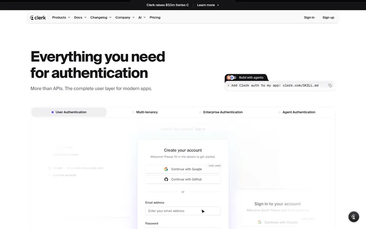
North star · Keep a deep navy foundation and let clear type, working product UI, and selective blue signals explain the product.
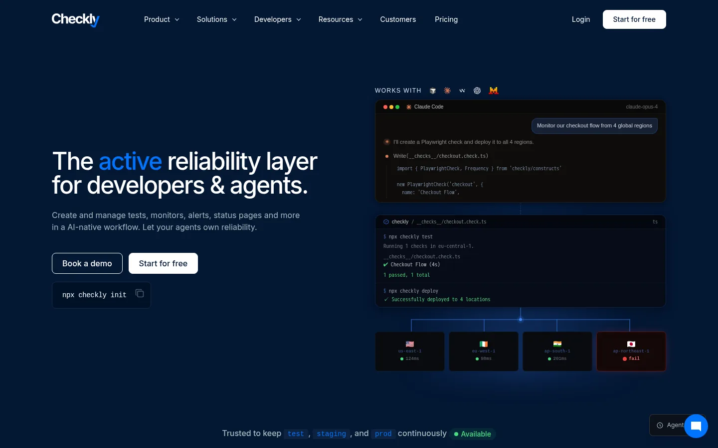
A nearly continuous deep navy canvas establishes a focused developer-tool atmosphere across the page. White headlines carry the hierarchy, while muted blue-gray copy stays readable without competing; vivid blue selectively emphasizes linked words, product capabilities, and interface details. Inter is the main voice: large, tightly tracked headlines contrast with compact, practical body text. Monospace captions and code panels introduce a recognizable engineering vocabulary. The hero uses a balanced two-column composition, pairing plain-language messaging and calls to action with a dark product-interface montage. Below, generous vertical section breaks alternate text-led introductions with bordered feature panels, product screenshots, customer proof, and integration tiles. Hairline blue borders define cards and section edges rather than heavy containers. Interfaces remain dark and detailed, with restrained colored status indicators that clarify product behavior instead of turning the page into a bright illustration.
配色
点色块复制色值。用途说明来自对页面的实测位置(背景、文字、描边、按钮)与截图判读。
品牌色
强调色
表层色
中性色
功能色
页面底色 · Reliability Navy表层 · Signal White表层 2 · Card Navy表层 3 · Panel Midnight表层 4 · Terminal Black主文字 · Signal White次要文字 · Mist Slate描边 · Border Blue强调 · Signal Blue强调 2 · Action Blue强调 3 · Layered Blue
Primary interface font for headings, body copy, navigation, links, and buttons.
Aa 设计
ui-monospace
系统字体 · 字重 400 / 700 / 600 / 500 · 占比 23%
免费替代:Roboto Mono
Code samples, command snippets, and compact technical captions.
Aa 设计
-apple-system
系统字体 · 字重 400 / 700 / 500 / 600 · 占比 5%
免费替代:Inter
Fallback font appearing in captured product-interface cards.
角色
示例
字号
字重
行高
字距
一级标题
Hero headline, large and tightly tracked.
Checkly
48px
500
1
-0.04em
二级标题
Major section headings introducing product themes.
Checkly
30px
500
1.2
0
三级标题
Feature and content-card headings.
The quick brown fox 敏捷的狐狸
20px
400
1.4
0
四级标题
Smaller supporting headings within sections.
The quick brown fox 敏捷的狐狸
18px
400
1.56
0
正文
Explanatory copy, descriptions, and supporting paragraphs.
The quick brown fox 敏捷的狐狸
14px
400
1.63
0
辅助文字
Compact monospace labels and technical metadata.
The quick brown fox 敏捷的狐狸
12px
400
1.63
0
按钮
CTA labels and compact action text.
The quick brown fox 敏捷的狐狸
14px
400
1.43
0
导航
Top-level navigation and menu labels.
The quick brown fox 敏捷的狐狸
13px
500
1.54
0
链接
Inline and standalone action links.
The quick brown fox 敏捷的狐狸
14px
500
1.43
0
眉题
Small uppercase section labels above headings.
The quick brown fox 敏捷的狐狸
11px
600
1.82
0.05em
代码
Commands and code snippets in product demonstrations.
const style = 1;
12px
400
1.63
0
间距与布局
基准单位 4px · 密度:适中
80px版块间距
8px元素间距
—卡片内边距
—内容最大宽度
1px
2px
3px
4px
6px
8px
10px
12px
14px
16px
20px
24px
28px
40px
Use a centered content area with broad horizontal margins and a clear desktop two-column hero. Align headlines and copy to the left; let product UI occupy the opposing column or span a feature area. Long-form sections follow a deliberate vertical rhythm, alternating text-led introductions with screenshot panels, feature grids, and bordered content bands. Keep information density comfortable: ample separation between major blocks, compact spacing inside technical cards, and no invented fixed widths where measurements are unavailable.
圆角与层次
按钮 · 8px
卡片 · 12px
徽标 · 4px
导航 · 6px
inset · nav
xl · card
inset · card
xl · nav
The page is mostly flat, with depth concentrated in product mockups and navigation. Use fine blue borders to define cards and section edges, then reserve soft, deep shadows for floating interface panels. Dark inset surfaces create layered UI without bright elevation effects; avoid applying heavy shadows to every content block.
组件
下面的预览按实测的按钮、输入框、徽标、卡片样式重建(字体用替代字体)。
Primary navigation
White Inter labels sit directly on the navy canvas; compact dropdown cues and a contrasting white Start for free button anchor the right side.
Hero actions
Pair an outlined Book a demo action with a white Start for free CTA, followed by a dark monospace command chip.
Product-interface montage
Stack dark terminal and monitoring panels with fine blue borders, compact technical text, and small status-color details.
Feature cards
Use dark navy surfaces, hairline blue borders, concise headings, and product content; retain a technical rather than decorative feel.
Section eyebrow
Set a small uppercase Inter label above major headings to mark themes without adding visual weight.
Integration tiles
Arrange partner marks and concise descriptions in a dense, bordered grid over the dark canvas.
Code snippet
Present commands and code in compact ui-monospace text on a near-black inset surface.
Imagery · The page relies on product imagery rather than lifestyle photography: terminal windows, monitoring dashboards, code snippets, status tiles, and integration marks. Frame screenshots as dark, detailed interface panels against the navy canvas, with subtle blue glows or connectors where visible. Small green, red, and other status accents belong to the product UI and should remain subordinate to the brand palette. Avoid decorative imagery that distracts from the working-tool narrative.
该做与不该做
✓ 该做
Use Reliability Navy as the continuous page foundation.
Reserve Signal Blue for links and focused emphasis.
Set large headlines in Inter with tight tracking.
Use monospace only for code and technical metadata.
Frame product screenshots with restrained borders and shadows.
Keep status colors small and inside product UI.
Separate major content blocks with generous vertical breathing room.
✕ 不该做
Do not introduce bright full-width section backgrounds.
Do not use gradients as the primary visual identity.
Do not turn every card into a strongly elevated panel.
Do not use status colors as broad decorative fills.
Do not replace the product UI with lifestyle photography.
Do not make secondary copy compete with the headlines.
Do not invent measured spacing, radii, or container widths.
给 AI 的提示词
想快速出一个同风格的新页面,把这段话连同 DESIGN.md 一起发给 AI。
Build a new developer-tool page on a deep Reliability Navy (#041734) canvas. Use Signal White (#ffffff) for primary headings and controls, Mist Slate (#a7babe) for supporting copy, and Signal Blue (#0075ff) sparingly for links and emphasis. Set the main interface in Inter, reserving monospace for commands and code. Establish a clear headline-and-copy column beside a dark product screenshot or interface composition. Organize lower content into spaced sections with concise introductions, bordered feature cards, practical code panels, and restrained integration tiles. Use Border Blue (#163051) for hairlines and Panel Midnight (#0a1728) or Terminal Black (#020b1a) for inset surfaces. Keep shadows subtle and focused on product panels. Let small green or other semantic colors appear only as meaningful UI statuses. Avoid decorative clutter and oversized gradients.