North star · Let warm blank space and a quiet editorial hierarchy frame the architecture, rather than decorating around it.
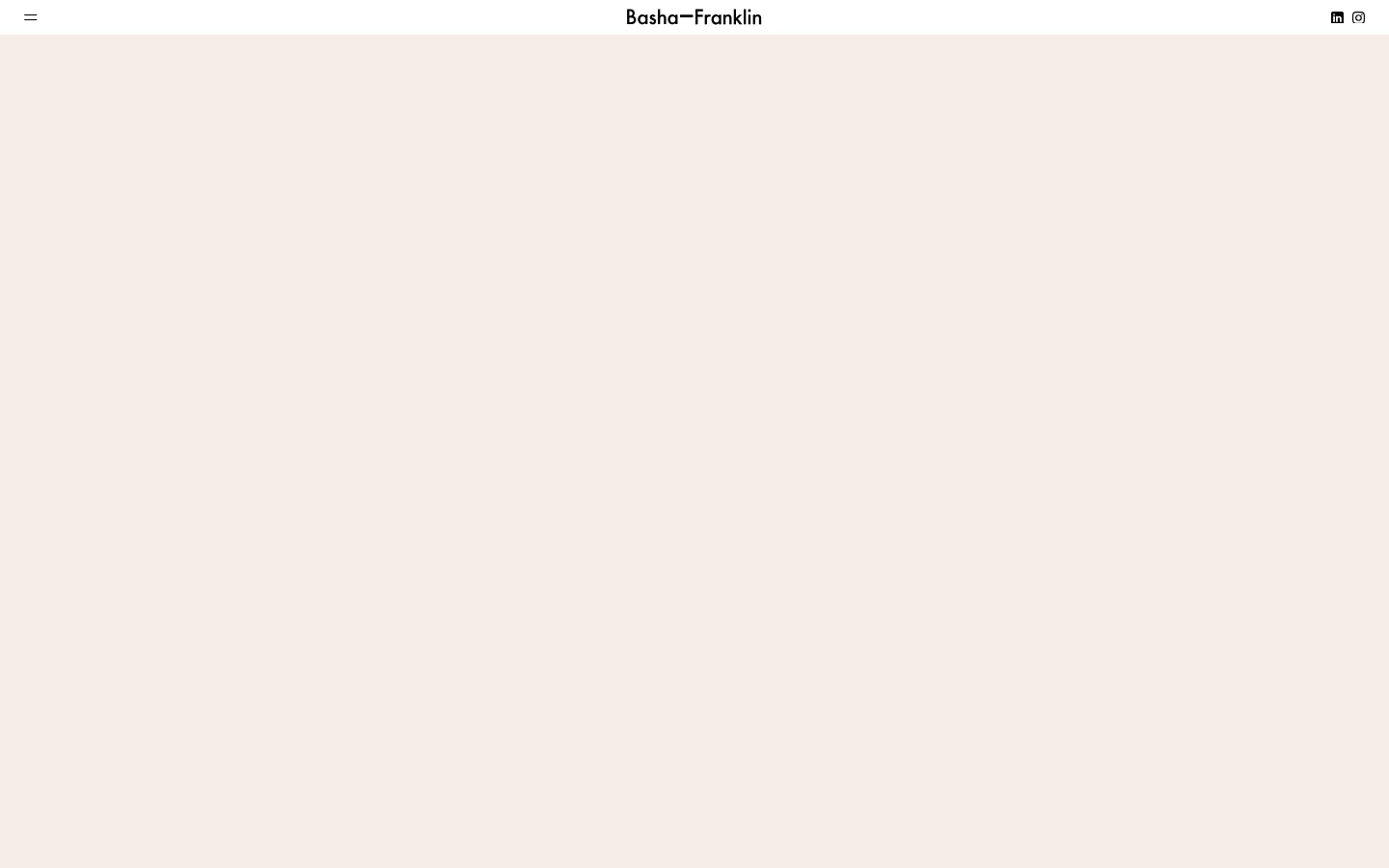
The visual strategy is quiet and architectural: a pale warm canvas (#f4ede6) dominates the page, leaving the top viewport exceptionally open and placing a compact black wordmark at the center of a slim header. Black is reserved for typography and small utility icons, rather than large filled controls. When opened, the navigation becomes a broad peach field (#e5c0a4) divided into tall columns by fine vertical rules; serif menu links give this panel an editorial, gallery-like character. STKBureau-Serif supplies the larger display and navigation voice, while STKBureau-Sans handles compact uppercase labels and supporting text. Project imagery introduces deeper terracotta, ochre, blush, and green tones, but these are supporting artwork colours, not the main canvas palette. The overall composition is spacious and low-density, with restrained alignment, generous blank areas, and flat surfaces instead of decorative effects.
Compact supporting copy, uppercase labels, links, and utility navigation.
Aa 设计
STKBureau-Serif
网络字体 · 字重 400 · 占比 47%
免费替代:Cormorant Garamond
Wordmark, prominent navigation links, and editorial display text.
角色
示例
字号
字重
行高
字距
一级标题
Editorial serif page or project headline.
Basha-Franklin
29px
400
1.19
-0.02em
正文
Sans-serif descriptions and supporting project copy.
The quick brown fox 敏捷的狐狸
14.5px
400
1.2
-0.01em
辅助文字
Small uppercase contextual labels.
The quick brown fox 敏捷的狐狸
11.5px
400
1.3
0.04em
导航
Large serif links in the menu and masthead hierarchy.
Basha-Franklin
29px
400
1.19
-0.02em
链接
Compact uppercase calls to action and text links.
The quick brown fox 敏捷的狐狸
11.5px
400
1.3
0.04em
眉题
Small uppercase labels above content or project names.
The quick brown fox 敏捷的狐狸
11.5px
400
1.3
0.04em
间距与布局
基准单位 1px · 密度:适中
72px版块间距
9px元素间距
—卡片内边距
—内容最大宽度
9px
22px
25px
36px
72px
176px
Keep the header slim, with a menu icon aligned left, a centered wordmark, and small social icons at the right. Preserve a large, quiet canvas before the portfolio content; the captured first viewport is intentionally sparse. The opened menu spans the page width and separates link groups into tall columns with fine vertical dividers. Use a simple editorial grid for project cards, with generous gutters and no invented max-width. Section spacing feels comfortable, and content density stays low.
圆角与层次
没有测到阴影:页面是扁平的,层次靠底色和描边区分。
The interface reads as flat and gallery-like. Measured data reports no shadows, and the card samples have no corner radius. Use thin, quiet vertical dividers in the opened menu rather than raised panels or heavy outlines; let background colour and whitespace establish the layers.
组件
下面的预览按实测的按钮、输入框、徽标、卡片样式重建(字体用替代字体)。
Slim masthead
Place the menu control at the left, centered Basha-Franklin wordmark, and compact social icons at the right on the warm canvas.
Menu control
Use a minimal black menu icon; opening it reveals a full-width peach navigation panel.
Column navigation
Group studio links in tall columns over #e5c0a4, with fine vertical dividers, small uppercase category labels, and serif links.
Project card
Present architectural project imagery in a restrained grid; allow muted artwork colours such as #c49760 and #34483f.
Text link
Use black sans-serif uppercase link styling for compact actions such as “+ FIND OUT MORE”.
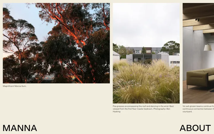
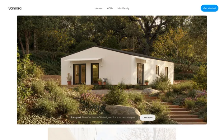
Imagery · Treat project imagery as the main source of saturated colour: the scaled page view shows architectural portfolio cards with broad blocks of forest green, rose clay, ochre, and terracotta. Keep these colours inside the artwork rather than spreading them across interface chrome. The captured first viewport has no visible hero image, so retain an open, image-free opening area and introduce project imagery lower on the page.
该做与不该做
✓ 该做
Use #f4ede6 as the dominant canvas.
Keep the centered wordmark small and understated.
Use the serif for prominent navigation and editorial display.
Set utility labels and compact links in uppercase sans-serif.
Use #e5c0a4 as a distinct navigation-panel surface.
Keep project colours within the portfolio artwork.
Preserve generous blank space and flat surfaces.
✕ 不该做
Do not fill the opening canvas with decorative content.
Do not use saturated project colours as global UI accents.
Do not add shadows or rounded-card styling.
Do not replace the quiet masthead with a heavy navigation bar.
Do not make labels compete with the large serif links.
Do not crowd the project grid with dense metadata.
给 AI 的提示词
想快速出一个同风格的新页面,把这段话连同 DESIGN.md 一起发给 AI。
Build a new page in the Basha-Franklin visual style. Use Gallery Cream (#f4ede6) for the dominant canvas and Soft Ink (#000000) for typography and simple utility icons. Create a restrained masthead with a left menu control, centered studio wordmark, and small right-side social links. Use STKBureau-Serif, or a close editorial serif, for prominent headings and navigation; use STKBureau-Sans for compact supporting copy and uppercase labels. If showing an open menu, use a broad Peach Panel (#e5c0a4) divided into tall columns with subtle rules. Keep the opening area spacious and low-density. Build a clean portfolio grid, keeping Muted Ochre (#c49760), Kiln Terracotta (#7c3420), Dusty Apricot (#d6a891), Rose Clay (#c58e86), and Forest Slate (#34483f) primarily inside project imagery. Avoid shadows, rounded cards, and decorative effects.