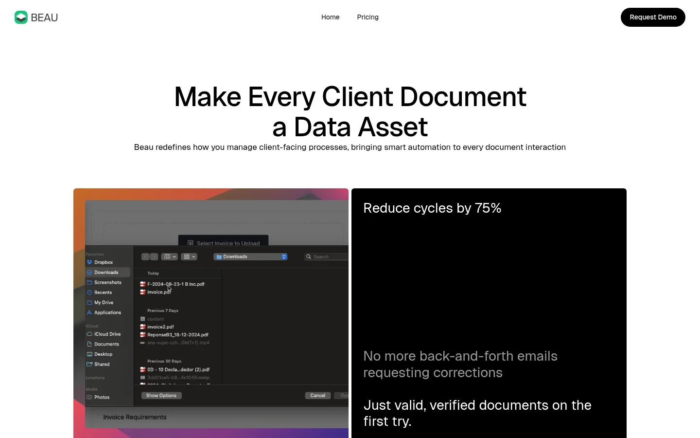
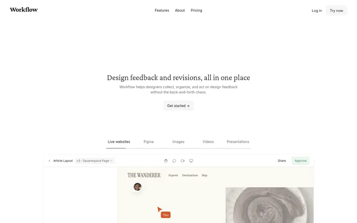
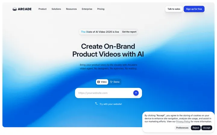
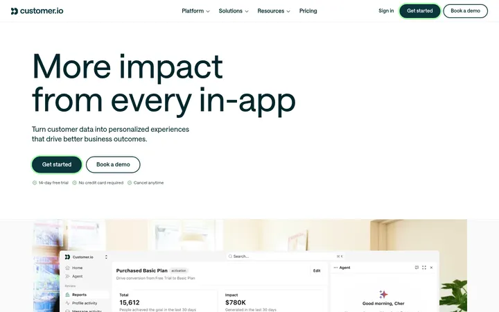
North star · Keep the interface quiet and spacious in black and white, reserving vivid gradients for product framing and key actions.
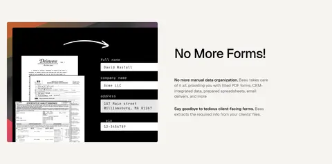
The visual strategy relies on a white canvas, near-black typography, and generous open space to make a document-automation product feel direct and legible. A warm off-white band breaks up the otherwise white sequence without changing the restrained palette. Orange, coral, and indigo appear as a vivid multicolor gradient around product demonstrations and selected calls to action; they are accents, not broad background fills. Geist’s clean sans-serif forms support centered, assertive headings and compact explanatory copy, with muted gray text lowering emphasis where needed. The page alternates centered statements with split product demonstrations and a three-step workflow, maintaining a spacious vertical rhythm. Product screenshots and document examples provide the visual detail, often framed by black panels or gradient edges. Cards use subtle outlines or restrained shadow rather than heavy elevation. A black footer and inverse pricing card provide strong contrast at the end.
Site-wide font for headings, body copy, navigation, links, and buttons.
角色
示例
字号
字重
行高
字距
特大标题
Large statement headings for major page moments.
Beau
56px
500
1.1
-0.02em
一级标题
Primary hero headline and prominent section titles.
Beau
40px
500
1.15
-0.02em
二级标题
Feature and pricing section headings.
Beau
33px
500
1.15
-0.01em
三级标题
Workflow steps and smaller feature titles.
Beau
28px
400
1.2
0
正文
Main explanatory copy and card content.
The quick brown fox 敏捷的狐狸
17px
400
1.4
0
辅助文字
Supporting notes and compact secondary information.
The quick brown fox 敏捷的狐狸
14px
400
1.4
0
导航
Header and footer navigation links.
The quick brown fox 敏捷的狐狸
14px
400
1.4
0
链接
Emphasized text links and CTA labels.
The quick brown fox 敏捷的狐狸
17px
500
1.4
0
间距与布局
基准单位 4px · 密度:宽松
96px版块间距
18px元素间距
24px卡片内边距
896px内容最大宽度
6px
9px
12px
18px
24px
36px
48px
72px
96px
The page uses a centered content column with a measured maximum width of 896px, while selected product compositions spread across the available width. The hero centers its headline above a two-column demonstration; later blocks alternate centered copy, single-column statements, split feature layouts, and a three-column workflow. Sections are vertically generous, with a measured 96px section gap and spacious density. The warm off-white feature band provides a clear pause. Alignment shifts intentionally between centered headings and left-aligned product explanations.
圆角与层次
按钮 · 9999px
卡片 · 6px
图片 · 6px
链接 · 9999px
sm · card
Most sections remain flat against the canvas, with separation created by whitespace, a single warm band, and occasional hairlines. Cards have restrained treatment: light cards may use a subtle measured shadow, while feature cards use black fills or thin borders. Keep layering focused on screenshot frames and avoid pronounced drop shadows.
组件
下面的预览按实测的按钮、输入框、徽标、卡片样式重建(字体用替代字体)。
Header navigation
White, minimal navigation with the logo at left, compact links, and a black pill-shaped Request Demo action.
Hero demonstration
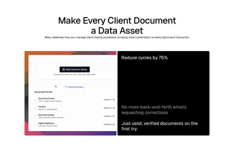
Centered headline and supporting line above a paired product image and black benefit panel.
Feature split
Product or document demonstration sits beside a concise heading and explanation, with generous surrounding whitespace.
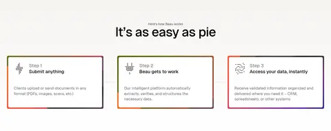
Workflow cards
Three horizontally aligned steps with rounded corners, subtle outlines, compact labels, and gradient edge details.
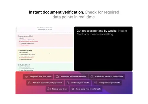
Black benefit panel
Inverse black surface pairs a bright heading with muted supporting copy and a short outcome statement.
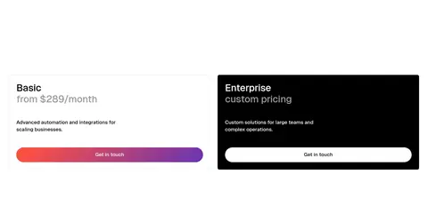
Pricing cards
Light Basic plan card sits beside an inverse black Enterprise card; pill-shaped Get in touch actions use contrasting treatments.
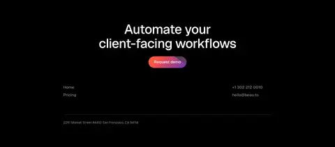
Footer CTA
Full-width black closing section centers a white workflow message and demo action above compact contact and navigation details.
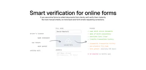
Imagery · Imagery is product-led: document uploads, online form verification, filled PDFs, and workflow interfaces show the service in context. Screenshots and document mockups are arranged in framed compositions, often beside black text panels or edged with the orange-coral-indigo gradient. The visual evidence is UI and document content rather than lifestyle photography or decorative illustration; keep examples legible and closely cropped.
Set primary copy in near-black and secondary copy in measured grays.
Reserve the orange-to-coral-to-indigo gradient for selective emphasis.
Give product demonstrations ample breathing room.
Alternate centered messaging with practical split layouts.
Use black inverse panels to spotlight benefits or close the page.
✕ 不该做
Do not turn accent colors into broad section backgrounds.
Do not crowd the page with dense, edge-to-edge content.
Do not add decorative photography that competes with the product UI.
Do not use heavy shadows or elaborate card elevation.
Do not introduce unrelated colors beyond the measured palette.
Do not make every heading, label, and action visually loud.
给 AI 的提示词
想快速出一个同风格的新页面,把这段话连同 DESIGN.md 一起发给 AI。
Build a new Beau-style SaaS page with a calm white canvas (#ffffff), Document Ink (#000000) headings, and restrained supporting text in Muted Graphite (#666666) or Soft Pewter (#999999). Use Geist, or Inter as a close free substitute, with clean medium-weight headings and regular body copy. Keep content centered within the measured 896px maximum width where appropriate, with generous vertical section rhythm. Alternate centered statements, split product demonstrations, and concise workflow cards. Show real product UI or document examples as the primary imagery. Use Warm Paper (#f6f4f1) sparingly for a section band. Apply the Citrus Orange (#ff8308), Coral Signal (#ff5043), and Electric Indigo (#392bd5) gradient selectively to product frames and key actions. Keep borders subtle, shadows restrained, buttons pill-shaped, and finish with a black inverse CTA or footer.