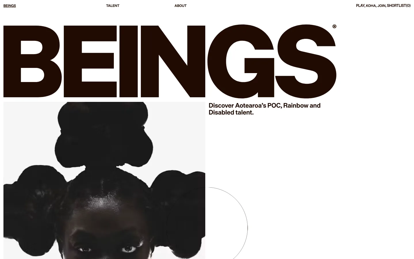
North star · Let oversized near-black typography and candid talent photography command a quiet white canvas, with generous space between them.
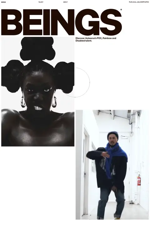
The page is built around a stark white canvas and an oversized, near-black BEINGS wordmark that dominates the opening view. Navigation stays small and widely separated along the top edge, while the hero pairs the wordmark and a compact mission statement with large, documentary-style portraits. The palette remains deliberately restrained: #1b0800 anchors the logo, headings and dark closing band; #ffffff provides the main breathing room; #fff4ec and #f6c9a1 appear as warm supporting tones for content and text. Typography is bold, compact sans serif, with uppercase micro-navigation and strong display lettering. The long page uses asymmetrical image placement and substantial vertical pauses rather than boxed cards or dense grids. Photography supplies nearly all visual texture and colour, keeping the identity human, direct and editorial rather than decorative.
Uppercase navigation, button labels and short links
角色
示例
字号
字重
行高
字距
特大标题
Oversized BEINGS identity lettering at the top of the hero.
Beings
66px
400
1
-0.03em
一级标题
Primary page heading and prominent section statements.
Beings
30px
400
1.18
0
二级标题
Talent and other section headings.
The quick brown fox 敏捷的狐狸
22px
400
1.1
0
正文
Mission copy and supporting editorial text.
The quick brown fox 敏捷的狐狸
16px
400
1.1
0
辅助文字
Small notes and image-related supporting copy.
The quick brown fox 敏捷的狐狸
12px
400
1.4
0
按钮
Compact uppercase action labels, including PLAY.
The quick brown fox 敏捷的狐狸
12px
400
1.4
0
链接
Uppercase navigation and concise linked labels.
The quick brown fox 敏捷的狐狸
12px
400
1.4
0
间距与布局
基准单位 4px · 密度:适中
48px版块间距
12px元素间距
—卡片内边距
1416px内容最大宽度
6px
12px
48px
84px
A single long, comfortable-density page uses a measured maximum width of 1416px. The first viewport is led by a full-width typographic mark, with a portrait positioned below it on the left and the mission statement to the right. Subsequent photographs shift across the canvas instead of following a rigid card grid. Navigation is distributed across the top edge. Large areas of white space separate content moments; the measured section gap is 48px, with 12px element spacing where elements cluster.
圆角与层次
没有测到阴影:页面是扁平的,层次靠底色和描边区分。
Keep the interface predominantly flat: the measured data reports no shadows and no component corner-radius scale. White space, image crops and bold contrast create the hierarchy instead of floating cards. A fine circular outline appears as a restrained graphic detail in the hero; use hairlines sparingly and do not add heavy borders or layered UI panels.
组件
下面的预览按实测的按钮、输入框、徽标、卡片样式重建(字体用替代字体)。
Top navigation
Small, uppercase labels sit across the white canvas: brand at left, section links through the center and compact action links at right.
Wordmark hero
A huge, near-black BEINGS mark spans most of the opening width and is the dominant graphic element.
Mission statement
Short, bold copy sits beside the opening portrait, using a tight editorial block rather than a card.
Talent photography
Large portraits and video imagery are offset across the page, with varied crops and generous white space.
Section heading
Warm-toned, prominent talent lettering introduces an editorial content area without a filled panel.
Closing band
A deep #1b0800 footer-like band provides a high-contrast base for concise light-coloured closing copy.
Imagery · Use large, candid portrait and talent photography, including stills or video frames, as the primary visual content. Images are placed asymmetrically and often cropped close, with subjects retaining a documentary, human presence rather than a polished product-shot treatment. The opening portrait has a monochrome appearance; later images introduce natural colour. Avoid decorative illustrations that compete with the people shown.
Make the wordmark or main display type the visual anchor.
Use #1b0800 for strong type contrast.
Place portraits in an asymmetrical editorial rhythm.
Leave generous open space around image and text blocks.
Keep navigation and action labels compact and uppercase.
✕ 不该做
Do not turn the page into a dense card grid.
Do not add unmeasured colours to the brand palette.
Do not place heavy shadows behind content.
Do not use rounded, elevated app-style panels.
Do not let decorative graphics overpower talent photography.
Do not fill the open canvas with unnecessary copy.
给 AI 的提示词
想快速出一个同风格的新页面,把这段话连同 DESIGN.md 一起发给 AI。
Build a new editorial talent-directory page in the Beings visual style. Use Gallery White (#ffffff) as the dominant canvas, Roasted Ink (#1b0800) for the wordmark, headings and high-contrast closing areas, and reserve Warm Parchment (#fff4ec) and Apricot Signal (#f6c9a1) for restrained supporting accents. Lead with oversized, dense sans-serif display typography and a small uppercase navigation row. Pair concise mission copy with candid portrait photography, then arrange further image and text moments asymmetrically with substantial white space. Use compact, bold body typography and avoid cards, shadows and decorative gradients. Keep images human and documentary in feel; let their subjects provide most of the page’s texture. Use spacing in the measured rhythm, not invented component dimensions.