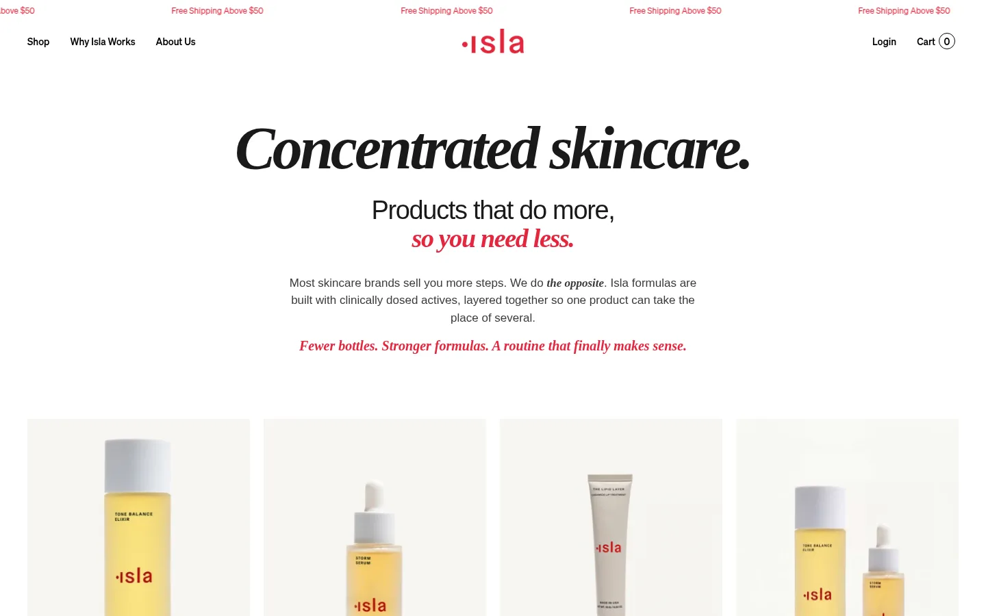
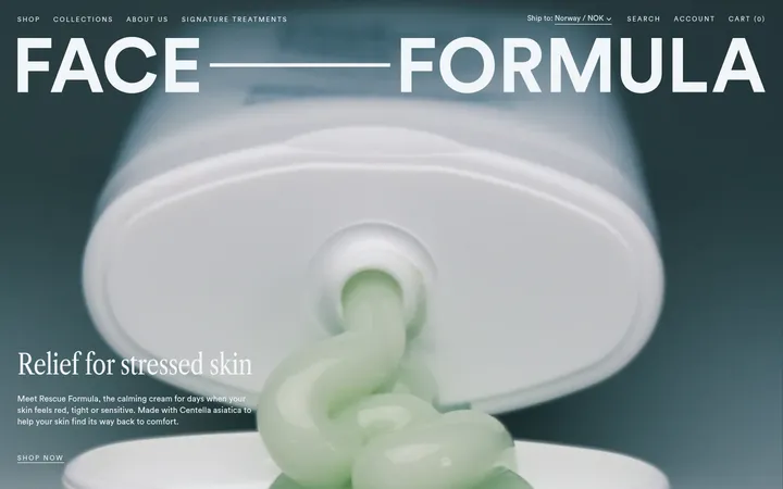
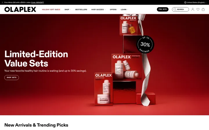
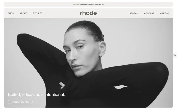
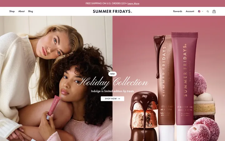
North star · Let editorial serif headlines and real product imagery tell the story, while warm whitespace and precise red accents keep shopping actions unmistakable.
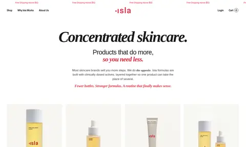
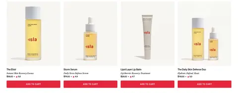
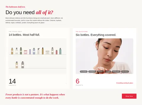
The visual strategy balances a clean white canvas with warm, pale-neutral panels that create gentle section changes without heavy colour blocking. Signal red (#e4263d) is reserved for the wordmark, emphasis, links and purchase actions, giving a focused point of energy against mostly black typography. Large editorial headlines use a confident serif treatment, while navigation, body copy and product information rely on compact sans-serif styles. The hero is centered and spacious, then the page shifts into practical four-column product cards and a warm-toned comparison section. Skincare packaging, shelf comparisons and real-skin before-and-after photography carry the story; images are presented plainly rather than surrounded by decorative effects. Comfortable gaps, restrained hairlines and simple card edges keep the long homepage readable and product-led.
配色
点色块复制色值。用途说明来自对页面的实测位置(背景、文字、描边、按钮)与截图判读。
强调色
表层色
中性色
功能色
页面底色 · Gallery White表层 · Oat Veil表层 2 · Blush Clay主文字 · True Ink次要文字 · Soft Charcoal弱文字 · Stone Text描边 · Linen Line强调 · Signal Red
Display and body copy, with the measured body style also supporting product and button text.
Aa 设计
Soehne Buch
网络字体 · 字重 400 · 占比 19%
免费替代:Inter
Captions, links, navigation, and form text.
Aa 设计
AGaramondPro
系统字体 · 字重 600 · 占比 15%
免费替代:EB Garamond
H1, H2, and H3 editorial headings.
Aa 设计
Soehne Kraftig
网络字体 · 字重 400 / 500 · 占比 9%
免费替代:Inter
Buttons, navigation labels, and uppercase eyebrow text.
Aa 设计
EB Garamond
网络字体 · 字重 600 / 500 · 占比 4%
免费替代:EB Garamond
Additional serif emphasis and supporting editorial type.
Aa 设计
Garamond Italic
系统字体 · 字重 400 · 占比 4%
免费替代:Cormorant Garamond
Italic serif emphasis in short editorial phrases.
角色
示例
字号
字重
行高
字距
特大标题
Large hero statement and prominent brand display moments.
Isla Beauty
65px
400
1.05
-0.02em
一级标题
Primary editorial heading for major page stories.
Isla Beauty
30px
600
1.2
-0.01em
二级标题
Secondary section headings and comparison titles.
The quick brown fox 敏捷的狐狸
26px
600
1.25
0
三级标题
Smaller feature and product-story headings.
The quick brown fox 敏捷的狐狸
20px
600
1.25
0
正文
Explanatory copy, product details, and supporting paragraphs.
The quick brown fox 敏捷的狐狸
15.5px
400
1.55
0
辅助文字
Small labels, captions, and compact product metadata.
The quick brown fox 敏捷的狐狸
12px
400
normal
0
按钮
Uppercase purchase and action labels.
The quick brown fox 敏捷的狐狸
12px
500
1
0.1em
导航
Header navigation and compact menu labels.
The quick brown fox 敏捷的狐狸
14px
500
normal
0
链接
Inline and product links.
The quick brown fox 敏捷的狐狸
16px
400
normal
0
眉题
Uppercase introductory labels above headings.
The quick brown fox 敏捷的狐狸
12px
500
1
0.1em
间距与布局
基准单位 2px · 密度:适中
56px版块间距
10px元素间距
32px卡片内边距
1128px内容最大宽度
3px
4px
6px
7px
8px
10px
12px
15px
16px
20px
32px
40px
50px
56px
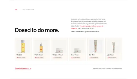
The measured content max width is 1128px, with comfortable density and a 56px section rhythm. The hero is centered, followed by a four-column product grid; comparison content uses two side-by-side cards, awards sit in a centered row, and customer results form a three-column gallery. The lower formula section moves to a six-column product lineup, then the newsletter and footer use a two-column arrangement. Preserve generous whitespace and clear changes between story, proof, and shopping areas.
圆角与层次
按钮 · 3px
输入框 · 3px
卡片 · 3px
徽标 · 2px
导航 · 50%
没有测到阴影:页面是扁平的,层次靠底色和描边区分。
The measured interface has no shadows or gradients. Cards feel mostly flat, relying on warm surface fills, small restrained corner radii, and thin pale borders where needed. Let spacing and background shifts define layers; avoid floating panels or strong depth effects.
组件
下面的预览按实测的按钮、输入框、徽标、卡片样式重建(字体用替代字体)。
Announcement strip
Repeat a small red free-shipping message across the top; keep it visually light above the main navigation.
Product card
Show a large product image, product and descriptor text, price or rating, then a full-width red add-to-cart button with white uppercase labeling.
Comparison cards
Set the typical crowded shelf beside Isla's smaller routine on pale neutral surfaces, combining short headings, imagery, and clear product-count messaging.
Results gallery
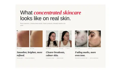
Arrange real-skin before-and-after pairs in three columns, with concise editorial headlines and restrained labels.
Formula lineup
Present a horizontal set of six products with small product imagery, names, and concise active-ingredient notes.
Newsletter form
Use a compact email sign-up area with supporting discount copy and a simple submit action in the lower-page layout.
Imagery · Use clean product photography of Isla bottles and tubes on pale neutral backgrounds, with consistent, uncluttered framing. Real-skin customer photographs and before-and-after pairs provide evidence in the results section; shelf imagery supports the fewer-products comparison. Keep images natural and direct, with no added illustrative or 3D treatment that competes with the photographed products.
Keep the main canvas white and section surfaces warm and pale.
Use red for brand emphasis and high-priority purchase actions.
Pair editorial serif headings with practical sans-serif product details.
Use real product and skin photography as the main evidence.
Preserve the centered, spacious hero before denser shopping content.
Separate long-page stories with subtle surface shifts and generous gaps.
✕ 不该做
Do not add gradients or decorative shadows.
Do not introduce extra brand colours beyond the measured palette.
Do not make every heading red; reserve red for selective emphasis.
Do not crowd product cards with unnecessary copy or ornament.
Do not replace real-skin imagery with glossy illustrations.
Do not use heavy borders or high-contrast section dividers.
给 AI 的提示词
想快速出一个同风格的新页面,把这段话连同 DESIGN.md 一起发给 AI。
Build a new Isla Beauty page using a bright white canvas (#ffffff), warm Oat Veil section surfaces (#f8f6f3), and Signal Red (#e4263d) only for focused brand emphasis and primary actions. Pair expressive editorial serif headings with clean sans-serif navigation, body copy, and product details. Keep the layout comfortable and centered within the measured 1128px content width; use clear grids for product cards and customer results, with open space between story sections. Use authentic skincare product and real-skin photography on quiet backgrounds. Keep components flat, using subtle Linen Line (#eae6e2) borders where useful and no shadows or gradients. Make the page feel like a considered skincare editorial that still supports easy product discovery and purchase.