North star · Make every section feel like a distinct, colorful creator story while keeping the message and pill-shaped action immediately legible.
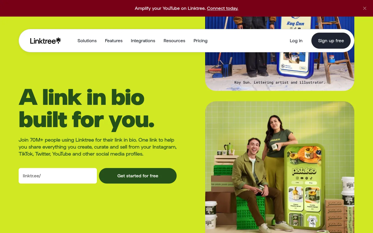
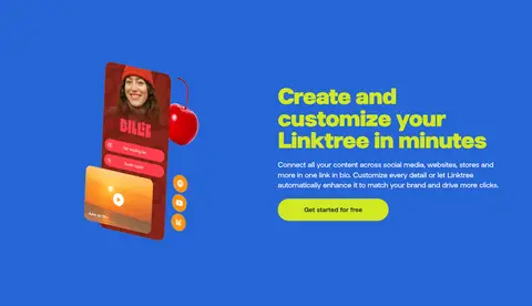
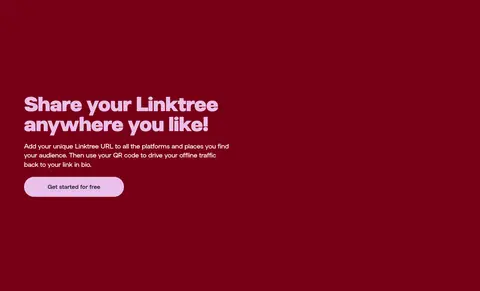
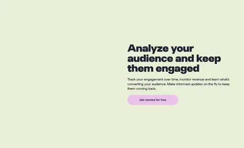
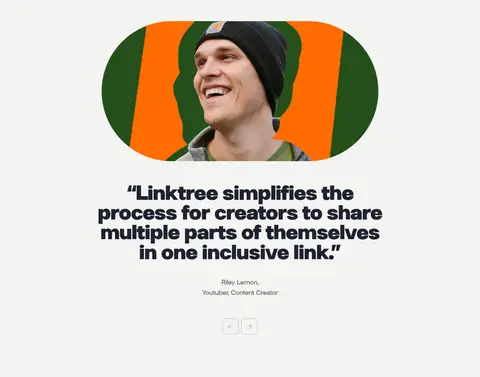
The page builds its visual identity through a sequence of bold, full-width color fields: vivid lime for the opening hero, saturated blue and burgundy for feature stories, pale green for analytics, and light gray for proof and editorial content. Deep ink text anchors the bright backgrounds, while lilac and lime pill buttons provide repeated, high-contrast calls to action. LinkSans carries everything from the oversized, tightly tracked display headline to compact navigation and body copy; headings are heavy and conversational, with mostly sentence case. The opening layout balances a left-aligned pitch and sign-up form against a vertical stack of rounded creator imagery. Lower sections alternate split feature presentations, image-led cards, centered testimonials, and a burgundy FAQ. Generous section spacing gives each color band room to register, while large rounded media and controls soften the otherwise graphic, high-impact composition.
All interface and marketing text, including display headlines, navigation, body copy, and buttons.
角色
示例
字号
字重
行高
字距
特大标题
Oversized campaign headlines and high-impact hero messaging.
Linktree
80px
800
1.07
-0.02em
一级标题
Primary page or major feature-section heading.
Linktree
56px
700
1.06
-0.02em
二级标题
Feature and supporting section headings.
Linktree
28px
500
1.3
-0.01em
三级标题
Feature-card and testimonial-related headings.
The quick brown fox 敏捷的狐狸
24px
500
1.5
0
四级标题
Smaller subheads within feature and information areas.
The quick brown fox 敏捷的狐狸
20px
500
1.5
-0.01em
正文
Paragraphs, explanatory copy, and standard interface text.
The quick brown fox 敏捷的狐狸
16px
400
1.5
0
辅助文字
Image labels, attribution, and compact supporting details.
The quick brown fox 敏捷的狐狸
13px
400
1.5
-0.013em
按钮
Primary and secondary CTA labels.
The quick brown fox 敏捷的狐狸
16px
500
1.5
0
导航
Header navigation and supporting footer links.
The quick brown fox 敏捷的狐狸
16px
400
1.5
0
链接
Inline feature links and content destinations.
The quick brown fox 敏捷的狐狸
16px
400
1.5
0
间距与布局
基准单位 8px · 密度:适中
64px版块间距
24px元素间距
—卡片内边距
1020px内容最大宽度
4px
6px
8px
12px
13px
14px
16px
20px
24px
26px
32px
36px
40px
48px
64px
128px
The page uses full-width stacked color bands, with content arranged within a measured maximum width of 1020px. The hero is a two-column composition: left-aligned headline, copy, URL field, and CTA beside a tall image stack. Feature bands switch between split layouts and centered single-column messaging; lower proof sections use card grids, centered editorial elements, and a vertical FAQ list. A measured 64px section gap and 24px element gap support a comfortable rhythm. Navigation sits in a floating, rounded capsule, and footer links resolve into multiple columns.
圆角与层次
按钮 · 9999px
输入框 · 8px
卡片 · 64px
图片 · 64px
导航 · 16px
链接 · 32px
没有测到阴影:页面是扁平的,层次靠底色和描边区分。
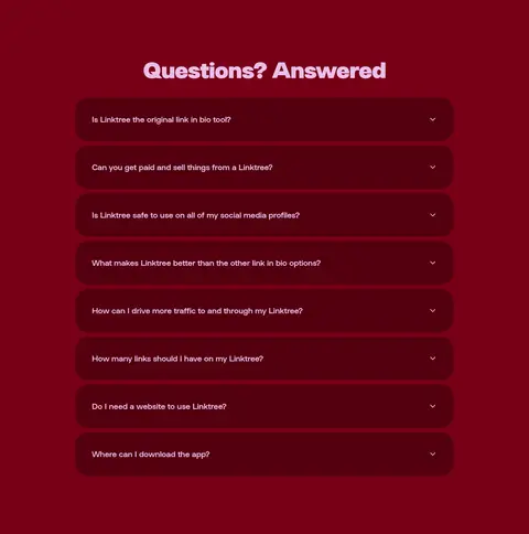
The interface is largely flat: bold background bands and color contrast establish hierarchy instead of shadows. Fine light borders appear around navigation or controls, while rounded white capsules and cards sit cleanly against the page. Layering comes from the floating header, overlapping or stacked creator media, and darker accordion rows nested within the burgundy FAQ section.
组件
下面的预览按实测的按钮、输入框、徽标、卡片样式重建(字体用替代字体)。
Floating navigation capsule
White pill-shaped navigation with brand mark, links, account actions, and a fine measured #ebebeb border on the outlined variant.
Hero URL form
White, rounded URL field with a subdued linktr.ee/ prefix beside a large pill CTA; the hero pairs the form with vivid imagery.
Pill CTA
Rounded 9999px actions use #d2e823 or #e9c0e9 with #1e2330 text; section-specific variants may switch to darker green.
Feature band
Full-width saturated color block with one focused feature story, bold headline, supporting copy, and prominent media or product preview.
Creator showcase card
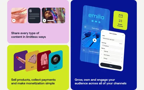
Large rounded media cards combine creator photography or product mockups with short feature messaging on pastel, lime, or blue surfaces.
FAQ accordion
Centered question list on a #780016 band, with rounded dark #54000f rows, pale labels, and a right-aligned disclosure icon.
Footer panel
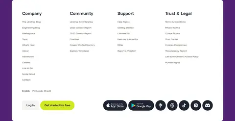
Multi-column link directory presented as a white rounded panel within the #502274 footer area.
Imagery · Authentic creator and small-business photography is the main emotional anchor, often shown in large rounded frames and stacked media in the hero. Product features use app and profile previews, device-like mockups, and colorful content cards. Image treatment is bright and varied, with each section’s solid background contrasting against the media. Some colors and intricate details belong to the embedded creator examples rather than the core interface palette.
Use broad, confident color bands to distinguish major stories.
Reserve Electric Lime and Soft Lilac for conspicuous CTA treatments.
Keep headings heavy, short, and easy to scan.
Use rounded creator photography and product previews as visual proof.
Give each section comfortable breathing room.
Keep dark text legible against bright surfaces.
✕ 不该做
Do not flatten the page into one neutral background.
Do not introduce unmeasured palette hex values.
Do not rely on shadows for hierarchy.
Do not use tiny, low-contrast body copy over saturated color.
Do not make every section use the same layout.
Do not treat colors inside creator mockups as core interface colors.
给 AI 的提示词
想快速出一个同风格的新页面,把这段话连同 DESIGN.md 一起发给 AI。
Build a new Linktree-style page with LinkSans or a close substitute, DM Sans. Establish clear section bands using Electric Lime (#d2e823), Creator Blue (#2665d6), Oxblood (#780016), Pale Sage (#e8efd6), and Soft Chalk (#f3f3f1), with Gallery White (#ffffff) and Deep Ink (#1e2330) for legibility. Use a bold, tight-tracked headline, concise supporting text, rounded creator photography or product previews, and pill-shaped actions. Keep the opening area split between messaging and imagery, then vary the layout across feature sections, proof cards, testimonials, and FAQs. Use Soft Lilac (#e9c0e9) as a secondary CTA color. Favor flat color fields, generous section breathing room, and rounded controls over shadows or elaborate borders. Include a structured footer on Plum Night (#502274).