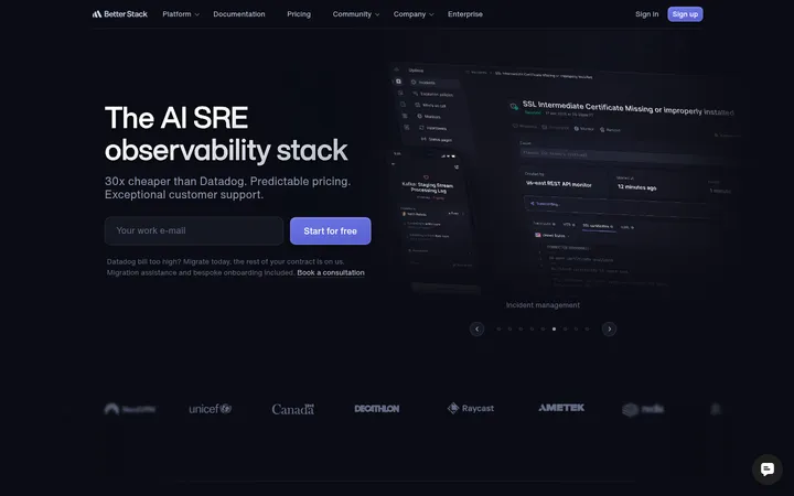
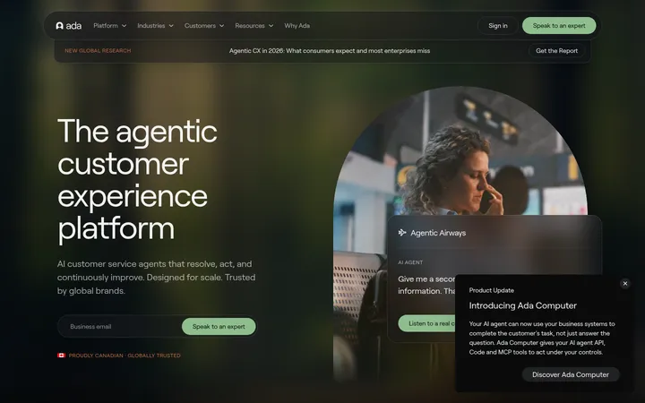
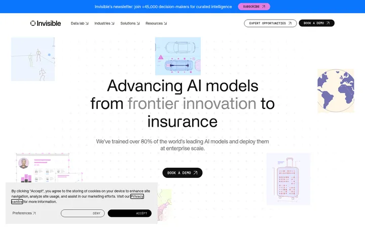
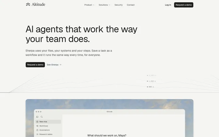
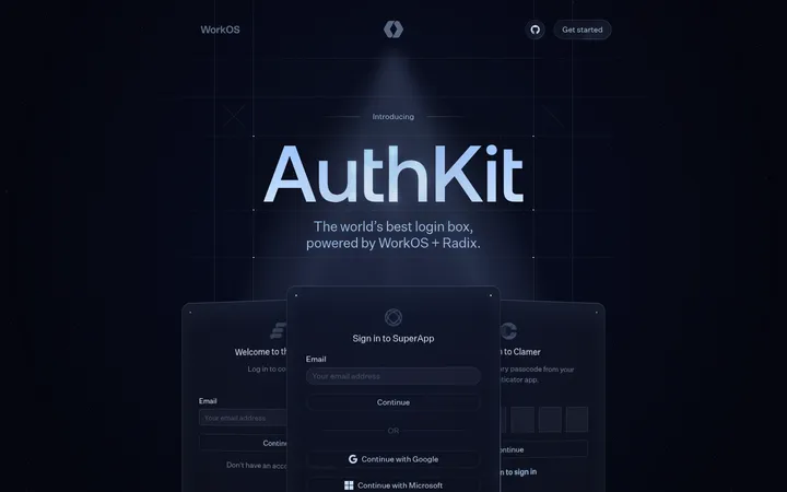
North star · Keep the canvas consistently deep navy and let crisp typography, restrained glows, and real product context create contrast.
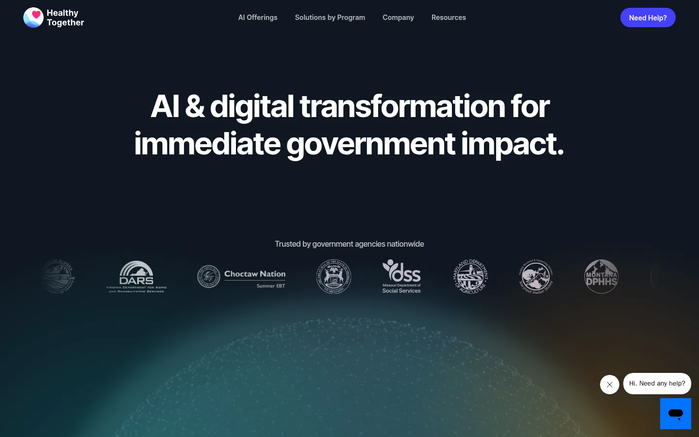
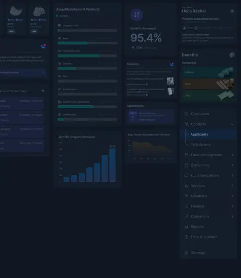
The visual system is anchored by a near-black navy canvas (#101722), used continuously across the page so the long-form homepage feels cohesive rather than divided into contrasting bands. White headlines carry the message; two muted grays support supporting copy, while green and violet glow effects appear mainly in hero and CTA imagery rather than as a dependable UI palette. Inter is used throughout, with bold, tightly tracked display headlines and smaller, softer supporting text. The composition alternates between centered statements, compact metric groups, product-led sections, and testimonial cards. Large areas of dark negative space give the oversized hero and product imagery room to register. Government logos establish trust early; later dashboard visuals show the software in context. Fine borders distinguish cards and controls without turning the page into a heavily elevated interface. A vivid violet CTA is a restrained exception to the otherwise subdued palette.
Body copy, navigation, captions, and medium-weight headings.
Aa 设计
Inter:Regular
网络字体 · 字重 400 · 占比 19%
免费替代:Inter
Regular-weight headings and selected product or link text.
Aa 设计
Inter:Semi Bold
网络字体 · 字重 600 · 占比 13%
免费替代:Inter
Display headlines and uppercase eyebrow labels.
Aa 设计
Inter:Bold
网络字体 · 字重 700 · 占比 12%
免费替代:Inter
Strong section headings and prominent product or navigation text.
角色
示例
字号
字重
行高
字距
特大标题
Oversized hero and campaign statements.
Healthy Together
64px
600
1
-0.05em
一级标题
Primary page headline and major introductory text.
Healthy Together
36px
500
1.4
-0.005em
二级标题
Major section titles, including solutions and social proof.
Healthy Together
32px
700
1.4
0
三级标题
Strong feature and product section headings.
Healthy Together
30.5px
700
1
-0.05em
四级标题
Secondary headings and supporting card titles.
The quick brown fox 敏捷的狐狸
24px
400
1.3
-0.05em
正文
Feature descriptions and primary explanatory copy.
The quick brown fox 敏捷的狐狸
18px
500
1.45
-0.005em
辅助文字
Testimonials, interface notes, and compact supporting copy.
The quick brown fox 敏捷的狐狸
16px
500
1.45
-0.005em
导航
Prominent navigation or expanded-menu headline treatment.
Healthy Together
64px
700
1.2
-0.05em
眉题
Small uppercase labels above section headings.
The quick brown fox 敏捷的狐狸
12px
600
1.33
0.06em
间距与布局
基准单位 2px · 密度:紧凑
32px版块间距
9px元素间距
—卡片内边距
1280px内容最大宽度
2px
4px
8px
9px
10px
14px
16px
18px
24px
27px
32px
36px
40px
48px
64px
160px
A centered content system sits within a measured page maximum width of 1280px, with a compact overall density but unusually generous vertical pauses between major stories. The header spans the canvas, while the hero headline is centered and the trust logos form a horizontal strip beneath it. Later sections alternate between centered messaging, multi-column metrics, split product narratives, and full-width visual showcases. Keep content edges and card groups aligned; use the measured 32px section gap as a baseline rhythm, allowing the page's large visual interludes to feel expansive rather than crowded.
圆角与层次
图片 · 50%
lg · other
lg · media
The page is mostly flat, relying on the uninterrupted navy canvas and negative space instead of pronounced shadows. Cards and product panels are separated by fine, low-contrast outlines and darker surfaces. Product imagery carries its own layered panels and occasional glow; reserve measured shadows for media or subtle card depth, not every section.
组件
下面的预览按实测的按钮、输入框、徽标、卡片样式重建(字体用替代字体)。
Top navigation
Compact logo and horizontal link row on the navy canvas, with a distinct violet pill-shaped help action at the far right.
Hero and trust strip
Centered, high-contrast headline above a small trust statement and a row of subdued government agency logos over atmospheric media.
Solutions metrics
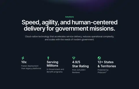
Centered section introduction followed by four compact proof points, each combining a small green icon, a strong value, and muted supporting text.
AI feature block
A short uppercase eyebrow and bold, tightly set heading lead into explanatory copy alongside or above dark product imagery.
Program integrations
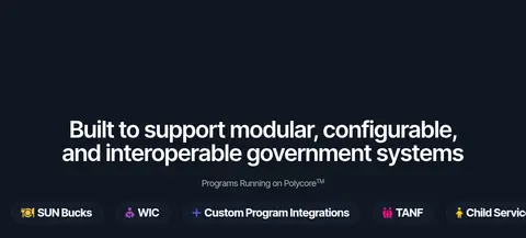
Large centered statement with a concise program label, a horizontal set of program marks, and dashboard imagery beneath.
Testimonial cards
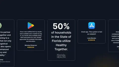
Outlined dark cards with compact customer quotes, platform or agency marks, and occasional star ratings; preserve varied card content.
Demo CTA and footer
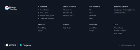
Centered closing headline with a small violet action, followed by a dense multi-column footer of program, support, and legal links.
Imagery · Use product-interface imagery as the key proof of capability: dark dashboards with compact panels, charts, navigation, and muted teal highlights. The hero and CTA use soft, atmospheric teal, blue, violet, and warm glows against navy; treat these as image effects, not extra core UI colors. Government logos appear as a restrained monochrome trust strip. Testimonial cards mix app-store marks, brief quotes, and ratings. Prefer contextual product compositions over generic stock photography.
Use Midnight Navy (#101722) as the continuous page canvas.
Set primary headlines in Soft Porcelain (#fcfdfa) with strong Inter weights.
Use Quiet Silver (#bbbbbb) for secondary descriptions.
Keep green and violet glows inside visual media rather than treating them as core palette colors.
Show agency marks early and realistic dashboard imagery in product sections.
Use fine outlines and Night Surface (#141c2a) to separate contained content.
✕ 不该做
Do not introduce alternating bright section backgrounds.
Do not use vivid gradients as the default treatment for buttons, cards, or text.
Do not make every heading centered; align feature copy to its product composition.
Do not crowd large hero and showcase areas with extra UI.
Do not rely on heavy shadows to define cards.
Do not promote illustration-only colors into the core brand palette.
给 AI 的提示词
想快速出一个同风格的新页面,把这段话连同 DESIGN.md 一起发给 AI。
Build a new enterprise SaaS page in the Healthy Together visual style. Use Midnight Navy (#101722) as the continuous canvas, Soft Porcelain (#fcfdfa) for primary headings, and Quiet Silver (#bbbbbb) for supporting copy. Use Inter throughout, with bold, tightly tracked display headlines and compact uppercase eyebrows. Keep a centered content frame within the measured 1280px page maximum, but vary alignment between centered hero/CTA moments and product-led feature layouts. Use subdued borders, Night Surface (#141c2a) panels, and restrained Blue Slate (#26324c) details. Add contextual dark dashboard imagery and atmospheric teal or violet glows as media treatment, not as new UI tokens. Include a trust-logo strip, metric proof points, outlined testimonials, one violet CTA, and a dense multi-column footer. Preserve generous vertical pauses between major sections.