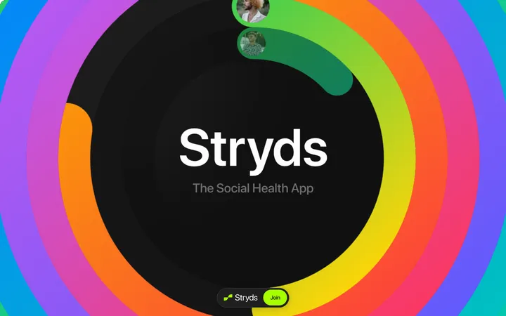
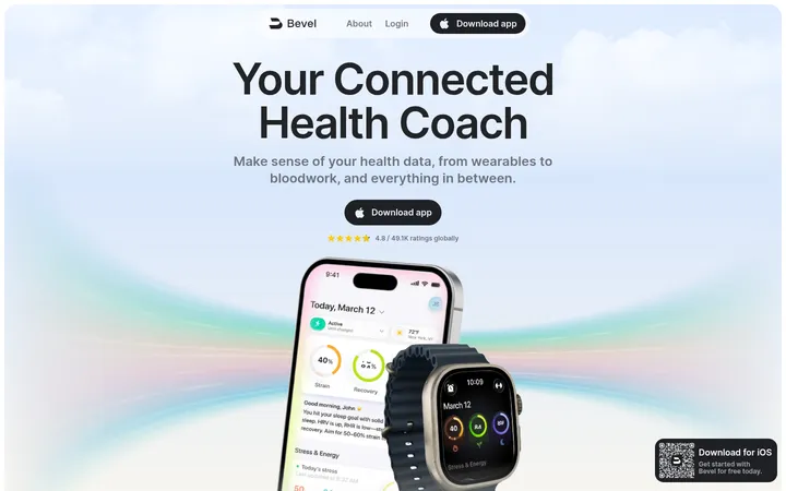
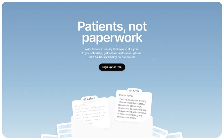
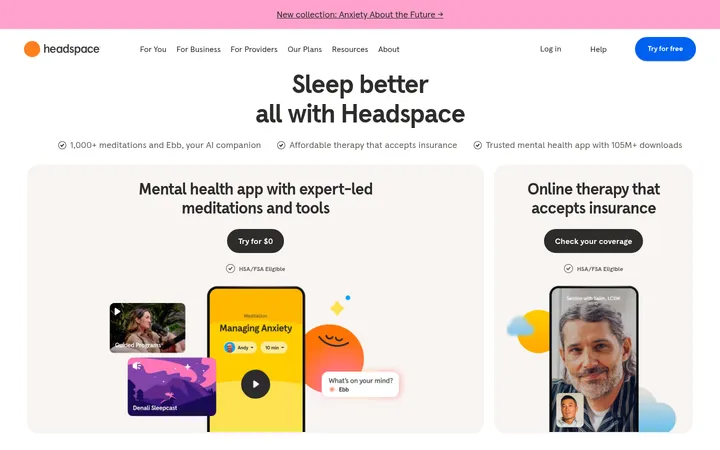
North star · Keep the page predominantly white and let oversized type, restrained violet accents, and carefully framed app imagery carry the story.
The page is built on a bright white canvas, with black typography providing the main structure and a saturated violet headline acting as the first strong brand signal. Pale aqua, mint, and blue gradients appear in large showcase artwork rather than as general page backgrounds; they add color without compromising the clean, clinical feel. Sofia is used throughout in a rounded, contemporary style, with unusually large display text and compact navigation. The layout favors broad single-column compositions and generous vertical pauses: a framed hero with a centered headline and hand-held phone gives way to an expansive gradient app statement, supporting copy, and category imagery. Photography is prominent but kept within deliberate compositions, including phone screens, portraits, and product tiles. Soft shadows create separation around floating navigation and image cards; visible borders are minimal. The overall effect is calm and spacious, with color reserved for key messages and visual demonstrations.
配色
点色块复制色值。用途说明来自对页面的实测位置(背景、文字、描边、按钮)与截图判读。
品牌色
强调色
表层色
中性色
页面底色 · Gallery White主文字 · Soft Ink次要文字 · Slate Text强调 · Signal Violet强调 2 · Care Mint强调 3 · Sky Blue
All page typography, including hero, headings, body text, captions, and navigation.
角色
示例
字号
字重
行高
字距
特大标题
Oversized statement lettering within the app showcase artwork.
Hims
280px
500
1
-0.057em
一级标题
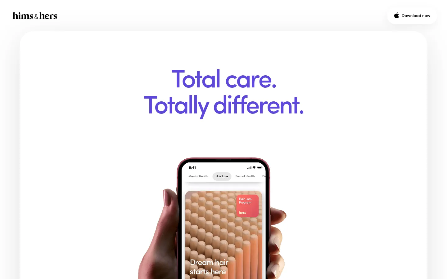
Primary hero message, centered above the phone image.
Hims
220px
500
1
-0.057em
二级标题
Major section headings and large editorial statements.
Hims
141px
500
1.1
-0.057em
三级标题
Secondary feature and content headings.
Hims
85px
500
1.15
-0.047em
四级标题
Small supporting heading or emphasized short label.
Hims
84px
500
2.44
-0.057em
正文
Large supporting paragraph beneath the showcase statement.
Hims
35px
500
1.18
-0.047em
辅助文字
Compact labels and explanatory text around imagery.
The quick brown fox 敏捷的狐狸
14px
500
1.43
-0.017em
导航
Header links and the Download now navigation action.
The quick brown fox 敏捷的狐狸
14px
500
1.43
-0.017em
间距与布局
基准单位 2px · 密度:宽松
250px版块间距
—元素间距
—卡片内边距
—内容最大宽度
2px
6px
7px
16px
22px
40px
90px
100px
120px
135px
156px
160px
170px
200px
The page uses a spacious, mostly single-column composition rather than a dense grid. A slim header sits above a large inset hero panel; centered display copy and phone imagery establish the opening hierarchy. Later sections alternate oversized showcase artwork, left-aligned supporting copy, and broad image-led category arrangements. Whitespace separates each narrative beat. Keep alignment deliberate and preserve the measured spacious density; specific maximum width and card padding are not established by the measurements.
圆角与层次
卡片 · 74px
导航 · 45px
xl · nav, section
lg · nav
xl · card
The page is mostly flat, with no prominent border system. Soft, broad shadows lift the floating download navigation and image-led card from the white canvas. Rounded corners are visible on cards and navigation; keep layering subtle so generous whitespace remains the primary source of separation.
组件
下面的预览按实测的按钮、输入框、徽标、卡片样式重建(字体用替代字体)。
Floating download navigation
A compact, softly elevated header action with a rounded pill shape, black Apple icon, and the label “Download now”.
Hero statement
Centered two-line Sofia headline in Signal Violet (#5d48db), separated from the phone imagery by generous white space.
Hand-held app phone
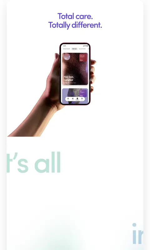
Large lifestyle image of a hand holding a phone, with the app interface clearly visible against the white hero.
Gradient app showcase
Large rounded showcase artwork using measured pale aqua, mint, and blue tones, with oversized text integrated into the visual.
Supporting copy block
Prominent left-aligned Sofia paragraph on white; gradient-colored opening text transitions into dark closing copy.
Category icon tiles
Simple black category icons presented on pale, softly shadowed, rounded tiles.
Program image gallery
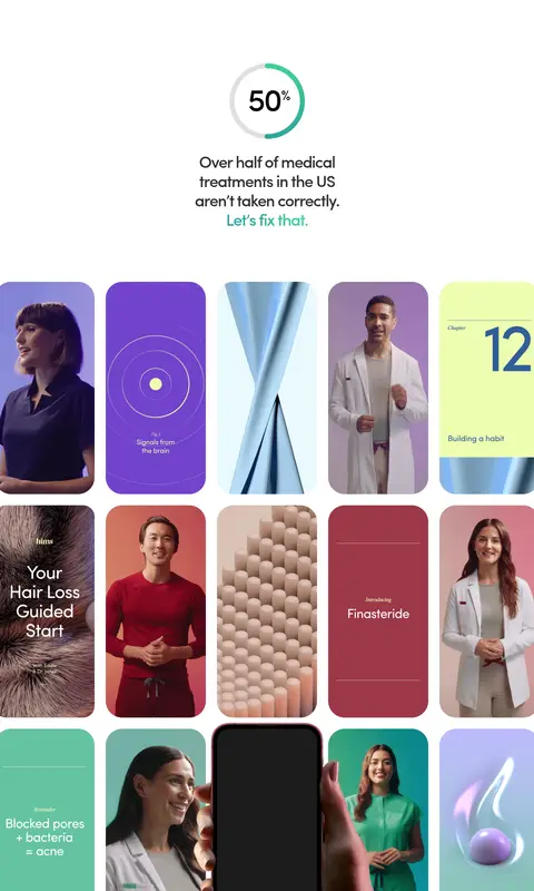
Dense sequence of rounded vertical app and lifestyle tiles, including portraits, treatments, and product imagery.
Imagery · Use polished lifestyle photography and app mockups: a hand holding a phone anchors the hero, while later sections show portraits, clinicians, and product or program tiles. Frame imagery as large, rounded visual cards or integrated showcase artwork. Gradients and tiny interface details belong within the app/product visuals; avoid turning them into unrelated decorative illustrations.
Reserve Signal Violet (#5d48db) for major typographic emphasis.
Keep the hero headline centered above app imagery.
Use oversized, tightly tracked display typography.
Use gradients as showcase artwork, not generic page decoration.
Give each major content beat generous vertical breathing room.
✕ 不该做
Do not introduce unmeasured palette colors.
Do not make the page dense or dashboard-like.
Do not outline every card with a visible border.
Do not use gradients as full-page backgrounds.
Do not replace lifestyle app imagery with generic icons.
Do not add decorative shadows to every text block.
给 AI 的提示词
想快速出一个同风格的新页面,把这段话连同 DESIGN.md 一起发给 AI。
Build a new health-app landing page in the Hims visual style. Use Gallery White (#ffffff) as the dominant canvas, Soft Ink (#000000) for primary text, and Signal Violet (#5d48db) as a restrained headline accent. Set rounded, contemporary sans typography similar to Sofia, with oversized tightly tracked headings and readable supporting copy. Compose the page as a spacious single-column story: a slim floating download action, centered hero statement, hand-held phone image, gradient-led app showcase, supporting copy, and image-rich category content. Keep mint and blue tones—Care Mint (#6ab4a5), Sky Blue (#86b7d4), and Cloud Aqua (#e8f4f7)—inside showcase artwork rather than broad backgrounds. Use softly elevated rounded cards, minimal borders, and generous vertical pauses. Preserve a calm clinical mood while making the app and people feel tangible.