North star · Keep the page grounded in deep teal, using crisp off-white type and the vivid three-color gradient as a focused highlight.
The visual identity is built around a deep teal canvas (#002025), which gives the homepage a quiet, technical atmosphere. Warm off-white (#fffffa) carries the main headings and navigation, while muted blue-grays soften supporting copy. A saturated cyan-to-green-to-yellow gradient supplies the main burst of energy: it appears in the hero CTA and in prominent visual treatments, rather than as a substitute for the dark page background. Gellix is used throughout, with large, tightly tracked display and heading styles contrasted against small uppercase, widely tracked eyebrows. The first viewport uses a compact navigation above a left-aligned, multiline hero and a rounded product visual on the right. Broad dark section bands and ample vertical breathing room keep the overall density low. Cards and media use generous rounding; subtle teal borders distinguish surfaces without making the interface feel outlined or busy.
配色
点色块复制色值。用途说明来自对页面的实测位置(背景、文字、描边、按钮)与截图判读。
品牌色
强调色
表层色
中性色
功能色
页面底色 · Deep Tidal表层 · Soft Porcelain表层 2 · Slate Teal表层 3 · Abyss Teal主文字 · Soft Porcelain次要文字 · Harbor Gray弱文字 · Mist Gray描边 · Slate Teal强调 · Electric Lime强调 2 · Signal Cyan强调 3 · Solar Yellow
Site-wide typeface for navigation, headings, body copy, links, and buttons.
角色
示例
字号
字重
行高
字距
特大标题
Oversized display moments and prominent brand statements.
Boost Insurance
120px
500
0.85
-0.04em
一级标题
Primary homepage headline in the hero.
Boost Insurance
90px
500
0.85
-0.04em
二级标题
Major section headings.
Boost Insurance
48px
500
1.1
-0.03em
三级标题
Feature and content-card headings.
The quick brown fox 敏捷的狐狸
26px
500
1.2
-0.02em
四级标题
Smaller supporting headings.
The quick brown fox 敏捷的狐狸
22px
400
1.3
0
正文
Main explanatory and paragraph copy.
The quick brown fox 敏捷的狐狸
16px
400
1.3
0
辅助文字
Compact captions and tertiary details.
The quick brown fox 敏捷的狐狸
12px
400
1.3
0
按钮
CTA and button labels.
The quick brown fox 敏捷的狐狸
14px
500
1.3
-0.01em
链接
Navigation and inline action links.
The quick brown fox 敏捷的狐狸
14px
500
1.3
-0.01em
眉题
Small uppercase labels above section content.
The quick brown fox 敏捷的狐狸
12px
300
1.05
0.35em
间距与布局
基准单位 1px · 密度:宽松
136px版块间距
15px元素间距
29px卡片内边距
—内容最大宽度
5px
9px
10px
15px
18px
19px
20px
24px
25px
30px
40px
100px
112px
136px
Use a spacious, wide desktop composition with navigation across the top and a two-column hero: headline and supporting copy on the left, product media on the right. Keep text left-aligned and content groups clearly separated, with generous vertical gaps between dark section bands. The measured page width is unspecified, so do not hard-code a maximum width from these observations. Keep supporting content visually sparse, letting large type and uninterrupted dark canvas carry the hierarchy.
圆角与层次
按钮 · 9999px
卡片 · 30px
图片 · 30px
lg · other
The interface relies more on tonal contrast and fine borders than on pronounced shadows. Separate dark cards with subdued teal surfaces and hairlines; use rounded media and card containers for softness. Where layering is needed, keep the shadow broad and faint against the deep canvas rather than creating a hard, floating effect.
组件
下面的预览按实测的按钮、输入框、徽标、卡片样式重建(字体用替代字体)。
Top navigation
Place the Boost mark at the left, compact navigation links through the center, and a Contact Us action at the right; use off-white text against the deep teal canvas.
Hero headline
Set a large, multiline, left-aligned Gellix statement with tight negative tracking and warm off-white color.
Hero product visual
Pair the headline with rounded product-interface media on the right; keep its contrast controlled so the message remains primary.
Gradient CTA
Use a pill-shaped button with the cyan, lime, and yellow gradient, deep teal label, and medium-weight Gellix text.
Content card
Use a dark teal inset surface, generous corner rounding, and restrained borders for cards against the canvas.
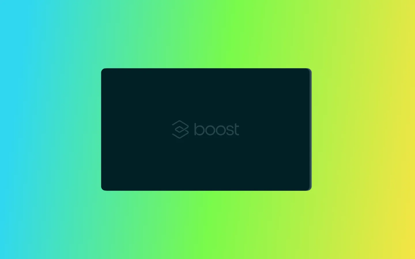
Imagery · The first viewport pairs the hero copy with a softly rounded product-interface visual. The separate captured viewport shows a large rounded dark panel against a cyan-green-yellow gradient; treat the gradient as a deliberate visual field, while keeping the interface panel and its details subdued. Avoid adding decorative photography or illustrations unsupported by the reference.
该做与不该做
✓ 该做
Use #002025 as the dominant page canvas.
Set primary text in #fffffa.
Reserve the cyan-to-lime-to-yellow gradient for focused highlights and CTAs.
Use Gellix or a close geometric sans-serif substitute consistently.
Keep hero copy left-aligned and pair it with product media.
Separate content with generous vertical breathing room.
✕ 不该做
Do not turn the page into a light-background layout.
Do not use the bright gradient as the default background for every section.
Do not introduce heavy shadows or high-contrast outlines.
Do not crowd the hero with extra content or decorative assets.
Do not use all-caps styling for regular headings or body text.
Do not invent page-width or spacing measurements not present in the supplied data.
给 AI 的提示词
想快速出一个同风格的新页面,把这段话连同 DESIGN.md 一起发给 AI。
Build a new Boost-style SaaS page on a deep teal (#002025) canvas. Use warm porcelain (#fffffa) for primary text, mist gray (#b7c6c9) for supporting copy, and restrained teal surfaces and borders such as #244348 and #05333a. Set type in Gellix, or DM Sans if unavailable; make major headings large, tight-tracked, and left-aligned, with small uppercase, widely tracked eyebrows. Use a spacious two-column hero with copy on the left and subdued, rounded product media on the right. Apply the Signal Cyan (#30d7f1), Electric Lime (#79fa4b), and Solar Yellow (#fce344) gradient selectively to the primary CTA and key visual accents. Keep cards soft-edged, borders subtle, shadows minimal, and section transitions calm. Avoid adding unsupported measurements or decorative imagery.