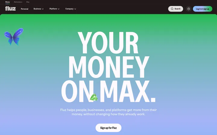
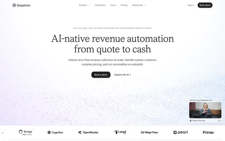
North star · Keep the interface calm and spacious, reserving saturated colour for purposeful emphasis and technical visual storytelling.
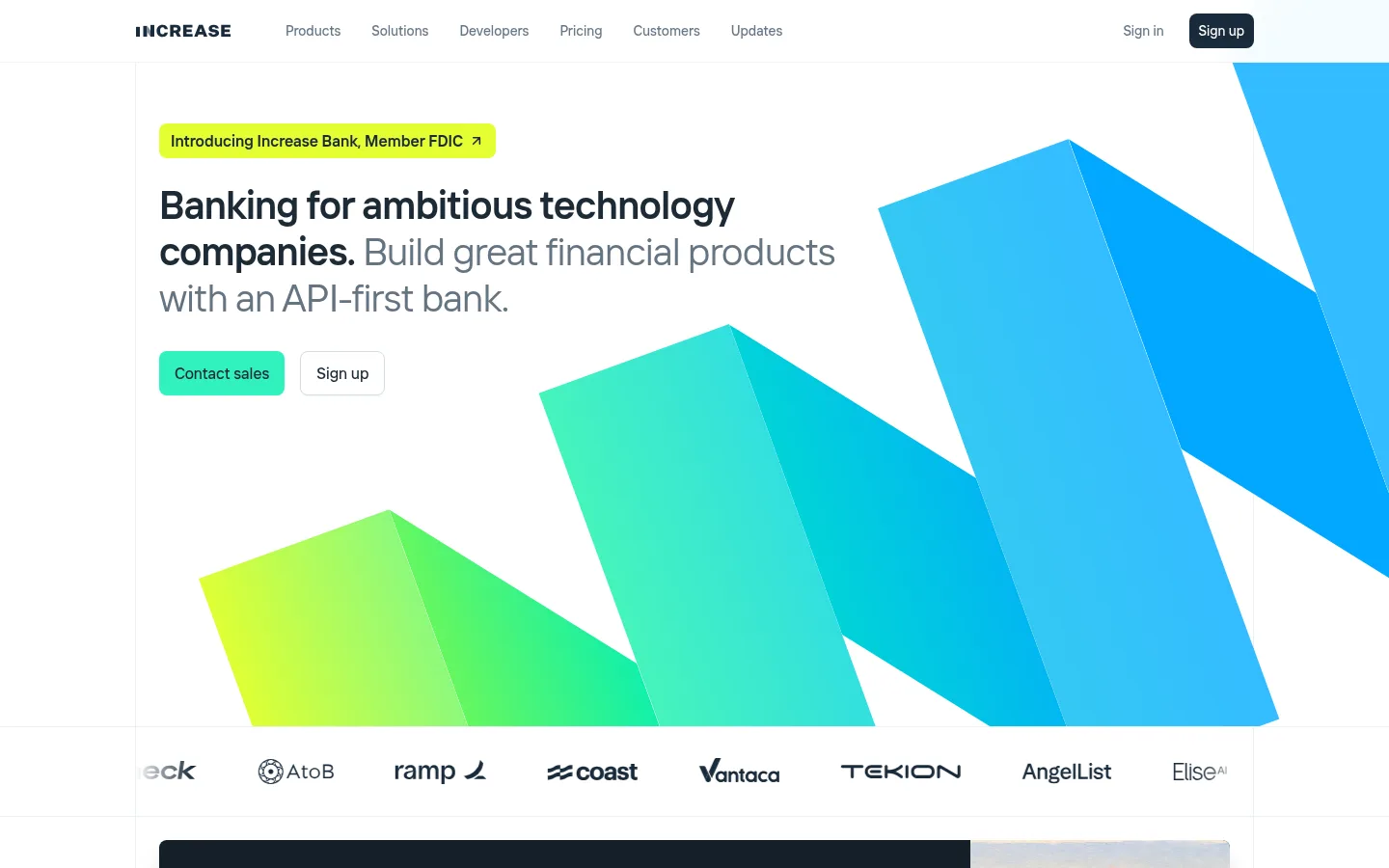
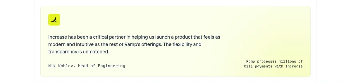
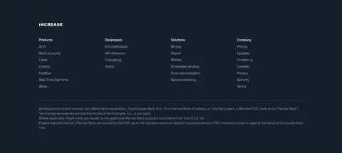
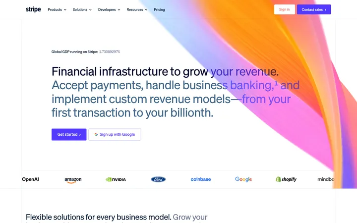
The visual strategy pairs a predominantly white canvas with deep ink-blue bands that anchor the infrastructure story and footer. Dark headings and muted slate copy establish hierarchy without heavy decoration; bright mint marks the primary CTA and small interactive accents, while lime appears in the announcement badge and select graphic details. The headline uses a clean, lightly tracked sans serif with regular-weight display text and selective bold emphasis. A narrow monospace face is reserved for code-like product details. The page moves from an expansive hero with an oversized geometric gradient illustration into compact product cards, testimonials, statistics, a long dark technical section, and customer-facing content. Layouts align to a centered, wide content frame, with two- and three-column groupings balanced by broad vertical breathing room. Product imagery is mostly interface mockups and diagrams, not lifestyle photography. Fine borders and restrained shadows separate interactive surfaces without making the page feel raised or ornamental.
配色
点色块复制色值。用途说明来自对页面的实测位置(背景、文字、描边、按钮)与截图判读。
品牌色
强调色
表层色
中性色
功能色
页面底色 · Gallery White表层 · Midnight Ledger表层 2 · Cloud Panel表层 3 · Deep Ink表层 4 · Lemon Tint主文字 · Deep Ink次要文字 · Slate Copy弱文字 · Pale Slate描边 · Mist Hairline强调 · Ledger Mint强调 2 · Sky Current强调 3 · Electric Blue
Primary interface, navigation, headings, buttons, and body copy
Aa 设计
Input Mono-4c4a0ba0f7fa02b9
网络字体 · 字重 400 · 占比 6%
免费替代:IBM Plex Mono
Code samples and technical or data-like interface details
角色
示例
字号
字重
行高
字距
一级标题
Hero headline, set prominently with selective bold emphasis.
Increase
40px
400
1.2
-0.02em
二级标题
Major section introductions and broad product-story headlines.
Increase
32px
400
1.2
-0.01em
三级标题
Feature and customer-story headings.
The quick brown fox 敏捷的狐狸
24px
500
1.2
-0.004em
四级标题
Smaller card headings and supporting section labels.
The quick brown fox 敏捷的狐狸
20px
500
1.5
0
正文
Explanatory copy, testimonials, and product descriptions.
The quick brown fox 敏捷的狐狸
14px
400
1.43
0
辅助文字
Small annotations, dates, and secondary metadata.
The quick brown fox 敏捷的狐狸
12px
400
1.33
0
按钮
CTA and action labels, medium weight.
The quick brown fox 敏捷的狐狸
14px
500
1.43
0
导航
Primary navigation and footer link group labels.
The quick brown fox 敏捷的狐狸
14px
500
1.43
0
链接
Inline editorial links and content-feed headlines.
The quick brown fox 敏捷的狐狸
14px
400
1.43
0
代码
API examples and technical UI snippets.
const style = 1;
14px
400
1.43
0
间距与布局
基准单位 4px · 密度:适中
48px版块间距
8px元素间距
—卡片内边距
1110px内容最大宽度
1px
3px
4px
5px
6px
7px
8px
10px
12px
16px
24px
26px
32px
48px
64px
96px
Use a centered content frame with a measured maximum width of 1110px and a comfortable density. The opening hero gives its text a clear left alignment while a large geometric illustration occupies the right and lower area. Subsequent content alternates between two-column product presentations and compact multi-column card or metric groups. Separate major stories with broad vertical breathing room; the long dark infrastructure section is a distinct, full-width band. Keep section edges and card grids aligned, with text blocks generally left-aligned.
圆角与层次
按钮 · 8px
卡片 · 12px
图片 · 6px
徽标 · 5px
导航 · 8px
md · other, card
lg · other
hairline · button
lg · card
The page is mostly flat: white and dark section bands do the primary layering. Use pale hairlines to define navigation and card edges, with soft shadows only where cards or navigation need separation. Product mockups sit within subtly contrasting panels; avoid heavy outlines, dramatic depth, or pervasive floating-card effects.
组件
下面的预览按实测的按钮、输入框、徽标、卡片样式重建(字体用替代字体)。
Primary navigation
Compact horizontal header on white, with wordmark, muted navigation links, sign-in text, and a dark rounded Sign up control.
Announcement badge
Small lime rounded link above the hero headline, using dark text and a compact arrow detail.
Hero CTA pair
Mint Contact sales button with dark text beside a white outlined Sign up button; both have softened corners.
Announcement card
Dark text panel paired with a landscape image, announcement description, and mint read-more link.
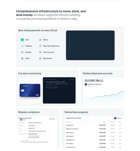
Product capability cards
Light-gray panels with concise headings and embedded payment, card, account, compliance, or lending UI visuals.
Dark infrastructure band
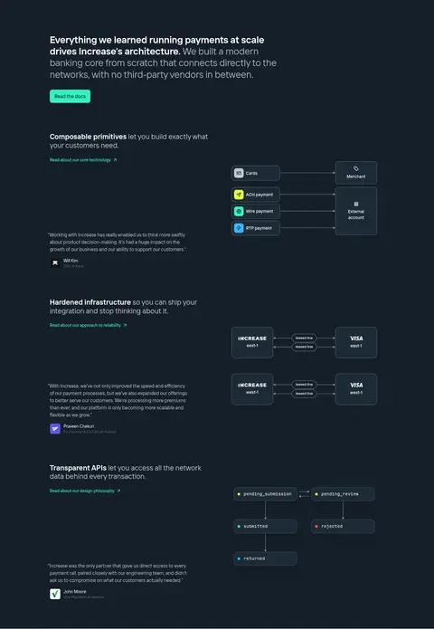
Full-width midnight section with left-aligned explanations and technical flow diagrams on a dark canvas.
Latest updates feed
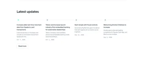
Compact multi-column editorial links with short headlines, muted summaries, and date metadata.
Imagery · Lead with oversized, angular gradient artwork that suggests upward movement; it is graphic illustration, not photography. Product sections use realistic interface mockups, code panels, payment-flow diagrams, and data displays inside restrained cards. A small landscape image appears in the bank announcement panel. Keep visuals crisp and rectangular, with the dark technical section using diagrams and interface elements rather than decorative lifestyle imagery.
Use white as the default canvas and preserve broad areas of whitespace.
Use Midnight Ledger for the technical story and footer bands.
Make Ledger Mint the clearest primary action colour.
Use Signal Lime sparingly for announcement emphasis.
Align cards and text blocks to a consistent centered content frame.
Render product visuals as crisp interface mockups and diagrams.
✕ 不该做
Do not fill the page with saturated accent colour.
Do not use lifestyle photography as the main product visual.
Do not add heavy borders or dramatic shadows to every card.
Do not center all copy; preserve the page’s mostly left-aligned storytelling.
Do not treat illustration-only blues as general text colours.
Do not compress the major sections into a dense dashboard.
给 AI 的提示词
想快速出一个同风格的新页面,把这段话连同 DESIGN.md 一起发给 AI。
Build a fintech homepage in Increase’s restrained, technical visual style. Use Gallery White (#ffffff) as the main canvas, Deep Ink (#1d2a36) for headings, and Slate Copy (#657482) for secondary text. Reserve Midnight Ledger (#151e29) for a full-width infrastructure section and footer. Use Ledger Mint (#31f2bf) for the primary CTA and links, with Signal Lime (#e4ff33) as a sparse announcement highlight. Set a clean sans-serif hierarchy, with a narrow monospace face only for code and technical labels. Create a generous centered content frame, left-aligned copy, roomy section breaks, and balanced card grids. Use geometric gradient artwork in the hero, then realistic API, payments, and account interface mockups. Keep panels softly tinted, borders hairline-light, and shadows subtle; avoid decorative clutter and excessive accent colour.