North star · Keep the interface almost entirely monochrome and let oversized, art-directed advertising imagery deliver the visual drama.
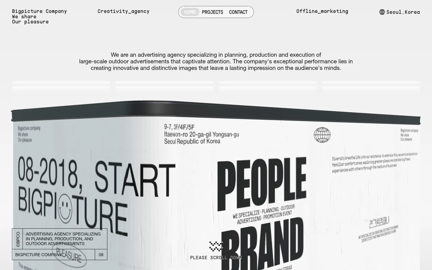
The page builds its identity from a near-monochrome palette: white canvas, near-black text and outlines, and pale grays that soften the transition into the hero artwork. The screenshot’s dominant grays belong largely to the billboard image, rather than a separate colorful brand palette. Helvetica Neue carries the clear, centered introduction and oversized display lettering; PPSupplyMono gives the navigation and small utility copy a technical, studio-like voice. Rock Salt adds a handwritten accent where the design calls for a more expressive note. The header spreads compact text labels across a wide horizontal line, while the intro sits centered above the large perspective billboard. Generous open space separates these elements, but the hero image itself is dense with printed messaging and graphic detail. Use dashed, pill-shaped navigation framing sparingly; keep other outlines crisp and square. The result feels like an editorial agency portfolio: quiet interface, assertive typography, and image-led impact.
Main interface text, introduction copy, captions, and oversized display lettering.
Aa 设计
Rock Salt
网络字体 · 字重 400 · 占比 10%
免费替代:Permanent Marker
Occasional handwritten display accent.
Aa 设计
PPSupplyMono
网络字体 · 字重 400 · 占比 6%
免费替代:Space Mono
Navigation, utility labels, and compact mono-style interface copy.
Aa 设计
PPSupplySans
网络字体 · 字重 400 · 占比 1%
免费替代:Inter
Navigation text inside the dashed, pill-shaped menu.
角色
示例
字号
字重
行高
字距
特大标题
Oversized hero and billboard lettering, led by bold condensed-looking headlines.
큰그림컴퍼니
273.5px
700
1.05
-0.04em
正文
Centered agency introduction and longer explanatory copy.
The quick brown fox 敏捷的狐狸
20px
400
1.3
0
辅助文字
Small supporting labels and compact explanatory text.
The quick brown fox 敏捷的狐狸
15px
500
1.6
0
导航
Monospaced header labels and utility navigation.
The quick brown fox 敏捷的狐狸
17px
400
1
0
代码
Technical-style compact labels where a code-like voice is appropriate.
const style = 1;
17px
400
1
0
间距与布局
基准单位 2px · 密度:宽松
171px版块间距
72px元素间距
—卡片内边距
—内容最大宽度
1px
3px
10px
13px
17px
20px
30px
40px
45px
50px
72px
81px
99px
108px
144px
171px
The header forms a wide horizontal band of small labels, with the brand at left, a dashed pill navigation near center, and location information toward the right. A centered agency introduction sits below it. The hero then expands into a full-bleed, perspective billboard image that dominates the composition. Keep the interface sparse and the artwork visually dense; the measured spacing system is spacious, with pronounced separation between major content areas. Avoid inventing a fixed maximum width: the screenshot presents the hero as a broad, edge-spanning composition.
圆角与层次
图片 · 9999px
导航 · 9999px
没有测到阴影:页面是扁平的,层次靠底色和描边区分。
The interface is predominantly flat: no measured shadows are present, and the visual hierarchy comes from typography, whitespace, and the billboard’s perspective. Use thin dark outlines for select controls and labels. The dashed navigation border is a distinctive detail; reserve layered depth for the artwork and its soft gray background treatment.
组件
下面的预览按实测的按钮、输入框、徽标、卡片样式重建(字体用替代字体)。
Distributed header
Arrange compact brand, agency descriptor, navigation, marketing category, and location labels across one horizontal header; use dark text on white.
Dashed pill navigation
Frame HOME, PROJECTS, and CONTACT in a dashed dark outline with a fully rounded silhouette; keep the menu lettering compact.
Centered agency introduction
Use centered, multi-line sans-serif copy to describe planning, production, and large-scale outdoor advertising.
Perspective billboard hero
Show a broad, angled billboard artwork with oversized black lettering, printed brand details, and monochrome surface imagery.
Outlined information label
Place compact agency and service text in a square-cornered, thin dark outlined panel over the lower-left area of the hero artwork.
Scroll cue
Use a small graphic mark and concise scroll instruction near the lower center of the hero composition.
Imagery · The defining visual is a large, perspective-rendered advertising billboard, treated as a physical surface carrying printed identity, oversized words, and fine supporting copy. Its gray and near-black tones harmonize with the interface. Frame it broadly and let its angled top edge and warped surfaces create depth. The captured page does not establish a general photographic or illustration style beyond this art-directed showcase, so avoid adding unrelated colorful imagery.
Center the agency introduction above the hero artwork.
Use generous whitespace between major content areas.
Let one art-directed billboard image dominate the first impression.
✕ 不该做
Do not introduce a bright accent palette.
Do not add shadows to otherwise flat interface elements.
Do not turn the header into a conventional stacked app toolbar.
Do not crowd the introduction with extra controls.
Do not make every element rounded; reserve pill rounding for navigation.
Do not treat gray billboard colors as separate brand accents.
给 AI 的提示词
想快速出一个同风格的新页面,把这段话连同 DESIGN.md 一起发给 AI。
Build a new agency homepage in the Bigpicture Company visual style. Use Gallery White (#ffffff) as the canvas and Print Ink (#121212) for text, navigation, and crisp outlines. Keep the header wide and sparse, with compact mono-style labels and a dashed pill menu. Center a short agency introduction beneath it, then give the main visual broad, full-bleed presence. Use Mist Gray (#e5e5e5) and Cloud Gray (#f3f3f3) only for restrained atmospheric transitions, not as colorful accents. Pair clean sans-serif copy with oversized, tightly tracked display lettering and occasional handwritten character. Keep interface surfaces flat, avoid shadows, and make the artwork feel like a perspective-rendered printed billboard. Preserve generous whitespace around the text while allowing the hero composition itself to carry dense visual detail.