North star · Let one vivid, tightly set brand message sit on an expansive white canvas, and keep every other element subordinate.
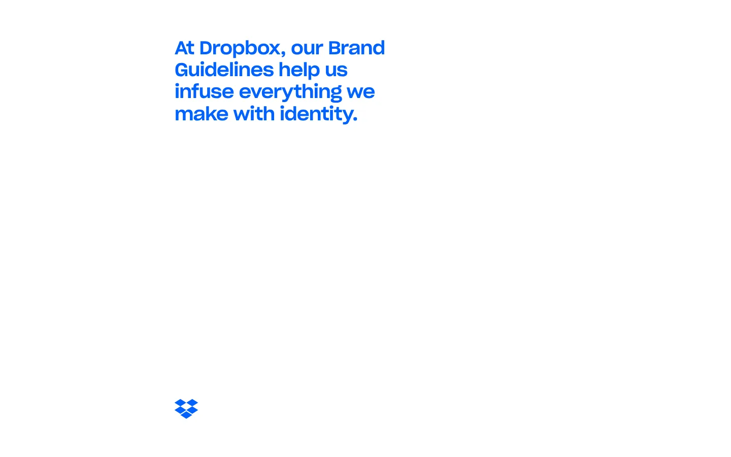
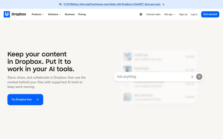
The page’s visual identity is unusually restrained in the supplied screenshots: a white canvas dominates, with a compact, bold blue headline positioned toward the upper-left portion of a broad empty field. The measured palette includes vivid brand and secondary hues, but the first viewport does not show them as broad section bands; treat those colors as supporting guideline or navigation colors rather than forcing them into the hero. Typography carries the composition: Dropbox’s sharp grotesk gives the headline a firm, compact presence, while Atlas Grotesk is the measured workhorse for smaller text and links. The page is sparse and editorial, with a tiny Dropbox mark far below the headline reinforcing the large vertical pause. Avoid invented panels, shadows, borders, or decorative imagery. Preserve the contrast between a small, confident message and generous uninterrupted whitespace.
Body copy, captions, navigation labels, and small links.
Aa 设计
Dbsharpgroteskvariable Vf
网络字体 · 字重 700 / 500 · 占比 26%
免费替代:Space Grotesk
Large display headings and prominent navigation headings.
角色
示例
字号
字重
行高
字距
一级标题
Primary blue brand-guidelines headline.
Dropbox
36px
700
1.2
-0.02em
二级标题
Large secondary heading, if additional content is introduced.
Dropbox
33.5px
500
0.8
-0.02em
三级标题
Bold section or feature heading.
Dropbox
30px
700
1.2
-0.02em
正文
Supporting explanatory copy.
The quick brown fox 敏捷的狐狸
14px
400
1.57
0
辅助文字
Small supporting labels or annotations.
The quick brown fox 敏捷的狐狸
12px
500
1.67
0
导航
Large-format navigation heading in guideline navigation.
Dropbox
33.5px
500
0.8
-0.02em
链接
Compact text links and secondary destinations.
The quick brown fox 敏捷的狐狸
12px
500
1.67
0
间距与布局
基准单位 2px · 密度:适中
—版块间距
16px元素间距
—卡片内边距
—内容最大宽度
6px
8px
12px
14px
16px
18px
22px
23px
24px
32px
The screenshot places a narrow headline block well in from the left edge and near the top, leaving most of the viewport empty. Alignment is left-led rather than centered, with a small Dropbox mark appearing much farther down. The full-page capture remains exceptionally sparse. Measurements do not establish a reliable max-width or grid, so do not impose a numeric container size. Keep content density low, preserve generous vertical separation, and introduce additional sections only when the page content requires them.
圆角与层次
没有测到阴影:页面是扁平的,层次靠底色和描边区分。
The visible page reads as flat: the white canvas has no apparent shadow, border, or layered card treatment. Although measured samples include colorful navigation tiles and card colors, those do not define the screenshot’s first view. Avoid adding elevation or hairlines without a clear content need; let spacing and color contrast establish hierarchy.
组件
下面的预览按实测的按钮、输入框、徽标、卡片样式重建(字体用替代字体)。
Display headline
A compact multi-line, bold Dropbox Blue statement set in the sharp grotesk and aligned to the left.
Brand mark
A small blue Dropbox symbol appears well below the headline, surrounded by extensive whitespace.
Text links
Measured links use Dropbox Blue or Sky Link, in Atlas Grotesk at a small, medium-weight scale.
Guideline navigation tiles
Measured navigation includes colorful tiles such as Pool Cyan and Lilac Panel; they are not visible in the supplied first viewport.
Supporting text
Use Soft Black for primary dark copy and Warm Graphite for muted supporting text.
Imagery · The supplied screenshots show no photography, product mockups, or large illustrations. A small blue Dropbox symbol is the only visible graphic, isolated against the white canvas. Keep imagery minimal and brand-led; if adding visual content to a new page, use it as a deliberate supporting element rather than filling the empty field with decorative assets.
该做与不该做
✓ 该做
Use Gallery White as the dominant canvas.
Make Dropbox Blue the headline’s defining color.
Keep the headline left-aligned and tightly composed.
Preserve generous whitespace around each visible element.
Use the measured grotesk families or close substitutes.
Keep the Dropbox mark small and visually secondary.
✕ 不该做
Do not fill the open canvas with invented cards or sections.
Do not use colorful palette hues as arbitrary full-page backgrounds.
Do not add shadows or borders absent from the visual reference.
Do not center the headline by default.
Do not let links or supporting copy compete with the headline.
Do not introduce prominent photography or decorative illustrations.
给 AI 的提示词
想快速出一个同风格的新页面,把这段话连同 DESIGN.md 一起发给 AI。
Build a new page in the restrained Dropbox Brand Guidelines visual style. Use Gallery White (#ffffff) as the dominant canvas and place a compact, left-aligned display message in Dropbox Blue (#0061fe) near the top of the content area. Use a bold sharp-grotesk-style face for display text and Atlas Grotesk or a close substitute such as Inter for supporting copy and links. Keep the layout sparse, with extensive uninterrupted whitespace and only a small, subordinate Dropbox mark or similarly restrained brand graphic. Use Soft Black (#1e1919) for dark copy, Warm Graphite (#736c64) for muted text, and Sky Link (#5f9dff) only for secondary links. Avoid invented cards, shadows, borders, large images, and arbitrary color bands. Treat the other measured palette hues as optional guideline-navigation accents, not mandatory hero decoration.