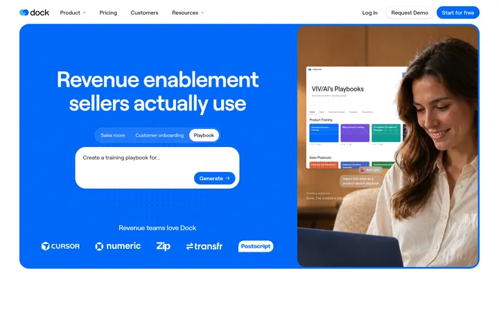
North star · Keep the interface calm and legible, then let a single vivid, geometric product illustration provide the visual energy.
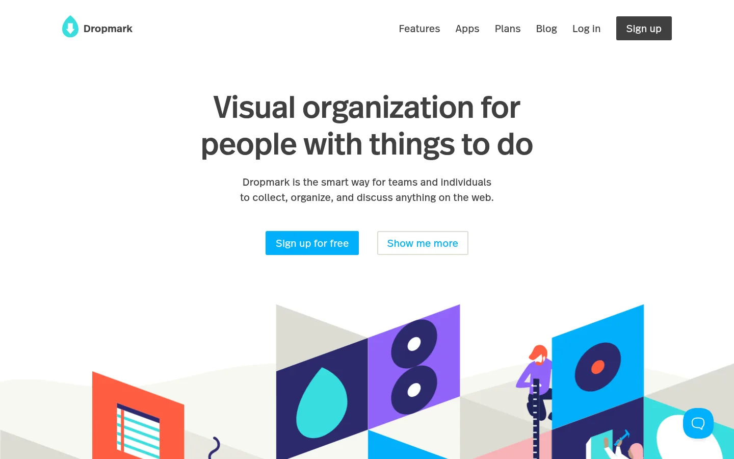
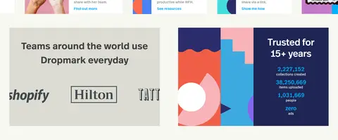
The page uses a predominantly white canvas, with charcoal text providing contrast and a warm, lightly tinted band distinguishing the lower showcase and trust content. Bright cyan-blue is reserved for the primary sign-up action and selected links, while dark navy appears mainly within illustration artwork rather than as a broad interface surface. A centered hero establishes a clear reading hierarchy: bold, compact headline, supporting copy, paired actions, then a wide, geometric illustration. The custom Dropmark text face carries most interface and body copy; a distinct display face adds character to larger headings. Below the hero, small visual collection previews form a horizontal strip, followed by a two-column trust area and a restrained footer. Thin neutral borders and mostly flat surfaces keep the visual system crisp; the colorful artwork supplies energy without turning the interface into a dense or heavily decorated layout.
Main interface font for navigation, body copy, buttons, links, and text headings.
Aa 设计
DropmarkRealHead
网络字体 · 字重 500 · 占比 6%
免费替代:Manrope
Display and secondary heading face, especially the prominent hero headline.
角色
示例
字号
字重
行高
字距
特大标题
Large centered hero headline.
Dropmark
60px
500
1.2
0
一级标题
Primary page or section headline.
Dropmark
40px
600
1.5
0
二级标题
Secondary section headings, including the trust block.
The quick brown fox 敏捷的狐狸
24px
500
1.2
0
三级标题
Feature and collection-preview titles.
The quick brown fox 敏捷的狐狸
20px
400
1.5
0
正文
Hero supporting copy and explanatory text.
The quick brown fox 敏捷的狐狸
15px
400
1.5
0
辅助文字
Small supporting labels and metadata.
The quick brown fox 敏捷的狐狸
14px
400
1.2
0
按钮
Primary and secondary action labels.
The quick brown fox 敏捷的狐狸
20px
400
1.5
0
导航
Header navigation links.
The quick brown fox 敏捷的狐狸
20px
400
1.5
0
链接
Inline calls to action such as “Find out more.”
The quick brown fox 敏捷的狐狸
15px
600
1.5
0
间距与布局
基准单位 1px · 密度:适中
60px版块间距
10px元素间距
—卡片内边距
1200px内容最大宽度
5px
8px
10px
20px
27px
30px
35px
46px
58px
60px
80px
A centered hero sits within a broad, responsive page frame, with a compact header aligning the logo left and navigation right. The headline, supporting copy, and paired actions share a centered axis above a wide illustration. Content below shifts into a horizontal row of collection previews, then a two-column trust area. The measured page max width is 1200px, with comfortable density and a measured 60px section gap. A multi-column footer closes the page; transitions between white and warm off-white provide rhythm without heavy dividers.
圆角与层次
按钮 · 3px
导航 · 3px
inset · nav
sm · other
The interface is predominantly flat, with white cards separated by thin #e0e0da borders and warm off-white bands. A subtle inset shadow is measured on navigation, while other elements use only a light soft shadow. Avoid floating stacks or dramatic depth; the illustration itself provides the strongest visual layering.
组件
下面的预览按实测的按钮、输入框、徽标、卡片样式重建(字体用替代字体)。
Header navigation
Logo on the left, text links aligned on the right, and a compact charcoal sign-up button; links use the measured 20px navigation style.
Hero
Centered display headline, short supporting paragraph, paired actions, and a wide geometric illustration below.
Primary action
Cyan #00affa button with white text, a 3px radius, and measured padding of 8px 20px 10px.
Secondary action
White, lightly bordered button with cyan text, placed beside the primary sign-up action.
Collection preview strip
A horizontal row of image-led cards on the warm off-white section band, with short titles and blue links.
Trust panel
Two-column lower section pairing customer logos and a “Trusted for 15+ years” statistics panel.
Footer
Quiet multi-column link groups with compact brand and copyright information on a white canvas.
Imagery · The main visual is a large, flat geometric illustration of people arranging colorful content panels. It combines bold cyan, violet, coral, teal, and dark indigo shapes; these vivid artwork colors are illustrative, not core interface tokens. Smaller collection previews show image-led cards and product examples in a horizontal strip. The imagery is clean-edged, playful, and integrated into the page rather than presented as photography.
Use cyan for the primary action and selected links.
Use charcoal for the main text hierarchy.
Let the illustration carry the brightest colors.
Separate lower content with a warm off-white band.
Keep cards and controls visually flat and crisp.
✕ 不该做
Do not spread illustration colors across ordinary interface controls.
Do not crowd the hero with extra copy or badges.
Do not use heavy shadows or layered floating cards.
Do not replace the clean white canvas with a dark theme.
Do not make all links look like primary buttons.
Do not add decorative gradients absent from the measured design.
给 AI 的提示词
想快速出一个同风格的新页面,把这段话连同 DESIGN.md 一起发给 AI。
Build a new Dropmark-style productivity page with a calm white canvas (#ffffff), charcoal typography (#404040), and a warm off-white section band (#f7f7f1). Use Signal Cyan (#00affa) selectively for the main CTA and prominent links; use Quiet Stone (#e0e0da) for restrained borders and Soft Graphite (#7f7f7f) for secondary copy. Keep the header compact, with brand left and navigation right. Center the hero headline, short explanation, and paired actions above one broad, playful geometric product illustration. Use DropmarkRealText with Inter as a fallback for interface copy, and DropmarkRealHead with Manrope as a fallback for display headings. Below, organize content into image-led collection previews and a simple trust or proof section. Favor generous whitespace, flat surfaces, thin borders, and a quiet multi-column footer; reserve Midnight Indigo (#1e2554) for illustration or inverse artwork.