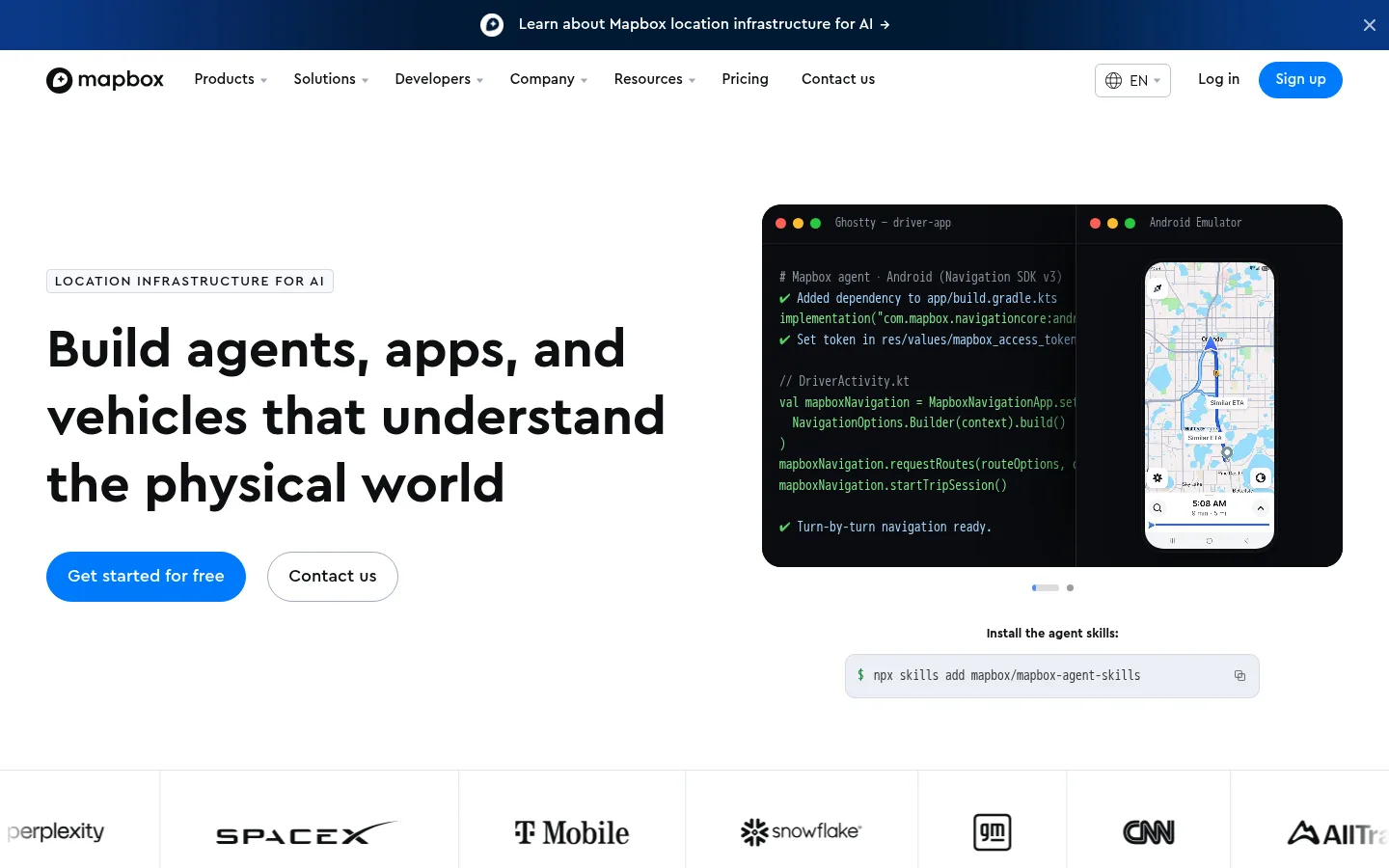
Mapbox 首页以克制的白色界面、醒目的黑色字体和鲜明蓝色行动按钮,呈现位置技术平台。开发者产品演示、客户品牌标识和内容卡片共同展示平台能力,同时保持页面清爽。
North star · Keep the interface bright and spacious, using bold dark type, restrained blue actions, and product imagery to make complex location technology feel approachable.
The page uses white as a continuous canvas, letting large, near-black headlines and the saturated blue sign-up action carry the strongest interface contrast. Muted charcoal supports navigation and body copy; pale cool-gray surfaces and hairline borders separate cards and code-related details without making the page feel boxed in. Cera Pro gives headlines a broad, rounded confidence, while compact uppercase eyebrow labels add a technical editorial cue. The hero balances a left-aligned message and actions against a dark product demo showing code alongside a navigation app, then gives the interface room to breathe. Customer logos and content cards form orderly horizontal and modular groupings. Across the longer page, generous blank intervals distinguish major content bands; map imagery, video, and dark product mockups provide visual depth. Blue is reserved for action and emphasis, while green and pale blue appear as smaller technical accents.
配色 点色块复制色值。用途说明来自对页面的实测位置(背景、文字、描边、按钮)与截图判读。
品牌色
Carbon Ink
#0e1012
Primary headings, navigation text, and dark inverse surfaces.
Mapbox Blue
#007afc
Primary sign-up action and selective link or interface emphasis.
强调色
Terminal Green
#7ee787
Small code and terminal-status accents, chiefly inside product demonstrations.
Glacier Blue
#a5d6ff
Occasional pale-blue technical text accent, not a main page surface.
表层色
Gallery White
#ffffff
Primary page canvas, broad content backgrounds, and light text on dark surfaces.
Cloud Panel
#f7f9fc
Pale card and section surfaces, including subtle gradient transitions.
Frosted Gray
#eceff5
Code-command control and subtle pale gradient or card transitions.
Night Interface
#0a0c10
Dark product-demo and mock terminal surfaces within showcased interface imagery.
中性色
Slate Copy
#333943
Muted body copy, secondary links, and text on pale controls.
Silver Rule
#e0e4ec
Fine dividers and card borders that separate content on white.
Code Gray
#8b949e
Subdued monospace badge or code text on dark demonstration surfaces.
功能色
Harbor Haze
#8b96aa
Soft radial glow and footer-related gradient detail, not a dominant interface color.
文字 背景 对比度 WCAG #0e1012 Carbon Ink#ffffff Gallery White19.06:1 AAA #0e1012 Carbon Ink#f7f9fc Cloud Panel18.08:1 AAA #0e1012 Carbon Ink#0a0c10 Night Interface1.03:1 不达标 #333943 Slate Copy#ffffff Gallery White11.62:1 AAA #333943 Slate Copy#0e1012 Carbon Ink1.64:1 不达标 #333943 Slate Copy#f7f9fc Cloud Panel11.02:1 AAA
字体 字号阶梯:Augmented Fourth(比例约 1.409,正文 20px)。示例用免费替代字体渲染,数值为实测。
Aa 设计
Cera pro 网络字体 · 字重 400 / 700 / 500 / 600 · 占比 92%
免费替代:DM Sans
Headlines, navigation, body copy, labels, buttons, and links
Aa 设计
ui-monospace 系统字体 · 字重 400 / 500 · 占比 8%
免费替代:Roboto Mono
Code snippets and compact technical labels
角色 示例 字号 字重 行高 字距 特大标题 Large display headline treatment for prominent page messaging.
Mapbox
56px 700 1.25 -0.01em 一级标题 Primary hero headline and major page-level statements.
Mapbox
46px 700 1.25 -0.01em 二级标题 Section headings such as news and platform capabilities.
Mapbox
36px 700 1.3 -0.01em 正文 Supporting descriptions and explanatory platform copy.
The quick brown fox 敏捷的狐狸
20px 400 1.65 0 辅助文字 Secondary content descriptions and compact supporting text.
The quick brown fox 敏捷的狐狸
18px 400 1.65 0 按钮 Calls to action and button labels.
The quick brown fox 敏捷的狐狸
15px 500 1.33 0 导航 Primary navigation and account actions.
The quick brown fox 敏捷的狐狸
15px 500 1.25 0 眉题 Uppercase section kicker above the hero headline.
The quick brown fox 敏捷的狐狸
14px 500 1 0.1em 代码 Monospace command snippets and technical interface text.
const style = 1;
13.5px 400 1.6 0
间距与布局 基准单位 2px · 密度:适中
67px 版块间距
6px 元素间距
51px 卡片内边距
1344px 内容最大宽度
1px
4px
6px
7px
8px
9px
10px
12px
16px
18px
20px
23px
24px
43px
45px
48px
Use a wide centered content area within the measured 1344px page maximum, with comfortable spacing and clear horizontal alignment. The first viewport pairs a left-aligned hero copy column with a right-side product demo; navigation and announcement sit above it. Lower sections alternate centered introductions, modular card groups, and split or multi-column showcases. Preserve generous section intervals, a 67px section-gap measure, and comfortable density; avoid compressing the long page into a tight feed.
圆角与层次 The page is mostly flat: whitespace, pale fills, and thin gray borders define structure instead of heavy shadows. Dark product mockups provide their own visual depth, while card and showcase groupings remain crisp and restrained. Use the measured 16px card radius where rounded cards appear, and keep CTA geometry compact and clear.
组件 下面的预览按实测的按钮、输入框、徽标、卡片样式重建(字体用替代字体)。
Announcement strip A narrow dark-blue top banner with centered informational link and a close control.
Primary navigation White horizontal header with Mapbox identity, product links, language control, login, and a blue sign-up action.
Hero message and actions Left-aligned uppercase eyebrow, bold multi-line headline, blue primary action, and outlined secondary contact action.
Product demo Dark rounded showcase panel pairing code and a mobile navigation view, with a command-install control below.
Customer logo rail Horizontal customer marks separated into evenly arranged cells by subtle vertical hairlines.
Showcase card Editorial feature card with image or demo media, compact category label, supporting title, and a muted read link.
Code command control Pale gray rounded command field with monospace-like command content and a small copy affordance.
Imagery · Lead with a dark, framed product demo that juxtaposes a developer terminal and mobile navigation screen. Use map and location product visuals, customer marks, and editorial showcase imagery as evidence of real use cases. Video and image panels sit within otherwise bright, uncluttered space; technical green and blue accents belong mainly to the interface shown inside those demos.
页面版块 共 41 个版块,按页面从上到下排列,每个都标了类型、布局和交互套路。
首屏 定价概览
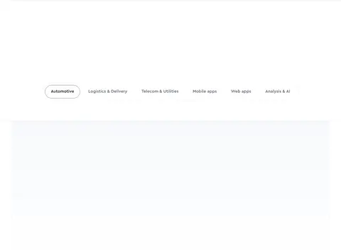
Centered title and subtitle above three evenly spaced benefit columns; a horizontal category navigation bar anchors the bottom.
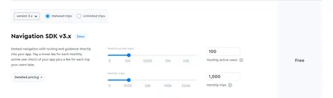
价格方案 导航定价
Navigation category heading followed by stacked product rows; each row places description and controls on the left, usage estimator in the center, and monthly cost in a shaded right column.
价格方案 路线规划定价
Single product row in the recurring two-column pricing table, with product details on the left and a usage estimator plus cost panel on the right.
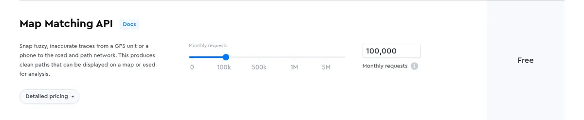
价格方案 地图匹配定价
One product row split between explanatory copy and an interactive usage-and-cost estimator.
价格方案 路线优化定价
Single horizontal pricing row with descriptive text at left and request-volume controls and cost at right.
价格方案 矩阵接口定价
A single product row uses the standard description-left, estimator-center, monthly-cost-right arrangement.
价格方案 等时圈定价
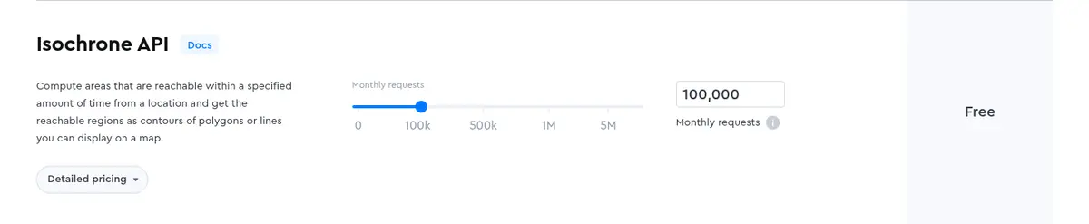
One row in the product pricing table, with API description beside a usage estimator and cost panel.
价格方案 电子地平线
Compact product row with description and links on the left and a simple availability note in the right cost column.
价格方案 移动地图定价
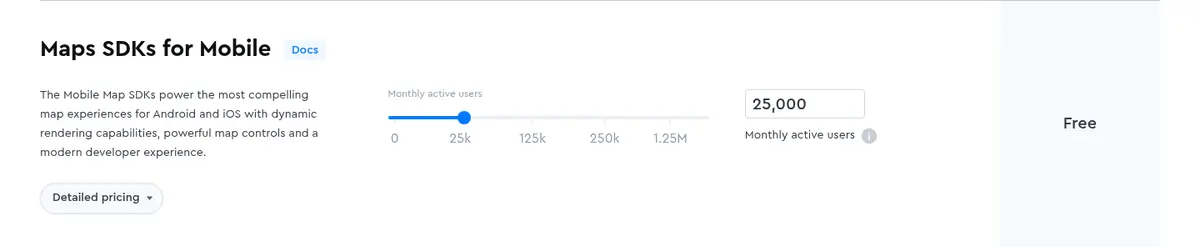
Maps category product row with explanatory copy, monthly active user estimator, and a separate monthly-cost column.
价格方案 网页地图定价
Two related Mapbox GL JS pricing rows, preceded by a selector for map-load or seat billing; each uses the standard estimator and cost layout.
价格方案 静态图片定价
One Maps product row with description at left and request-volume estimator and cost panel at right.
价格方案 要素查询定价
A single product row in the two-column pricing table, with usage controls aligned beside the description.
价格方案 矢量瓦片定价
One pricing-table row with API copy on the left, tile-request controls in the middle, and cost at right.
价格方案 静态瓦片定价
Single product row with explanatory copy, usage estimator, and a right-aligned cost panel.
价格方案 栅格瓦片定价
One standard pricing row with description and monthly request estimator alongside a shaded cost column.
价格方案 日本天气图层
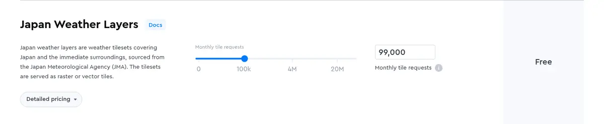
Single product row with product explanation, request-volume controls, and monthly cost shown in a separate right column.
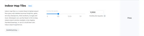
价格方案 室内地图瓦片
A taller product row accommodates a longer description, with the usual usage estimator and cost panel to the right.
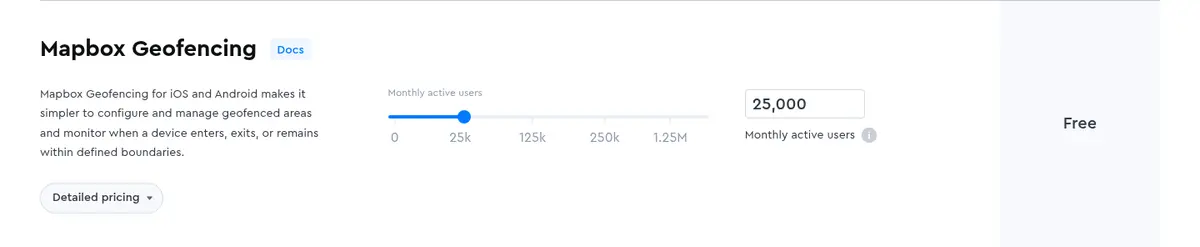
价格方案 地理围栏定价
One product row divided into descriptive copy, active-user estimate controls, and a monthly cost column.
价格方案 搜索会话定价
Search product row with copy at left and monthly-session estimator and cost panel to the right.
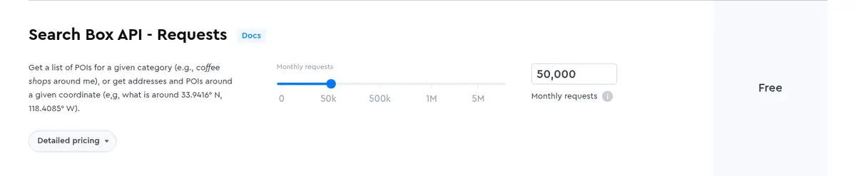
价格方案 搜索请求定价
Single Search product row with product description, monthly request estimator, and right-side cost display.
价格方案 临时地理编码
One pricing row with API copy, a monthly request control, and an aligned cost column.
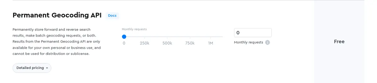
价格方案 永久地理编码
A taller row presents longer usage restrictions beside the standard request estimator and cost panel.
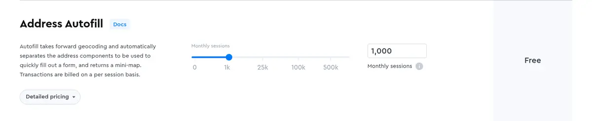
价格方案 地址自动填充
Single Search row with descriptive text at left and a monthly-session estimator beside the cost column.
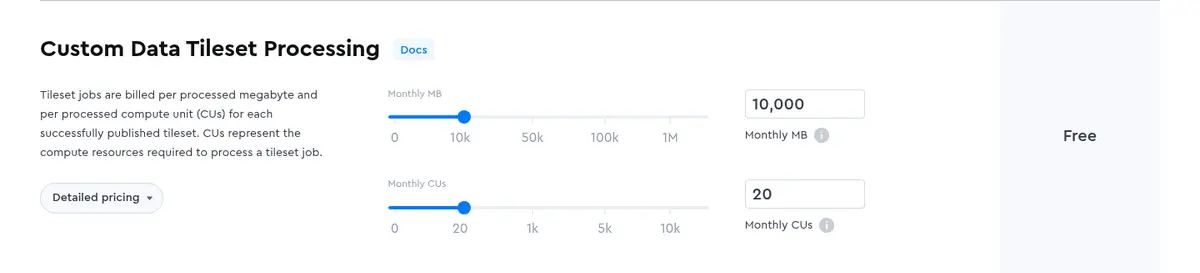
价格方案 瓦片处理定价
Data pricing row with two stacked usage estimators for processing units and compute units, plus a monthly cost column.
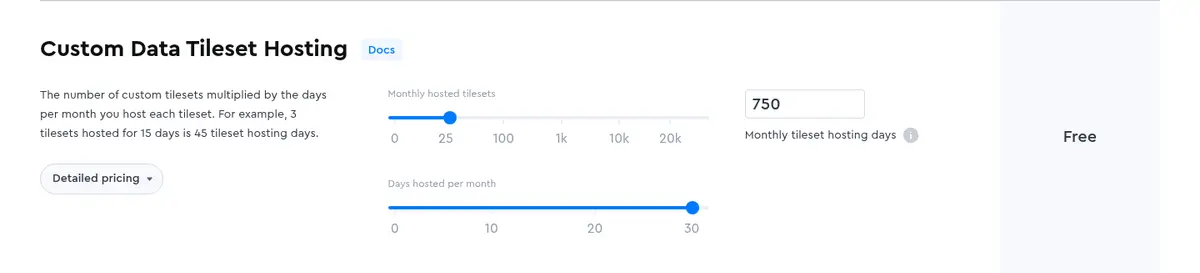
价格方案 瓦片托管定价
Data product row with a longer hosting explanation, usage estimator, and right-side monthly cost panel.
价格方案 地图边界数据
Compact product row with a data description on the left and a contact-sales action in the right-side pricing area.
价格方案 交通与移动数据
Two stacked data product rows, each with descriptive copy on the left and a sales contact action on the right.
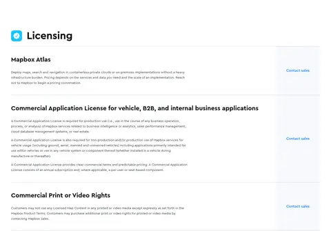
价格方案 授权许可
Licensing heading followed by three vertically stacked license rows; descriptions occupy the left area and sales links align in a right column.
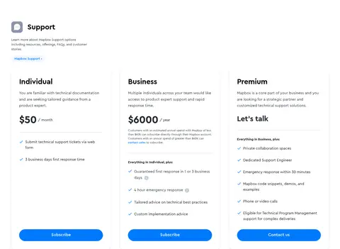
价格方案 支持服务方案
Support introduction and link above three side-by-side plan cards for Individual, Business, and Premium.
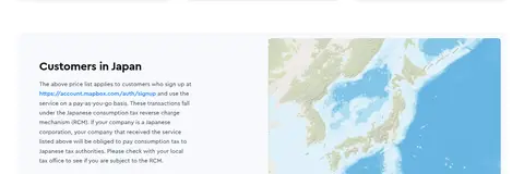
内容列表 日本客户说明
Single horizontal information block with explanatory text on the left and a Japan map image on the right.
该做与不该做 ✓ 该做 Keep white as the dominant page canvas. Use Carbon Ink for strong headlines and primary navigation. Reserve Mapbox Blue for high-priority actions and selective emphasis. Pair text with concrete map, navigation, or developer-product demos. Separate long-page content with generous whitespace and subtle rules. Use monospace styling only for code and technical snippets. ✕ 不该做 Do not introduce unmeasured colors into the interface palette. Do not turn the page into a dark overall theme. Do not use blue as a large decorative background wash. Do not crowd the hero, logo rail, and content sections together. Do not treat illustration-only terminal colors as core brand colors. Do not add heavy shadows to otherwise flat cards and sections. 给 AI 的提示词 想快速出一个同风格的新页面,把这段话连同 DESIGN.md 一起发给 AI。
复制 Build a new Mapbox-style developer platform page on a Gallery White (#ffffff) canvas. Use Carbon Ink (#0e1012) for bold, slightly tight-tracked Cera Pro-style headings and navigation, with Slate Copy (#333943) for secondary text. Keep Mapbox Blue (#007afc) for the primary CTA and restrained emphasis; use Cloud Panel (#f7f9fc), Frosted Gray (#eceff5), and Silver Rule (#e0e4ec) for quiet surfaces and dividers. Compose a clear header, a spacious split hero, and modular product or customer showcases inside a wide centered layout. Make the hero’s media a believable map, navigation, or developer demo; keep Terminal Green (#7ee787) and Glacier Blue (#a5d6ff) inside technical media rather than broad page decoration. Favor flat surfaces, hairlines, generous whitespace, and concise developer-focused copy.
DESIGN.md Tailwind v4 CSS 变量 Design Tokens
---
title: "Mapbox design system"
variant: extended
source: https://www.mapbox.com/
captured_at: 2026-10-12
theme: light
industry: devtools
generator: Design DNA (https://four.wiralomi.com/style/mapbox-com)
ai_generated: true
ai_label: "本文件由 AI 辅助生成:数值取自公开网页的实测样式,命名、用途说明与建议为模型解读。商标归原所有者。 / AI-assisted content"
---
# Mapbox · Design System
> A bright canvas for location technology
**Theme:** light · **Industry:** devtools · **Source:** https://www.mapbox.com/ · **Captured:** 2026-10-12 (1440×900 desktop)
_AI-assisted content: values are measured from the public page at capture time; names, roles and guidance are model-written interpretations. Trademarks belong to their owners._
Mapbox’s homepage pairs a restrained white interface with confident black typography and vivid blue calls to action. Developer-oriented product demos, customer marks, and editorial content make the platform tangible without crowding the page.
## North star
Keep the interface bright and spacious, using bold dark type, restrained blue actions, and product imagery to make complex location technology feel approachable.
## Overview
The page uses white as a continuous canvas, letting large, near-black headlines and the saturated blue sign-up action carry the strongest interface contrast. Muted charcoal supports navigation and body copy; pale cool-gray surfaces and hairline borders separate cards and code-related details without making the page feel boxed in. Cera Pro gives headlines a broad, rounded confidence, while compact uppercase eyebrow labels add a technical editorial cue. The hero balances a left-aligned message and actions against a dark product demo showing code alongside a navigation app, then gives the interface room to breathe. Customer logos and content cards form orderly horizontal and modular groupings. Across the longer page, generous blank intervals distinguish major content bands; map imagery, video, and dark product mockups provide visual depth. Blue is reserved for action and emphasis, while green and pale blue appear as smaller technical accents.
## Colors
| Name | Hex | Token | Group | Role |
|---|---|---|---|---|
| Gallery White | ` | `--color-gallery-white` | surface | Primary page canvas, broad content backgrounds, and light text on dark surfaces. |
| Carbon Ink | ` | `--color-carbon-ink` | brand | Primary headings, navigation text, and dark inverse surfaces. |
| Slate Copy | ` | `--color-slate-copy` | neutral | Muted body copy, secondary links, and text on pale controls. |
| Mapbox Blue | ` | `--color-mapbox-blue` | brand | Primary sign-up action and selective link or interface emphasis. |
| Cloud Panel | ` | `--color-cloud-panel` | surface | Pale card and section surfaces, including subtle gradient transitions. |
| Silver Rule | ` | `--color-silver-rule` | neutral | Fine dividers and card borders that separate content on white. |
| Harbor Haze | ` | `--color-harbor-haze` | semantic | Soft radial glow and footer-related gradient detail, not a dominant interface color. |
| Frosted Gray | ` | `--color-frosted-gray` | surface | Code-command control and subtle pale gradient or card transitions. |
| Night Interface | ` | `--color-night-interface` | surface | Dark product-demo and mock terminal surfaces within showcased interface imagery. |
| Terminal Green | ` | `--color-terminal-green` | accent | Small code and terminal-status accents, chiefly inside product demonstrations. |
| Code Gray | ` | `--color-code-gray` | neutral | Subdued monospace badge or code text on dark demonstration surfaces. |
| Glacier Blue | ` | `--color-glacier-blue` | accent | Occasional pale-blue technical text accent, not a main page surface. |
### Semantic aliases
`--color-canvas` → ` (Gallery White) · `--color-surface` → ` (Carbon Ink) · `--color-surface-2` → ` (Cloud Panel) · `--color-surface-3` → ` (Night Interface) · `--color-text` → ` (Carbon Ink) · `--color-text-muted` → ` (Slate Copy) · `--color-text-subtle` → ` (Gallery White) · `--color-border` → ` (Silver Rule) · `--color-accent` → ` (Mapbox Blue) · `--color-accent-2` → ` (Terminal Green) · `--color-accent-3` → ` (Glacier Blue) · `--color-on-accent` → ` (Gallery White)
### Contrast (WCAG 2.x)
| Text | Background | Ratio | Level |
|---|---|---|---|
| ` | ` | 19.06:1 | AAA |
| ` | ` | 18.08:1 | AAA |
| ` | ` | 1.03:1 | fail |
| ` | ` | 11.62:1 | AAA |
| ` | ` | 1.64:1 | fail |
| ` | ` | 11.02:1 | AAA |
| ` | ` | 1.68:1 | fail |
| ` | ` | 19.06:1 | AAA |
| ` | ` | 1.05:1 | fail |
| ` | ` | 19.57:1 | AAA |
### Gradients
- `radial-gradient(circle closest-side, rgb(139, 150, 170) 0%, rgba(0, 0, 0, 0) 100%)`
- `linear-gradient(rgb(236, 239, 245), rgb(247, 249, 252))`
- `linear-gradient(rgb(247, 249, 252), rgb(255, 255, 255))`
## Typography
| Family | Token | Source | Weights | Role | Free substitute |
|---|---|---|---|---|---|
| Cera pro | `--font-body` | webfont | 400, 700, 500, 600 | Headlines, navigation, body copy, labels, buttons, and links | DM Sans |
| ui-monospace | `--font-mono` | system | 400, 500 | Code snippets and compact technical labels | Roboto Mono |
- **Cera pro:** Use bold, slightly tight-tracked display and heading styles; keep body and controls clean, with uppercase, tracked eyebrow labels.
- **ui-monospace:** Reserve for terminal-like content and badges; use a regular monospace voice rather than headline typography.
### Type scale — Augmented Fourth (ratio ≈ 1.409, base 20px)
| Role | Size | Weight | Line height | Letter spacing | Case | Family | Used for |
|---|---|---|---|---|---|---|---|
| display | 56px | 700 | 1.25 | -0.01em | — | Cera pro | Large display headline treatment for prominent page messaging. |
| h1 | 46px | 700 | 1.25 | -0.01em | — | Cera pro | Primary hero headline and major page-level statements. |
| h2 | 36px | 700 | 1.3 | -0.01em | — | Cera pro | Section headings such as news and platform capabilities. |
| body | 20px | 400 | 1.65 | 0 | — | Cera pro | Supporting descriptions and explanatory platform copy. |
| caption | 18px | 400 | 1.65 | 0 | — | Cera pro | Secondary content descriptions and compact supporting text. |
| button | 15px | 500 | 1.33 | 0 | — | Cera pro | Calls to action and button labels. |
| nav | 15px | 500 | 1.25 | 0 | — | Cera pro | Primary navigation and account actions. |
| eyebrow | 14px | 500 | 1 | 0.1em | uppercase | Cera pro | Uppercase section kicker above the hero headline. |
| code | 13.5px | 400 | 1.6 | 0 | — | ui-monospace | Monospace command snippets and technical interface text. |
OpenType features in use: `"lnum"` .
## Spacing & layout
- Base unit **2px**, density **comfortable**.
- Scale (most used values): 1, 4, 6, 7, 8, 9, 10, 12, 16, 18, 20, 23, 24, 43, 45, 48 px.
- Section rhythm 67px · element gap 6px · card padding 51px · max content width 1344px.
Use a wide centered content area within the measured 1344px page maximum, with comfortable spacing and clear horizontal alignment. The first viewport pairs a left-aligned hero copy column with a right-side product demo; navigation and announcement sit above it. Lower sections alternate centered introductions, modular card groups, and split or multi-column showcases. Preserve generous section intervals, a 67px section-gap measure, and comfortable density; avoid compressing the long page into a tight feed.
## Shape & elevation
- Radius: button `2px` · card `16px` · badge `9999px` · xs `2px` · sm `3px` · md `4px` · lg `16px` · xl `24px` · pill `9999px`
- Shadow `xl` (card): `rgba(0, 0, 0, 0.7) -28px 0px 60px -14px`
- Shadow `lg` (card): `rgba(255, 255, 255, 0.06) 0px 0px 0px 1px, rgba(0, 0, 0, 0.6) 0px 18px 44px -14px`
- Motion: standard transition `0.5s ease` on interactive elements.
The page is mostly flat: whitespace, pale fills, and thin gray borders define structure instead of heavy shadows. Dark product mockups provide their own visual depth, while card and showcase groupings remain crisp and restrained. Use the measured 16px card radius where rounded cards appear, and keep CTA geometry compact and clear.
## Imagery
Lead with a dark, framed product demo that juxtaposes a developer terminal and mobile navigation screen. Use map and location product visuals, customer marks, and editorial showcase imagery as evidence of real use cases. Video and image panels sit within otherwise bright, uncluttered space; technical green and blue accents belong mainly to the interface shown inside those demos.
## Components
### Announcement strip
A narrow dark-blue top banner with centered informational link and a close control.
### Primary navigation
White horizontal header with Mapbox identity, product links, language control, login, and a blue sign-up action.
### Hero message and actions
Left-aligned uppercase eyebrow, bold multi-line headline, blue primary action, and outlined secondary contact action.
### Product demo
Dark rounded showcase panel pairing code and a mobile navigation view, with a command-install control below.
### Customer logo rail
Horizontal customer marks separated into evenly arranged cells by subtle vertical hairlines.
### Showcase card
Editorial feature card with image or demo media, compact category label, supporting title, and a muted read link.
### Code command control
Pale gray rounded command field with monospace-like command content and a small copy affordance.
### Measured component styles
- **Primary button** (“Sign up”): background ## Do
- Keep white as the dominant page canvas.
- Use Carbon Ink for strong headlines and primary navigation.
- Reserve Mapbox Blue for high-priority actions and selective emphasis.
- Pair text with concrete map, navigation, or developer-product demos.
- Separate long-page content with generous whitespace and subtle rules.
- Use monospace styling only for code and technical snippets.
## Don't
- Do not introduce unmeasured colors into the interface palette.
- Do not turn the page into a dark overall theme.
- Do not use blue as a large decorative background wash.
- Do not crowd the hero, logo rail, and content sections together.
- Do not treat illustration-only terminal colors as core brand colors.
- Do not add heavy shadows to otherwise flat cards and sections.
## Agent prompt
Build a new Mapbox-style developer platform page on a Gallery White (## Page sections (top to bottom)
| # | Type | Layout | UX patterns | UI patterns |
|---|---|---|---|---|
| 1 | hero | Split two-column hero with left copy and actions, right product demo. | Primary and secondary CTA, Install command affordance | Uppercase eyebrow, Bold multi-line headline, Dark demo panel |
| 2 | logo-cloud | Wide horizontal rail of customer logos in separate cells. | Customer credibility, Horizontal logo scan | Logo marks, Fine vertical separators |
| 3 | content-feed | Centered single-column section introduction. | Orient to recent updates | Centered heading, Short muted introduction |
| 4 | content-feed | Multi-column editorial card grid. | Browse recent stories, Open featured items | Category labels, Image-led cards, Read links |
| 5 | gallery | Centered gallery introduction above an interactive showcase area. | Explore live examples, Open gallery | Centered heading, Single supporting link |
| 6 | product-showcase | Two-column media showcase with wide visual panels. | Interact with map content | Large map media, Carousel controls |
| 7 | feature-grid | Centered section introduction above platform capabilities. | Understand service breadth | Centered section title, Short explanatory copy |
| 8 | feature-grid | Centered heading followed by a six-column industry-oriented showcase. | Scan use cases, Select industry | Industry labels, Visual feature cards |
| 9 | testimonials | Two-column section introduction with title and supporting copy. | Discover customer examples, Explore stories | Left-aligned heading, Supporting text, Text link |
| 10 | gallery | Multi-column showcase grid with image-led examples. | Browse use cases, Open showcase | Industry labels, Media cards, Read links |
| 11 | feature-split | Centered single-column introduction. | Reinforce developer audience | Centered heading, Brief supporting line |
## Source CSS custom properties (selected)
```css
--_color-mode---background--cm_bg-neutral-01: white;
--_color-mode---text--cm_text-neutral-02: