North star · Keep the canvas quiet and the typography decisive; let product UI carry the detail, with vivid color reserved for focused accents.
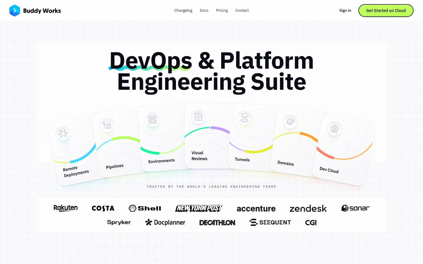
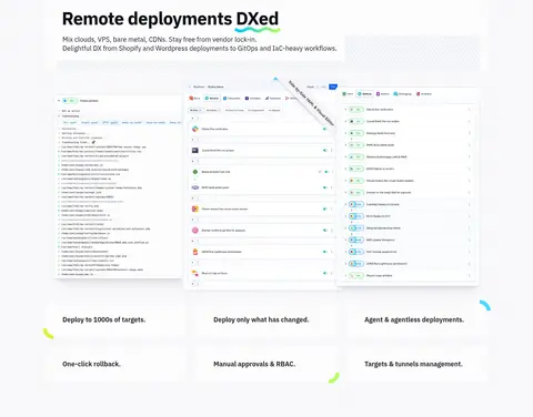
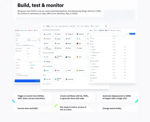
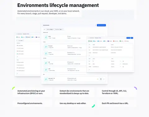
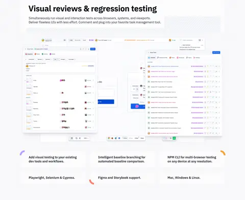
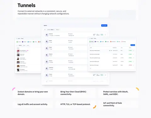
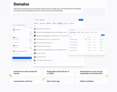
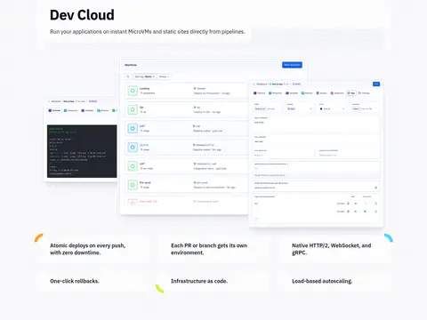
The visual system is anchored by a near-white canvas (#fcfcfd), with deep ink text and pale, cool-gray hairlines keeping the page bright and legible. Lime (#bfff5a) is reserved for the primary cloud CTA, while stronger greens and other vivid hues appear sparingly in product graphics and promotional bands rather than defining the base palette. IBM Plex Sans gives headings and body copy a compact, confident technical voice; IBM Plex Mono supplies small uppercase eyebrow labels. The page uses a centered, constrained content area and repeats a clear feature rhythm: concise heading and copy, overlapping screenshots of Buddy’s interface, then short capability statements in a multi-column arrangement. Generous vertical breathing room separates these feature chapters. UI imagery is treated as a key proof point, framed in light panels with subtle borders and layered shadows. Rounded pills, small colored corner accents, a testimonial card, and gradient CTA bands add variety without disrupting the restrained core.
Display and headings, navigation, body copy, captions, and buttons.
Aa 设计
IBM Plex Mono
网络字体 · 字重 500 · 占比 1%
免费替代:IBM Plex Mono
Small eyebrow and code-style labels.
角色
示例
字号
字重
行高
字距
特大标题
Large, bold hero headline.
Buddy
80px
700
0.9
-0.012em
一级标题
Main section headlines and prominent calls to action.
Buddy
48px
700
1
-0.021em
二级标题
Supporting introductory or section-level copy.
The quick brown fox 敏捷的狐狸
22px
500
1.45
-0.045em
正文
Feature descriptions and emphasized explanatory copy.
The quick brown fox 敏捷的狐狸
18px
600
1.33
0
辅助文字
Fine print, metadata, and secondary labels.
The quick brown fox 敏捷的狐狸
13px
400
1.85
0
按钮
CTA labels in pill-shaped controls.
The quick brown fox 敏捷的狐狸
14px
600
2.29
0
导航
Compact top navigation and menu labels.
The quick brown fox 敏捷的狐狸
13px
600
1.85
0
眉题
Uppercase mono labels, including the trust-strip heading.
The quick brown fox 敏捷的狐狸
12px
500
2
0.167em
代码
Small uppercase technical or code-oriented labels.
const style = 1;
12px
500
2
0.167em
间距与布局
基准单位 8px · 密度:适中
72px版块间距
24px元素间距
24px卡片内边距
1200px内容最大宽度
1px
4px
6px
8px
12px
16px
24px
32px
48px
96px
Use a centered content container capped at the measured 1200px maximum, with comfortable spacing and clear vertical separation between chapters. The homepage alternates centered hero content with left-aligned feature introductions and three-column capability groupings. Large product screenshots overlap or sit side by side as focal points, followed by concise text. The page is long but modular; preserve generous section gaps, consistent alignment, and a relatively airy density rather than compressing content.
圆角与层次
按钮 · 9999px
卡片 · 24px
图片 · 8px
导航 · 9999px
xl · media
inset · button
inset · other
md · card
Most content sits on the flat canvas with pale, fine borders rather than heavy card fills. Product media gains depth through layered screenshot panels and subtle, diffuse shadows; controls use crisp inset edging. Preserve the distinction between quiet feature layouts and the more colorful testimonial and CTA bands.
组件
下面的预览按实测的按钮、输入框、徽标、卡片样式重建(字体用替代字体)。
Primary CTA
A lime-filled, dark-outlined pill with a compact bold label; use for the main cloud-start action.
Top navigation
Brand mark at left, compact text links across the top, and sign-in plus a prominent pill CTA at right.
Feature showcase
Left-aligned heading and short introduction above layered product screenshots, followed by concise capability items in three columns.
Trust strip
Centered uppercase mono introduction above a multi-row band of customer logos.
Testimonial card
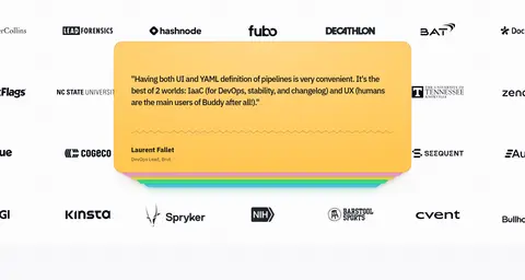
Bright, warm-colored card placed among customer marks, with quote, author details, and layered decorative edges.
Pricing banner
High-contrast green gradient strip with a short pricing message and an outlined pill link.
Signup panel
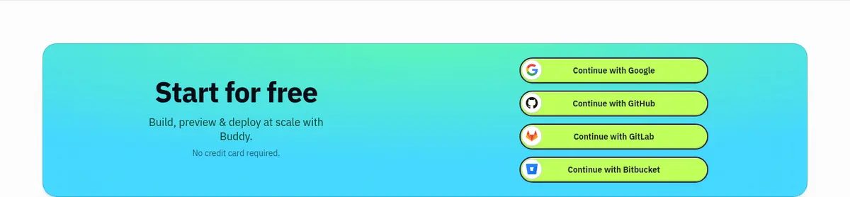
Wide cyan-to-green gradient CTA with centered headline and stacked provider sign-up buttons.
Imagery · Product UI screenshots are the primary imagery: clean, bright interface captures arranged in overlapping panels or broad multi-screen compositions. The hero uses an illustrated fan of feature cards, while small colorful corner marks and customer logos add supporting detail. Keep screenshots light and legible with restrained framing; do not introduce lifestyle photography. Some vivid gradients and multicolor shapes belong to illustrations or promotional blocks, not the default page canvas.
Keep the page canvas near-white and visually quiet.
Use bold, tightly tracked headings for strong hierarchy.
Show real product-interface compositions as feature proof.
Reserve lime for prominent actions and small accents.
Separate feature chapters with generous vertical breathing room.
Use pale borders and subtle shadows to frame layered media.
✕ 不该做
Do not turn every section into a colored background band.
Do not use heavy shadows on ordinary text and content blocks.
Do not let decorative gradients overpower the product UI.
Do not crowd feature descriptions or screenshots together.
Do not use the accent lime as a broad page background.
Do not add lifestyle photography that conflicts with the interface-led presentation.
给 AI 的提示词
想快速出一个同风格的新页面,把这段话连同 DESIGN.md 一起发给 AI。
Build a new Buddy-style page with a bright, technical, product-led visual system. Use Cloud Canvas (#fcfcfd) as the base and Midnight Type (#0a0d16) or Soft Ink (#151720) for crisp text. Set headings and interface copy in IBM Plex Sans, with IBM Plex Mono reserved for occasional uppercase eyebrows. Use Signal Lime (#bfff5a) selectively on the primary CTA, with a dark outline and pill form. Structure content in a centered, constrained container with generous vertical separation, concise left-aligned feature introductions, and three-column capability groups. Make layered, light product screenshots the main visual evidence; frame them with Frost Line (#ebeef7) or Quiet Edge (#d5d9e8) and restrained shadows. Keep the ordinary sections mostly white, adding vivid gradients only to deliberate promotional or signup panels.