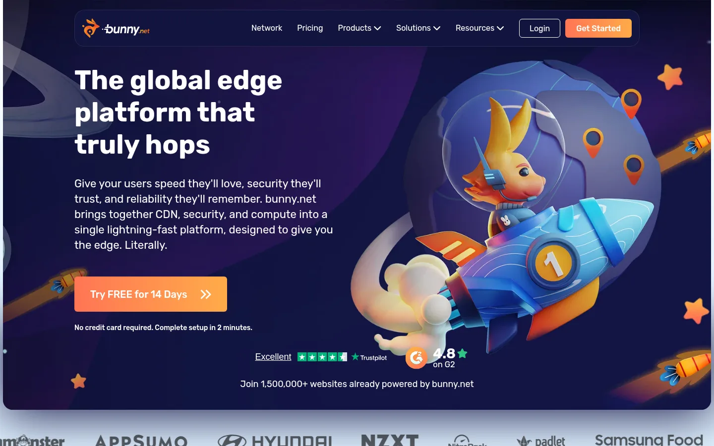
bunny.net 首页以浅蓝内容区、深海军蓝功能面板和鲜明的 3D 角色插画,呈现亲切的技术平台形象。圆润醒目的字体、清晰的产品分组与亮橙色行动按钮,让复杂服务易于浏览和理解。
North star · Pair a calm pale-blue product canvas and deep-blue panels with friendly 3D bunny artwork, using orange to make the next action unmistakable.
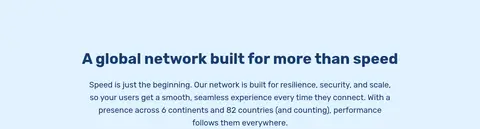
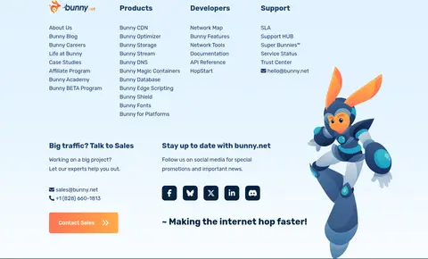
The page establishes a distinctive contrast between an immersive, dark indigo hero and a long, airy pale-blue canvas. White surfaces give the service cards and footer room to stand apart, while deep blue carries headings, body copy, and dark promotional panels. Orange is the strongest functional signal: it marks trial and sales actions and appears vividly in the character artwork. Rubik is used throughout, with bold, large headings and readable regular-weight copy; rounded forms keep the technical subject friendly. The layout alternates centered introductions, paired feature content, compact metric groups, and broad promotional panels rather than relying on a rigid repeated template. Highly polished 3D bunny illustrations provide the page’s personality and anchor otherwise text-heavy sections. Cards are white and gently elevated, while most of the pale-blue page remains flat and open, with consistent generous section spacing.
Site-wide headings, body copy, navigation, links, and buttons.
角色
示例
字号
字重
行高
字距
一级标题
Large, bold hero headline, set flush left.
bunny.net
45px
700
1.2
0
二级标题
Bold section headings for feature and network introductions.
bunny.net
30px
700
1.27
0
三级标题
Medium-weight card or subsection headings.
bunny.net
29px
500
1.2
0
四级标题
Regular-weight supporting headings and longer callouts.
The quick brown fox 敏捷的狐狸
24px
400
1.58
0
正文
Readable descriptive copy beneath headings and within feature panels.
The quick brown fox 敏捷的狐狸
18px
400
1.61
0
辅助文字
Compact helper text, notes, and small supporting labels.
The quick brown fox 敏捷的狐狸
14.5px
400
1.75
0
按钮
CTA text; measured button font size is unavailable, so do not infer it.
The quick brown fox 敏捷的狐狸
0px
400
29
0
导航
Regular-weight top navigation links.
The quick brown fox 敏捷的狐狸
16px
400
1.19
0
链接
Medium-weight text links and prominent trial actions.
The quick brown fox 敏捷的狐狸
20px
500
1.2
0
间距与布局
基准单位 2px · 密度:适中
60px版块间距
3px元素间距
22px卡片内边距
1140px内容最大宽度
1px
3px
4px
5px
6px
10px
15px
18px
20px
21px
23px
24px
30px
32px
34px
38px
Use a centered content frame with a measured maximum width of 1140px and a comfortable, vertically paced rhythm. The hero is a two-column composition with left-aligned copy and full-bleed illustrative media; the header sits within the dark hero. Most lower sections share the pale-blue canvas, alternating centered headings, two-column features, cards, statistics, and wide CTAs. Keep text blocks compact beside artwork, and use clear open space between section groups. Measured card padding is 22px and section gap is 60px.
圆角与层次
按钮 · 10px
卡片 · 10px
图片 · 50%
导航 · 6px
链接 · 6px
lg · card
md · card
Keep most pale-blue sections flat and uncluttered. White service cards use a 10px radius and subtle measured shadows, rather than heavy outlines. Dark navy panels create contrast through color, not elaborate borders. The header and large CTA panels sit cleanly over backgrounds, while the hero artwork supplies most of the visual depth.
组件
下面的预览按实测的按钮、输入框、徽标、卡片样式重建(字体用替代字体)。
Hero and navigation
Dark illustrated two-column hero with a compact horizontal header, white navigation text, an outlined Login control, and a warm gradient primary CTA.
Service cards
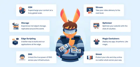
Eight measured white cards on the pale-blue canvas, with 10px corners, 22px measured padding, blue text, and subtle shadowing.
Trial CTA
Prominent orange-gradient trial action paired with concise reassurance such as no credit card required; preserve clear contrast on light or dark panels.
Dark promotional panel
A rounded #051e38 or #022e57 inset panel containing white copy, a trial action, and character artwork.
Network metrics
A compact row of prominent performance figures with blue labels; reserve orange emphasis for selected large values.
Feature illustration split
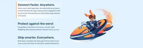
Pair concise explanatory copy and short benefit lists with large 3D bunny or technology artwork on the opposite side.
Footer
White, multi-column link area with blue headings and copy, contact and social details, then a full-width deep-blue legal strip.
Imagery · Make polished, colorful 3D bunny characters and technology props the defining imagery, not generic stock photography. The hero pairs a large character-and-globe scene with left-side copy; later illustrations sit beside feature explanations or overlap dark promotional panels. Treat artwork as high-contrast focal points against simple pale-blue or navy fields. A video appears in the network section; reserve a clear, broad media area for it.
Reserve dark navy for the hero and inset promotional panels.
Use orange gradient actions for trials and sales prompts.
Pair feature explanations with distinctive bunny illustrations.
Set headings and navigation in Rubik or a close rounded sans.
Keep cards white, rounded, and gently elevated.
Create varied section layouts while keeping the overall page airy.
✕ 不该做
Do not turn the entire page into a dark interface.
Do not use orange as a large continuous background.
Do not replace the character illustrations with generic stock imagery.
Do not crowd copy and artwork into one dense block.
Do not apply strong shadows to every section.
Do not add unmeasured spacing, sizes, or corner radii.
Do not treat illustration-only palette noise as a core interface color.
给 AI 的提示词
想快速出一个同风格的新页面,把这段话连同 DESIGN.md 一起发给 AI。
Build a new page in the bunny.net visual style: use Hopper Sky (#e1f2ff) as the primary content canvas, Gallery White (#ffffff) for cards and light sections, and Bunny Navy (#183d6d) for headings and copy. Use Rubik throughout, with bold, friendly headings and readable regular body text. Make the top section a dark, immersive hero with a horizontal navigation bar, left-aligned message, prominent bunny-themed 3D artwork, and an orange gradient CTA using Carrot Orange (#fd8d32) and Sunlit Orange (#ffaf48). Organize the remaining content into spacious centered introductions, feature splits, white rounded cards, metric rows, and inset dark panels using Midnight Panel (#051e38) or Harbor Blue (#022e57). Let vivid, polished character illustrations provide personality. Keep interactions obvious and the layout varied but orderly; avoid inventing unmeasured dimensions.