MotherDuck以温暖的米白底色、天蓝色区块、清晰描边和鸭子插画,塑造出亲切又鲜明的品牌视觉。等宽标题与产品示意图突出技术属性,同时保持轻松易读。
North star · Balance warm, open editorial space with outlined technical UI and occasional playful duck-led illustrations.
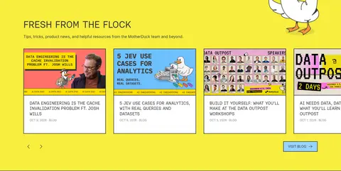
The page alternates a warm off-white canvas (#f4efea) with broad sky-blue (#97d4ff) bands, then reserves vivid yellow (#f9ee3e) for the resource feed near the footer. Charcoal (#383838) supplies readable copy, strong outlines, and the dark footer; white cards create clean contrast within the blue and neutral sections. Aeonik Fono gives uppercase hero headings a distinctive technical voice, while Inter handles paragraphs and navigation. Aeonik Mono and Source Code Pro support interface labels, diagrams, and code-like details. A wide, centered composition pairs text with a product UI in the hero, then moves through architecture diagrams, feature cards, customer proof, integrations, and agent workflows. Hand-drawn clouds, duck motifs, and schematic illustrations soften the precise layout. Comfortable section spacing and compact outlined components keep a long page orderly and scannable.
配色 点色块复制色值。用途说明来自对页面的实测位置(背景、文字、描边、按钮)与截图判读。
品牌色
Duck Ink
#383838
Primary text, dark footer, strong card outlines, and inverse interface surfaces.
Sky Blue
#97d4ff
Primary CTA fill and large architecture, customer, and agent-focused section bands.
强调色
Flock Yellow
#ffde00
Radial and decorative gradient accent; appears in illustrative and background treatments.
Bright Azure
#2ba5ff
Badge outline accent, especially the shared-storage label.
Signal Lemon
#f9ee3e
Full-width resource-feed section background near the bottom of the page.
Duckling Coral
#d97757
Small action accent within product interface controls.
表层色
Warm Canvas
#f4efea
Main page background, hero canvas, and neutral sections.
Clean White
#ffffff
Product UI panels, cards, navigation elements, and light text on dark surfaces.
Night Panel
#16161e
Occasional dark product-mockup card surface, not a primary page background.
Cloud Paper
#f8f8f7
Minor light card and footer detail surface.
中性色
Muted Graphite
#666666
Secondary body copy and subdued button text.
Cool Lilac Gray
#e8e6ec
Light code and interface text inside dark product mockups.
Slate Lavender
#8b8a96
Low-emphasis interface text within product-like panels.
Quiet Line
#d7d7d7
Subtle card and interface hairline borders.
功能色
Badge Gold
#ebcd00
Fine badge border detail paired with the yellow stack-selection label.
Soft Marigold
#faf175
Pale yellow badge fill for the stack-selection label.
Status Teal
#16aa98
Small status indicators and interface details in product mockups.
文字 背景 对比度 WCAG #383838 Duck Ink#f4efea Warm Canvas10.26:1 AAA #383838 Duck Ink#97d4ff Sky Blue7.36:1 AAA #383838 Duck Ink#ffffff Clean White11.73:1 AAA #ffffff Clean White#f4efea Warm Canvas1.14:1 不达标 #ffffff Clean White#383838 Duck Ink11.73:1 AAA #ffffff Clean White#97d4ff Sky Blue1.59:1 不达标
字体 字号阶梯:Golden Ratio(比例约 1.581,正文 16px)。示例用免费替代字体渲染,数值为实测。
Aa 设计
Inter 网络字体 · 字重 300 / 400 / 500 / 700 · 占比 72%
免费替代:Inter
Body copy, navigation, secondary headings, and compact buttons.
Aa 设计
Aeonik Fono 网络字体 · 字重 400 · 占比 13%
免费替代:Space Mono
Primary display heading, especially the uppercase hero title.
Aa 设计
Source Code Pro 系统字体 · 字重 400 / 700 · 占比 8%
免费替代:Source Code Pro
Captions, code examples, and technical labels.
Aa 设计
Aeonik Mono 网络字体 · 字重 400 / 300 · 占比 6%
免费替代:Space Mono
Navigation, interface labels, diagram text, and product-card copy.
Aa 设计
JetBrains Mono 网络字体 · 字重 400 / 700 · 占比 1%
免费替代:JetBrains Mono
Occasional code or technical UI text.
角色 示例 字号 字重 行高 字距 一级标题 Uppercase hero headline introducing the agent-focused warehouse.
MotherDuck
40px 400 1.2 0 二级标题 Light supporting section headings and explanatory subheads.
The quick brown fox 敏捷的狐狸
20px 300 1.6 0 正文 Paragraphs describing product benefits, integrations, and customer proof.
The quick brown fox 敏捷的狐狸
16px 400 1.4 0.02em 辅助文字 Compact labels, annotations, and small technical notes.
The quick brown fox 敏捷的狐狸
13px 400 1.62 0 按钮 Short uppercase calls to action and navigation controls.
The quick brown fox 敏捷的狐狸
12px 400 1 0 导航 Primary navigation links across the header.
The quick brown fox 敏捷的狐狸
16px 300 1.3 0 代码 SQL snippets and developer-oriented code examples.
const style = 1;
13px 400 1.62 0
间距与布局 基准单位 4px · 密度:适中
80px 版块间距
8px 元素间距
— 卡片内边距
1242px 内容最大宽度
1px
2px
4px
6px
8px
12px
16px
20px
22px
24px
30px
32px
40px
A centered page composition uses a measured maximum width of 1242px, with the hero split between copy and an oversized product interface. Broad, full-width color bands alternate with neutral canvas sections, while card groups range from three-column features to denser integration grids. The page aligns headings and content to clear section edges; the hero headline is left aligned, and the integrations introduction is centered. A comfortable section rhythm supports the long scroll, with tighter spacing inside controls and diagrams. The footer shifts to a dark, multi-column directory.
圆角与层次 The design relies on outlines and contrast more than soft elevation. Buttons, badges, and selected cards use dark borders with very slight corner rounding; product panels read as framed interfaces. A restrained card shadow may appear, while the dark offset detail adds a graphic, print-like edge. Keep surfaces mostly flat and avoid floating layers.
组件 下面的预览按实测的按钮、输入框、徽标、卡片样式重建(字体用替代字体)。
Primary CTA Sky Blue (#97d4ff) fill, Duck Ink (#383838) outline, uppercase label, and tight rectangular shape; pair with a plain outlined secondary action.
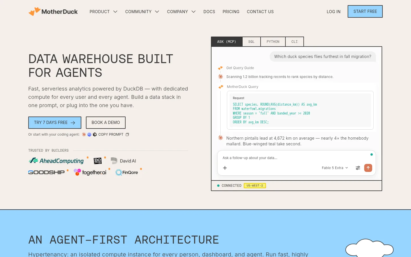
Product interface frame Large white mockup with a dark hairline border, compact tab strip, SQL panel, and status details that make the product tangible.
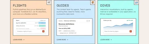
Feature cards Three-column product cards on Warm Canvas, each with a distinct pastel panel, small interface preview, and concise learn-more link.
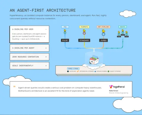
Architecture diagram Layered dark schematic blocks, connectors, small labels, and illustrated clouds sit within a Sky Blue section.
Badge Compact uppercase Aeonik Mono label in a pale fill with a clearly visible colored outline.
Resource card Thumbnail-led editorial card with a strong outline, compact metadata, and short headline on the yellow resource band.
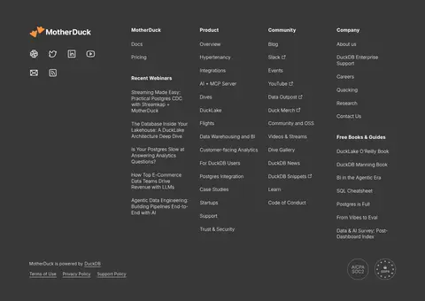
Footer directory Dark charcoal canvas with brand mark, social icons, and tightly organized link columns.
Imagery · Product screenshots and interface mockups are framed in dark, crisp outlines and paired with code-like detail. Hand-drawn clouds, small ducks, and schematic architecture diagrams bring a playful editorial quality to otherwise technical content. Customer and integration marks sit in orderly grids; resource cards use thumbnail imagery. Keep illustrations flat and outlined, with occasional bright color confined to diagrams and decorative motifs.
页面版块 共 10 个版块,按页面从上到下排列,每个都标了类型、布局和交互套路。
该做与不该做 ✓ 该做 Use Warm Canvas (#f4efea) as the default page ground. Reserve Sky Blue (#97d4ff) for large feature bands and primary CTAs. Set display headlines in an uppercase technical face. Frame product previews and cards with crisp dark outlines. Use monospace typography for code, labels, and diagram annotations. Keep duck and cloud artwork playful, flat, and secondary to content. ✕ 不该做 Don't replace the warm canvas with pure white across the whole page. Don't use rounded, pill-shaped controls where the measured UI is square-edged. Don't add gradients as a general-purpose background treatment. Don't make every section blue or yellow; preserve the neutral-blue-yellow rhythm. Don't let decorative illustrations overwhelm product information. Don't apply soft shadows to every card. 给 AI 的提示词 想快速出一个同风格的新页面,把这段话连同 DESIGN.md 一起发给 AI。
复制 Build a new MotherDuck-style page with a Warm Canvas (#f4efea) foundation, Duck Ink (#383838) typography and outlines, and broad Sky Blue (#97d4ff) feature bands. Use Signal Lemon (#f9ee3e) sparingly for a standout editorial or resource area. Set display headlines in uppercase Aeonik Fono or a close monospace substitute; use Inter for readable body copy and Aeonik Mono or Source Code Pro for interface labels and code. Favor a centered, wide composition with clear section bands, left-aligned product storytelling, and compact grid-based cards. Show product value through outlined interface panels and schematic diagrams. Add restrained hand-drawn clouds or duck illustrations as supporting motifs. Keep controls rectangular, borders crisp, shadows minimal, and the long-page rhythm comfortable and scannable.
DESIGN.md Tailwind v4 CSS 变量 Design Tokens
---
title: "MotherDuck design system"
variant: extended
source: https://motherduck.com/
captured_at: 2026-10-12
theme: light
industry: devtools
generator: Design DNA (https://four.wiralomi.com/style/motherduck-com)
ai_generated: true
ai_label: "本文件由 AI 辅助生成:数值取自公开网页的实测样式,命名、用途说明与建议为模型解读。商标归原所有者。 / AI-assisted content"
---
# MotherDuck · Design System
> Playful duck motifs meet precise, agent-ready data tooling.
**Theme:** light · **Industry:** devtools · **Source:** https://motherduck.com/ · **Captured:** 2026-10-12 (1440×900 desktop)
_AI-assisted content: values are measured from the public page at capture time; names, roles and guidance are model-written interpretations. Trademarks belong to their owners._
MotherDuck pairs a warm editorial canvas with sky-blue feature bands, crisp outlines, and playful duck illustrations. Monospaced display type and product-like diagrams make the page feel technical without losing its approachable character.
## North star
Balance warm, open editorial space with outlined technical UI and occasional playful duck-led illustrations.
## Overview
The page alternates a warm off-white canvas (## Colors
| Name | Hex | Token | Group | Role |
|---|---|---|---|---|
| Duck Ink | ` | `--color-duck-ink` | brand | Primary text, dark footer, strong card outlines, and inverse interface surfaces. |
| Sky Blue | ` | `--color-sky-blue` | brand | Primary CTA fill and large architecture, customer, and agent-focused section bands. |
| Warm Canvas | ` | `--color-warm-canvas` | surface | Main page background, hero canvas, and neutral sections. |
| Clean White | ` | `--color-clean-white` | surface | Product UI panels, cards, navigation elements, and light text on dark surfaces. |
| Flock Yellow | ` | `--color-flock-yellow` | accent | Radial and decorative gradient accent; appears in illustrative and background treatments. |
| Badge Gold | ` | `--color-badge-gold` | semantic | Fine badge border detail paired with the yellow stack-selection label. |
| Bright Azure | ` | `--color-bright-azure` | accent | Badge outline accent, especially the shared-storage label. |
| Muted Graphite | ` | `--color-muted-graphite` | neutral | Secondary body copy and subdued button text. |
| Signal Lemon | ` | `--color-signal-lemon` | accent | Full-width resource-feed section background near the bottom of the page. |
| Soft Marigold | ` | `--color-soft-marigold` | semantic | Pale yellow badge fill for the stack-selection label. |
| Duckling Coral | ` | `--color-duckling-coral` | accent | Small action accent within product interface controls. |
| Cool Lilac Gray | ` | `--color-cool-lilac-gray` | neutral | Light code and interface text inside dark product mockups. |
| Slate Lavender | ` | `--color-slate-lavender` | neutral | Low-emphasis interface text within product-like panels. |
| Status Teal | ` | `--color-status-teal` | semantic | Small status indicators and interface details in product mockups. |
| Night Panel | ` | `--color-night-panel` | surface | Occasional dark product-mockup card surface, not a primary page background. |
| Cloud Paper | ` | `--color-cloud-paper` | surface | Minor light card and footer detail surface. |
| Quiet Line | ` | `--color-quiet-line` | neutral | Subtle card and interface hairline borders. |
### Semantic aliases
`--color-canvas` → ` (Warm Canvas) · `--color-surface` → ` (Duck Ink) · `--color-surface-2` → ` (Sky Blue) · `--color-surface-3` → ` (Clean White) · `--color-text` → ` (Duck Ink) · `--color-text-muted` → ` (Clean White) · `--color-text-subtle` → ` (Muted Graphite) · `--color-border` → ` (Quiet Line) · `--color-accent` → ` (Sky Blue) · `--color-accent-2` → ` (Flock Yellow) · `--color-accent-3` → ` (Duckling Coral) · `--color-on-accent` → ` (Duck Ink)
### Contrast (WCAG 2.x)
| Text | Background | Ratio | Level |
|---|---|---|---|
| ` | ` | 10.26:1 | AAA |
| ` | ` | 7.36:1 | AAA |
| ` | ` | 11.73:1 | AAA |
| ` | ` | 1.14:1 | fail |
| ` | ` | 11.73:1 | AAA |
| ` | ` | 1.59:1 | fail |
| ` | ` | 5.03:1 | AA |
| ` | ` | 2.04:1 | fail |
| ` | ` | 3.6:1 | AA-large |
| ` | ` | 5.74:1 | AA |
### Gradients
- `repeating-conic-gradient(rgb(255, 222, 0) 0deg, rgb(255, 222, 0) 5deg, rgba(255, 222, 0, 0) 5deg, rgba(255, 222, 0, 0) 30deg)`
- `radial-gradient(circle, rgb(255, 222, 0) 0%, rgba(255, 222, 0, 0) 70%)`
- `linear-gradient(45deg, rgb(27, 102, 15) 0%, rgb(108, 174, 62) 100%)`
## Typography
| Family | Token | Source | Weights | Role | Free substitute |
|---|---|---|---|---|---|
| Inter | `--font-body` | webfont | 300, 400, 500, 700 | Body copy, navigation, secondary headings, and compact buttons. | Inter |
| Aeonik Fono | `--font-display` | webfont | 400 | Primary display heading, especially the uppercase hero title. | Space Mono |
| Source Code Pro | `--font-mono` | system | 400, 700 | Captions, code examples, and technical labels. | Source Code Pro |
| Aeonik Mono | `--font-aeonik-mono` | webfont | 400, 300 | Navigation, interface labels, diagram text, and product-card copy. | Space Mono |
| JetBrains Mono | `--font-jetbrains-mono` | webfont | 400, 700 | Occasional code or technical UI text. | JetBrains Mono |
- **Inter:** Use light navigation, regular body weight, restrained tracking, and mostly sentence case.
- **Aeonik Fono:** Regular weight with uppercase treatment; preserve the technical, monospaced display character.
- **Source Code Pro:** Regular monospace with compact sizing and a clear code-console feel.
- **Aeonik Mono:** Use monospace for product-facing details; uppercase labels and compact controls suit the schematic UI.
- **JetBrains Mono:** Keep to code-like supporting content; regular or bold weights are measured.
### Type scale — Golden Ratio (ratio ≈ 1.581, base 16px)
| Role | Size | Weight | Line height | Letter spacing | Case | Family | Used for |
|---|---|---|---|---|---|---|---|
| h1 | 40px | 400 | 1.2 | 0 | uppercase | Aeonik Fono | Uppercase hero headline introducing the agent-focused warehouse. |
| h2 | 20px | 300 | 1.6 | 0 | — | Inter | Light supporting section headings and explanatory subheads. |
| body | 16px | 400 | 1.4 | 0.02em | — | Inter | Paragraphs describing product benefits, integrations, and customer proof. |
| caption | 13px | 400 | 1.62 | 0 | — | Source Code Pro | Compact labels, annotations, and small technical notes. |
| button | 12px | 400 | 1 | 0 | uppercase | Inter | Short uppercase calls to action and navigation controls. |
| nav | 16px | 300 | 1.3 | 0 | — | Inter | Primary navigation links across the header. |
| code | 13px | 400 | 1.62 | 0 | — | Source Code Pro | SQL snippets and developer-oriented code examples. |
## Spacing & layout
- Base unit **4px**, density **comfortable**.
- Scale (most used values): 1, 2, 4, 6, 8, 12, 16, 20, 22, 24, 30, 32, 40 px.
- Section rhythm 80px · element gap 8px · card padding — · max content width 1242px.
A centered page composition uses a measured maximum width of 1242px, with the hero split between copy and an oversized product interface. Broad, full-width color bands alternate with neutral canvas sections, while card groups range from three-column features to denser integration grids. The page aligns headings and content to clear section edges; the hero headline is left aligned, and the integrations introduction is centered. A comfortable section rhythm supports the long scroll, with tighter spacing inside controls and diagrams. The footer shifts to a dark, multi-column directory.
## Shape & elevation
- Radius: button `2px` · card `2px` · badge `2px` · nav `2px` · link `2px` · xs `2px` · sm `8px` · md `14px` · lg `16px`
- Shadow `md` (card): `rgba(0, 0, 0, 0.08) 0px 4px 20px 0px`
- Shadow `hairline` (card): `rgb(56, 56, 56) -4px 4px 0px 0px`
- Motion: standard transition `0.12s ease-in-out` on interactive elements.
The design relies on outlines and contrast more than soft elevation. Buttons, badges, and selected cards use dark borders with very slight corner rounding; product panels read as framed interfaces. A restrained card shadow may appear, while the dark offset detail adds a graphic, print-like edge. Keep surfaces mostly flat and avoid floating layers.
## Imagery
Product screenshots and interface mockups are framed in dark, crisp outlines and paired with code-like detail. Hand-drawn clouds, small ducks, and schematic architecture diagrams bring a playful editorial quality to otherwise technical content. Customer and integration marks sit in orderly grids; resource cards use thumbnail imagery. Keep illustrations flat and outlined, with occasional bright color confined to diagrams and decorative motifs.
## Components
### Primary CTA
Sky Blue (### Product interface frame
Large white mockup with a dark hairline border, compact tab strip, SQL panel, and status details that make the product tangible.
### Feature cards
Three-column product cards on Warm Canvas, each with a distinct pastel panel, small interface preview, and concise learn-more link.
### Architecture diagram
Layered dark schematic blocks, connectors, small labels, and illustrated clouds sit within a Sky Blue section.
### Badge
Compact uppercase Aeonik Mono label in a pale fill with a clearly visible colored outline.
### Resource card
Thumbnail-led editorial card with a strong outline, compact metadata, and short headline on the yellow resource band.
### Footer directory
Dark charcoal canvas with brand mark, social icons, and tightly organized link columns.
### Measured component styles
- **Primary button** (“START FREE”): background ## Do
- Use Warm Canvas (## Don't
- Don't replace the warm canvas with pure white across the whole page.
- Don't use rounded, pill-shaped controls where the measured UI is square-edged.
- Don't add gradients as a general-purpose background treatment.
- Don't make every section blue or yellow; preserve the neutral-blue-yellow rhythm.
- Don't let decorative illustrations overwhelm product information.
- Don't apply soft shadows to every card.
## Agent prompt
Build a new MotherDuck-style page with a Warm Canvas (## Page sections (top to bottom)
| # | Type | Layout | UX patterns | UI patterns |
|---|---|---|---|---|
| 1 | hero | Warm Canvas split hero: left-aligned copy and actions beside a large framed product interface. | Product-led introduction, Primary and secondary CTA, Customer logo proof | Uppercase display headline, Outlined interface mockup, Sky-blue CTA |
| 2 | how-it-works | Full-width blue band combining a left accordion with a central architecture schematic. | Expandable feature points, Architecture explanation, Customer quote | Cloud illustrations, Connected diagram blocks, Outlined quote panel |
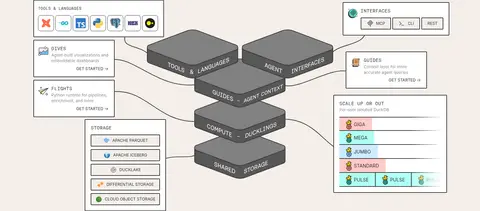
| 3 | product-showcase | Neutral canvas with a central layered stack diagram and compact explanatory panels around it. | Product architecture overview, Tool and interface mapping | Layered dark blocks, Outlined label panels, Connector lines |
| 4 | feature-grid | Three equal feature cards aligned in a row on the neutral canvas. | Feature comparison, Learn-more links | Pastel card backgrounds, Embedded product previews, Dark outlines |
| 5 | testimonials | Single wide quote card with testimonial text and customer attribution aligned opposite. | Customer evidence, Named attribution | White quote panel, Strong rectangular border, Logo and role details |
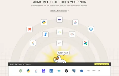
| 6 | integrations | Centered introduction above a broad, illustrated integration field and horizontal tools strip. | Integration discovery, View-all link | Partner logo grid, Duck illustration, Outlined tools panel |
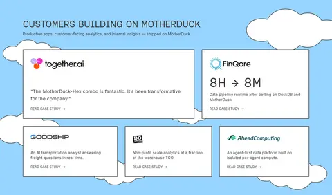
| 7 | testimonials | Full-width blue band with customer cards arranged in a loose two-row grid. | Customer proof, Case-study navigation | White bordered cards, Cloud backdrop, Brand marks |
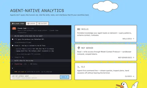
| 8 | feature-split | Blue feature area with a dark terminal preview beside a vertical stack of white capability cards. | Agent workflow demonstration, Documentation links, MCP entry point | Terminal mockup, Outlined cards, Yellow decorative edge |
| 9 | content-feed | Bright yellow section with an editorial card row and compact carousel controls. | Browse recent resources, Carousel navigation, Visit blog | Thumbnail cards, Compact metadata, Blue outlined CTA |
| 10 | footer | Dark full-width footer with brand and social links beside multiple directory columns. | Browse site sections, Social navigation, Policy and trust links | Charcoal background, Compact link lists, Small brand marks |
## Source CSS custom properties (selected)
```css
--sim-surface: