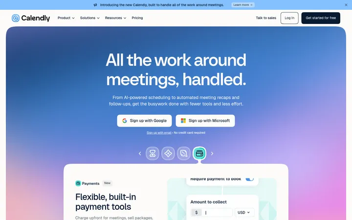
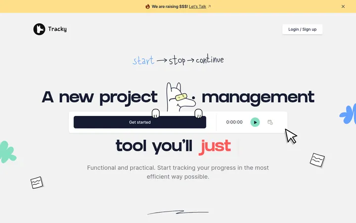
North star · Keep the page as a calm white product canvas, using blue for action and hand-drawn magenta accents to make interface previews feel approachable.
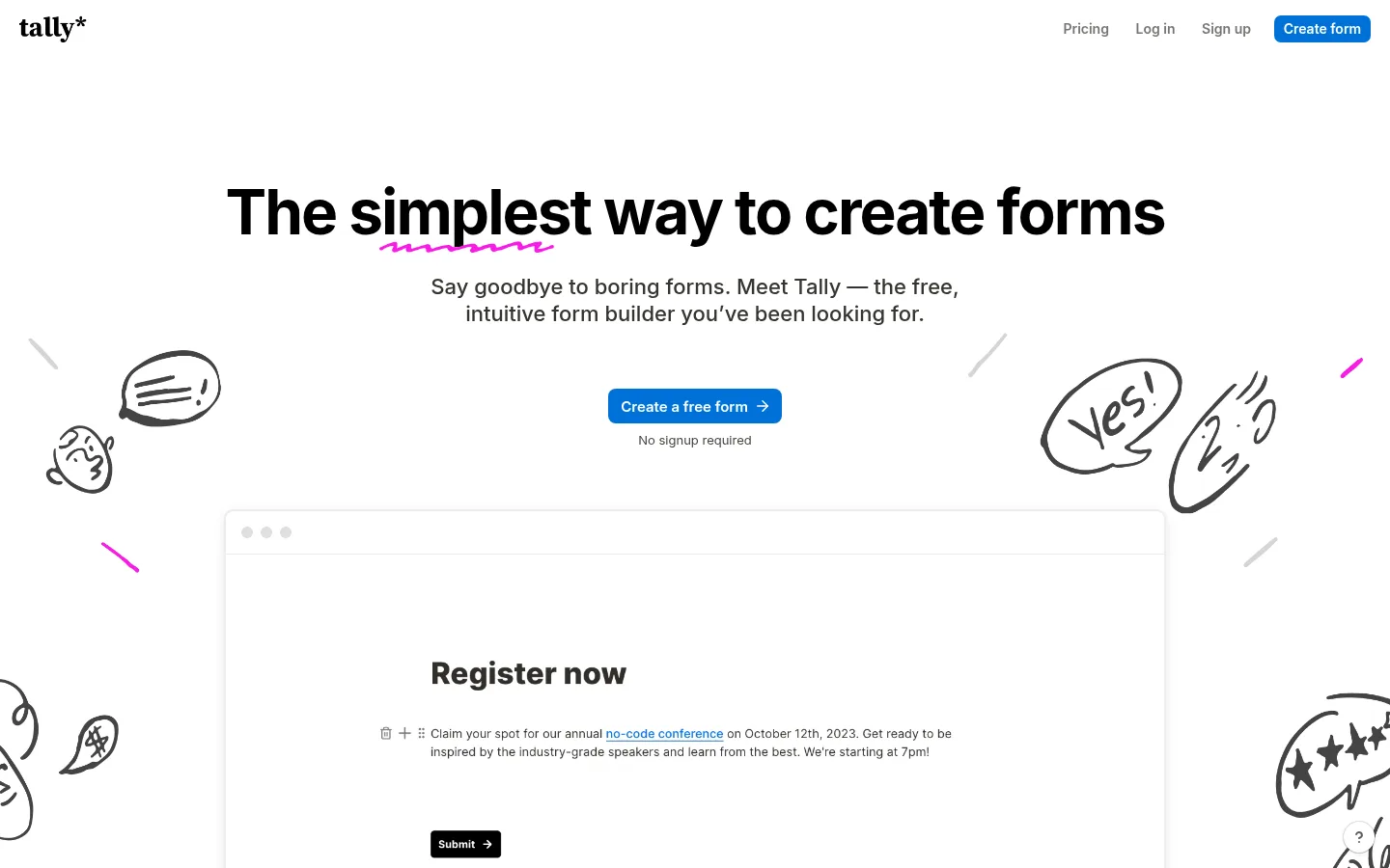
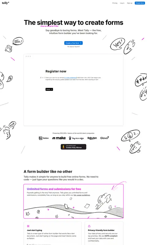
Tally’s visual strategy uses an almost uninterrupted white canvas to keep attention on the message and the form previews. Dark, near-black headings create a strong reading hierarchy, while restrained gray text and hairline borders keep supporting content quiet. Blue is reserved for the primary create-form actions and occasional in-product links; vivid purple-to-pink accents appear in selected heading marks, icons, and playful illustration details rather than as broad section fills. Inter is used throughout, with bold display and section headings balanced by readable, regular-weight body copy. The layout moves through centered hero content into a long, centered sequence of product demonstrations, feature cards, testimonials, integrations, and closing calls to action. Hand-drawn monochrome doodles add personality around otherwise tidy interface mockups. Generous whitespace separates the varied content blocks, while subtle borders and restrained shadows give product previews just enough depth.
Feature-card and subfeature headings, often strongly emphasized.
The quick brown fox 敏捷的狐狸
26px
800
1.15
0
四级标题
Smaller supporting headings and preview-panel titles.
The quick brown fox 敏捷的狐狸
22px
500
1.25
0
正文
Main explanatory copy, product descriptions, and testimonial text.
The quick brown fox 敏捷的狐狸
16px
400
1.5
0
辅助文字
Compact helper notes, interface labels, and attribution details.
The quick brown fox 敏捷的狐狸
13px
400
1.15
0
导航
Header navigation links and compact menu items.
The quick brown fox 敏捷的狐狸
14px
600
1
0
链接
Inline links and emphasized navigational text.
The quick brown fox 敏捷的狐狸
16px
600
1.5
0
间距与布局
基准单位 8px · 密度:适中
64px版块间距
8px元素间距
—卡片内边距
976px内容最大宽度
4px
6px
8px
10px
14px
16px
24px
32px
64px
192px
A long, single-column homepage centers its primary content in a measured 976px maximum-width container. The hero uses centered alignment and generous breathing room, then the page alternates between full-width-feeling product demonstrations and compact multi-column feature cards. Section spacing follows a comfortable, consistent rhythm; card groups introduce denser information without crowding. Doodles occasionally extend around the main content, while text and interface examples remain aligned to the central page structure.
圆角与层次
按钮 · 8px
卡片 · 10px
图片 · 50%
导航 · 7px
链接 · 5px
md · card
md · card
hairline · card
sm · other
Most sections sit flat on white, with fine gray borders defining cards and browser-like previews. Product panels use restrained, soft shadows to distinguish them from the canvas without creating heavy depth. Rounded card corners are visible, and selected preview cards may use a vivid magenta outline or focus ring as a localized highlight.
组件
下面的预览按实测的按钮、输入框、徽标、卡片样式重建(字体用替代字体)。
Top navigation
Compact brand mark at the left, with right-aligned Pricing, Log in, Sign up, and a blue Create form button.
Hero and primary action
Centered, bold headline with a small pink hand-drawn underline, brief supporting copy, blue creation CTA, and a small reassurance note.
Form preview
Large browser-like panel with a subtle border and shadow, showing realistic form content as the main product demonstration.
Feature cards
A mix of broad showcase panels and smaller modular cards, with restrained borders, concise copy, and magenta feature icons.
Testimonial
Centered customer quote with muted attribution and a small portrait, separated from adjacent feature sections by whitespace.
Repeated CTA
Blue Create a free form button reappears after product explanations and near the closing conversion section.
Imagery · Hand-drawn black-line doodles, often with small magenta strokes, frame the hero and feature sections. Large product mockups show form-builder interfaces and completed forms, presented as clean browser-like panels. Small customer logos, portraits, and award artwork appear as supporting proof. Imagery is illustrative and product-led rather than photographic; keep drawings airy and let interface previews remain legible.
Reserve Action Blue for primary conversion actions.
Add Electric Petal and Violet Spark as small expressive accents.
Show realistic form interfaces inside clean, softly elevated panels.
Separate long-page sections with generous whitespace.
Use hand-drawn line art to soften product-led layouts.
✕ 不该做
Do not turn the page into a dark theme.
Do not spread the accent gradient across large backgrounds.
Do not use heavy shadows or thick card borders.
Do not let illustrations obscure interface previews or copy.
Do not crowd the centered content with dense layouts.
Do not use multiple competing primary-action colors.
给 AI 的提示词
想快速出一个同风格的新页面,把这段话连同 DESIGN.md 一起发给 AI。
Build a new SaaS page in Tally’s friendly, minimal visual style. Use Gallery White (#ffffff) as the dominant canvas, Warm Ink (#37352f) for key text, Quiet Graphite (#5f5e5a) for supporting copy, and Soft Divider (#ececeb) for subtle panel boundaries. Make primary actions Action Blue (#0070d7); use Violet Spark (#8a46ff) and Electric Petal (#f81ce0) sparingly for small doodles, icons, and expressive marks. Set all typography in Inter, with bold, crisp headings and comfortable body text. Center content in a measured 976px maximum-width column, then vary product showcases and modular feature cards. Use browser-like form previews, restrained shadows, light borders, and generous whitespace. Add occasional monochrome hand-drawn illustrations, never letting them compete with product content.