Cap以明亮克制的界面、清晰字体和充足留白,呈现功能丰富但易上手的屏幕录制产品。柔和着色的产品画面与蓝色点缀提供层次,同时让页面始终聚焦于软件本身。
North star · Keep the page itself quiet and spacious so colorful, realistic product demonstrations carry the visual interest.
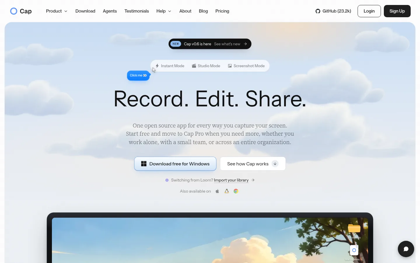
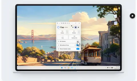
The page builds its identity from a near-white canvas, pale cool section backgrounds, and restrained black and gray typography. Blue appears as a functional accent in badges, interface details, and download actions rather than as a broad brand-color wash. The hero is the exception: a softly clouded sky image fills a large rounded panel behind a centered headline, while a prominent desktop mockup anchors the lower portion. Instrument Sans provides the clean display and interface voice; light Source Serif 4 brings a quiet editorial contrast to supporting copy, and Geist handles compact UI labels. Sections repeat a spacious, centered introduction followed by either a two-column product split or a neatly aligned feature-card grid. Product screenshots retain vivid, nuanced color, but surrounding surfaces stay muted so they read as demonstrations, not page chrome. Fine borders and subtle shadows define cards and media without making the long page feel heavy.
配色 点色块复制色值。用途说明来自对页面的实测位置(背景、文字、描边、按钮)与截图判读。
强调色
Signal Blue
#0090ff
Blue status badges and small interface accents; use as a focused highlight.
Action Blue
#0588f0
Blue button accent found in product interface controls.
Link Blue
#007aff
Small blue link and badge details; not a dominant page color.
Deep Link Blue
#0d74ce
Sparse blue text and button detail.
Interface Azure
#3b82f6
Blue details within controls and product interface visuals.
Control Blue
#2563eb
Small blue interface and button details.
表层色
Gallery White
#ffffff
Primary page canvas, white cards, and reverse text on dark or blue elements.
Cloud Surface
#f8fafc
Cool, pale background for most feature, platform, and content sections.
Soft Fog
#f2f2f2
Secondary pale surface and subtle section or card contrast.
中性色
Cap Ink
#111111
Primary headings, body text, navigation, and dark button text.
Slate Copy
#444445
Muted supporting text and explanatory copy.
Graphite Copy
#4e4f51
Secondary text and subdued interface copy.
True Black
#000000
Dark surfaces, notably the announcement pill and dark product or code panels.
Muted Graphite
#595a5b
Low-emphasis text, especially secondary product-interface labels.
Deep Charcoal
#202020
Occasional dark text and compact interface details.
功能色
Hairline Gray
#ebebeb
Fine borders around cards, controls, badges, and other subtle divisions.
文字 背景 对比度 WCAG #111111 Cap Ink#ffffff Gallery White18.88:1 AAA #111111 Cap Ink#f8fafc Cloud Surface18.05:1 AAA #111111 Cap Ink#f2f2f2 Soft Fog16.87:1 AAA #111111 Cap Ink#000000 True Black1.11:1 不达标 #444445 Slate Copy#ffffff Gallery White9.73:1 AAA #444445 Slate Copy#f8fafc Cloud Surface9.3:1 AAA
字体 字号阶梯:Perfect Fourth(比例约 1.329,正文 13.5px)。示例用免费替代字体渲染,数值为实测。
Aa 设计
Source Serif 4 网络字体 · 字重 300 · 占比 44%
免费替代:Source Serif 4
Light editorial supporting headings and descriptive copy
Aa 设计
Geist 网络字体 · 字重 500 / 400 / 300 / 600 · 占比 25%
免费替代:Inter
Compact UI labels, badges, and controls
Aa 设计
Instrument Sans 网络字体 · 字重 400 / 500 · 占比 25%
免费替代:Inter
Display headline, section headings, body, links, and buttons
Aa 设计
DM Mono 网络字体 · 字重 400 · 占比 3%
免费替代:IBM Plex Mono
Uppercase section eyebrows and technical labels
Aa 设计
-apple-system 系统字体 · 字重 500 · 占比 1%
免费替代:Inter
System-font navigation fallback
角色 示例 字号 字重 行高 字距 特大标题 Large centered hero headline and prominent product statement.
Cap
56px 400 1 -0.03em 一级标题 Light serif supporting headline treatment.
The quick brown fox 敏捷的狐狸
24px 300 1.4 -0.01em 二级标题 Section-level headings, often centered above content.
The quick brown fox 敏捷的狐狸
21px 400 2.48 -0.02em 三级标题 Feature and card headings.
The quick brown fox 敏捷的狐狸
19px 400 1.15 -0.02em 四级标题 Light serif subheadings and explanatory titles.
The quick brown fox 敏捷的狐狸
17.5px 300 1.5 -0.01em 正文 Feature descriptions, summaries, and ordinary supporting copy.
The quick brown fox 敏捷的狐狸
13.5px 400 1.38 0 辅助文字 Compact UI labels, card metadata, and status text.
The quick brown fox 敏捷的狐狸
12px 500 2 0 按钮 Download actions and prominent interface controls.
The quick brown fox 敏捷的狐狸
21px 400 2.48 -0.02em 链接 Navigation and inline action links.
The quick brown fox 敏捷的狐狸
15px 500 1.6 0 眉题 Small uppercase section labels such as mode and platform names.
The quick brown fox 敏捷的狐狸
12px 400 1 0.05em 代码 CLI commands and technical examples.
const style = 1;
11.5px 400 2.09 0
间距与布局 基准单位 4px · 密度:宽松
96px 版块间距
8px 元素间距
— 卡片内边距
1200px 内容最大宽度
2px
4px
6px
8px
10px
12px
14px
16px
20px
24px
32px
Use a centered content frame capped around the measured 1200px, with a spacious page rhythm and broad section gaps. The page alternates centered introductions and feature grids with two-column product splits, aligning text and media carefully rather than forcing every block into one template. The hero is centered and broad; later sections use left-aligned text beside screenshots. Feature cards form three- or four-column groups where appropriate. Keep density low, leave generous breathing room around media, and use pale background bands to distinguish sequences without introducing strong color blocks.
圆角与层次 hairline · other
xl · card, other
hairline · card
hairline · card
Most surfaces are flat and separated through pale background shifts or fine gray borders. Apply subtle shadows to large product media and selected cards to lift them from the cool-white canvas; reserve stronger depth for the hero mockup and dark announcement pill. Avoid heavy outlines, repeated drop shadows, or stacked layers that compete with screenshots.
组件 下面的预览按实测的按钮、输入框、徽标、卡片样式重建(字体用替代字体)。
Top navigation Compact horizontal nav with Cap mark, product links, GitHub reference, and outlined Login plus dark Sign Up controls.
Hero announcement Small black rounded pill above the headline, with a blue NEW badge and a short release link.
Hero download actions Primary download button beside a quiet secondary explainer action; platform availability sits below.
Product media frame Large screenshot or video in a softly rounded, lightly bordered frame with restrained shadow.
Feature split Eyebrow and heading with explanatory text on one side, product demonstration on the other; alternate sides between sections.
Feature cards Pale, lightly separated cards with small colored icons, concise headings, and compact descriptive copy.
Platform cards Three softly tinted platform panels with operating-system icon, short copy, and download action.
Imagery · Use crisp screen recordings, desktop-app screenshots, and product mockups as the main visual content. Frame media in softly rounded panels with delicate borders or shadows; preserve the screenshot’s native interface colors and realistic detail. The hero uses a clouded sky background behind an oversized desktop display. Other illustrations and interface diagrams should remain explanatory, light, and secondary to the actual product UI.
页面版块 共 12 个版块,按页面从上到下排列,每个都标了类型、布局和交互套路。
首页
首屏 产品主视觉
Centered announcement, mode selector, headline, copy, actions, and large desktop mockup in a rounded sky panel.
使用步骤 三种录制模式
Centered section heading followed by a product walkthrough and three mode-oriented content areas.
功能网格 工作流总览
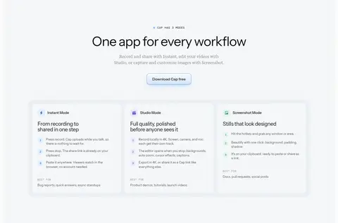
Centered introduction, supporting copy, download link, and three aligned mode cards.
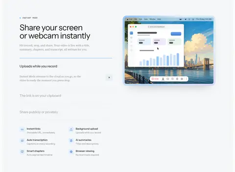
图文交替 即时分享
Left-aligned text and expandable feature details beside a product recording preview.
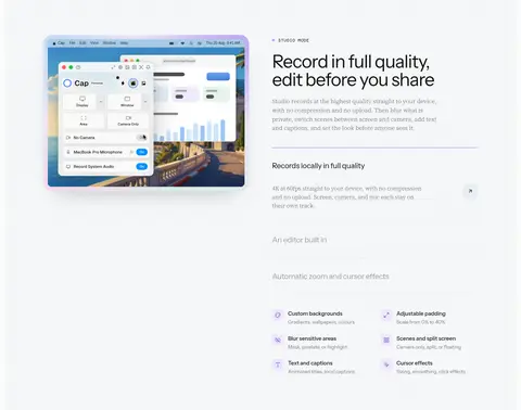
图文交替 录制与编辑
Product preview on one side and recording-quality explanation with feature rows on the other.
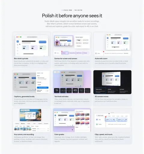
功能网格 Studio 编辑器
Centered eyebrow, headline, and copy above a three-column by three-row gallery of feature demonstrations.
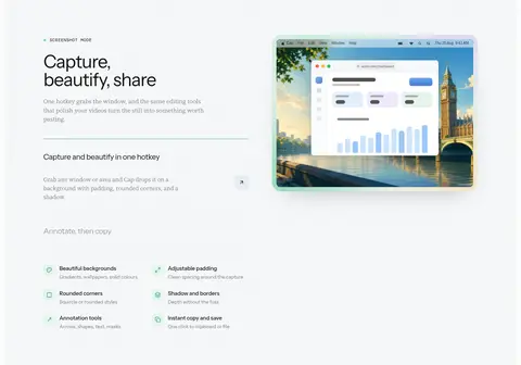
图文交替 截图美化
Left-side explanation and feature details paired with a screenshot editor preview.
图文交替 录制内容理解
Recording page preview beside heading, description, and vertically arranged feature details.
功能网格 产品设计理念
Centered heading and intro above a four-column grid of short product-principle cards.
功能网格 开源与存储
Centered open-source introduction above a two-column storage diagram and supporting cards.
集成生态 多平台支持
Centered platform introduction, three download cards, then browser extension and developer tool panels.
图文交替 AI 代理工具
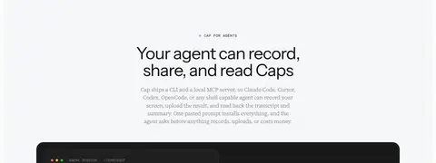
Centered introductory heading and copy above a wide dark agent-interface demonstration.
该做与不该做 ✓ 该做 Keep the canvas predominantly white and cool near-white. Use blue only for focused actions, badges, and interface accents. Let screenshots provide most of the page’s vivid color. Alternate centered section introductions with aligned product splits. Use fine borders and soft shadows to separate media from surfaces. Keep explanatory copy calm, readable, and visually subordinate. ✕ 不该做 Do not turn the page into a saturated blue layout. Do not add decorative gradients to ordinary content sections. Do not crowd screenshots with dense surrounding text. Do not use heavy card outlines or strong shadows everywhere. Do not make every heading bold or uppercase. Do not treat colors inside product screenshots as global brand colors. 给 AI 的提示词 想快速出一个同风格的新页面,把这段话连同 DESIGN.md 一起发给 AI。
复制 Build a new Cap-style SaaS page with a quiet, spacious product-first composition. Use Gallery White (#ffffff) as the main canvas and Cloud Surface (#f8fafc) for broad content bands; use Hairline Gray (#ebebeb) for delicate separators and Cap Ink (#111111) for headings. Keep Signal Blue (#0090ff) and related measured blues to small badges, links, and controls. Set display and interface text in Instrument Sans or a close sans substitute, use light Source Serif 4 for editorial supporting copy, Geist for compact labels, and DM Mono for uppercase eyebrows. Center concise section introductions, then alternate two-column feature explanations with carefully framed screenshots. Favor pale cards, generous whitespace, modest rounded media frames, and subtle shadows. Preserve realistic, colorful product UI inside imagery rather than spreading its colors across the page.
DESIGN.md Tailwind v4 CSS 变量 Design Tokens
---
title: "Cap design system"
variant: extended
source: https://cap.so/
captured_at: 2026-10-12
theme: light
industry: saas
generator: Design DNA (https://four.wiralomi.com/style/cap-so)
ai_generated: true
ai_label: "本文件由 AI 辅助生成:数值取自公开网页的实测样式,命名、用途说明与建议为模型解读。商标归原所有者。 / AI-assisted content"
---
# Cap · Design System
> A calm canvas for a capable screen recorder
**Theme:** light · **Industry:** saas · **Source:** https://cap.so/ · **Captured:** 2026-10-12 (1440×900 desktop)
_AI-assisted content: values are measured from the public page at capture time; names, roles and guidance are model-written interpretations. Trademarks belong to their owners._
Cap pairs an airy, near-white interface with restrained typography and generous whitespace to make a feature-rich screen recorder feel approachable. Softly tinted product imagery and blue accents add color while keeping the page focused on the app.
## North star
Keep the page itself quiet and spacious so colorful, realistic product demonstrations carry the visual interest.
## Overview
The page builds its identity from a near-white canvas, pale cool section backgrounds, and restrained black and gray typography. Blue appears as a functional accent in badges, interface details, and download actions rather than as a broad brand-color wash. The hero is the exception: a softly clouded sky image fills a large rounded panel behind a centered headline, while a prominent desktop mockup anchors the lower portion. Instrument Sans provides the clean display and interface voice; light Source Serif 4 brings a quiet editorial contrast to supporting copy, and Geist handles compact UI labels. Sections repeat a spacious, centered introduction followed by either a two-column product split or a neatly aligned feature-card grid. Product screenshots retain vivid, nuanced color, but surrounding surfaces stay muted so they read as demonstrations, not page chrome. Fine borders and subtle shadows define cards and media without making the long page feel heavy.
## Colors
| Name | Hex | Token | Group | Role |
|---|---|---|---|---|
| Gallery White | ` | `--color-gallery-white` | surface | Primary page canvas, white cards, and reverse text on dark or blue elements. |
| Cloud Surface | ` | `--color-cloud-surface` | surface | Cool, pale background for most feature, platform, and content sections. |
| Soft Fog | ` | `--color-soft-fog` | surface | Secondary pale surface and subtle section or card contrast. |
| Signal Blue | ` | `--color-signal-blue` | accent | Blue status badges and small interface accents; use as a focused highlight. |
| Cap Ink | ` | `--color-cap-ink` | neutral | Primary headings, body text, navigation, and dark button text. |
| Slate Copy | ` | `--color-slate-copy` | neutral | Muted supporting text and explanatory copy. |
| Action Blue | ` | `--color-action-blue` | accent | Blue button accent found in product interface controls. |
| Link Blue | ` | `--color-link-blue` | accent | Small blue link and badge details; not a dominant page color. |
| Graphite Copy | ` | `--color-graphite-copy` | neutral | Secondary text and subdued interface copy. |
| Deep Link Blue | ` | `--color-deep-link-blue` | accent | Sparse blue text and button detail. |
| Interface Azure | ` | `--color-interface-azure` | accent | Blue details within controls and product interface visuals. |
| Control Blue | ` | `--color-control-blue` | accent | Small blue interface and button details. |
| True Black | ` | `--color-true-black` | neutral | Dark surfaces, notably the announcement pill and dark product or code panels. |
| Hairline Gray | ` | `--color-hairline-gray` | semantic | Fine borders around cards, controls, badges, and other subtle divisions. |
| Muted Graphite | ` | `--color-muted-graphite` | neutral | Low-emphasis text, especially secondary product-interface labels. |
| Deep Charcoal | ` | `--color-deep-charcoal` | neutral | Occasional dark text and compact interface details. |
### Semantic aliases
`--color-canvas` → ` (Gallery White) · `--color-surface` → ` (Cloud Surface) · `--color-surface-2` → ` (Soft Fog) · `--color-surface-3` → ` (True Black) · `--color-text` → ` (Cap Ink) · `--color-text-muted` → ` (Slate Copy) · `--color-text-subtle` → ` (Graphite Copy) · `--color-border` → ` (Hairline Gray)
### Contrast (WCAG 2.x)
| Text | Background | Ratio | Level |
|---|---|---|---|
| ` | ` | 18.88:1 | AAA |
| ` | ` | 18.05:1 | AAA |
| ` | ` | 16.87:1 | AAA |
| ` | ` | 1.11:1 | fail |
| ` | ` | 9.73:1 | AAA |
| ` | ` | 9.3:1 | AAA |
| ` | ` | 8.69:1 | AAA |
| ` | ` | 2.16:1 | fail |
| ` | ` | 8.2:1 | AAA |
| ` | ` | 7.84:1 | AAA |
### Gradients
- `url("data:image/svg+xml,%3Csvg xmlns='http://www.w3.org/2000/svg' width='200' height='200'%3E%3Cfilter id='n'%3E%3CfeTurbulence type='fractalNoise' baseFrequency='0.8' numOctaves='2' stitchTiles='stitch'/%3E%3CfeColorMat`
- `radial-gradient(36% 32% at 70% 2%, rgba(255, 224, 192, 0.8) 0%, rgba(255, 224, 192, 0) 70%), radial-gradient(80% 42% at 50% 74%, rgba(255, 240, 224, 0.5) 0%, rgba(255, 240, 224, 0) 72%), linear-gradient(rgb(200, 221, 246`
- `linear-gradient(rgb(43, 45, 51) 0%, rgb(16, 17, 20) 8%)`
- `linear-gradient(135deg, rgb(195, 220, 248) 0%, rgb(218, 203, 249) 55%, rgb(246, 217, 236) 100%)`
## Typography
| Family | Token | Source | Weights | Role | Free substitute |
|---|---|---|---|---|---|
| Source Serif 4 | `--font-display` | webfont | 300 | Light editorial supporting headings and descriptive copy | Source Serif 4 |
| Geist | `--font-geist` | webfont | 500, 400, 300, 600 | Compact UI labels, badges, and controls | Inter |
| Instrument Sans | `--font-body` | webfont | 400, 500 | Display headline, section headings, body, links, and buttons | Inter |
| DM Mono | `--font-mono` | webfont | 400 | Uppercase section eyebrows and technical labels | IBM Plex Mono |
| -apple-system | `--font-apple-system` | system | 500 | System-font navigation fallback | Inter |
- **Source Serif 4:** Light weights soften supporting copy; use naturally mixed case and avoid heavy emphasis.
- **Geist:** Use measured regular-to-semibold weights for crisp, compact interface text.
- **Instrument Sans:** Clean sans voice with tight headline tracking; keep headings in sentence case.
- **DM Mono:** Monospaced, small, lightly tracked uppercase labels; reserve for brief metadata.
- **-apple-system:** Medium-weight system sans appearance; use for compact navigation if matching the native feel.
### Type scale — Perfect Fourth (ratio ≈ 1.329, base 13.5px)
| Role | Size | Weight | Line height | Letter spacing | Case | Family | Used for |
|---|---|---|---|---|---|---|---|
| display | 56px | 400 | 1 | -0.03em | — | Instrument Sans | Large centered hero headline and prominent product statement. |
| h1 | 24px | 300 | 1.4 | -0.01em | — | Source Serif 4 | Light serif supporting headline treatment. |
| h2 | 21px | 400 | 2.48 | -0.02em | — | Instrument Sans | Section-level headings, often centered above content. |
| h3 | 19px | 400 | 1.15 | -0.02em | — | Instrument Sans | Feature and card headings. |
| h4 | 17.5px | 300 | 1.5 | -0.01em | — | Source Serif 4 | Light serif subheadings and explanatory titles. |
| body | 13.5px | 400 | 1.38 | 0 | — | Instrument Sans | Feature descriptions, summaries, and ordinary supporting copy. |
| caption | 12px | 500 | 2 | 0 | — | Geist | Compact UI labels, card metadata, and status text. |
| button | 21px | 400 | 2.48 | -0.02em | — | Instrument Sans | Download actions and prominent interface controls. |
| link | 15px | 500 | 1.6 | 0 | — | Instrument Sans | Navigation and inline action links. |
| eyebrow | 12px | 400 | 1 | 0.05em | uppercase | DM Mono | Small uppercase section labels such as mode and platform names. |
| code | 11.5px | 400 | 2.09 | 0 | — | DM Mono | CLI commands and technical examples. |
## Spacing & layout
- Base unit **4px**, density **spacious**.
- Scale (most used values): 2, 4, 6, 8, 10, 12, 14, 16, 20, 24, 32 px.
- Section rhythm 96px · element gap 8px · card padding — · max content width 1200px.
Use a centered content frame capped around the measured 1200px, with a spacious page rhythm and broad section gaps. The page alternates centered introductions and feature grids with two-column product splits, aligning text and media carefully rather than forcing every block into one template. The hero is centered and broad; later sections use left-aligned text beside screenshots. Feature cards form three- or four-column groups where appropriate. Keep density low, leave generous breathing room around media, and use pale background bands to distinguish sequences without introducing strong color blocks.
## Shape & elevation
- Radius: button `8px` · card `12px` · media `10px` · badge `9999px` · nav `6px` · link `12px` · xs `2px` · sm `3px` · md `4px` · lg `5px` · xl `6px` · 2xl `7px` · pill `9999px`
- Shadow `hairline` (other): `rgb(255, 255, 255) 0px 0px 0px 2px`
- Shadow `xl` (card, other): `rgba(0, 0, 0, 0.18) 0px 22px 60px 0px, rgba(0, 0, 0, 0.08) 0px 3px 12px 0px`
- Shadow `hairline-2` (card): `rgba(0, 0, 0, 0) 0px 0px 0px 0px, rgba(0, 0, 0, 0) 0px 0px 0px 0px, rgba(17, 17, 17, 0.05) 0px 0px 0px 1px`
- Shadow `hairline-3` (card): `rgba(0, 0, 0, 0) 0px 0px 0px 0px, rgba(0, 0, 0, 0) 0px 0px 0px 0px, rgba(17, 17, 17, 0.06) 0px 0px 0px 1px`
- Shadow `sm` (other): `rgba(255, 244, 214, 0.9) 0px 0px 6px 0px`
- Shadow `lg` (card, badge, other): `rgba(0, 0, 0, 0.25) 0px 12px 32px -12px, rgba(0, 0, 0, 0.075) 0px 0px 0px 1px`
- Motion: standard transition `0.15s cubic-bezier(0.4, 0, 0.2, 1)` on interactive elements.
Most surfaces are flat and separated through pale background shifts or fine gray borders. Apply subtle shadows to large product media and selected cards to lift them from the cool-white canvas; reserve stronger depth for the hero mockup and dark announcement pill. Avoid heavy outlines, repeated drop shadows, or stacked layers that compete with screenshots.
## Imagery
Use crisp screen recordings, desktop-app screenshots, and product mockups as the main visual content. Frame media in softly rounded panels with delicate borders or shadows; preserve the screenshot’s native interface colors and realistic detail. The hero uses a clouded sky background behind an oversized desktop display. Other illustrations and interface diagrams should remain explanatory, light, and secondary to the actual product UI.
## Components
### Top navigation
Compact horizontal nav with Cap mark, product links, GitHub reference, and outlined Login plus dark Sign Up controls.
### Hero announcement
Small black rounded pill above the headline, with a blue NEW badge and a short release link.
### Hero download actions
Primary download button beside a quiet secondary explainer action; platform availability sits below.
### Product media frame
Large screenshot or video in a softly rounded, lightly bordered frame with restrained shadow.
### Feature split
Eyebrow and heading with explanatory text on one side, product demonstration on the other; alternate sides between sections.
### Feature cards
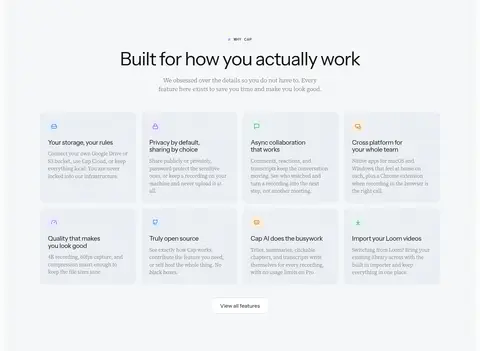
Pale, lightly separated cards with small colored icons, concise headings, and compact descriptive copy.
### Platform cards
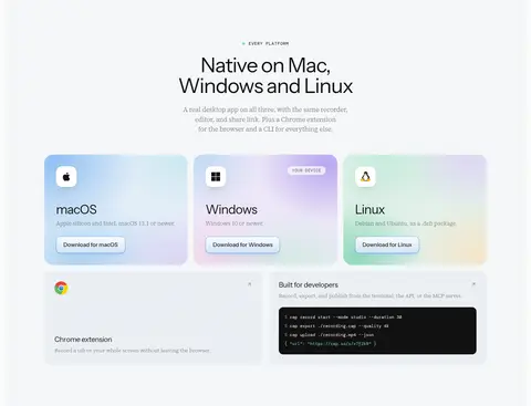
Three softly tinted platform panels with operating-system icon, short copy, and download action.
### Measured component styles
- **Primary button** (“Display”): background ## Do
- Keep the canvas predominantly white and cool near-white.
- Use blue only for focused actions, badges, and interface accents.
- Let screenshots provide most of the page’s vivid color.
- Alternate centered section introductions with aligned product splits.
- Use fine borders and soft shadows to separate media from surfaces.
- Keep explanatory copy calm, readable, and visually subordinate.
## Don't
- Do not turn the page into a saturated blue layout.
- Do not add decorative gradients to ordinary content sections.
- Do not crowd screenshots with dense surrounding text.
- Do not use heavy card outlines or strong shadows everywhere.
- Do not make every heading bold or uppercase.
- Do not treat colors inside product screenshots as global brand colors.
## Agent prompt
Build a new Cap-style SaaS page with a quiet, spacious product-first composition. Use Gallery White (## Page sections (top to bottom)
| # | Type | Layout | UX patterns | UI patterns |
|---|---|---|---|---|
| 1 | hero | Centered announcement, mode selector, headline, copy, actions, and large desktop mockup in a rounded sky panel. | Release announcement link, Mode selector, Primary download CTA, Platform availability | Cloud backdrop, Centered display headline, Blue action accent, Product mockup |
| 2 | how-it-works | Centered section heading followed by a product walkthrough and three mode-oriented content areas. | Mode comparison, Product walkthrough, Inline version link | Pale band, Three-column structure, Screenshots and video, Mode labels |
| 3 | feature-grid | Centered introduction, supporting copy, download link, and three aligned mode cards. | Mode overview, Download link, Scannable feature summaries | Small eyebrow, Three-column cards, Pale card surfaces |
| 4 | feature-split | Left-aligned text and expandable feature details beside a product recording preview. | Feature accordion, Instant share explanation, Windows version link | Two-column split, Thin divider, Product screenshot, Small benefit icons |
| 5 | feature-split | Product preview on one side and recording-quality explanation with feature rows on the other. | Recording settings overview, Expandable feature details, Platform version link | Alternating split, Screenshot frame, Fine rules, Compact feature list |
| 6 | feature-grid | Centered eyebrow, headline, and copy above a three-column by three-row gallery of feature demonstrations. | Editor feature discovery, Visual feature comparison | Nine media cards, Pale card surfaces, Screenshot thumbnails |
| 7 | feature-split | Left-side explanation and feature details paired with a screenshot editor preview. | Capture workflow explanation, Annotation and copy actions, Feature list | Two-column split, Mint-toned interface details, Product screenshot |
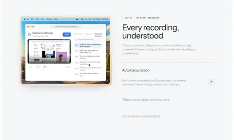
| 8 | feature-split | Recording page preview beside heading, description, and vertically arranged feature details. | Transcript discovery, Titles and chapter information, Comments and reactions | Two-column layout, Warm accent detail, Video or interface preview |
| 9 | feature-grid | Centered heading and intro above a four-column grid of short product-principle cards. | Feature discovery, View all features link | Four-column cards, Small colored icons, Soft tinted backgrounds |
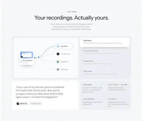
| 10 | feature-grid | Centered open-source introduction above a two-column storage diagram and supporting cards. | Storage destination comparison, Open-source trust explanation, User-controlled hosting | Workflow diagram, Testimonial card, Technical detail panels |
| 11 | integrations | Centered platform introduction, three download cards, then browser extension and developer tool panels. | Platform download choices, Extension discovery, Developer CLI overview | Three platform cards, Soft gradients inside cards, Dark code sample panel |
| 12 | feature-split | Centered introductory heading and copy above a wide dark agent-interface demonstration. | CLI setup introduction, JSON output explanation, Agent workflow demonstration | Centered section intro, Monospaced technical details, Dark product panel |
## Source CSS custom properties (selected)
```css
--fa-font-solid: normal 900 1em/1 'Font Awesome 7 Free';
--fa-font-regular: normal 400 1em/1 'Font Awesome 7 Free';
--fa-font-light: normal 300 1em/1 'Font Awesome 7 Pro';
--fa-font-thin: normal 100 1em/1 'Font Awesome 7 Pro';
--fa-font-duotone: normal 900 1em/1 'Font Awesome 7 Duotone';
--fa-font-duotone-regular: normal 400 1em/1 'Font Awesome 7 Duotone';
--fa-font-duotone-light: normal 300 1em/1 'Font Awesome 7 Duotone';
--fa-font-duotone-thin: normal 100 1em/1 'Font Awesome 7 Duotone';
--fa-font-brands: normal 400 1em/1 'Font Awesome 7 Brands';
--fa-font-sharp-solid: normal 900 1em/1 'Font Awesome 7 Sharp';
--fa-font-sharp-regular: normal 400 1em/1 'Font Awesome 7 Sharp';
--fa-font-sharp-light: normal 300 1em/1 'Font Awesome 7 Sharp';
--fa-font-sharp-thin: normal 100 1em/1 'Font Awesome 7 Sharp';
--fa-font-sharp-duotone-solid: normal 900 1em/1 'Font Awesome 7 Sharp Duotone';
--fa-font-sharp-duotone-regular: normal 400 1em/1 'Font Awesome 7 Sharp Duotone';
--fa-font-sharp-duotone-light: normal 300 1em/1 'Font Awesome 7 Sharp Duotone';
--fa-font-sharp-duotone-thin: normal 100 1em/1 'Font Awesome 7 Sharp Duotone';
--fa-font-slab-regular: normal 400 1em/1 'Font Awesome 7 Slab';
--fa-font-slab-press-regular: normal 400 1em/1 'Font Awesome 7 Slab Press';
--fa-font-slab-duo-regular: normal 400 1em/1 'Font Awesome 7 Slab Duo';
--fa-font-slab-press-duo-regular: normal 400 1em/1 'Font Awesome 7 Slab Press Duo';
--fa-font-pixel-regular: normal 400 1em/1 'Font Awesome 7 Pixel';
--fa-font-mosaic-solid: normal 900 1em/1 'Font Awesome 7 Mosaic';
--fa-font-vellum-solid: normal 900 1em/1 'Font Awesome 7 Vellum';
--fa-font-whiteboard-semibold: normal 600 1em/1 'Font Awesome 7 Whiteboard';
--fa-font-thumbprint-light: normal 300 1em/1 'Font Awesome 7 Thumbprint';
--fa-font-notdog-solid: normal 900 1em/1 'Font Awesome 7 Notdog';
--fa-font-notdog-duo-solid: normal 900 1em/1 'Font Awesome 7 Notdog Duo';
--fa-font-etch-solid: normal 900 1em/1 'Font Awesome 7 Etch';
--fa-font-graphite-thin: normal 100 1em/1 'Font Awesome 7 Graphite';
--fa-font-jelly-regular: normal 400 1em/1 'Font Awesome 7 Jelly';
--fa-font-jelly-fill-regular: normal 400 1em/1 'Font Awesome 7 Jelly Fill';
--fa-font-jelly-duo-regular: normal 400 1em/1 'Font Awesome 7 Jelly Duo';
--fa-font-chisel-regular: normal 400 1em/1 'Font Awesome 7 Chisel';
--fa-font-utility-semibold: normal 600 1em/1 'Font Awesome 7 Utility';
--fa-font-utility-duo-semibold: normal 600 1em/1 'Font Awesome 7 Utility Duo';
--fa-font-utility-fill-semibold: normal 600 1em/1 'Font Awesome 7 Utility Fill';
--background: 0 0% 100%;
--foreground: 224 71.4% 4.1%;
--card-foreground: 224 71.4% 4.1%;
```
---
本文件由 AI 辅助生成:数值取自公开网页的实测样式,命名、用途说明与建议为模型解读。商标归原所有者。
Generated by Design DNA · https://four.wiralomi.com/style/cap-so