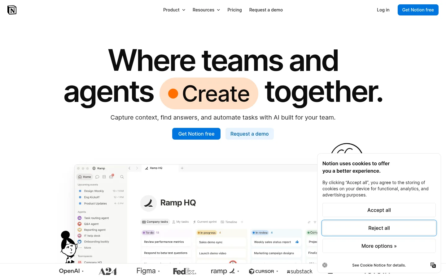
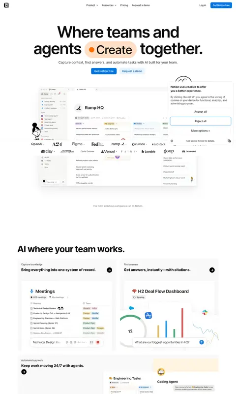
Notion 首页以明亮留白和醒目的标题呈现 AI 工作空间。产品界面、客户故事与清晰的行动按钮,让页面既实用又亲切。
North star · Keep a bright, quiet canvas and let bold type, real product views, and one clear blue action lead each section.
The page is built around a white canvas, with very light warm-gray panels separating feature areas without making the experience feel boxed in. Near-black headlines and restrained gray supporting text keep attention on the message; a saturated blue marks the primary action, while a pale blue button distinguishes the demo request. NotionInter carries the navigation, large headline, body copy, and controls, with tight display tracking creating a compact, confident hero. Lyon Text appears as a quieter editorial accent. The layout starts with a centered, oversized headline and short supporting line, then moves into product imagery, feature cards, customer stories, and a broad closing CTA. Interface screenshots and customer portraits provide color and evidence of use; vivid orange, red, and blue tones belong chiefly to those visual assets rather than the core UI palette. Fine borders, rounded cards, and subtle media shadows add structure while preserving the page’s open feel.
配色
点色块复制色值。用途说明来自对页面的实测位置(背景、文字、描边、按钮)与截图判读。
品牌色
强调色
表层色
中性色
功能色
页面底色 · Gallery White表层 · Warm Paper主文字 · Headline Black次要文字 · Gallery White弱文字 · Warm Slate描边 · Fine Line强调 · Action Blue强调 2 · Bright Blue强调 3 · Deep Blue
Primary type for headlines, navigation, body copy, and buttons.
Aa 设计
Lyon Text
网络字体 · 字重 400 · 占比 19%
免费替代:Lora
Editorial serif accent in limited supporting content.
角色
示例
字号
字重
行高
字距
特大标题
Oversized hero statement with compact line spacing and tight tracking.
Notion
96px
600
1.04
-0.048em
一级标题
Primary page or major section headline.
Notion
72px
500
1.21
-0.028em
二级标题
Large feature and closing-section headlines.
Notion
54px
700
1.04
-0.035em
三级标题
Feature group and customer-story section headings.
Notion
42px
700
1.14
-0.036em
四级标题
Card titles and smaller feature headings.
The quick brown fox 敏捷的狐狸
22px
700
1.27
-0.011em
正文
Supporting descriptions and compact explanatory copy.
The quick brown fox 敏捷的狐狸
14px
500
1.43
0
辅助文字
Small labels and footnotes around product content.
The quick brown fox 敏捷的狐狸
12px
500
1.33
0.01em
按钮
Calls to action and prominent interactive controls.
The quick brown fox 敏捷的狐狸
16px
500
1.5
0
导航
Top navigation labels and menu links.
The quick brown fox 敏捷的狐狸
14px
500
1.43
0
间距与布局
基准单位 8px · 密度:宽松
96px版块间距
8px元素间距
24px卡片内边距
1229px内容最大宽度
3px
4px
5px
6px
8px
10px
12px
15px
16px
24px
32px
A spacious, centered page uses a measured maximum width of 1229px, with a compact top navigation and a strongly centered hero. Below, product imagery and feature cards shift into multi-column groupings, followed by customer stories and a full-width closing band. Sections have generous measured separation, while content inside cards remains compact. Keep alignment deliberate: centered for the hero and closing CTA, left-aligned for feature headings and card copy. Preserve broad margins and avoid dense, edge-to-edge text.
圆角与层次
按钮 · 8px
卡片 · 12px
图片 · 12px
导航 · 8px
链接 · 12px
lg · media
hairline · nav
xl · card
The interface is mostly flat: use fine gray borders to define cards and rely on whitespace to separate sections. Media and selected cards can sit above the canvas with restrained layered shadows. Rounded card and media corners soften the product presentation; avoid heavy shadows, thick outlines, or stacked decorative layers.
组件
下面的预览按实测的按钮、输入框、徽标、卡片样式重建(字体用替代字体)。
Primary CTA
Blue filled button with white NotionInter text, an 8px radius, and compact padding; repeat at key conversion points.
Demo CTA
Pale-blue button with deep-blue text, matching the primary CTA’s rounded shape while reading as secondary.
Product feature card
Light surface with a concise heading and workspace screenshot; use a 12px card radius and measured 24px padding where applicable.
Outlined task card
White card with a fine #e5e5e5 border, 12px radius, and compact task-oriented text.
Customer story tile
Portrait-led customer quote card with saturated image treatment and legible overlay copy.
Top navigation
Quiet horizontal header with logo, grouped links, login, and a blue sign-up button; keep it visually light.
Imagery · Use product-interface screenshots as the main proof of function, framed as floating workspace views and card-based feature examples. Customer stories use portrait-led thumbnails with strong color treatments. Small illustrated marks and playful artwork can add personality, but vivid reds, golds, and blues should remain confined to media rather than spreading across the interface. Keep imagery crisp, contextual, and secondary to headline hierarchy.
Keep demo requests visually secondary on pale blue.
Show real-looking workspace interfaces in feature areas.
Use warm-gray panels sparingly to divide content.
Reserve strong colors for product media and customer stories.
✕ 不该做
Do not turn every section into a bordered card.
Do not use vivid illustration colors as global UI accents.
Do not crowd the hero with supporting copy.
Do not make secondary actions compete with the primary CTA.
Do not use heavy shadows or thick borders.
Do not replace the calm canvas with dark section backgrounds.
给 AI 的提示词
想快速出一个同风格的新页面,把这段话连同 DESIGN.md 一起发给 AI。
Build a new Notion-style productivity page with a bright, open canvas. Use Gallery White (#ffffff) as the main background, Warm Paper (#f9f9f8) for occasional feature bands, and Headline Black (#000000) for strong, tightly tracked headlines. Set interface copy in an Inter-like sans-serif; keep navigation and body text restrained, with a sparing serif accent if useful. Center the hero and its concise supporting line, then show realistic workspace imagery in spacious feature cards. Use Action Blue (#0075de) for the primary CTA and a pale-blue/deep-blue treatment for secondary actions. Keep cards softly rounded and lightly outlined in Fine Line (#e5e5e5); use subtle shadows only for media. Let customer imagery carry saturated colors, not the interface. Maintain wide section breathing room, clear alignment, and a single obvious action per content area.