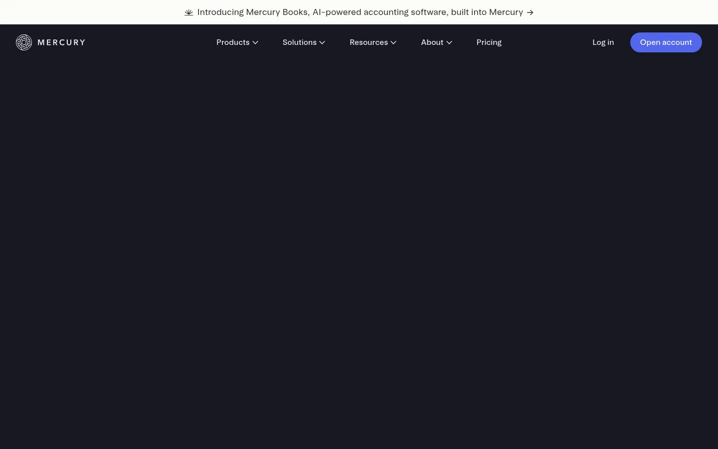
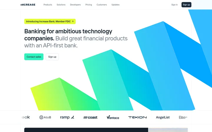
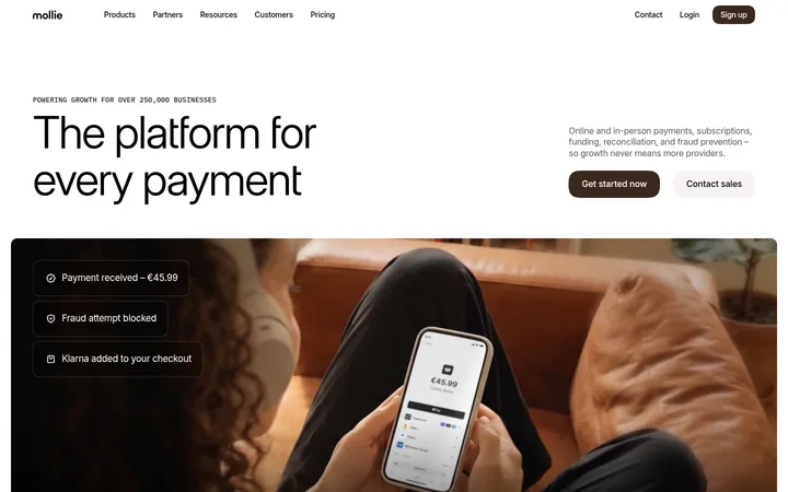
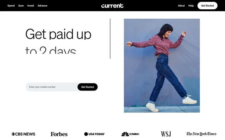
North star · Keep the deep indigo canvas uninterrupted and use restrained bright accents to make the banking product and next action unmistakably clear.
The page is anchored by a continuous deep indigo canvas (#171721), creating a quiet backdrop for pale text and product demonstrations. White appears in the announcement strip and other inverse elements, while brighter blue is reserved for the primary account-opening action. Arcadia provides the main interface typography; Arcadia Display gives headings a softer, spacious editorial character. The layout moves through generous, mostly dark section bands, with centered statements and logo proof alternating with split product features and compact multi-column modules. Product imagery shows financial interfaces and supporting illustrations rather than lifestyle photography, keeping the product itself central. Cards use a slightly lifted dark surface and fine muted borders instead of prominent shadows. The overall contrast is controlled: bright text and accents are focused on navigation, key actions, section headings and selected interface details, while supporting copy stays muted.
Body copy, navigation, buttons, links, captions and supporting labels.
Aa 设计
arcadiaDisplay
网络字体 · 字重 480 / 360 · 占比 11%
免费替代:DM Sans
Display headlines and section headings.
角色
示例
字号
字重
行高
字距
特大标题
Large opening or major campaign headlines.
Mercury
65.5px
480
1.1
0
一级标题
Primary page headline and key top-level statements.
Mercury
42px
480
1.15
0.01em
二级标题
Major feature and section headings.
Mercury
32px
480
1.15
0.015em
三级标题
Subsection and feature-card headings.
Mercury
28px
360
1.2
0.015em
四级标题
Smaller feature titles and content-card headings.
The quick brown fox 敏捷的狐狸
24px
480
1.2
0.02em
正文
Feature explanations, testimonials and supporting paragraphs.
The quick brown fox 敏捷的狐狸
18px
360
1.35
0
辅助文字
Footnotes, disclaimers and compact legal labels.
The quick brown fox 敏捷的狐狸
12px
400
1.4
0.02em
按钮
Primary and secondary action labels.
The quick brown fox 敏捷的狐狸
16px
420
1
0
导航
Header navigation and footer navigation labels.
The quick brown fox 敏捷的狐狸
16px
420
1
0
链接
Inline actions, resource links and disclosures.
The quick brown fox 敏捷的狐狸
16px
420
1
0
间距与布局
基准单位 8px · 密度:宽松
32px版块间距
32px元素间距
32px卡片内边距
1024px内容最大宽度
1px
2px
4px
8px
12px
16px
20px
24px
32px
40px
72px
128px
The measured content max width is 1024px, with a spacious density and a consistent 8px-based spacing system. A long single-page sequence keeps the same dark canvas while changing alignment by content: centered brand statements, split feature/product presentations, and three-column benefit groups. Navigation spans the top; later footer content uses multiple columns. Sections have generous breathing room, with measured 32px section and element gaps and 32px card padding. Keep copy blocks readable and avoid crowding product imagery.
圆角与层次
按钮 · 4px
卡片 · 12px
图片 · 50%
导航 · 4px
链接 · 4px
没有测到阴影:页面是扁平的,层次靠底色和描边区分。
The interface favors flat, dark surfaces over noticeable shadows. Separate raised content with the measured #1e1e2a card surface and fine #70707d or #4e4f5f outlines. Layering is most visible in product mockups and the lighter announcement strip; keep the page itself visually calm.
组件
下面的预览按实测的按钮、输入框、徽标、卡片样式重建(字体用替代字体)。
Announcement strip
A narrow white band above the dark navigation, with centered announcement copy and a small directional cue.
Primary account CTA
Use #5266eb with white text for the Open account action; the measured component has a pill-like rendered shape.
Top navigation
Place the Mercury mark at left, product and company links across the center, and login plus account action at right.
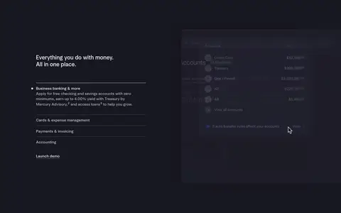
Product feature split
Pair concise copy and feature selectors with a larger banking-interface mockup; maintain generous space around both.
Benefit modules
Use three-column groups for getting started, payments and financial benefits, with headings, short descriptions and product visuals.
News cards
Show press highlights on #1e1e2a cards, with muted borders, restrained text and consistent interior padding.
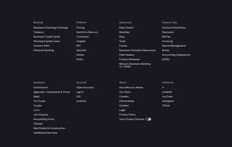
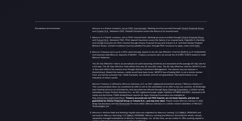
Footer and disclosures
Arrange grouped navigation links in columns, then separate dense legal text with a fine horizontal rule.
Imagery · Product-interface imagery is the defining visual: dark banking dashboards, cards and account views appear beside feature copy. The opening section includes media, while later blocks mix interface images and small illustrations. Use clean, controlled crops and keep mockups visually integrated with the dark canvas. Customer logos and interface graphics provide proof and detail; avoid introducing unrelated lifestyle photography or decorative imagery.
Use #171721 as the dominant canvas across the page.
Reserve #5266eb for the primary account-opening action.
Keep headings pale and supporting text visibly muted.
Pair banking-product visuals with the feature they explain.
Use measured spacing to preserve a spacious rhythm.
Keep card edges subtle and shadows understated.
✕ 不该做
Do not add bright section backgrounds absent from the page.
Do not use the accent blue as a large decorative field.
Do not crowd product mockups with surrounding copy.
Do not style every link as a primary button.
Do not introduce heavy shadows or thick borders.
Do not substitute lifestyle imagery for product-led visuals.
给 AI 的提示词
想快速出一个同风格的新页面,把这段话连同 DESIGN.md 一起发给 AI。
Build a new Mercury-style fintech page with a continuous Midnight Indigo (#171721) canvas. Use Soft Porcelain (#ededf3) for clear headings and navigation, Silver Haze (#c3c3cc) for supporting copy, and Mercury Blue (#5266eb) only for the main action. Use Arcadia-like sans typography, with a softer display face for large editorial headings. Keep the layout spacious within the measured 1024px content width: alternate centered proof statements with split feature-and-dashboard sections and compact multi-column benefit groups. Use dark interface imagery that feels integrated into the canvas. Raise selected cards with Raised Night (#1e1e2a), defining their edges with restrained Slate Hairline (#70707d). Keep the header simple, actions easy to identify, section transitions calm, and the footer organized into link columns followed by dense disclosures.