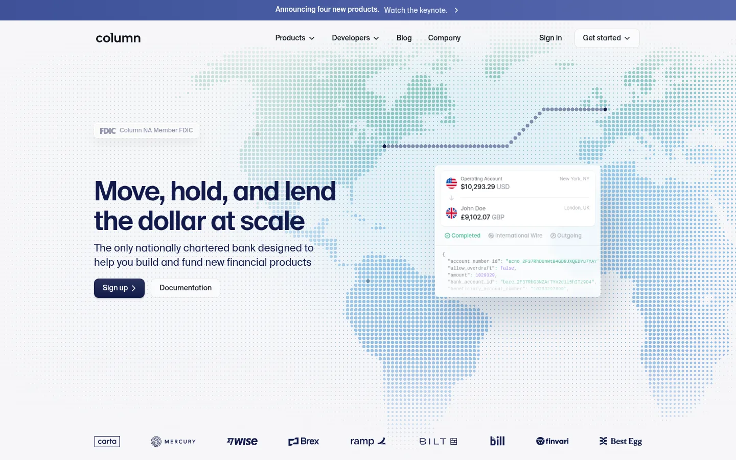
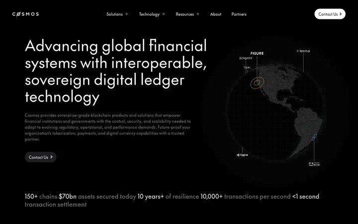
North star · Keep the canvas quiet and spacious, then use real-feeling financial product UI and disciplined navy typography to make infrastructure understandable.
The page uses a cool near-white canvas (#f6f6f8) as its main field, with a subtle dotted world map and pale blue-green tones carrying the hero imagery rather than competing with the message. Dark navy headings (#111a4a) establish a strong reading anchor; muted gray supports secondary copy and navigation. A single dark, full-width infrastructure section (#011821) creates a clear change of pace, while green highlights mark selected status and product details. SuisseIntl supplies the clean, humanist sans-serif voice, with mono captions and code labels adding a developer-facing layer. Content aligns to a spacious central grid, generally left-aligned, and alternates explanatory copy with product UI, customer proof, and technical diagrams. Cards and buttons have softly rounded corners; fine borders and restrained shadows separate interface mockups from the quiet canvas. The overall effect is precise and approachable, not ornamental.
配色
点色块复制色值。用途说明来自对页面的实测位置(背景、文字、描边、按钮)与截图判读。
品牌色
强调色
表层色
中性色
页面底色 · Cloud Canvas表层 · Paper White表层 2 · Deep Harbor表层 3 · Mist Panel主文字 · Column Navy次要文字 · Quiet Gray弱文字 · Paper White描边 · Soft Divider强调 · Ledger Green强调 2 · Signal Orange强调 3 · Mint Highlight
Code samples, compact captions, and technical labels.
Aa 设计
SuisseIntl
网络字体 · 字重 300 / 500 / 400 / 600 · 占比 44%
免费替代:Inter
Headings, body copy, navigation, links, and buttons.
Aa 设计
Inter
网络字体 · 字重 500 / 600 / 400 · 占比 5%
免费替代:Inter
Some product-interface headings and compact UI labels.
角色
示例
字号
字重
行高
字距
一级标题
Hero headline; concise, prominent statement aligned to the content column.
Column
40px
500
1.1
-0.02em
二级标题
Major section headings and key explanatory statements.
Column
28px
500
1.1
-0.01em
三级标题
Product and feature subheadings, including denser interface content.
The quick brown fox 敏捷的狐狸
24px
600
1.5
-0.03em
四级标题
Smaller feature titles and supporting content headings.
The quick brown fox 敏捷的狐狸
20px
500
1.1
0
正文
Explanatory paragraphs, product descriptions, and customer context.
The quick brown fox 敏捷的狐狸
16px
300
1.38
0
辅助文字
Compact mono labels, code details, and technical annotations.
The quick brown fox 敏捷的狐狸
12px
400
1.5
0
导航
Header navigation and primary menu labels.
The quick brown fox 敏捷的狐狸
14px
500
1
0
链接
Secondary navigation, inline references, and footer links.
The quick brown fox 敏捷的狐狸
14px
300
1.5
0
代码
API snippets and developer-facing examples.
const style = 1;
12px
400
1.5
0
间距与布局
基准单位 4px · 密度:宽松
140px版块间距
4px元素间距
—卡片内边距
1072px内容最大宽度
2px
4px
6px
8px
12px
16px
20px
24px
32px
40px
48px
Use a centered, spacious content grid with a measured page maximum of 1072px. The hero is left-aligned and paired with a large full-bleed dotted map and floating transaction UI. Follow with proof and product stories, then create contrast with a dark infrastructure band. Keep reading columns clear, alternate copy and interface-led areas, and reserve a substantial vertical pause between major sections. Avoid crowding the logo strip and footer navigation.
圆角与层次
按钮 · 8px
卡片 · 8px
徽标 · 5px
导航 · 8px
链接 · 8px
inset · other
hairline · text
hairline · button
inset · other
Most page areas remain flat, with fine borders defining cards and controls. Interface cards lift gently from the canvas through restrained shadows and white surfaces. Keep the hero transaction panel and API examples visually distinct, but avoid heavy shadows or deep stacked-card effects.
组件
下面的预览按实测的按钮、输入框、徽标、卡片样式重建(字体用替代字体)。
Announcement strip
A narrow blue-toned message band above the navigation, with centered announcement copy and a small directional cue.
Header navigation
Column wordmark at left, compact SuisseIntl navigation across the center, and sign-in plus a softly rounded Get started control at right.
Hero
Left-aligned headline, supporting copy, FDIC label, and paired actions over a dotted world map with a floating transaction interface.
Primary and secondary buttons
Use a navy #111a4a primary with white text and a white or near-white secondary control; both use an 8px radius.
Product interface card
White, softly rounded financial UI panels with compact labels, transaction rows, status colors, and developer-oriented details.
Infrastructure section
A full-width #011821 band containing tightly structured technical content, diagrams, links, and selected bright accents.
Customer logo strip
A low-profile row of customer marks beneath the hero, spaced evenly and kept visually secondary.
Imagery · The hero relies on a dotted world map rather than photography, using cool, pale blue-green tones behind the headline and a transaction card. Product mockups, account activity, API snippets, and diagrams appear as interface-led illustrations throughout. Keep these visuals crisp, lightly layered, and legible; use colored gradients and brighter accents mainly inside artwork, not as broad page fills.
Anchor key headings and primary actions in #111a4a.
Keep large areas open and align copy consistently to the content grid.
Use dotted maps and product UI to explain financial infrastructure.
Reserve #011821 for a distinct technical section.
Use green, cyan, orange, and violet accents sparingly inside interface details or artwork.
✕ 不该做
Do not turn the page into a dark theme; dark color is a section-level contrast.
Do not use bright accent colors as broad page backgrounds.
Do not crowd the hero with extra copy or competing visual elements.
Do not replace the dotted map and UI-led imagery with generic lifestyle photography.
Do not use heavy shadows or thick borders on every card.
Do not center every section; preserve the page's strong left-aligned reading flow.
给 AI 的提示词
想快速出一个同风格的新页面,把这段话连同 DESIGN.md 一起发给 AI。
Build a new fintech infrastructure page in Column’s visual style. Use Cloud Canvas (#f6f6f8) for the main background, Column Navy (#111a4a) for headings and the primary action, and Quiet Gray (#7c7f88) for supporting text. Keep the layout spacious and centered within the measured 1072px content width, with left-aligned editorial copy. Create a hero that pairs a clear headline with dotted-map artwork and a believable transaction interface card. Use Paper White (#ffffff) panels, fine Soft Divider (#e3e4e8) borders, and restrained shadows. Add a contrasting Deep Harbor (#011821) technical section, with Ledger Green (#44b48b) and other bright accents confined to status details or artwork. Set body and headings in a SuisseIntl-like sans serif; use mono labels for code. Favor legibility, restrained hierarchy, and generous section pauses.