North star · Let spacious, high-contrast typography and real product UI explain the product; reserve green for meaningful status signals.
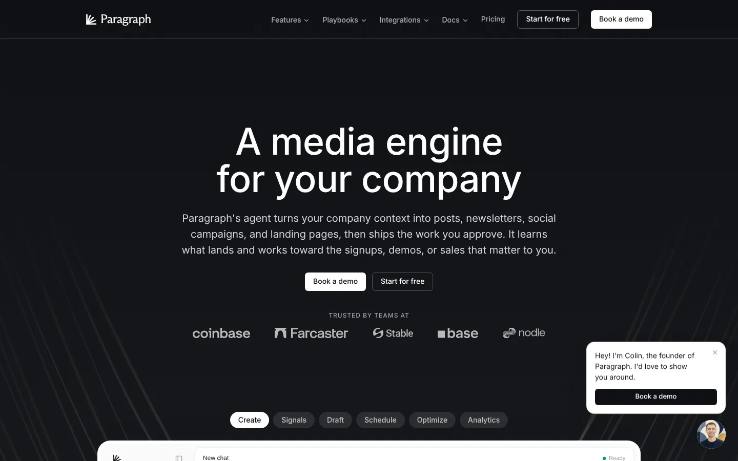
The page alternates a near-black canvas with expansive white content sections, creating a clear shift from brand-led introduction to product explanation and back to a dark closing CTA. White and near-black do most of the work; warm off-white cards soften dense UI examples, while muted grays establish supporting copy and fine structure. Emerald is a rare signal for integrations, progress, and status rather than a broad decorative field. Inter Variable provides a contemporary, neutral voice: the hero is large, centered, light in weight, and tightly led, while body copy stays readable and calm. A spacious centered hero gives way to left-aligned feature narratives, modular cards, stats, and an updates carousel. Product screenshots, interface mockups, maps, and small integration marks supply visual evidence. Thin borders and restrained shadows define layers without making the page feel heavily boxed.
Primary system for hero and section headings, body copy, navigation, links, and buttons.
Aa 设计
Inter
系统字体 · 字重 400 / 500 · 占比 4%
免费替代:Inter
Small UI labels and a few compact badges.
Aa 设计
ui-monospace
系统字体 · 字重 400 / 600 · 占比 2%
免费替代:IBM Plex Mono
Code-like labels and technical snippets in product imagery.
角色
示例
字号
字重
行高
字距
特大标题
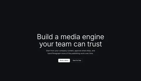
Centered hero headline and prominent closing CTA headline.
Paragraph
72px
350
1.02
-0.011em
一级标题
Major section headings and primary page-level product statements.
Paragraph
40px
600
1.1
0
二级标题
Supporting introductory and explanatory section copy.
The quick brown fox 敏捷的狐狸
20px
400
1.55
0
正文
Feature descriptions, hero explanation, and standard paragraph text.
The quick brown fox 敏捷的狐狸
16px
400
1.5
0
辅助文字
Small card descriptions, supporting metadata, and fine print.
The quick brown fox 敏捷的狐狸
14px
400
1.71
0
按钮
Primary and secondary CTA labels and compact control text.
The quick brown fox 敏捷的狐狸
14px
500
1.43
0
导航
Header navigation and footer navigation labels.
The quick brown fox 敏捷的狐狸
14px
400
1.71
0
链接
Prominent update titles and key inline links.
The quick brown fox 敏捷的狐狸
18px
600
1.33
0
眉题
Uppercase section labels and small contextual overlines.
The quick brown fox 敏捷的狐狸
12px
500
1.33
0.08em
代码
Short code-like snippets inside product interface visuals.
const style = 1;
10px
400
1.5
0
间距与布局
基准单位 4px · 密度:宽松
192px版块间距
8px元素间距
32px卡片内边距
1024px内容最大宽度
2px
4px
6px
8px
10px
12px
16px
20px
24px
32px
40px
48px
Use a centered content frame capped at the measured 1024px maximum, with generous open margins and a spacious section rhythm. The hero centers its heading, copy, actions, and customer logos on the dark canvas; later white sections switch to left-aligned feature introductions and modular two- or multi-column content. Product cards sit in orderly rows, while editorial updates form a horizontal feed. Keep the interface airy rather than dashboard-dense, and use clear alignment changes to distinguish narrative sections.
圆角与层次
按钮 · 6px
卡片 · 12px
图片 · 5px
徽标 · 9999px
导航 · 6px
链接 · 12px
hairline · card, other, text
sm · card, other
hairline · card
sm · other, badge
The page is mostly flat, with contrast between dark and light section bands doing the main layering work. Light cards use fine borders or very restrained hairline shadows rather than heavy depth. Rounded card corners and pill badges separate interface elements; keep edges clean and avoid pronounced drop shadows.
组件
下面的预览按实测的按钮、输入框、徽标、卡片样式重建(字体用替代字体)。
Header navigation
Compact dark-canvas navigation with white brand mark, muted links, a restrained outlined free-start action, and a light demo CTA.
Hero
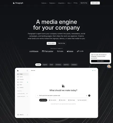
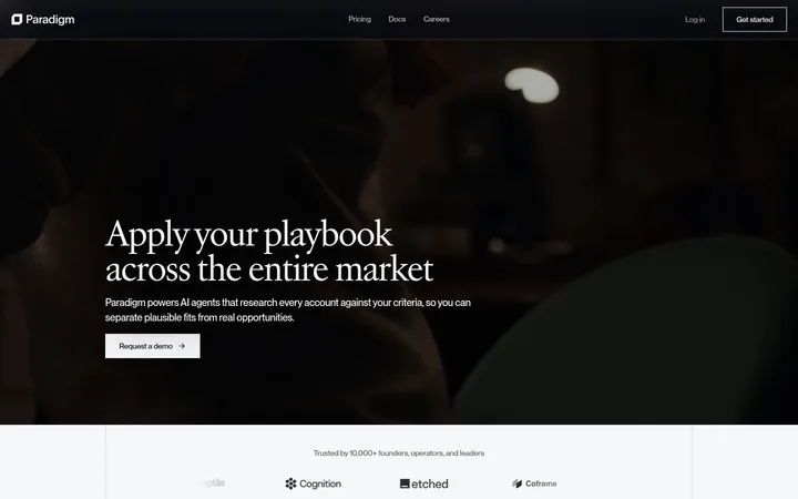
Centered white headline and muted supporting copy on near-black, followed by paired CTAs, customer logos, and a product workspace preview.
Product feature cards
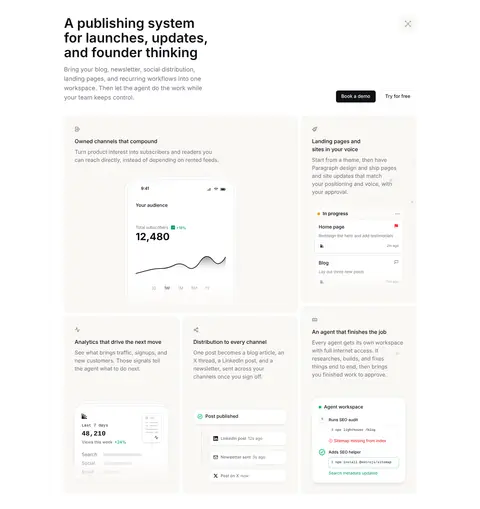
Warm off-white or white rounded panels show draft, launch, analytics, and workflow UI with concise explanatory copy.
Primary CTA
Near-black button with white medium-weight label; pair with a light inverse action where the surrounding surface is dark.
Status and integration marks
Small emerald status details and colorful integration symbols appear inside product examples, not as broad decoration.
Updates feed
Horizontal editorial cards combine dark, graphic-led thumbnails with compact metadata, prominent titles, and short descriptions.
Footer
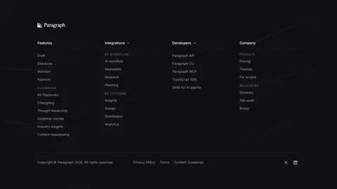
Near-black multi-column link directory with low-contrast labels, subtle separators, and a compact legal row.
Imagery · Treat product UI as the primary imagery: crisp workspace mockups, cards, charts, and integration marks demonstrate the publishing workflow. The hero places a large bright app interface against a dark background with subtle curved linework. Supporting visuals include small maps and charts rather than lifestyle photography. Preserve their clean, product-led framing and avoid adding unrelated photography or decorative 3D.
Alternate dark brand bands with broad white content sections.
Use Inter Variable for the main typographic system.
Keep the hero centered and the product workspace prominent.
Use warm off-white for selected product cards.
Reserve emerald for meaningful status or integration signals.
Separate cards with fine borders and restrained elevation.
✕ 不该做
Do not turn the page into a saturated gradient-led design.
Do not use green as a large background or primary CTA fill.
Do not crowd the hero with dense interface detail.
Do not rely on lifestyle photography to explain the product.
Do not use heavy shadows or thick borders on every card.
Do not make secondary navigation compete with the hero.
给 AI 的提示词
想快速出一个同风格的新页面,把这段话连同 DESIGN.md 一起发给 AI。
Build a new Paragraph-style SaaS page with an editorial, product-led visual system. Use Engine Ink (#0f1115) for the hero, closing CTA, footer, and primary text; contrast those bands with Gallery White (#ffffff) content sections. Use Warm Porcelain (#faf8f5) for selected UI cards, Soft Graphite (#71717b) for supporting copy, and Signal Emerald (#059669) only for meaningful status or integration accents. Set the primary typography in Inter Variable, with a large centered, light-weight hero and calm readable body copy. Use a centered content frame, generous section spacing, left-aligned feature stories, and modular product mockups. Favor clean interface screenshots, fine borders, subtle elevation, and rounded cards. Keep CTAs direct and high contrast; avoid decorative gradients, heavy shadows, and unnecessary imagery.