North star · Keep the bright, continuous canvas and black editorial typography in charge, using imagery as supporting evidence rather than decoration.
A continuous bright yellow-green canvas gives the page its defining identity, while black text, rules, and buttons provide sharp contrast and structure. The visual hierarchy pairs Signifier’s refined, lightweight serif display headings with DM Sans for navigation, explanatory copy, and controls. Hero copy sits opposite a stark silhouette on a dotted field; later sections alternate concise text and photography or organize product screenshots into compact grids. Content spans a broad measured maximum width, aligns to consistent left edges, and uses generous vertical separation rather than boxed, card-heavy layouts. The repeated background ties the many use cases, client marks, benefits, testimonial, and footer together. Images and interface mock-ups add detail and varied color, but remain supporting evidence rather than defining the brand palette. Keep controls square, black, and legible; use the muted ochre accent sparingly for secondary links and form details.
Navigation, body copy, labels, buttons, links, and most section headings.
Aa 设计
Signifier
网络字体 · 字重 300 · 占比 5%
免费替代:Cormorant Garamond
Display and H1 headlines, especially the hero and editorial section titles.
角色
示例
字号
字重
行高
字距
特大标题
Oversized editorial statements and prominent display headlines.
Carrot
72px
300
1.15
-0.01em
一级标题
Hero headline and primary page-level heading.
Carrot
50px
300
1.15
-0.01em
二级标题
Main section headings and important content titles.
Carrot
29px
400
1.25
0
三级标题
Feature, benefit, and product-item headings.
The quick brown fox 敏捷的狐狸
24px
400
1.25
0
正文
Explanatory copy, product descriptions, and section paragraphs.
The quick brown fox 敏捷的狐狸
20px
400
1.25
0
辅助文字
Small supporting notes, attribution, and privacy text.
The quick brown fox 敏捷的狐狸
17px
400
1.25
0
按钮
Primary and secondary action labels.
The quick brown fox 敏捷的狐狸
20px
400
1.4
0
导航
Header navigation and footer navigation labels.
The quick brown fox 敏捷的狐狸
20px
400
1.25
0
链接
Inline links and case-study actions.
The quick brown fox 敏捷的狐狸
20px
400
1.25
0
间距与布局
基准单位 8px · 密度:宽松
40px版块间距
32px元素间距
—卡片内边距
1360px内容最大宽度
4px
8px
9px
10px
12px
14px
16px
24px
32px
40px
48px
120px
198px
Use a broad measured page maximum of 1360px, with content aligned to consistent left edges and ample side margins. The hero uses two columns: editorial text on the left and a graphic field on the right. Subsequent blocks alternate two-column industry stories with compact three- or four-column product and benefit grids. Separate major bands with thin dark rules and generous vertical gaps; maintain a spacious overall density while allowing the footer to become information-dense. Keep headings left-aligned and avoid floating card layouts.
圆角与层次
没有测到阴影:页面是扁平的,层次靠底色和描边区分。
The design is predominantly flat: no measured shadow system or radius scale. Use thin black horizontal rules to distinguish major content bands, and square black controls for crisp separation. Product screenshots and photographs provide their own depth and contrast; avoid adding decorative card shadows or rounded containers.
组件
下面的预览按实测的按钮、输入框、徽标、卡片样式重建(字体用替代字体)。
Header navigation
A compact top bar with the Carrot wordmark, inline navigation, and black Demo and Log in controls. Keep labels dark and the bar visually integrated with the canvas.
Hero
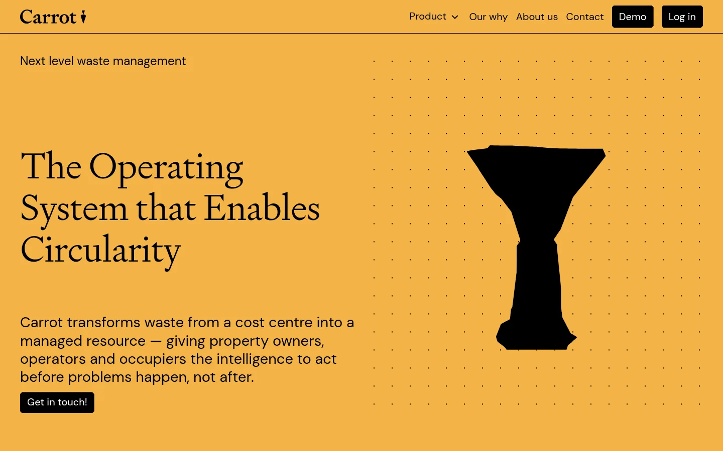
Two-column introduction: small sans-serif kicker, large light serif headline, body copy, and a square black contact CTA beside a dotted graphic field.
Feature tiles
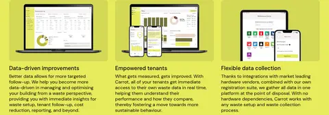
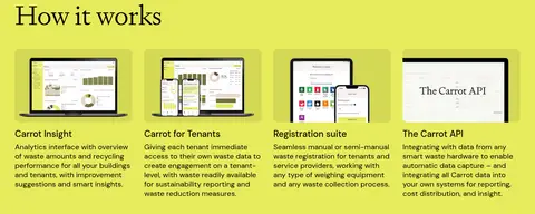
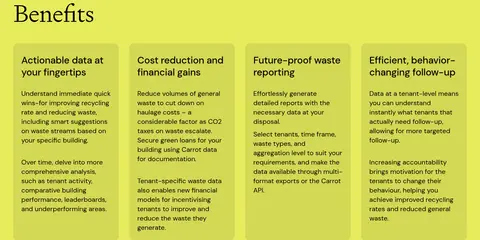
Three- or four-column product and benefit summaries with concise DM Sans titles and copy; product sections pair interface imagery with short explanations.
Industry story
Two-column case or sector block pairing a left-aligned serif title, explanatory text, and compact action with rectangular contextual photography.
Case-study proof
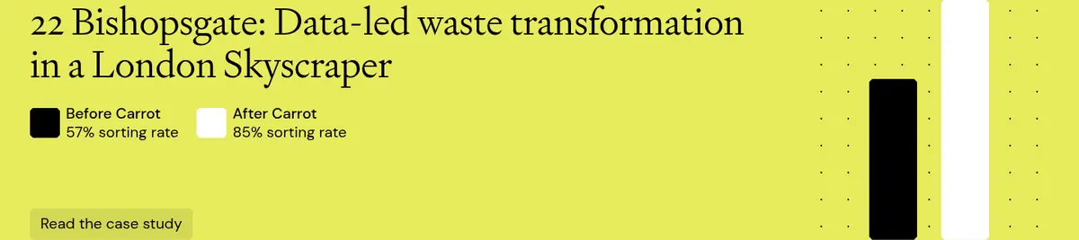
A concise performance story with sorting-rate comparison, a dotted graphic, and an ochre-backed case-study link.
Newsletter form
Footer subscription area with explanatory text, ochre input treatment, black submit button, and a compact privacy-policy note.
Footer
Dense multi-column link groups for product, company, social, and contact information, ending with the Carrot wordmark.
Imagery · Combine real-world waste and building photography with product-interface screenshots, client logos, and a simple black hero silhouette over a dotted field. Keep images rectangular and clearly framed within their columns; mock-ups may sit on softly contrasting image backdrops. Photography and interface details bring specificity, but should not override the bright page canvas or the black-and-serif identity.
Use the measured Harvest Gold canvas as the unifying page color.
Set display headlines in a light editorial serif.
Use DM Sans for navigation, body copy, and controls.
Keep major content aligned to clear left edges.
Use black square CTAs for high-contrast actions.
Show product interfaces and contextual waste imagery as evidence.
Separate long content runs with fine horizontal rules.
✕ 不该做
Do not introduce unmeasured colors as brand colors.
Do not replace the bright canvas with large white panels.
Do not make every section a rounded card.
Do not use heavy shadows or decorative gradients.
Do not center all headings or body copy.
Do not let mock-up colors redefine the page palette.
给 AI 的提示词
想快速出一个同风格的新页面,把这段话连同 DESIGN.md 一起发给 AI。
Build a new Carrot-style SaaS page around a continuous Harvest Gold (#eecf52) canvas, using Carbon Ink (#000000) for typography, rules, and square primary actions. Use Muted Ochre (#dbbf4c) only for secondary link or form emphasis; keep Olive Brown (#564b1e) sparse and Clean White (#ffffff) chiefly for contrast. Pair a light editorial serif such as Signifier for large headlines with DM Sans for navigation, body copy, and controls. Establish a broad, left-aligned content grid, then vary the rhythm with a two-column hero, split image-and-copy stories, and compact feature grids. Favor generous section separation and thin rules over cards, shadows, or ornament. Use rectangular product screenshots and contextual photography as supporting proof, not as the source of the brand palette.