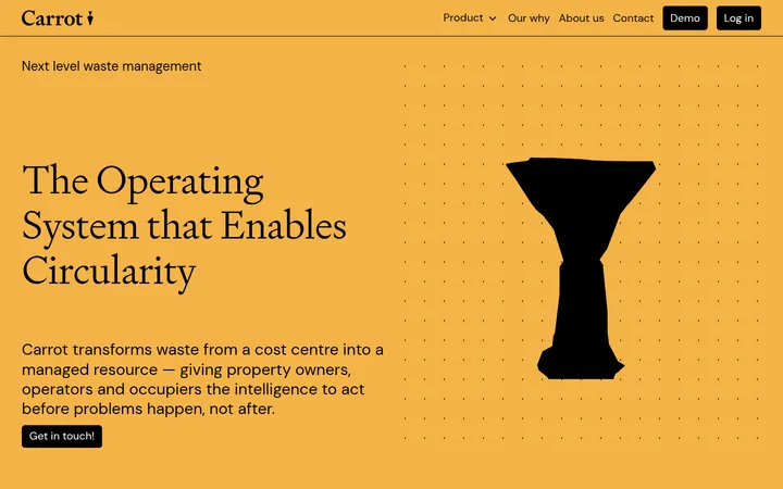
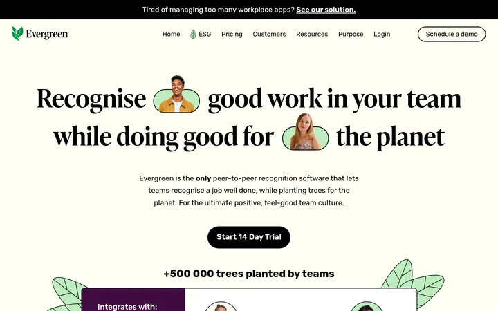
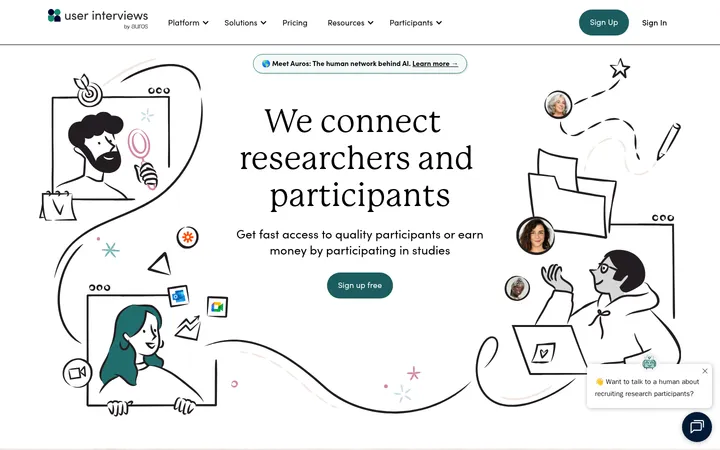
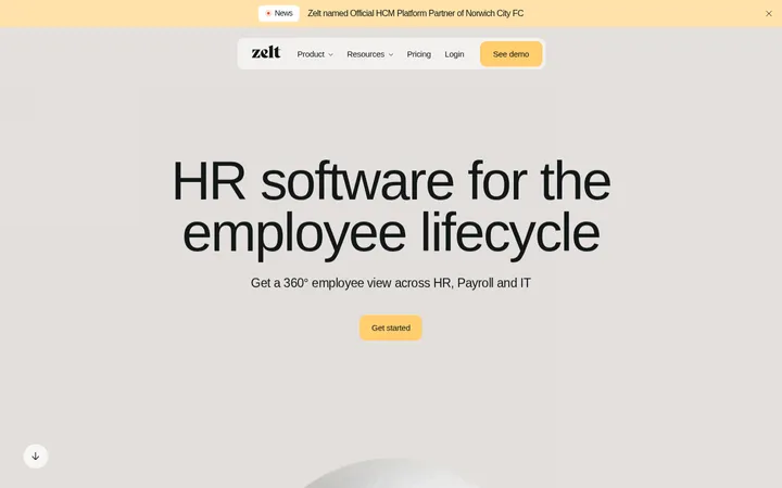
North star · Build a calm, editorial canvas around clear product evidence, using orange only as a precise brand signal.
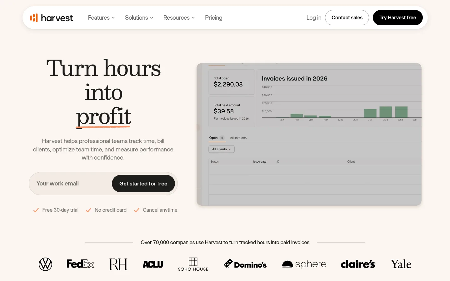
The visual identity centers on a warm cream canvas (#fbf5f0), softened by white section bands and pale beige cards. Near-black text anchors the page, while orange is used sparingly for the Harvest mark, small interface details, and emphasis rather than as a broad page fill. Large Besley serif headlines give the hero and section introductions an editorial, confident voice; Muoto VAR keeps navigation, explanatory copy, and controls crisp and human. The homepage moves between centered section introductions and left-aligned feature content, with generous breathing room and a measured maximum content width. Product screenshots and UI mockups are framed as evidence of the software, often against warm orange surrounds. Rounded pill controls and soft card corners contrast with thin, low-contrast dividers. Customer quotes and recognizable client marks add credibility without displacing the product from the visual hierarchy.
Navigation, body copy, labels, buttons, and compact feature headings.
Aa 设计
Besley
网络字体 · 字重 400 · 占比 20%
免费替代:Lora
Display and large page-section headlines, including the hero statement.
角色
示例
字号
字重
行高
字距
特大标题
Primary oversized hero statement.
Harvest
70px
400
1.1
-0.04em
一级标题
Hero headline and top-level page title.
Harvest
67px
400
1.1
-0.04em
二级标题
Major section introductions, often centered.
Harvest
50px
400
1.1
-0.04em
三级标题
Feature headings and supporting section titles.
Harvest
30px
400
1.3
-0.04em
四级标题
Smaller card or subsection headings.
The quick brown fox 敏捷的狐狸
26px
500
1.3
-0.03em
正文
Descriptions, paragraphs, and customer-story copy.
The quick brown fox 敏捷的狐狸
16px
400
1.5
-0.02em
辅助文字
Compact labels and secondary interface details.
The quick brown fox 敏捷的狐狸
14px
400
1.5
-0.02em
按钮
Pill-shaped CTAs and action controls.
The quick brown fox 敏捷的狐狸
16px
500
1.2
-0.02em
导航
Header navigation and footer navigation links.
The quick brown fox 敏捷的狐狸
16px
400
1.5
-0.02em
链接
Inline feature and supporting navigation links.
The quick brown fox 敏捷的狐狸
16px
400
1.5
-0.02em
间距与布局
基准单位 4px · 密度:宽松
100px版块间距
24px元素间距
28px卡片内边距
1257px内容最大宽度
4px
5px
6px
7px
8px
10px
12px
15px
16px
20px
24px
30px
32px
40px
56px
60px
Use a centered content frame capped at the measured 1257px maximum width, with generous side breathing room. The hero is a two-column composition: centered copy and signup form beside a large product preview. Alternate full-width cream and white bands; center major section headings, then use left-aligned feature content and card grids beneath. The measured section rhythm is spacious, with a 100px section gap and 24px element gap as the system anchors. Keep content density moderate and let screenshots, testimonial cards, and customer marks carry proof.
圆角与层次
按钮 · 9999px
输入框 · 16px
卡片 · 20px
图片 · 20px
导航 · 9999px
md · nav
md · card
The page is mostly flat, relying on cream and white bands, pale card fills, and fine low-contrast borders to separate content. Use restrained soft shadows beneath the floating pill navigation and selected cards, matching the measured subtle depth. Rounded panels layer over warm backdrops for screenshots; avoid heavy outlines or dramatic elevation.
组件
下面的预览按实测的按钮、输入框、徽标、卡片样式重建(字体用替代字体)。
Floating navigation
White pill-shaped header on the cream canvas, with Harvest mark, muted links, outlined contact action, and black free-trial CTA; use subtle shadow.
Hero signup
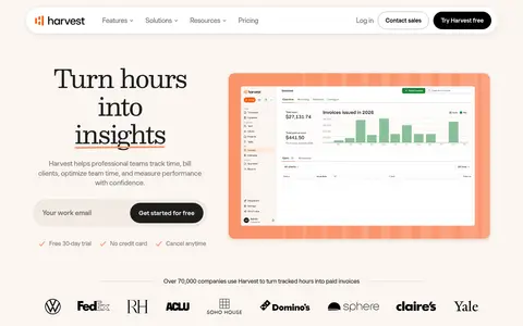
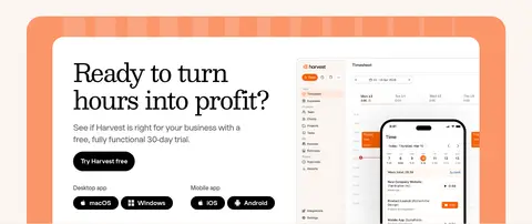
Editorial serif headline and centered supporting copy beside a product preview; combine rounded email entry and black pill CTA with short trust notes.
Product preview
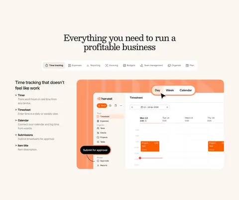
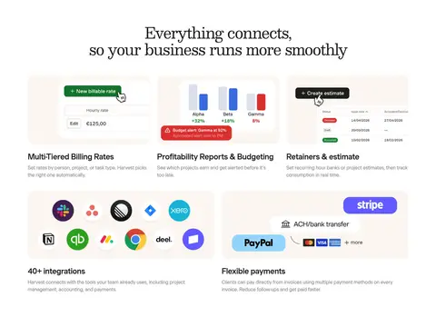
Show a legible software interface inside a softly rounded frame, sometimes set against a warm orange backing panel.
Workflow features
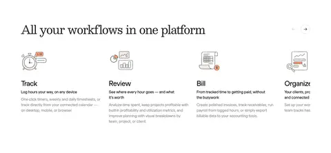
Use compact icon-led columns with concise titles, short copy, and links on the white band.
Customer proof cards
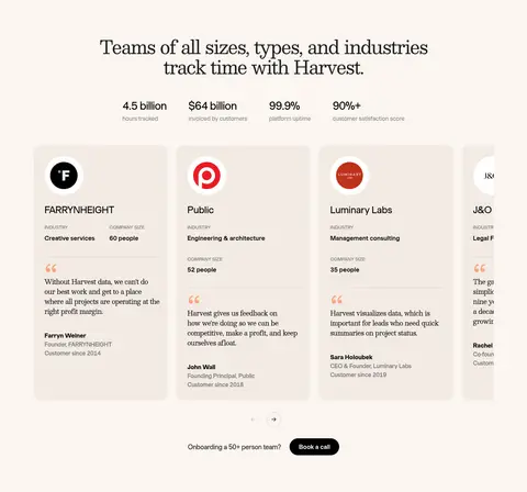
Pale beige rounded quote cards pair client identity, industry details, and testimonial copy with understated typography.
Primary CTA
Black pill button with white medium-weight Muoto text; keep orange out of the main action fill.
Footer
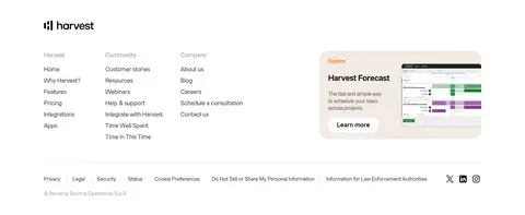
White surface with Harvest mark, grouped small navigation columns, a product promotion card, and fine muted legal links.
Imagery · Prioritize Harvest product-interface screenshots and realistic software mockups over lifestyle photography. Show timesheets, invoicing, reporting, and mobile views in clear, framed panels; warm orange surrounds appear around selected previews. Customer-story cards use restrained brand marks and quote text. Third-party logos and payment or integration marks belong inside their feature panels as product context, not as core brand colors.
Use Besley for large editorial headlines and Muoto for interface text.
Alternate cream and white section bands in a calm rhythm.
Show real product-interface details as the primary visual evidence.
Reserve orange for small brand and interface accents.
Make the free-trial action a high-contrast black pill.
Use pale beige cards and subtle dividers for supporting content.
✕ 不该做
Do not turn orange into a full-page or dominant section fill.
Do not replace the serif headline voice with generic all-sans typography.
Do not crowd the hero or section introductions with excess copy.
Do not use heavy borders or dramatic shadows on every card.
Do not make product screenshots too small to read as software.
Do not treat colors inside customer or product imagery as brand palette.
Do not make every section a dense card grid.
给 AI 的提示词
想快速出一个同风格的新页面,把这段话连同 DESIGN.md 一起发给 AI。
Create a new Harvest-style SaaS page with a warm, editorial, product-led feel. Use Harvest Cream (#fbf5f0) as the primary canvas and Gallery White (#ffffff) for alternating bands; use Carbon Ink (#000000) for headlines and primary actions, with Oat Beige (#f3ebe4) for quiet cards and Harvest Orange (#fa5d00) only for precise accents. Set major headlines in Besley or a close serif substitute and all navigation, body copy, and controls in Muoto VAR or Inter. Build a clear centered content frame with generous breathing room, alternating centered introductions and practical feature layouts. Show product UI in softly rounded panels, add restrained shadows and hairlines, and make the main CTA a black pill. Keep trust evidence visible but secondary.