North star · Use near-black framing and generous pale panels to make bold product UI the focal point, then reserve vivid accents for meaningful controls and feature cues.
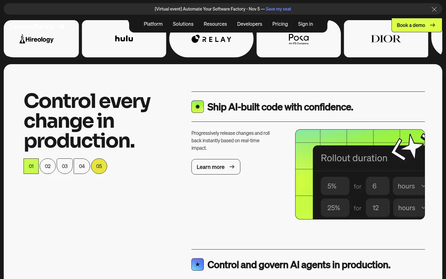
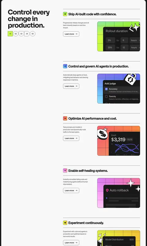
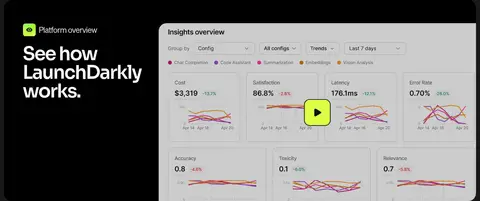
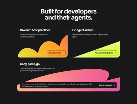
The page alternates a near-black canvas (#191919) with large off-white panels (#f8f8f8), creating a strong frame around the product story. Dark sections carry centered or left-aligned white headings; the main feature sequence sits inside a spacious pale panel with a large lead statement and repeated horizontal feature rows. Headings use a heavy, compact sans with tight line spacing, while body copy stays smaller and quieter. Thin charcoal rules divide content rather than shadows. Bright lime anchors important actions and numbered controls; orange, blue, and pink appear as selective feature cues and colorful product artwork. Screenshots, dashboard mockups, and bold abstract shapes keep the technical narrative visual. Rounded panels and media soften the otherwise crisp grid. The overall rhythm is comfortable and deliberate: generous section breaks, clear two-column splits, and compact text beside prominent visuals.
配色
点色块复制色值。用途说明来自对页面的实测位置(背景、文字、描边、按钮)与截图判读。
品牌色
强调色
表层色
中性色
页面底色 · Control Charcoal表层 · Panel Ivory表层 2 · Raised Charcoal表层 3 · Absolute Black主文字 · Panel Ivory次要文字 · Control Charcoal弱文字 · Muted Graphite描边 · Rule Charcoal强调 · Signal Tangerine强调 2 · Spring Green强调 3 · Volt Green
Major section headlines, especially dark product sections.
LaunchDarkly
64px
700
1
-0.05em
三级标题
Subsection and editorial feature headings.
LaunchDarkly
56px
600
1
-0.05em
四级标题
Smaller feature and content-card titles.
LaunchDarkly
40px
700
1.2
0
正文
Main explanatory copy beside product visuals.
The quick brown fox 敏捷的狐狸
16px
400
1.5
-0.03em
辅助文字
Small supporting notes and image captions.
The quick brown fox 敏捷的狐狸
14px
400
1.5
0
导航
Header navigation and footer navigation links.
The quick brown fox 敏捷的狐狸
16px
400
1.5
0
链接
Compact text links and secondary actions.
The quick brown fox 敏捷的狐狸
14px
500
1.5
0
眉题
Uppercase labels above section or feature headings.
The quick brown fox 敏捷的狐狸
14px
500
1.5
0.129em
间距与布局
基准单位 8px · 密度:适中
88px版块间距
24px元素间距
24px卡片内边距
1416px内容最大宽度
1px
4px
6px
8px
10px
12px
16px
20px
24px
31px
32px
56px
88px
The page uses a centered content frame with a measured maximum width of 1416px and comfortable density. Its dominant feature area is a pale, rounded panel: a wide lead column sits beside a stacked sequence of product rows. Subsequent dark sections alternate between centered headlines, two-column feature splits, media-led cards, and multi-column resources. Sections keep a measured 88px rhythm, with 24px between related elements and 24px card padding. Alignment shifts intentionally between centered statements and left-aligned product storytelling.
圆角与层次
按钮 · 12px
卡片 · 16px
图片 · 12px
没有测到阴影:页面是扁平的,层次靠底色和描边区分。
The visual system is mostly flat: no measured shadows are used. Separate cards with thin #2c2c2c borders on dark surfaces or clear contrast against the pale panels. Layer product UI over colorful illustration backdrops when needed, keeping controls visibly distinct without adding heavy effects.
组件
下面的预览按实测的按钮、输入框、徽标、卡片样式重建(字体用替代字体)。
Announcement strip
A slim dark message bar sits above the navigation, with compact event copy, a colored registration link, and a close affordance.
Primary CTA
The demo action uses Electric Citron (#ddff46) with dark text; measured button corners are square on this CTA.
Feature row
Thin horizontal rules separate feature titles, short explanatory copy, a Learn more action, and a product mockup.
Product card
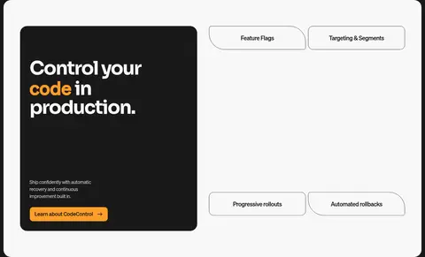
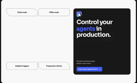
Dark product panels sit against pale or dark backgrounds, with rounded media and concise feature copy.
Feature tabs
Pill-like outlined labels name platform capabilities; measurements show card radii from 8px to 16px.
Customer story
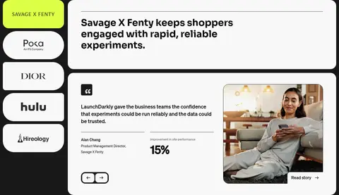
A pale, rounded testimonial panel combines a headline, quote, customer attribution, metric, and framed photo.
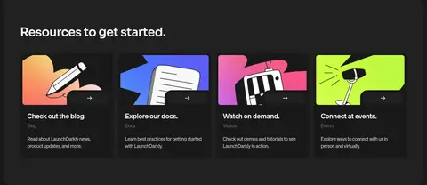
Resource cards
A compact multi-column group pairs bold, colorful illustrations with small headings and supporting links.
Imagery · Product screenshots and dashboard mockups are framed as rounded panels, often with vivid lime, blue, or warm gradient backdrops. Decorative illustrations use oversized abstract sweeps, stickers, and bright shapes rather than realistic 3D rendering. Customer photography appears in a testimonial card, cropped within its own rounded media area. Preserve readable UI detail while treating screenshots as product proof, not generic decoration.
Use #f8f8f8 for broad, high-contrast content panels.
Reserve #ddff46 for prominent actions and key markers.
Use orange, blue, and pink as selective feature signals.
Separate dense feature rows with fine horizontal rules.
Let product screenshots carry meaningful visual detail.
✕ 不该做
Do not replace the restrained palette with many competing accents.
Do not place every section on the same background color.
Do not add heavy drop shadows to otherwise flat cards.
Do not crowd the product mockups with oversized body copy.
Do not use the bright gradient as a general page background.
Do not treat illustration-only colors as core interface colors.
给 AI 的提示词
想快速出一个同风格的新页面,把这段话连同 DESIGN.md 一起发给 AI。
Build a new LaunchDarkly-style page with a near-black Control Charcoal (#191919) canvas and broad Panel Ivory (#f8f8f8) content surfaces. Use a heavy, tightly tracked geometric sans for major headings and a clean sans for navigation, body copy, labels, and actions. Structure the page with a clear centered frame, generous section breaks, and alternating two-column product stories and dark editorial sections. Use fine Rule Charcoal (#2c2c2c) dividers, flat surfaces, and rounded media or cards. Give key actions Electric Citron (#ddff46); use Signal Tangerine (#ff9d29) and Agent Blue (#405bff) sparingly for specific features. Frame crisp product screenshots with bright illustrative accents, but keep controls and copy readable. Preserve contrast, whitespace, and a deliberate hierarchy rather than adding extra decoration.