North star · Keep the storefront framework crisp and compact, then let bold uppercase type and full-bleed lifestyle photography create the energy.
The page uses white as its main canvas, allowing a sequence of large lifestyle photographs to carry most of the visual impact. Teal anchors the announcement strip and footer, while a saturated pink promotional band and lime details supply playful contrast; these measured interface colors should stay distinct from the browns, reds, and other tones inside campaign photography. Montserrat provides a consistent, assertive voice: large headings are heavy and uppercase, navigation is compact, and body copy remains small and practical. The layout moves from a slim utility bar and navigation into full-width campaign imagery, then alternates category tiles, editorial product stories, and shopping modules. White gutters and simple rectangular image blocks keep the dense assortment legible. Buttons use rounded pill silhouettes and concise uppercase labels. Favor flat, crisp surfaces and strong photographic framing over decorative shadows or elaborate card chrome.
配色
点色块复制色值。用途说明来自对页面的实测位置(背景、文字、描边、按钮)与截图判读。
品牌色
强调色
表层色
中性色
功能色
页面底色 · Gallery White表层 · Deep Current表层 2 · Cool Haze表层 3 · Cloud Gray表层 4 · Stone Gray主文字 · Hard Ink次要文字 · Gallery White描边 · Soft Divider强调 · Deep Current强调 2 · Ocean Signal强调 3 · Lime Pop
All measured page typography, from navigation and product labels to campaign headlines and buttons.
角色
示例
字号
字重
行高
字距
特大标题
Oversized uppercase campaign headline layered over hero photography.
Chubbies
56px
800
0.9
0
一级标题
Primary campaign or collection headline, set in heavy uppercase.
Chubbies
48px
800
0.9
0
二级标题
Section titles and prominent promotional headings.
The quick brown fox 敏捷的狐狸
24px
800
0.9
0
三级标题
Category, product-story, and smaller module headings.
The quick brown fox 敏捷的狐狸
18px
800
0.9
0
正文
Supporting promotional copy, descriptions, and storefront text.
The quick brown fox 敏捷的狐狸
13px
400
1.2
0
辅助文字
Small utility labels and concise image or product captions.
The quick brown fox 敏捷的狐狸
11px
700
1.2
0
按钮
Short uppercase CTA labels in bold type.
The quick brown fox 敏捷的狐狸
13px
700
1
0
导航
Main storefront categories in compact bold text.
The quick brown fox 敏捷的狐狸
15px
700
1.2
0
链接
Product, footer, and utility links in clear bold text.
The quick brown fox 敏捷的狐狸
13px
700
1.2
0
间距与布局
基准单位 4px · 密度:紧凑
32px版块间距
8px元素间距
20px卡片内边距
1344px内容最大宽度
2px
4px
6px
8px
10px
12px
14px
16px
18px
24px
32px
Build a compact storefront header above broad, image-led campaign sections. The measured maximum page width is 1344px; the 1440px screenshot keeps the main hero edge-to-edge while the product and category modules use neat multi-column rows. Use compact spacing within navigation and cards, with clearer breathing room between major modules; the measured base spacing is 4px, element gap 8px, card padding 20px, and section gap 32px. Align campaign copy over imagery and keep utility and footer content in organized columns.
圆角与层次
按钮 · 9999px
输入框 · 9999px
md · other
The interface is predominantly flat, with crisp white and colored section bands rather than stacked, shadowed cards. Separate modules through whitespace, image boundaries, and occasional fine gray borders. Inputs and buttons rely on pill-shaped outlines or fills; reserve shadows for subtle interface layering and avoid adding heavy card elevation.
组件
下面的预览按实测的按钮、输入框、徽标、卡片样式重建(字体用替代字体)。
Utility bar and navigation
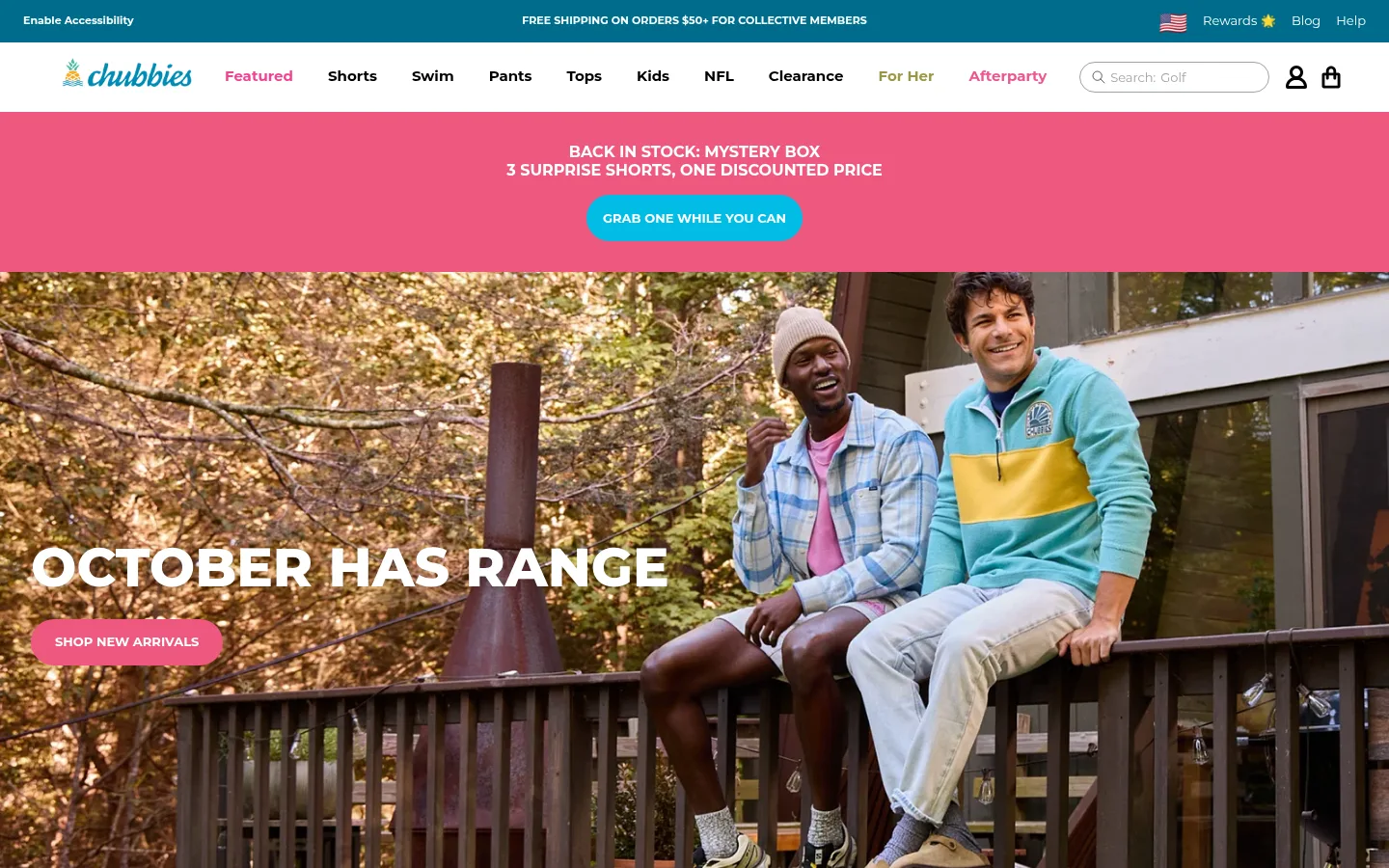
Slim deep-teal utility strip above a white navigation row, with a script-style logo, compact bold category links, search, and account/cart icons.
Campaign announcement
Full-width hot-pink message band with centered uppercase copy and a bright blue pill CTA.
Hero campaign
Edge-to-edge lifestyle photograph with a large white uppercase headline and pink pill CTA overlaid near the lower-left.
Category tiles
Four-column image grid with centered white uppercase category labels; use photos as the tile surface rather than ornamental card backgrounds.
Editorial product story
Large split or tightly cropped campaign image with a short uppercase collection title and a small pill-shaped shopping action.
Newsletter signup
Hot-pink signup band combining concise copy with a long rounded email field and compact teal subscribe button.
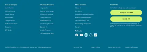
Footer
Deep-teal multi-column link directory with small white text, lime support actions, and social icons.
Imagery · Photography is the main visual asset: full-bleed scenes of people wearing the clothes, tightly framed product details, and multi-card category imagery. Use natural, candid lifestyle settings with vivid garment colors and confident human subjects. Keep images rectangular and edge-to-edge within their modules; use white gutters and occasional dark overlays or contrast to keep overlaid uppercase copy readable. No illustrative or 3D style defines the page.
Keep the canvas white and the shopping frame compact.
Use full-width lifestyle photography for major campaigns.
Set display headlines in heavy uppercase Montserrat.
Use pink and teal as clear, separate promotional signals.
Make key CTAs pill-shaped with short uppercase labels.
Organize category and footer links into tidy columns.
✕ 不该做
Do not let interface colors compete with campaign photography.
Do not use gray shimmer tones as prominent brand colors.
Avoid excessive shadows, rounded cards, or layered panels.
Do not use delicate serif display typography.
Avoid loose, oversized spacing in the storefront navigation.
Do not place white text over busy images without sufficient contrast.
给 AI 的提示词
想快速出一个同风格的新页面,把这段话连同 DESIGN.md 一起发给 AI。
Create a new Chubbies-style storefront page with a crisp white (#ffffff) canvas, compact retail navigation, and broad campaign photography that carries the personality. Use Deep Current (#006c8c) for utility and footer bands, Weekend Pink (#ee5780) for promotional sections, Ocean Signal (#0082a6) for prominent CTAs, and sparing Lime Pop (#d1f270) details. Keep interface text in Montserrat: heavy uppercase display headlines and buttons, compact bold navigation, and practical regular-weight body copy. Organize content into full-bleed hero imagery, rectangular category or product grids, and clear footer columns. Use pill-shaped buttons and simple borders; rely on whitespace and image edges instead of card shadows. Do not reuse image-specific colors as interface palette tokens.