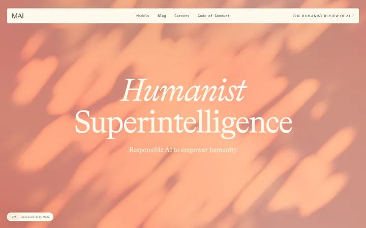
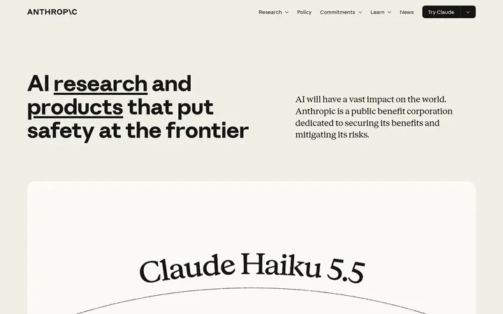
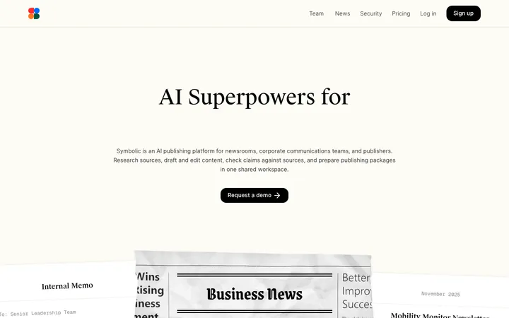
Ciridae 以克制的编辑式版面展示 AI 驱动的企业系统,暖色浅底与电影感深色媒体交替出现。窄体标题、等宽标签、细分隔线和流程示意图,让服务既显得亲切,也突出实际运营能力。
North star · Pair warm editorial restraint with precise operational diagrams, using typography and fine rules—not decorative effects—to organize the story.
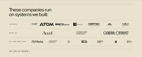
The page is built around a warm parchment canvas, #eae1ce, and clean near-white section bands, #fcfbf8, with deep charcoal media and footer sections creating strong visual pauses. Near-black #14110d carries most headings and body copy, while muted earth tones support secondary information and thin dividers. A small burnt-orange accent, #cc6437, marks the primary light-theme CTA rather than becoming a broad decorative color. Pragmatica Cond gives the large, compact headlines an editorial profile; Pragmatica handles readable body copy, and ABC Monument Grotesk Mono supplies uppercase navigation, labels, and actions. The composition moves between full-bleed hero video, spacious statement bands, a two-column operating-system diagram, a three-step process, customer marks, and testimonial cards. Most sections remain flat and square-edged, using hairlines instead of shadows. Repeated rules, compact metadata, and aligned grids lend structure without making the page feel dense.
Body copy, section headings, and readable testimonial content.
Aa 设计
ABC Monument Grotesk Mono
网络字体 · 字重 400 · 占比 26%
免费替代:Space Mono
Navigation, CTA labels, links, eyebrows, and compact technical metadata.
Aa 设计
Pragmatica Cond
网络字体 · 字重 400 · 占比 17%
免费替代:Barlow Condensed
Display headlines, hero copy, compact captions, and selected action labels.
Aa 设计
Roboto Mono
网络字体 · 字重 400 · 占比 2%
免费替代:Space Mono
Minor mono fallback for small technical details.
角色
示例
字号
字重
行高
字距
特大标题
Oversized uppercase hero statement and prominent brand messaging.
Ciridae
104px
400
0.88
-0.02em
一级标题
Primary hero or major section headline.
Ciridae
64px
400
0.96
-0.046em
二级标题
Main section headings, including the operating-system story.
Ciridae
48px
400
1
-0.042em
三级标题
Process and supporting editorial headings.
Ciridae
36px
400
1.25
-0.034em
四级标题
Compact uppercase subsection headings.
Ciridae
32px
400
1.04
-0.02em
正文
Paragraphs describing the service, process, and outcomes.
The quick brown fox 敏捷的狐狸
16px
400
1.55
0
辅助文字
Small supporting copy and diagram annotations.
The quick brown fox 敏捷的狐狸
14px
400
1.43
0
按钮
Uppercase CTA labels in monospaced styling.
The quick brown fox 敏捷的狐狸
11px
400
1.1
0.06em
导航
Compact uppercase primary navigation labels.
The quick brown fox 敏捷的狐狸
12px
400
1.5
0.04em
链接
Tracked uppercase text links and inline actions.
The quick brown fox 敏捷的狐狸
13px
400
1.3
0.06em
眉题
Small uppercase section and process pre-labels.
The quick brown fox 敏捷的狐狸
11px
400
1.35
0.08em
代码
Technical micro-labels and diagram-style metadata.
const style = 1;
11px
400
1.35
0.08em
间距与布局
基准单位 4px · 密度:宽松
128px版块间距
12px元素间距
32px卡片内边距
1258px内容最大宽度
5px
6px
8px
10px
12px
16px
18px
20px
24px
32px
40px
43px
48px
64px
Use a centered page frame with a measured maximum width of 1258px and a spacious section rhythm. Alternate full-width color bands with contained, aligned content. The operating-system feature pairs a large diagram area with explanatory steps; the process section uses three columns, while customer marks and testimonials form orderly grids. Headlines align left in editorial sections, with centered messaging reserved for the hero and select statements. Use generous breathing room, consistent hairline dividers, and compact mono labels to balance the expansive sections.
圆角与层次
按钮 · 9999px
没有测到阴影:页面是扁平的,层次靠底色和描边区分。
The interface is predominantly flat: section color changes, hairline borders, and carefully aligned rules define structure. Cards are square-cornered and outlined rather than lifted with shadows. Dark sections use tonal gradients or media texture for depth, while orange is a small functional accent, not a glow or decorative layer.
组件
下面的预览按实测的按钮、输入框、徽标、卡片样式重建(字体用替代字体)。
Primary CTA
A square-cornered burnt-orange button with near-black uppercase monospaced text; use for the prominent team-contact action on light surfaces.
Inverse CTA
Dark-filled button with pale text and a fine dark border; keep its label uppercase and monospaced.
Outlined inverse link
Pale outlined pill action on the dark footer, paired with a second compact action and no shadow.
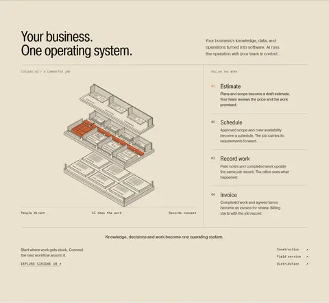
Operating-system diagram
Warm-canvas, two-column feature: isometric workflow illustration alongside a numbered list of operational steps, separated by fine rules.
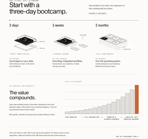
Process timeline
Three horizontally aligned milestones, from three days to three months, with small diagram illustrations and concise explanatory copy.
Testimonial card
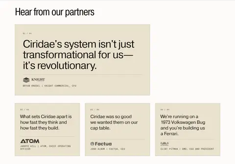
Square-cornered, lightly bordered card with a tracked sequence label, prominent quote, divider, and compact partner attribution.
Section navigation
Uppercase monospaced links arranged in compact groups, with restrained color contrast and thin separators in the footer.
Imagery · Lead with full-bleed, dark, softly blurred video imagery, treated as atmosphere behind the centered hero message rather than as a conventional product shot. Use fine-line isometric system diagrams to explain workflows, with restrained orange emphasis inside the illustration. Customer marks and partner identity graphics sit in tidy rows; testimonial cards remain typographic. Keep media understated and diagrammatic, with no glossy 3D treatment or heavy image frames.
Alternate parchment, gallery-white, and dark bands to pace the story.
Reserve burnt orange for the primary light-surface action and small diagram accents.
Use condensed display type for impactful headlines and Pragmatica for reading copy.
Set navigation, eyebrows, and CTA labels in tracked uppercase mono.
Use fine borders and aligned rules to divide content instead of shadows.
Explain product value with restrained diagrams and numbered process steps.
✕ 不该做
Do not turn the orange accent into a large background color.
Do not add drop shadows or rounded cards to the flat editorial system.
Do not crowd section transitions with dense copy or decorative elements.
Do not style every heading in monospaced type.
Do not treat illustration colors as additional core brand colors.
Do not replace the quiet video hero with glossy product photography.
给 AI 的提示词
想快速出一个同风格的新页面,把这段话连同 DESIGN.md 一起发给 AI。
Build a new Ciridae-style page as a spacious editorial narrative for AI-enabled business operations. Use Parchment Field (#eae1ce) and Gallery White (#fcfbf8) for alternating light sections, then use Carbon Night (#0b0b0b) or Soft Ink (#14110d) for strong inverse moments. Apply Burnt Signal (#cc6437) sparingly to the primary CTA. Set major headlines in a condensed sans, body copy in a clean neutral sans, and navigation, eyebrows, and actions in tracked uppercase mono. Organize the content with aligned columns, generous section breathing room, numbered steps, diagram-led feature blocks, and fine warm-gray rules. Keep cards square and flat, with borders instead of shadows. If using media, make it atmospheric and dark; use restrained technical diagrams to explain the system. Preserve clear contrast and a calm, precise hierarchy.