Gleap 以星点点缀的深色首屏开场,再转入平静温暖的浅色产品叙事。醒目的 Switzer 字体、圆角控件与渐变背景界面演示,让 AI 客服工作流清晰易懂。
North star · Use the contrast between a cinematic near-black opening and spacious warm-neutral product sections to make complex AI workflows feel calm and legible.
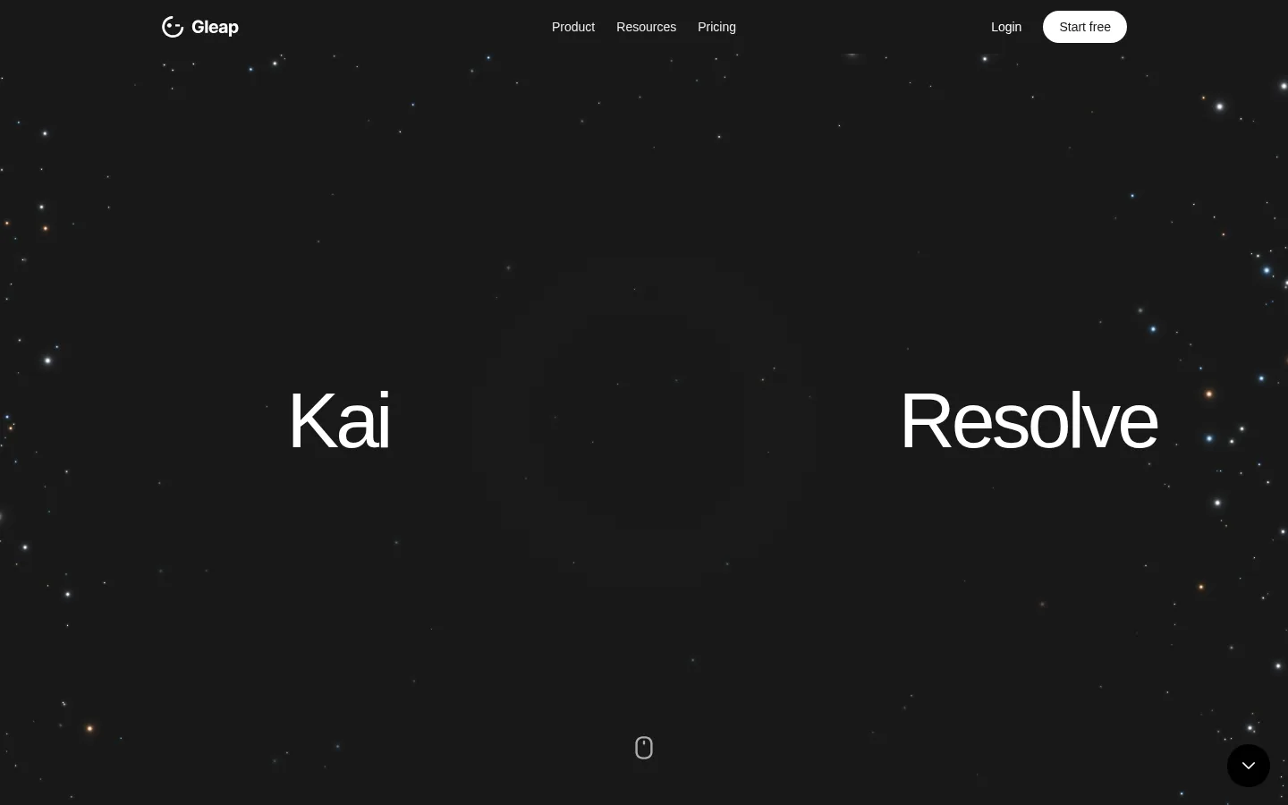
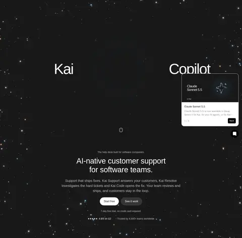
The page opens with an expansive near-black hero that uses sparse star-like details and oversized, widely separated type to create a cinematic pause. A small, unobtrusive navigation and pill-shaped light CTA sit above the dramatic field; supporting headline and buttons appear further down the hero. The rest of the page switches to a warm off-white canvas, with dark headings and muted gray copy arranged in centered introductions, alternating two-column feature stories, and broad vertical intervals. Switzer is the dominant sans serif: regular weights, compact line spacing, and tight display tracking keep large text confident without feeling heavy. Product interface mockups are framed by bright blue, lilac, and peach gradients; these are illustrative media rather than core brand accents. White cards, quiet neutral surfaces, hairline borders, and restrained shadows preserve legibility. Pricing, FAQs, proof points, and footer links continue the spacious, low-noise rhythm.
配色
点色块复制色值。用途说明来自对页面的实测位置(背景、文字、描边、按钮)与截图判读。
品牌色
表层色
中性色
功能色
页面底色 · Warm Canvas表层 · Night Ink表层 2 · Pure White表层 3 · Stone Divider表层 4 · Oat Surface主文字 · Midnight Navy次要文字 · Soft Graphite弱文字 · Charcoal Copy描边 · Stone Divider
Primary display, heading, body, navigation, and link typography.
Aa 设计
system-ui
系统字体 · 字重 500 / 600 / 400 / 700 · 占比 20%
免费替代:Inter
Small UI badges and compact labels within interface-like components.
Aa 设计
ui-monospace
系统字体 · 字重 600 / 700 / 400 / 500 · 占比 2%
免费替代:Roboto Mono
Minor technical or code-like details in product UI.
角色
示例
字号
字重
行高
字距
特大标题
Oversized hero wordmark-style phrases and high-impact display moments.
Gleap
78px
400
1.06
-0.045em
一级标题
Primary hero and major page-level headline.
Gleap
45.5px
400
1.15
-0.01em
二级标题
Feature, pricing, and closing section headings.
Gleap
40px
400
1.2
0
三级标题
Feature titles and prominent card headings.
The quick brown fox 敏捷的狐狸
27px
400
1.3
0
四级标题
Smaller section and component headings.
The quick brown fox 敏捷的狐狸
22.5px
400
1.35
0
正文
Feature descriptions, explanatory copy, and plan details.
The quick brown fox 敏捷的狐狸
16px
400
1.5
0
辅助文字
Fine print, proof notes, and image captions.
The quick brown fox 敏捷的狐狸
14px
400
1.5
0
导航
Header and footer navigation labels.
The quick brown fox 敏捷的狐狸
14px
400
1.5
0
链接
Compact inline links and supporting actions.
The quick brown fox 敏捷的狐狸
12px
400
2
0
间距与布局
基准单位 2px · 密度:适中
84px版块间距
9px元素间距
—卡片内边距
1080px内容最大宽度
1px
2px
3px
4px
5px
6px
7px
8px
9px
10px
11px
12px
14px
16px
18px
20px
A centered content system uses a measured maximum width of 1080px, with generous vertical section spacing and comfortable density. The opening hero occupies a large dark field; after it, content rests on a consistent light canvas. Centered section introductions lead into alternating two-column feature splits, with product imagery and copy trading sides. Pricing presents three adjacent plan cards, FAQs use a simple question list, and the close returns to a centered CTA before a multi-column footer. Keep alignments crisp and let large blank intervals separate stories.
圆角与层次
按钮 · 9999px
卡片 · 16px
图片 · 50%
徽标 · 9999px
导航 · 50%
链接 · 5px
lg · card, other
inset · other
md · other
lg · card
Most light sections stay visually flat, separated by whitespace and subtle neutral borders. Product cards and mockups use restrained, soft shadows to lift them from the canvas without appearing glossy. Dark pill buttons and white cards create clear contrast; use layering mainly for interface previews and the hero’s floating UI, not for stacked decoration.
组件
下面的预览按实测的按钮、输入框、徽标、卡片样式重建(字体用替代字体)。
Pill CTA
Fully rounded actions use a dark #191919 fill with white text for primary calls, or a pale neutral/light fill for secondary actions.
Hero navigation
Compact, low-contrast links sit across the top of the dark hero, balanced by a small logo and bright rounded Start free action.
Product preview card
White interface panels with rounded corners sit over vivid gradient imagery; use subtle shadowing and keep the mock UI legible.
Feature split
Alternate a concise heading and explanatory copy with a single product visual in a two-column row; use a dark pill action where relevant.
Pricing cards
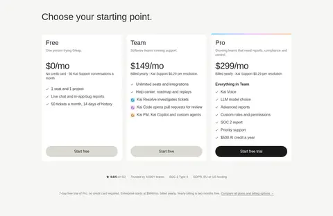
Three adjacent white plan cards organize tier name, price, short description, feature list, and a rounded action.
FAQ rows
A plain question list uses thin neutral separators and small disclosure indicators, with no heavy card chrome.
Footer directory
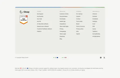
A light, softly tinted panel groups product, resource, company, and alternative links into compact columns.
Imagery · Product UI mockups carry the visual storytelling: clean white interface panels are placed over vivid blue, lilac, and peach gradient backdrops. These colorful treatments belong to illustrative product imagery, not the core page palette. The hero instead uses sparse star-like lights against near-black, with no conventional photography. Frame interface captures as clear, rounded panels and preserve readable UI details.
Use the warm off-white canvas for the long-form product narrative.
Use Switzer-like sans-serif type with restrained regular weights.
Reserve bright gradients for product interface illustrations.
Give section transitions generous breathing room.
Use rounded pill actions and subtle card edges.
✕ 不该做
Do not spread illustration colors across the core interface palette.
Do not crowd the page with dense paragraphs or tight section spacing.
Do not use heavy shadows as a default card treatment.
Do not make every section a boxed card grid.
Do not style navigation louder than the hero headline.
Do not use decorative display fonts or all-caps headings.
给 AI 的提示词
想快速出一个同风格的新页面,把这段话连同 DESIGN.md 一起发给 AI。
Build a new SaaS page in Gleap’s visual language. Use Warm Canvas (#f6f6f3) as the main content background and Night Ink (#191919) for a dramatic opening or key CTA. Set headings in a Switzer-like sans serif, with regular weights, tight tracking on large display text, and clear muted supporting copy in Charcoal Copy (#353535) or Soft Graphite (#6f6f6e). Create spacious, centered sections with alternating two-column product stories and a restrained three-card pricing area. Use white product panels over vivid gradients only as illustrative media, not as global UI colors. Keep borders quiet, shadows soft, corners rounded, and actions pill-shaped. Prioritize legibility, generous separation, and calm contrast over decoration.