North star · Use generous white space and restrained contrast to make editorial typography and real product-interface previews do the work.
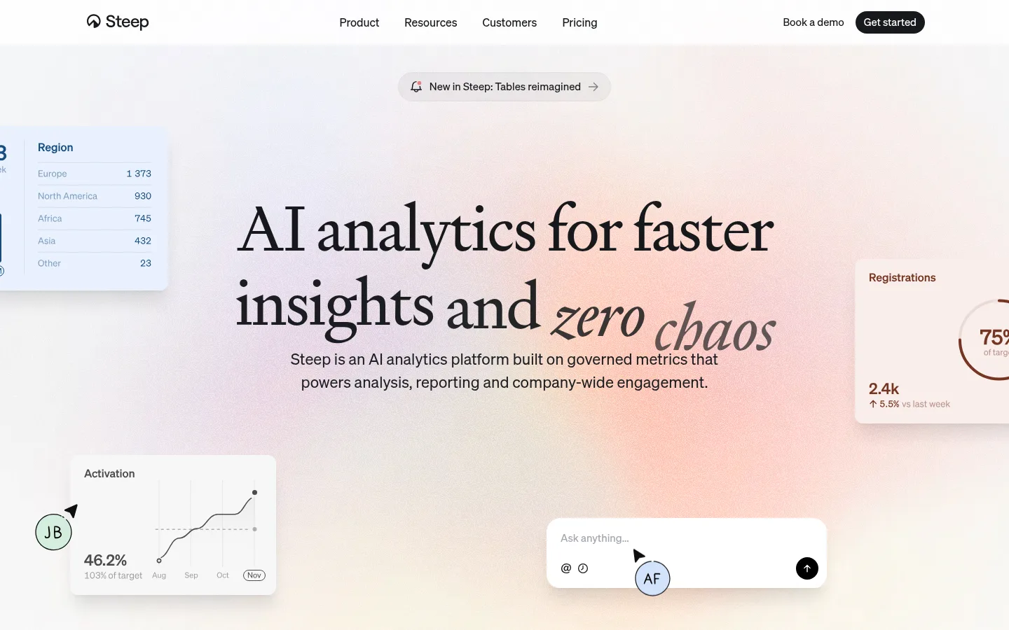
The page sets a calm, light canvas and lets a centered editorial headline lead the first impression. Signifier supplies the expressive serif display, with italic emphasis visible in the hero, while Sohne handles navigation, explanatory copy, and interface labels in a clean sans serif. Near-black text and pill-shaped dark CTAs create crisp contrast without introducing a loud brand colour. The hero’s warm blush haze is atmospheric rather than a flat section fill; surrounding analytics cards are product imagery, not a cue to expand the core palette. Lower sections alternate white space with soft gray, powder blue, peach, and near-black bands, using colour to distinguish stories and product capabilities. Spacious centered composition gives way to compact feature cards and split product showcases. Fine borders, rounded containers, and restrained shadows keep layered UI previews legible while the page remains visually quiet.
Navigation, body copy, labels, links, and button text
Aa 设计
Signifier
网络字体 · 字重 400 · 占比 2%
免费替代:Cormorant Garamond
Oversized editorial display headline, especially the hero
角色
示例
字号
字重
行高
字距
特大标题
Oversized editorial hero headline with selective italic emphasis.
Steep
90px
400
1.3
-0.025em
一级标题
Compact section headings and supporting page-level headings.
The quick brown fox 敏捷的狐狸
26px
450
1.18
-0.009em
二级标题
Feature and story section titles.
The quick brown fox 敏捷的狐狸
22px
400
1.5
0
三级标题
Feature-card titles and smaller content headings.
The quick brown fox 敏捷的狐狸
20px
500
1.35
0
正文
Hero description, feature explanations, and core page copy.
The quick brown fox 敏捷的狐狸
16px
400
1.38
0
辅助文字
Small supporting labels, product annotations, and footnotes.
The quick brown fox 敏捷的狐狸
15px
400
1.5
0
导航
Header navigation and primary menu labels.
The quick brown fox 敏捷的狐狸
16px
430
1.31
0
链接
Inline secondary links and muted navigation items.
The quick brown fox 敏捷的狐狸
16px
400
1.5
0
间距与布局
基准单位 4px · 密度:适中
80px版块间距
8px元素间距
32px卡片内边距
1200px内容最大宽度
2px
4px
6px
8px
10px
12px
14px
16px
20px
24px
32px
64px
80px
The measured content max width is 1200px, organized on a 12-column grid with comfortable density. The hero centers its headline, supporting copy, and actions while product-interface previews extend around the composition. Later content alternates broad, full-width section bands with compact card rows and split showcases. Section rhythm is generous, using an 80px measured section gap; internal gaps are tighter. Keep the header light and restrained, and let the main headline and feature imagery establish hierarchy.
圆角与层次
按钮 · 9999px
卡片 · 24px
图片 · 24px
导航 · 9999px
md · other
lg · text
lg · card
xl · media
Most sections feel flat, with separation coming from white space, background bands, and fine borders rather than heavy shadows. Product mockups and chat cards float above their surroundings with restrained soft shadows. Cards use measured 24px rounding; primary buttons and navigation pills are fully rounded. Keep layers crisp and understated.
组件
下面的预览按实测的按钮、输入框、徽标、卡片样式重建(字体用替代字体)。
Header navigation
Minimal horizontal header with the Steep mark, centered navigation links, a Book a demo text action, and a dark pill-shaped Get started button.
Announcement pill
Centered outlined capsule reading “New in Steep: Tables reimagined,” with a small alert icon and directional arrow.
Hero
Centered Signifier display headline, concise Sohne description, dark rounded CTA, and secondary Book a demo link over an understated warm gradient atmosphere.
Floating product previews
Rounded metric cards, charts, and an AI prompt panel placed around the hero; use subtle shadows and preserve their UI-like framing.
Feature cards
Three rounded capability cards with simple line illustrations; one warm peach card uses cocoa text, while the others use pale neutral surfaces.
Story band
Full-width pale-blue customer story section with compact text and actions, a monochrome customer image, and a row of customer marks.
Dark product showcase
Near-black full-width band with subdued copy and a prominent semantic-platform interface visual layered against a subtle colored glow.
Imagery · Use product-interface visuals as the main imagery: analytics cards, charts, chat prompts, and metric panels appear as clean floating previews. The hero places them around centered copy over a faint warm blush atmosphere. Line-drawn illustrations support capability cards, while a monochrome customer image sits in the blue story band. Treat the lavender and peach hues in screenshots as artwork or atmosphere, not extra foundational palette colors.
Keep the overall canvas predominantly white and quiet.
Use Signifier for large editorial display moments and Sohne for functional text.
Center hero copy and keep its CTA treatment simple and dark.
Use soft section bands to distinguish stories and product areas.
Show product UI in rounded, softly elevated panels.
Reserve peach and blue for specific cards or section bands.
✕ 不该做
Do not turn the warm hero haze into a saturated flat background.
Do not use colorful interface mockup hues as the global brand palette.
Do not add heavy borders or dramatic shadows to ordinary sections.
Do not crowd the hero with extra copy or competing calls to action.
Do not replace the editorial serif display with generic sans-serif typography.
Do not make every section a card grid; preserve broad whitespace and varied bands.
给 AI 的提示词
想快速出一个同风格的新页面,把这段话连同 DESIGN.md 一起发给 AI。
Build a new page in Steep’s calm editorial analytics style. Use Gallery White (#ffffff) as the main canvas, Soft Ink (#17191c) for core text and primary pill CTAs, and Cloud Gray (#f2f2f3) for quiet supporting surfaces. Set large headline moments in an elegant Signifier-like serif, with Sohne-like sans typography for navigation, copy, and interface details. Keep the layout spacious and centered, using a measured 1200px content maximum and broad section bands. Add product-interface previews as rounded, softly elevated panels rather than decorative stock imagery. Use Peach Panel (#fbe1d1) and Pale Sky (#d3e3fc) selectively, and Night Panel (#121212) for a contrasting showcase. Preserve subtle borders, restrained shadows, and generous breathing room; avoid loud gradients, clutter, and heavy ornament.