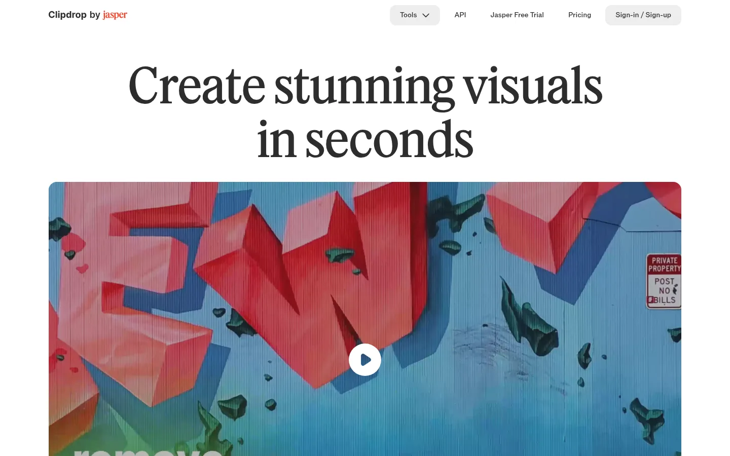
Clipdrop以克制的白色画布和编辑式排版,衬托鲜明的AI图像处理示例。大幅衬线标题与宽阔媒体区引导用户进入工具网格、API介绍和常见问题。
North star · Keep the interface quiet and editorial so vivid, varied AI imagery—not interface decoration—commands attention.
The page is anchored by a nearly uninterrupted white canvas, allowing the photographic and video examples to supply most of its colour. Charcoal display text creates a strong editorial contrast, while muted gray navigation and captions keep secondary information quiet. Blue is reserved for the primary tool action and red for the API call to action; neither competes with the image content. A refined serif headline establishes the opening mood, contrasted with compact sans-serif navigation, labels, and utility text. The layout centers the hero title and broad video, then transitions to a three-column grid of rounded image cards. Further down, a centered API feature and FAQ keep the same generous, uncluttered rhythm. Hairline gray dividers organize the FAQ and footer. Cards read as image surfaces rather than elevated panels: their rounded corners and soft neutral backgrounds do the work, with no measured shadow system.
配色 点色块复制色值。用途说明来自对页面的实测位置(背景、文字、描边、按钮)与截图判读。
品牌色
Gallery White
#ffffff
Page canvas, open section backgrounds, and white contrast text on colored actions.
Ink Charcoal
#2d2d2d
Primary headline, navigation, and dark text on pale buttons.
强调色
Tool Blue
#1c60f6
Primary blue tool action, including the repeated Universal Resizer buttons.
Action Coral
#fa4028
API documentation call to action, distinct from the blue tool action.
表层色
Mist Surface
#ededed
Pale neutral button fills and tool-card/link surfaces.
Stone Gray
#b8b8b8
Supporting inverse or neutral surfaces; subordinate to the white canvas.
Card Gray
#8f8f8f
Measured card backing, chiefly beneath image-led tool previews.
中性色
Soft Graphite
#767676
Muted supporting text and secondary link copy.
Slate Text
#404040
Secondary headings and navigation labels.
Footer Black
#171717
Small amount of dark footer text; not a dominant page field.
Pure Black
#000000
Sparse measured text and image-card content; not the main text color.
功能色
Rule Gray
#dddddd
Thin separators and understated navigation and footer hairlines.
文字 背景 对比度 WCAG #2d2d2d Ink Charcoal#ffffff Gallery White13.77:1 AAA #2d2d2d Ink Charcoal#ededed Mist Surface11.76:1 AAA #2d2d2d Ink Charcoal#b8b8b8 Stone Gray6.94:1 AA #2d2d2d Ink Charcoal#8f8f8f Card Gray4.26:1 AA-large #767676 Soft Graphite#ffffff Gallery White4.54:1 AA #767676 Soft Graphite#ededed Mist Surface3.88:1 AA-large
字体 字号阶梯:Custom(比例约 1.817,正文 16px)。示例用免费替代字体渲染,数值为实测。
Aa 设计
__primary_e9c525 网络字体 · 字重 500 / 600 / 700 / 400 · 占比 94%
免费替代:Inter
Navigation, body copy, tool labels, FAQ text, and buttons.
Aa 设计
SecondaryFont 网络字体 · 字重 400 · 占比 6%
免费替代:DM Serif Display
Large editorial display headline and prominent headings.
角色 示例 字号 字重 行高 字距 特大标题 Oversized opening headline, split across centered lines.
Clipdrop
96px 400 1.1 -0.02em 一级标题 Prominent page or section headline styling.
Clipdrop
60px 400 1.1 -0.02em 二级标题 Bold compact headings, including tool and utility titles.
The quick brown fox 敏捷的狐狸
20px 700 1 0 正文 Supporting paragraph copy beneath section headings.
The quick brown fox 敏捷的狐狸
16px 500 1.4 0 辅助文字 Small card descriptions and secondary labels.
The quick brown fox 敏捷的狐狸
14px 600 1 0 按钮 Compact action labels in navigation and CTA buttons.
The quick brown fox 敏捷的狐狸
14px 600 1 0 导航 Header navigation and tool-menu labels.
The quick brown fox 敏捷的狐狸
14px 600 1 0 链接 Inline links and supporting action text.
The quick brown fox 敏捷的狐狸
16px 500 1.4 0
间距与布局 基准单位 4px · 密度:适中
60px 版块间距
6px 元素间距
— 卡片内边距
1248px 内容最大宽度
4px
6px
8px
12px
16px
20px
24px
32px
64px
A centered content frame uses a measured page maximum width of 1248px. The opening title and video sit in a single centered column; the tools section switches to three columns, followed by a centered API feature and a two-column FAQ layout. Sections retain a spacious, comfortable rhythm, with a measured 60px section gap and 4px-based spacing scale. The compact header balances brand identity on the left with navigation and account actions on the right. The footer resolves into four narrow link groups.
圆角与层次 没有测到阴影:页面是扁平的,层次靠底色和描边区分。
The design is largely flat: no measured shadow system defines its hierarchy. Pale gray fills distinguish compact controls and card areas from the white canvas, while rounded corners soften media and tools. Thin gray rules structure FAQ rows and footer content. Layered imagery appears inside the API montage, not as a general interface elevation effect.
组件 下面的预览按实测的按钮、输入框、徽标、卡片样式重建(字体用替代字体)。
Header navigation A compact horizontal header pairs the Clipdrop by Jasper mark with tool, API, trial, pricing, and sign-in links; pale gray rounded controls distinguish selected actions.
Editorial hero A large centered regular-weight serif headline sits above a wide rounded video preview with a centered white circular play control.
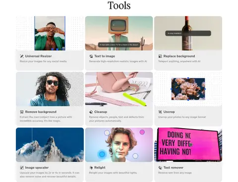
Tool card grid Nine image-led tools form a three-column grid; each card combines a preview, compact title, and short explanation on a soft neutral surface.
Primary tool action Blue pill-shaped buttons with white semibold text repeat for Universal Resizer actions.
API feature A centered API promotion pairs concise copy and a coral documentation CTA with a colorful layered product image.
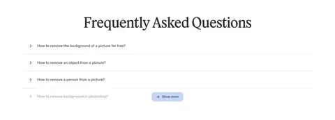
FAQ list Centered heading above concise question rows, subtle gray dividers, small leading chevrons, and a compact show-more control.
Footer A quiet multi-column link area groups company, support, legal, and social destinations with small copyright text.
Imagery · A large rounded video preview leads, with a central play control and vivid real-world mural footage. Nine image-led tool cards show varied edits and generated results, so color comes primarily from photography and demonstrations rather than interface chrome. The API section uses a layered, colorful product montage. Keep source imagery prominent, naturally varied, and cropped within clean rounded frames.
页面版块 共 4 个版块,按页面从上到下排列,每个都标了类型、布局和交互套路。
该做与不该做 ✓ 该做 Use white space as the dominant page surface. Set the main headline in a high-contrast editorial serif. Let saturated example imagery provide most of the color. Use blue for primary tool actions and coral for the API CTA. Keep navigation and card labels compact and sans-serif. Separate FAQ rows with fine, light-gray rules. ✕ 不该做 Do not add gradients as a general page background. Do not make every control brightly colored. Do not use heavy shadows to lift cards. Do not crowd the headline or media with surrounding UI. Do not treat illustration colors as interface palette colors. Do not make utility copy compete with the display type. 给 AI 的提示词 想快速出一个同风格的新页面,把这段话连同 DESIGN.md 一起发给 AI。
复制 Build a new Clipdrop-style page with a white Gallery White (#ffffff) canvas and a quiet editorial hierarchy. Use a large regular-weight serif headline with tight tracking, then a broad, rounded media feature that carries the page’s vivid photographic color. Keep navigation, body copy, and card labels in a clean compact sans-serif using Ink Charcoal (#2d2d2d) and Soft Graphite (#767676). Lay out image-led tools in a three-column grid inside a centered frame, with pale Mist Surface (#ededed) support surfaces and restrained corners. Reserve Tool Blue (#1c60f6) for primary tool actions and Action Coral (#fa4028) for a distinct API-style CTA. Use Rule Gray (#dddddd) for subtle separators. Favor generous section spacing, centered feature copy, flat surfaces, and no decorative shadow system.
DESIGN.md Tailwind v4 CSS 变量 Design Tokens
---
title: "Clipdrop design system"
variant: extended
source: https://clipdrop.co/
captured_at: 2026-10-12
theme: light
industry: ai
generator: Design DNA (https://four.wiralomi.com/style/clipdrop-co)
ai_generated: true
ai_label: "本文件由 AI 辅助生成:数值取自公开网页的实测样式,命名、用途说明与建议为模型解读。商标归原所有者。 / AI-assisted content"
---
# Clipdrop · Design System
> Quiet editorial framing for vivid AI imagery.
**Theme:** light · **Industry:** ai · **Source:** https://clipdrop.co/ · **Captured:** 2026-10-12 (1440×900 desktop)
_AI-assisted content: values are measured from the public page at capture time; names, roles and guidance are model-written interpretations. Trademarks belong to their owners._
Clipdrop pairs a restrained, editorial white canvas with expressive examples of AI image editing. A large serif headline and spacious media blocks lead into a compact tool grid, API promotion, and FAQ.
## North star
Keep the interface quiet and editorial so vivid, varied AI imagery—not interface decoration—commands attention.
## Overview
The page is anchored by a nearly uninterrupted white canvas, allowing the photographic and video examples to supply most of its colour. Charcoal display text creates a strong editorial contrast, while muted gray navigation and captions keep secondary information quiet. Blue is reserved for the primary tool action and red for the API call to action; neither competes with the image content. A refined serif headline establishes the opening mood, contrasted with compact sans-serif navigation, labels, and utility text. The layout centers the hero title and broad video, then transitions to a three-column grid of rounded image cards. Further down, a centered API feature and FAQ keep the same generous, uncluttered rhythm. Hairline gray dividers organize the FAQ and footer. Cards read as image surfaces rather than elevated panels: their rounded corners and soft neutral backgrounds do the work, with no measured shadow system.
## Colors
| Name | Hex | Token | Group | Role |
|---|---|---|---|---|
| Gallery White | ` | `--color-gallery-white` | brand | Page canvas, open section backgrounds, and white contrast text on colored actions. |
| Soft Graphite | ` | `--color-soft-graphite` | neutral | Muted supporting text and secondary link copy. |
| Tool Blue | ` | `--color-tool-blue` | accent | Primary blue tool action, including the repeated Universal Resizer buttons. |
| Rule Gray | ` | `--color-rule-gray` | semantic | Thin separators and understated navigation and footer hairlines. |
| Mist Surface | ` | `--color-mist-surface` | surface | Pale neutral button fills and tool-card/link surfaces. |
| Slate Text | ` | `--color-slate-text` | neutral | Secondary headings and navigation labels. |
| Stone Gray | ` | `--color-stone-gray` | surface | Supporting inverse or neutral surfaces; subordinate to the white canvas. |
| Card Gray | ` | `--color-card-gray` | surface | Measured card backing, chiefly beneath image-led tool previews. |
| Ink Charcoal | ` | `--color-ink-charcoal` | brand | Primary headline, navigation, and dark text on pale buttons. |
| Footer Black | ` | `--color-footer-black` | neutral | Small amount of dark footer text; not a dominant page field. |
| Action Coral | ` | `--color-action-coral` | accent | API documentation call to action, distinct from the blue tool action. |
| Pure Black | ` | `--color-pure-black` | neutral | Sparse measured text and image-card content; not the main text color. |
### Semantic aliases
`--color-canvas` → ` (Gallery White) · `--color-surface` → ` (Mist Surface) · `--color-surface-2` → ` (Stone Gray) · `--color-surface-3` → ` (Card Gray) · `--color-text` → ` (Ink Charcoal) · `--color-text-muted` → ` (Soft Graphite) · `--color-text-subtle` → ` (Slate Text) · `--color-border` → ` (Rule Gray) · `--color-accent` → ` (Tool Blue) · `--color-accent-2` → ` (Action Coral) · `--color-on-accent` → ` (Gallery White)
### Contrast (WCAG 2.x)
| Text | Background | Ratio | Level |
|---|---|---|---|
| ` | ` | 13.77:1 | AAA |
| ` | ` | 11.76:1 | AAA |
| ` | ` | 6.94:1 | AA |
| ` | ` | 4.26:1 | AA-large |
| ` | ` | 4.54:1 | AA |
| ` | ` | 3.88:1 | AA-large |
| ` | ` | 2.29:1 | fail |
| ` | ` | 1.4:1 | fail |
| ` | ` | 10.37:1 | AAA |
| ` | ` | 8.86:1 | AAA |
### Gradients
- `linear-gradient(to top, rgb(255, 255, 255), rgba(255, 255, 255, 0))`
## Typography
| Family | Token | Source | Weights | Role | Free substitute |
|---|---|---|---|---|---|
| __primary_e9c525 | `--font-body` | webfont | 500, 600, 700, 400 | Navigation, body copy, tool labels, FAQ text, and buttons. | Inter |
| SecondaryFont | `--font-display` | webfont | 400 | Large editorial display headline and prominent headings. | DM Serif Display |
- **SecondaryFont:** Serif display with regular weight, tight negative tracking, and sentence case.
- **__primary_e9c525:** Compact sans-serif; measured weights span regular to bold, with semibold utility labels and no uppercase treatment.
### Type scale — Custom (ratio ≈ 1.817, base 16px)
| Role | Size | Weight | Line height | Letter spacing | Case | Family | Used for |
|---|---|---|---|---|---|---|---|
| display | 96px | 400 | 1.1 | -0.02em | — | SecondaryFont | Oversized opening headline, split across centered lines. |
| h1 | 60px | 400 | 1.1 | -0.02em | — | SecondaryFont | Prominent page or section headline styling. |
| h2 | 20px | 700 | 1 | 0 | — | __primary_e9c525 | Bold compact headings, including tool and utility titles. |
| body | 16px | 500 | 1.4 | 0 | — | __primary_e9c525 | Supporting paragraph copy beneath section headings. |
| caption | 14px | 600 | 1 | 0 | — | __primary_e9c525 | Small card descriptions and secondary labels. |
| button | 14px | 600 | 1 | 0 | — | __primary_e9c525 | Compact action labels in navigation and CTA buttons. |
| nav | 14px | 600 | 1 | 0 | — | __primary_e9c525 | Header navigation and tool-menu labels. |
| link | 16px | 500 | 1.4 | 0 | — | __primary_e9c525 | Inline links and supporting action text. |
## Spacing & layout
- Base unit **4px**, density **comfortable**.
- Scale (most used values): 4, 6, 8, 12, 16, 20, 24, 32, 64 px.
- Section rhythm 60px · element gap 6px · card padding — · max content width 1248px.
A centered content frame uses a measured page maximum width of 1248px. The opening title and video sit in a single centered column; the tools section switches to three columns, followed by a centered API feature and a two-column FAQ layout. Sections retain a spacious, comfortable rhythm, with a measured 60px section gap and 4px-based spacing scale. The compact header balances brand identity on the left with navigation and account actions on the right. The footer resolves into four narrow link groups.
## Shape & elevation
- Radius: button `50%` · card `16px` · media `16px` · nav `8px` · link `16px` · xs `8px` · sm `12px` · md `16px`
- No box shadows measured: the page is flat.
- Motion: standard transition `0.15s cubic-bezier(0.4, 0, 0.2, 1)` on interactive elements.
The design is largely flat: no measured shadow system defines its hierarchy. Pale gray fills distinguish compact controls and card areas from the white canvas, while rounded corners soften media and tools. Thin gray rules structure FAQ rows and footer content. Layered imagery appears inside the API montage, not as a general interface elevation effect.
## Imagery
A large rounded video preview leads, with a central play control and vivid real-world mural footage. Nine image-led tool cards show varied edits and generated results, so color comes primarily from photography and demonstrations rather than interface chrome. The API section uses a layered, colorful product montage. Keep source imagery prominent, naturally varied, and cropped within clean rounded frames.
## Components
### Header navigation
A compact horizontal header pairs the Clipdrop by Jasper mark with tool, API, trial, pricing, and sign-in links; pale gray rounded controls distinguish selected actions.
### Editorial hero
A large centered regular-weight serif headline sits above a wide rounded video preview with a centered white circular play control.
### Tool card grid
Nine image-led tools form a three-column grid; each card combines a preview, compact title, and short explanation on a soft neutral surface.
### Primary tool action
Blue pill-shaped buttons with white semibold text repeat for Universal Resizer actions.
### API feature
A centered API promotion pairs concise copy and a coral documentation CTA with a colorful layered product image.
### FAQ list
Centered heading above concise question rows, subtle gray dividers, small leading chevrons, and a compact show-more control.
### Footer
A quiet multi-column link area groups company, support, legal, and social destinations with small copyright text.
### Measured component styles
- **Primary button** (“Universal Resizer”): background ## Do
- Use white space as the dominant page surface.
- Set the main headline in a high-contrast editorial serif.
- Let saturated example imagery provide most of the color.
- Use blue for primary tool actions and coral for the API CTA.
- Keep navigation and card labels compact and sans-serif.
- Separate FAQ rows with fine, light-gray rules.
## Don't
- Do not add gradients as a general page background.
- Do not make every control brightly colored.
- Do not use heavy shadows to lift cards.
- Do not crowd the headline or media with surrounding UI.
- Do not treat illustration colors as interface palette colors.
- Do not make utility copy compete with the display type.
## Agent prompt
Build a new Clipdrop-style page with a white Gallery White (## Page sections (top to bottom)
| # | Type | Layout | UX patterns | UI patterns |
|---|---|---|---|---|
| 1 | feature-grid | Three-column image-card grid with a centered section heading and compact titles and descriptions. | Browse tools, Open tool from card | Rounded image cards, Soft gray surfaces, Compact captions |
| 2 | integrations | Centered headline and supporting copy above a coral CTA and a wide product montage. | Explore API docs | Centered content, Coral action button, Layered product imagery |
| 3 | faq | Centered heading above a two-column FAQ region with horizontal question rows. | Expand questions, Show more | Chevron indicators, Fine dividers, Compact show-more button |
| 4 | footer | Four-column footer links with small copyright text below. | Navigate by category, Open social channels | Grouped text links, Light hairline separators, Compact legal copy |
## Source CSS custom properties (selected)
```css
--color-inherit: inherit;
--color-current: currentColor;
--color-transparent: transparent;
--color-black: #000;
--color-white: #fff;
--color-slate-50: