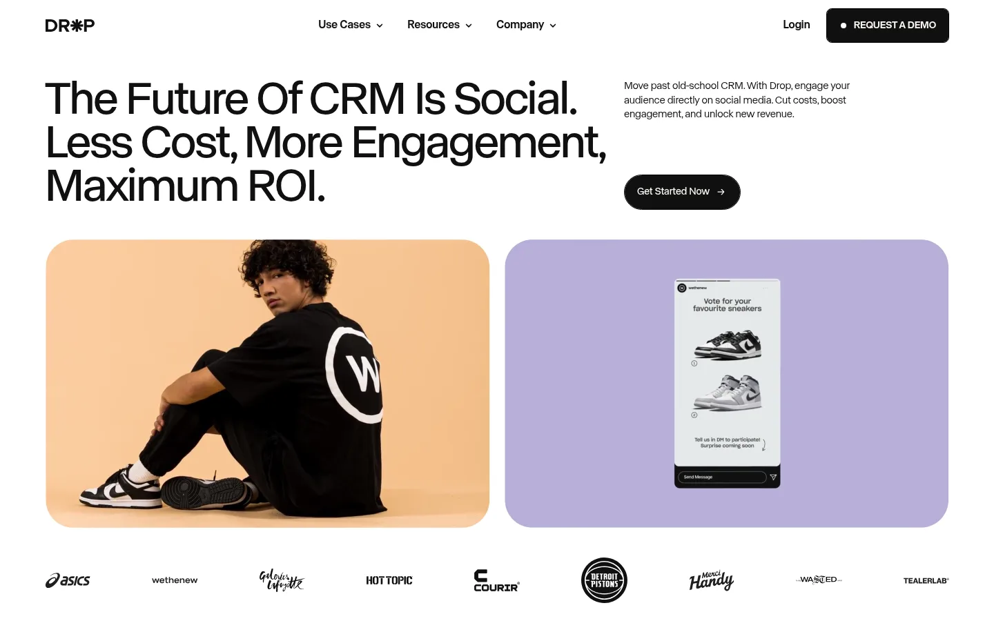
Drop 首页以干净的白色首屏开场,再通过深色长页面和超大编辑式标题展开品牌叙事。淡紫与柔绿的功能区块搭配客户案例和克制的产品界面图,让社交电商产品兼具表现力与实用感。
North star · Let oversized editorial typography lead each story, then use restrained colour bands and authentic product imagery to clarify the social-commerce value.
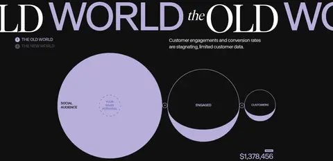
The visual strategy alternates a bright, spacious opening with a predominantly near-black editorial canvas. White and warm off-white provide clear breaks, while lavender and pale sage identify major feature stories; vivid yellow is a sparse signal in badges and product-related details, not a general UI accent. Oversized uppercase headlines create a magazine-like rhythm, supported by compact, lightly weighted sans-serif body copy. The hero uses an asymmetrical two-column composition with a large headline, short supporting copy, a pill CTA, and paired rounded media panels. Further down, wide feature bands pair concise copy with product or messaging imagery, and a pale case-study section shifts the mood before the dark closing CTA. Layout stays spacious and flat: borders and muted labels do more work than shadows. Much of the saturated colour belongs to photographs and interface mockups, so keep the surrounding product UI restrained.
配色
点色块复制色值。用途说明来自对页面的实测位置(背景、文字、描边、按钮)与截图判读。
品牌色
强调色
表层色
中性色
功能色
页面底色 · Drop Ink表层 · Story Ivory表层 2 · Social Lavender表层 3 · Soft Charcoal表层 4 · Gallery White主文字 · Gallery White次要文字 · Drop Ink弱文字 · Quiet Gray描边 · Quiet Gray强调 · Social Lavender
Primary sans-serif for navigation, body copy, captions, and most oversized display and heading text.
Aa 设计
Ivar Display
网络字体 · 字重 400 · 占比 3%
免费替代:Bodoni Moda
Editorial serif accent for selected oversized headline treatments.
角色
示例
字号
字重
行高
字距
特大标题
Oversized uppercase editorial display headlines and scrolling text.
Drop
177px
400
0.9
-0.041em
一级标题
Primary hero headline with tight uppercase editorial styling.
Drop
169px
400
0.95
-0.043em
二级标题
Large uppercase section titles and feature-story headings.
Drop
160px
300
0.86
-0.036em
三级标题
Serif-led display statements within editorial feature moments.
Drop
155.5px
400
0.78
0
四级标题
Secondary feature headings and prominent story labels.
Drop
75px
400
0.95
-0.029em
正文
Compact explanatory copy beside imagery and product visuals.
The quick brown fox 敏捷的狐狸
15px
300
1.35
-0.014em
辅助文字
Small uppercase eyebrow labels, metrics, and category tags.
The quick brown fox 敏捷的狐狸
11px
400
1
0
导航
Header navigation links and utility items.
The quick brown fox 敏捷的狐狸
16px
500
1.2
0
间距与布局
基准单位 1px · 密度:宽松
115px版块间距
14px元素间距
—卡片内边距
1310px内容最大宽度
1px
4px
5px
7px
8px
12px
14px
16px
17px
18px
29px
65px
72px
86px
115px
The measured page max width is 1310px, with a spacious composition and a 115px section-gap rhythm. The hero is a two-column layout: a broad left headline and paired media panels beneath, with supporting copy and CTA aligned to the right. Dark editorial sections rely on sweeping type and open space; feature stories alternate two-column copy/media layouts and full-width colour bands. The ivory success-story block introduces a horizontal card rail. Alignment is mostly left-led, with a centered closing CTA.
圆角与层次
按钮 · 50%
图片 · 24px
徽标 · 4px
导航 · 50%
没有测到阴影:页面是扁平的,层次靠底色和描边区分。
The page is mostly flat, using contrasting section backgrounds rather than cards with shadows. Fine gray borders define small category badges and subtle controls; black borders appear on measured button details. Rounded media frames and pill-shaped CTAs provide the main dimensional cues. Gradient fades are used as quiet dark-surface transitions, not as prominent decorative effects.
组件
下面的预览按实测的按钮、输入框、徽标、卡片样式重建(字体用替代字体)。
Editorial hero
Large left-aligned headline with compact right-side supporting copy and a dark pill CTA; paired rounded media panels sit below.
Pill CTA
Rounded, capsule-like action treatment with dark fill and light text in the screenshot; measured button styles show a thin black border and ABC Normal label.
Feature split
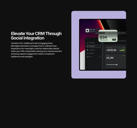
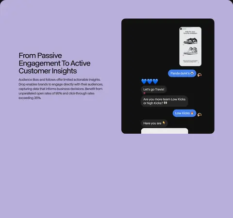
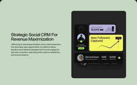
Two-column story block pairing a concise heading and paragraph with a product or messaging visual; selected stories sit on lavender or sage bands.
Category badge
Small uppercase outlined label with a 4px radius; gray is common, while a bright yellow outline marks selected customer labels.
Case-study rail
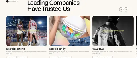
Warm ivory section with image-led customer cards, short labels, category badges, and small navigation controls.
Dark closing CTA
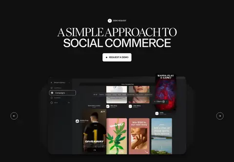
Centered uppercase statement, demo-request action, and prominent product imagery on the near-black canvas.
Imagery · Photography and interface mockups carry the product story: fashion and customer campaign imagery in the hero, messaging screens and analytics dashboards in feature bands, and customer photos in the case-study rail. Media sits in rounded rectangular frames, often on lavender or other coloured backdrops. Keep surrounding UI neutral so embedded imagery remains the strongest source of visual texture.
Reserve #b8afda and #c7d8c5 for distinct feature bands.
Keep large headlines uppercase, editorial, and tightly tracked.
Pair short copy with real customer or product imagery.
Use spacious section transitions and generous negative space.
Keep badges small, outlined, and uppercase.
Use the warm ivory surface to distinguish customer stories.
✕ 不该做
Do not make every section dark; preserve the white and light-colour breaks.
Do not use bright yellow as a large background or broad UI accent.
Do not add heavy shadows to cards or media frames.
Do not crowd the oversized headlines with dense supporting copy.
Do not treat colours inside mockups as global interface colours.
Do not replace the editorial type contrast with a uniform font treatment.
给 AI 的提示词
想快速出一个同风格的新页面,把这段话连同 DESIGN.md 一起发给 AI。
Build a new Drop-style SaaS page with an editorial, spacious composition. Use #101010 as the primary dark canvas and #ffffff for a clean opening or contrast surface. Introduce #b8afda and #c7d8c5 as distinct full-width feature bands, and use #fbf8f3 for a warm customer-story section. Keep #f6f361 to sparse outlined badges; use #9b9b9b for muted labels and borders. Set oversized uppercase headings in a tight sans-serif, with occasional refined serif display accents, and keep body copy compact and readable. Organize content in broad two-column layouts with copy opposite rounded product or customer imagery. Prefer flat surfaces, fine outlines, pill CTAs, and generous whitespace; avoid heavy shadows and avoid promoting mockup colours into the site-wide palette.