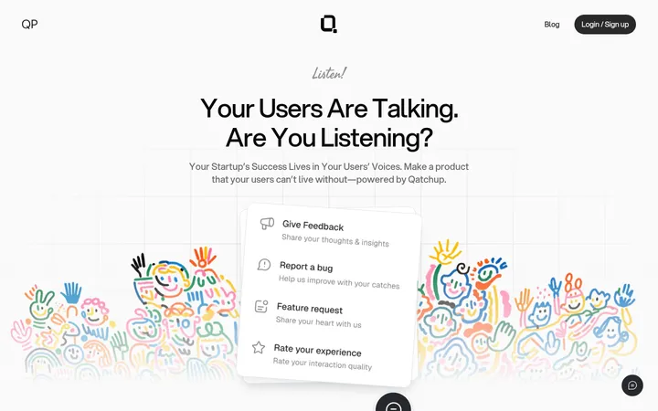
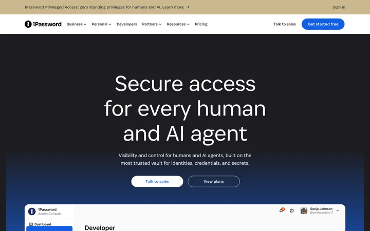
North star · Keep the interface almost entirely white and black, using blue sparingly while giving the 3D identity artwork room to command attention.
The visual strategy is built on a white canvas, near-black typography and fine pale-gray rules. Strong blue appears sparingly in badges, small illustration details and the hero’s radiant focal artwork; pale lavender and blue-gray are secondary accents rather than broad interface fills. PP Radio Grotesk gives headlines a distinctive, rounded display voice, while Inter keeps navigation, paragraphs and controls practical and quiet. The homepage is organized as a sequence of spacious, mostly white bands, with thin borders defining cards and section boundaries instead of colored panels. Headlines alternate between centered introductions and left-aligned editorial statements, supported by compact copy and modular columns. Abstract 3D identity objects, orbiting app marks and restrained connector diagrams supply the visual interest. The result feels enterprise-ready without relying on dense dashboards, heavy shadows or decorative interface chrome.
配色
点色块复制色值。用途说明来自对页面的实测位置(背景、文字、描边、按钮)与截图判读。
品牌色
强调色
表层色
中性色
功能色
页面底色 · Gallery White主文字 · Carbon Ink次要文字 · Quiet Graphite描边 · Rule Gray强调 · Signal Blue
Navigation, body copy, buttons, links, captions and functional labels.
Aa 设计
PP Radio Grotesk
网络字体 · 字重 400 / 600 / 500 · 占比 30%
免费替代:Space Grotesk
Display and section headings, selected feature titles, and uppercase eyebrow labels.
角色
示例
字号
字重
行高
字距
特大标题
Oversized hero or campaign statements.
Clutch Security
68px
400
1.1
-0.01em
一级标题
Primary hero and major page headings.
Clutch Security
56px
400
1.2
-0.01em
二级标题
Section titles such as platform and approach introductions.
Clutch Security
38px
400
1.2
0.01em
三级标题
Feature titles and emphasized content headings.
Clutch Security
32px
600
1.2
-0.01em
四级标题
Secondary module and card headings.
The quick brown fox 敏捷的狐狸
26px
400
1.2
0.01em
正文
Explanatory paragraphs and feature descriptions.
The quick brown fox 敏捷的狐狸
15px
400
1.5
0
辅助文字
Supporting labels, attribution and fine-print text.
The quick brown fox 敏捷的狐狸
14px
400
1.5
0
按钮
Calls to action and compact action controls.
The quick brown fox 敏捷的狐狸
15px
400
1.5
0
导航
Header navigation and footer navigation.
The quick brown fox 敏捷的狐狸
15px
400
1.5
0
链接
Feature links and text-based calls to action.
The quick brown fox 敏捷的狐狸
15px
400
1.5
0
眉题
Uppercase category badges and section labels.
The quick brown fox 敏捷的狐狸
12px
500
1.5
0.16em
间距与布局
基准单位 8px · 密度:适中
80px版块间距
16px元素间距
84px卡片内边距
1124px内容最大宽度
2px
4px
6px
8px
10px
12px
16px
24px
32px
40px
48px
64px
80px
88px
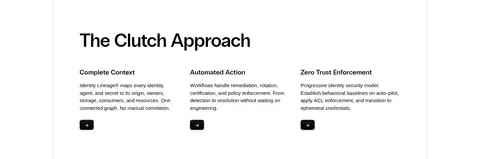
Use a centered content frame capped at the measured 1124px page width. Build a long, comfortable scroll of full-width white section bands, separated by fine borders rather than colored backgrounds. The hero is centered, while platform, approach, integration and footer areas shift to left-aligned modular columns. Alternate centered logo and trust bands with split feature sections and two- or three-column content. Keep content density low, align text and media to consistent column edges, and retain generous section rhythm; measured section spacing is 80px.
圆角与层次
按钮 · 6px
徽标 · 4px
导航 · 6px
链接 · 6px
sm · link, nav
The system is predominantly flat: white surfaces, thin Rule Gray outlines and clear section boundaries do most of the structural work. Use only subtle, restrained shadowing around select navigation or link controls. Create visual depth inside the hero artwork through 3D lighting and gradients, not through stacked UI cards or heavy drop shadows.
组件
下面的预览按实测的按钮、输入框、徽标、卡片样式重建(字体用替代字体)。
Header and demo action
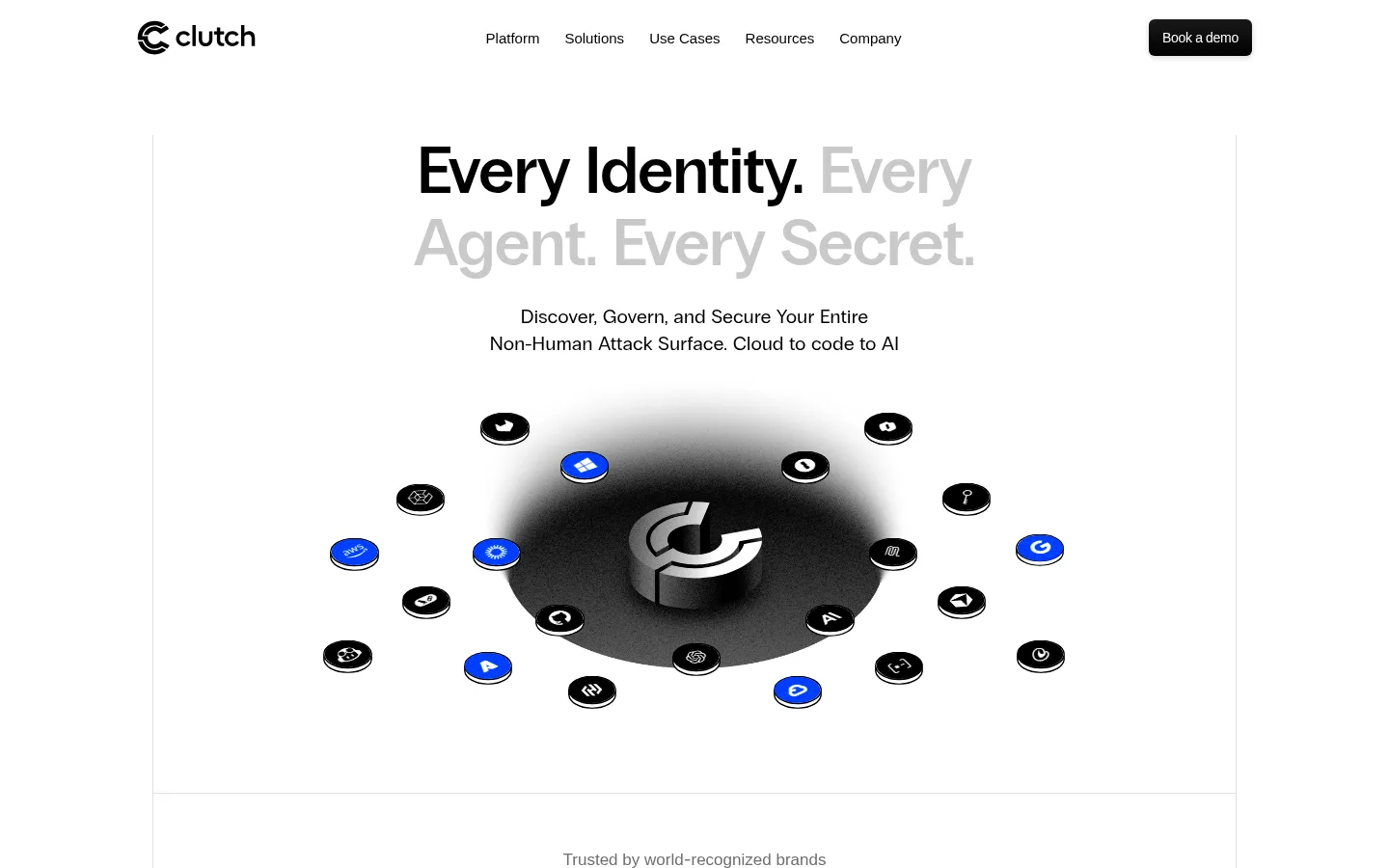
A sparse horizontal header with the black Clutch mark, compact Inter navigation and a dark, rounded Book a demo control.
Hero
Centered large Grotesk headline, compact supporting copy and a prominent floating 3D identity illustration on white.
Trust strip
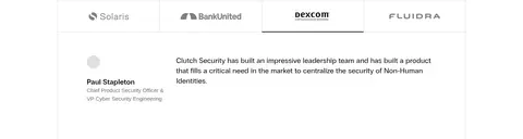
A short caption and a row of customer marks inside a white band with thin gray section rules.
Category badges
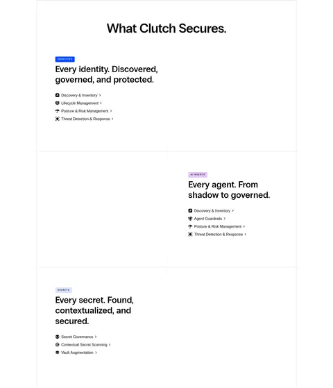
Compact uppercase Grotesk labels; identity uses Signal Blue with white text and AI agents uses Soft Orchid with black text.
Feature panels
Border-defined, spacious white modules combining a strong heading, concise copy, lists or links, and occasional product imagery.
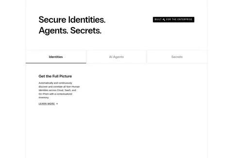
Tabbed security module
A three-category strip for Identities, AI Agents and Secrets above a sparse explanatory content panel.
Footer and signup
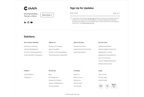
A broad multi-column footer pairing the brand and demo link with a newsletter form, dense link groups and muted legal copy.
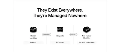
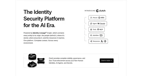
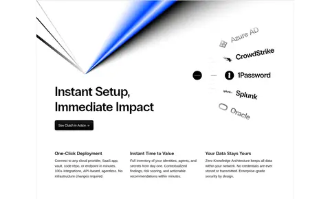
Imagery · Lead with a custom monochrome 3D identity mark floating over a dark circular field, surrounded by small service or identity tokens. Later sections use compact sculptural objects, simple node diagrams, integration logos and award marks rather than lifestyle photography. Keep artwork on white, with black-and-gray modeling and selective Signal Blue or pale accent details. Treat product visuals as isolated focal compositions, not busy full-bleed backgrounds.
Reserve Signal Blue for small, high-value accents.
Use PP Radio Grotesk for prominent headings.
Separate major bands with fine gray rules.
Give the hero illustration generous breathing room.
✕ 不该做
Do not introduce saturated section backgrounds.
Do not turn every card into a raised, shadowed tile.
Do not use blue for all links and controls.
Do not crowd the page with dashboard-like data.
Do not treat illustration-only colors as core interface fills.
Do not replace the clean section rhythm with dense grids.
给 AI 的提示词
想快速出一个同风格的新页面,把这段话连同 DESIGN.md 一起发给 AI。
Build a new enterprise security page in the Clutch visual style. Use Gallery White (#ffffff) for the canvas, Carbon Ink (#000000) for typography and primary marks, and Rule Gray (#dfdfdf) for quiet borders. Keep Signal Blue (#004dff) selective; Soft Orchid (#e6c5f7) and Mist Blue (#d9e4ff) belong in small category or artwork accents. Set headlines in PP Radio Grotesk or a close geometric substitute, with Inter for navigation, body text and controls. Use a centered content frame, spacious white section bands, thin dividers, and alternating centered and left-aligned modules. Feature abstract, monochrome 3D identity imagery rather than lifestyle photography. Favor flat surfaces and restrained shadowing. Keep paragraphs concise, align columns carefully, and make the primary demo action easy to find without making the page feel promotional or crowded.