North star · Let oversized type and generous white space frame real product previews, using bright accent colors only to make actions unmistakable.
The page uses Gallery White (#ffffff) as its dominant canvas, letting oversized black typography and large gaps establish a quiet, editorial first impression. Ink (#000000) anchors headings, copy, the FAQ and the closing section; pale Blue Haze (#d2dcdd) forms a recurring backdrop for feature demonstrations. Melange carries most of the display and body hierarchy, with Favorit Mono reserved for compact uppercase controls and utility labels. A small amount of Goudy Bookletter 1911 adds a contrasting literary note. The hero is centered and sparse, while later product examples sit in a broad, measured content area with varied single- and two-column arrangements. Interface screenshots, browser previews and video frames supply the color and texture, rather than decorative illustration. Vivid green and yellow mark key actions; the warm off-white button is a quieter alternative. Sections alternate between expansive white space, a pale feature band, a cream template showcase and a stark black FAQ/footer, maintaining rhythm without heavy borders or shadows.
配色
点色块复制色值。用途说明来自对页面的实测位置(背景、文字、描边、按钮)与截图判读。
品牌色
强调色
表层色
中性色
功能色
页面底色 · Gallery White表层 · Blue Haze表层 2 · Ink表层 3 · Linen主文字 · Ink次要文字 · Soft Graphite弱文字 · Warm Ash描边 · Charcoal Rule强调 · Electric Leaf强调 2 · Studio Yellow强调 3 · Pool Cyan
Primary display, headings and body copy throughout the page.
Aa 设计
Favorit Mono
网络字体 · 字重 400 · 占比 16%
免费替代:Space Mono
Compact CTA labels, code-like captions and uppercase utility text.
Aa 设计
Goudy Bookletter 1911
网络字体 · 字重 400 · 占比 8%
免费替代:Garamond
Occasional expressive feature-heading treatment.
角色
示例
字号
字重
行高
字距
特大标题
Oversized Control wordmark treatment in the hero.
Control
183px
400
normal
-0.048em
一级标题
Primary hero statement and major page headline.
Control
146px
500
1.03
-0.055em
二级标题
Large feature and section headlines.
Control
102px
400
0.7
-0.015em
三级标题
Occasional serif-led feature headline.
Control
90px
400
0.94
-0.02em
四级标题
Secondary feature and promotional headlines.
Control
71px
500
1.07
-0.051em
正文
Feature explanations, FAQ answers and supporting copy.
The quick brown fox 敏捷的狐狸
16px
400
1.31
-0.037em
辅助文字
Compact media captions and supporting labels.
The quick brown fox 敏捷的狐狸
11px
400
1.82
0
代码
Uppercase mono labels, utility copy and compact interface text.
const style = 1;
10px
400
1.2
0.02em
间距与布局
基准单位 2px · 密度:宽松
173px版块间距
29px元素间距
—卡片内边距
1248px内容最大宽度
1px
10px
20px
29px
147px
173px
A spacious single-page flow with a measured maximum content width of 1248px. The hero is centered, while feature copy and media align to a broad content grid that shifts between full-width showcases and paired examples. Sections have pronounced vertical separation; content is sparse rather than card-dense. The page moves from white to a blue-gray feature band, back to white, then a warm template area and black FAQ/footer. Keep alignment intentional and let large margins provide the rhythm.
圆角与层次
图片 · 8px
inset · button
The design is mostly flat: avoid drop shadows and card-heavy elevation. Separate areas through canvas changes, generous whitespace and the occasional fine dark rule. Product previews may overlap within their pale showcase panels, while media frames use a restrained measured corner radius. Buttons remain simple, crisp rectangles without prominent shadow treatment.
组件
下面的预览按实测的按钮、输入框、徽标、卡片样式重建(字体用替代字体)。
Minimal header
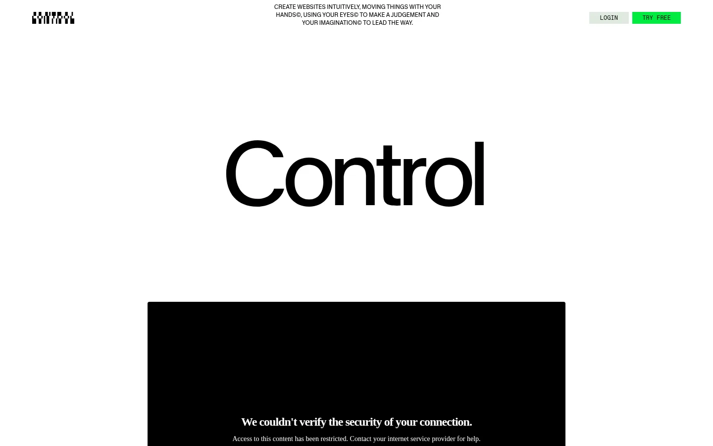
Place a compact brand mark left, a small centered descriptive line and LOGIN plus TRY FREE actions at right.
Hero wordmark
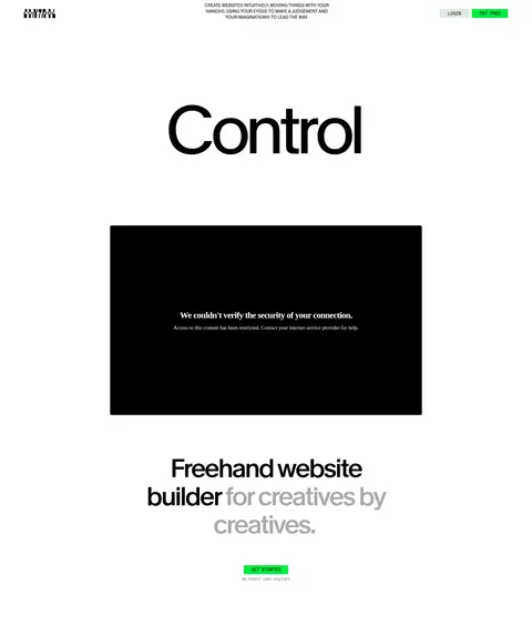
Center a very large Melange wordmark above a wide media preview, followed by the supporting headline and a green CTA.
Product showcase
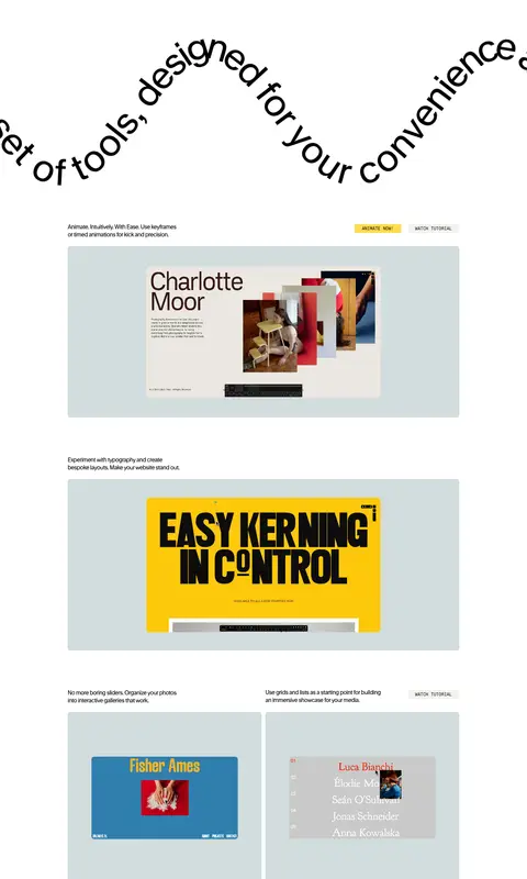
Pair concise feature copy with large pale blue-gray media frames; vary between full-width previews and two-column examples.
Action buttons
Use square-corner buttons with Favorit Mono uppercase labels; green for TRY FREE, yellow for ANIMATE NOW, and Linen for WATCH TUTORIAL.
Template collage
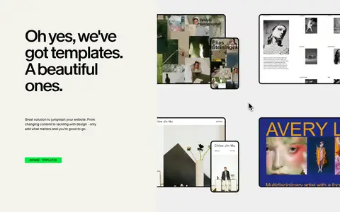
Set a bold headline and concise copy beside a full-bleed-style collection of varied website template previews on a warm surface.
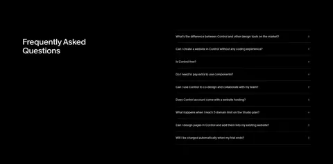
FAQ accordion
Use a black section with a clear heading, a vertical list of question rows and restrained horizontal separators.
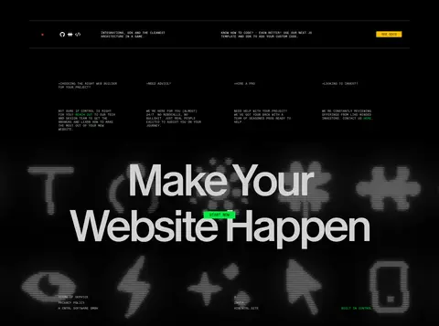
Closing CTA
Finish on black with oversized centered type, a compact green action and atmospheric product-related visuals.
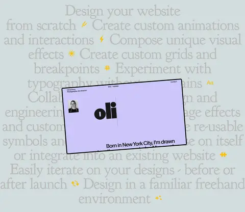
Imagery · Use product UI as the main visual content: browser windows, website mockups, component libraries, templates and tutorial previews. Frame media in pale blue-gray panels, often with softly rounded corners, and allow some previews to overlap or sit within a larger showcase. Video and screen captures should feel like evidence of the tool in use, not generic stock imagery. The template section uses a collage of distinct site examples.
Keep the primary canvas white and the overall composition spacious.
Use oversized, tightly tracked sans-serif headlines.
Show real-looking product interfaces in pale blue-gray frames.
Reserve mono uppercase text for compact actions and utility labels.
Use green for the primary action and yellow for selected secondary actions.
Create section rhythm with whitespace and restrained background changes.
✕ 不该做
Do not fill the page with dense cards or decorative UI chrome.
Do not use gradients as a defining brand treatment.
Do not spread accent colors across large areas without evidence.
Do not add prominent shadows to otherwise flat components.
Do not replace product previews with generic stock photography.
Do not make utility labels compete with the large headlines.
给 AI 的提示词
想快速出一个同风格的新页面,把这段话连同 DESIGN.md 一起发给 AI。
Build a new page in Control’s spacious, editorial design-tool style. Use Gallery White (#ffffff) as the main canvas and Ink (#000000) for strong type and dark sections. Set oversized, tightly tracked display headlines in a Melange-like sans, with compact uppercase mono labels and clear hierarchy. Organize content in a broad centered layout, but leave generous open space between sections. Present product work through browser previews and interface imagery inside Blue Haze (#d2dcdd) frames, alternating wide showcases with paired examples. Make the primary action Electric Leaf (#00eb40), using Studio Yellow (#ffdc4d) sparingly for secondary actions and Linen (#f4f3ed) for a quieter button. Keep surfaces flat, borders restrained, and imagery credible. Let each section feel distinct through alignment and background bands rather than card decoration.