Codex以近黑色界面呈现加密数据API,用醒目的荧光黄绿按钮和克制的绿色数据强调重点。细边框、紧凑标签与实时感产品面板,让丰富的技术能力显得清晰易读。
North star · Keep the dark canvas quiet and let clear grids, readable data, and lime actions establish hierarchy.
The page is anchored by a near-black canvas (#181818), which keeps attention on bright white and soft gray typography, fine gray dividers, and product interface previews. The primary action uses vivid lime (#e5ff5d) with dark text, while mint green appears sparingly in market data and status cues; amber and other accents are secondary details rather than core brand surfaces. Geist carries the headline, navigation, labels, and body copy, with tight display tracking and frequent uppercase micro-labels. Satoshi adds a softer supporting voice in some feature headings and data cards, while JetBrains Mono makes code samples legible as code. The layout alternates centered hero content with left-aligned section introductions and dense, sharply divided grids. Product screenshots, charts, token marks, and code panels provide the visual evidence; they sit inside dark frames instead of competing with the brand palette. Spacing is comfortable around major sections but compact within dashboards and tables.
配色 点色块复制色值。用途说明来自对页面的实测位置(背景、文字、描边、按钮)与截图判读。
品牌色
Codex Black
#181818
Primary canvas and recurring card background; also grounds the hero and dark fade overlays.
强调色
Signal Lime
#e5ff5d
Primary CTA fill, highlighted action labels, small badges, and lime interface indicators.
Market Mint
#00e599
Small market-data gains, badges, and status details; a data accent rather than a broad surface.
Pale Mint
#97e6b4
Occasional green-tinted text accent, supporting the market-data palette.
表层色
Graphite Line
#3d4045
Measured divider and border color; appears as a contrasting band and footer surface.
Panel Charcoal
#1f1f1f
Raised card and navigation surface, notably in portfolio-style data panels.
Divider Charcoal
#2e2e2e
Subtle card edges and separators within dark interface areas.
Control Charcoal
#282828
Quiet button, navigation, and card control backgrounds.
中性色
Soft Silver
#d1d1d1
Muted explanatory copy and secondary footer text on dark backgrounds.
Quiet Gray
#a7a7a7
Secondary text and less prominent copy, preserving contrast without competing with headings.
Paper White
#ffffff
Navigation, primary text, and selected headings and buttons.
Mist White
#e8e8e8
Main body and feature-card text, slightly softened against the black canvas.
Slate Gray
#8c8c8c
Low-emphasis labels, headings, footer copy, and muted button text.
Midnight Gray
#575757
Rare subdued text detail; keep it secondary on the dark canvas.
Deep Ink
#111111
Dark foreground on lime primary buttons and a small number of dark text details.
功能色
Data Amber
#ffcb6b
Small warm data highlight; use as a restrained informational detail, not a dominant brand color.
文字 背景 对比度 WCAG #ffffff Paper White#181818 Codex Black17.76:1 AAA #ffffff Paper White#3d4045 Graphite Line10.41:1 AAA #ffffff Paper White#1f1f1f Panel Charcoal16.48:1 AAA #d1d1d1 Soft Silver#181818 Codex Black11.63:1 AAA #d1d1d1 Soft Silver#3d4045 Graphite Line6.82:1 AA #d1d1d1 Soft Silver#1f1f1f Panel Charcoal10.79:1 AAA
字体 字号阶梯:Perfect Fourth(比例约 1.347,正文 14px)。示例用免费替代字体渲染,数值为实测。
Aa 设计
Geist 网络字体 · 字重 400 / 500 · 占比 62%
免费替代:Inter
Primary display, navigation, body copy, labels, and buttons
Aa 设计
Manrope 网络字体 · 字重 400 · 占比 21%
免费替代:Manrope
Supporting sans-serif text in secondary interface areas
Aa 设计
satoshi 网络字体 · 字重 500 / 400 · 占比 9%
免费替代:Manrope
Some feature headings and wallet/data card text
Aa 设计
JetBrains Mono 网络字体 · 字重 400 · 占比 8%
免费替代:JetBrains Mono
Code examples and API response snippets
角色 示例 字号 字重 行高 字距 特大标题 Oversized hero statement and prominent page-level display copy.
Codex
62px 500 0.92 -0.04em 一级标题 Primary hero heading.
Codex
56px 500 0.92 -0.04em 二级标题 Major section headings across the long landing page.
Codex
48px 500 1 -0.04em 三级标题 Feature headings and product panel titles.
Codex
32px 500 1.4 0 四级标题 Secondary card headings and nested feature titles.
Codex
28px 500 1.5 0 正文 Supporting descriptions, feature copy, and standard interface text.
The quick brown fox 敏捷的狐狸
14px 400 1.4 -0.02em 辅助文字 Uppercase micro-labels, badges, and compact metadata.
The quick brown fox 敏捷的狐狸
12px 500 1.33 -0.02em 按钮 Compact action labels, typically uppercase.
The quick brown fox 敏捷的狐狸
10px 400 1 -0.02em 导航 Uppercase primary navigation labels.
The quick brown fox 敏捷的狐狸
12px 500 1.33 -0.02em 代码 Monospace API queries and structured response examples.
const style = 1;
11.5px 400 1.75 0
间距与布局 基准单位 4px · 密度:适中
64px 版块间距
12px 元素间距
20px 卡片内边距
1278px 内容最大宽度
1px
4px
6px
8px
10px
11px
12px
13px
15px
16px
17px
20px
24px
26px
32px
56px
The content sits within a broad centered frame, measured at a 1278px maximum width, with a fine outer boundary visible in the screenshots. The hero centers its message over atmospheric media; subsequent sections use left-aligned introductions, paired feature panels, and multi-column grids. Dividers define the transitions between modules more than contrasting section backgrounds do. The measured rhythm uses generous gaps between sections and tighter spacing inside cards and dense data displays. Content density varies deliberately: open headline areas lead into compact, information-rich product demonstrations.
圆角与层次 The design is mostly flat: fine borders and hairlines establish card edges, section divisions, and table structure. Dark panels separate content subtly from the canvas instead of relying on conspicuous shadows. The pricing area introduces a brighter featured card against darker neighboring plans; shadows are restrained and used to distinguish layered cards where needed.
组件 下面的预览按实测的按钮、输入框、徽标、卡片样式重建(字体用替代字体)。
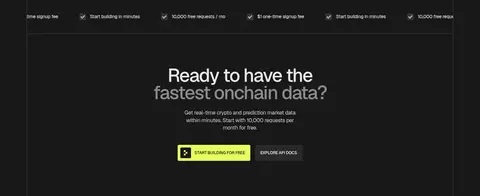
Primary CTA Lime-filled button with dark text, uppercase Geist label, compact padding, and a small icon on prominent start-building actions.
Section introduction Large left-aligned heading paired with a short muted description, often with the title wrapping across two lines.
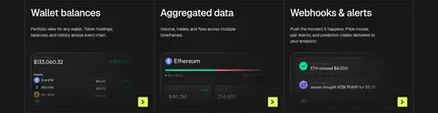
Feature grid Dark feature panels divided by thin borders, with compact headings, short copy, and small lime navigation markers.
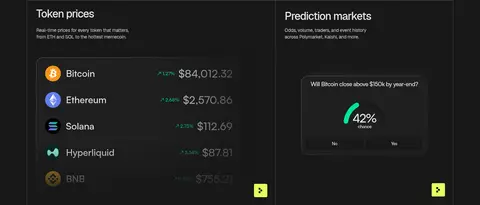
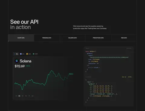
Data showcase Framed chart, wallet, or token interface previews on dark surfaces, mixing muted labels with mint market indicators.
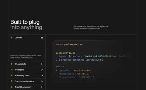
Code panel Dark API example panel with JetBrains Mono query and response text plus restrained syntax color.
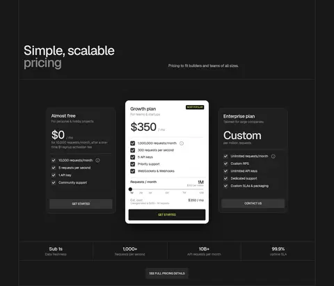
Pricing cards Three-column pricing comparison with dark side cards and a visually emphasized light central plan.
Navigation Compact uppercase labels on a dark bar, Codex wordmark at left, and a bright lime Get Started action at right.
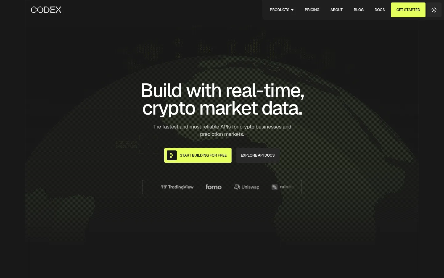
Imagery · The hero uses a subdued, dark, globe-like digital asset visual behind centered copy, faded so the headline and lime CTA remain dominant. Product illustrations are primarily interface captures or rendered mockups: token lists, charts, wallet balances, code, and data visualizations. Token logos and partner marks add color within those demonstrations, not as defining brand colors. Imagery is framed in dark panels and cropped to support the grid.
页面版块 共 14 个版块,按页面从上到下排列,每个都标了类型、布局和交互套路。
该做与不该做 ✓ 该做 Use #181818 as the dominant page canvas. Reserve #e5ff5d for primary actions and small emphasis. Use thin borders to organize grids and panels. Keep headings crisp, compact, and high contrast. Treat charts and interface previews as dark product evidence. Use monospace only for code and API responses. ✕ 不该做 Do not turn the page into a bright, light-themed layout. Do not use lime as a large background band. Do not add heavy shadows to every card. Do not let mockup colors redefine the brand palette. Do not make section layouts overly spacious or sparse. Do not use decorative display type in place of the measured sans-serif system. 给 AI 的提示词 想快速出一个同风格的新页面,把这段话连同 DESIGN.md 一起发给 AI。
复制 Build a new Codex-style page as a dark, technical interface with a #181818 Codex Black canvas and compact, deliberate hierarchy. Use #e5ff5d Signal Lime for the primary CTA and restrained interface emphasis; use #3d4045 Graphite Line for fine dividers, #1f1f1f Panel Charcoal for subtle card surfaces, and #e8e8e8 Mist White for readable copy. Use Geist or Inter for headings, navigation, and body text, with tightly tracked display headings and uppercase micro-labels. Use JetBrains Mono for code examples. Structure content in a centered wide frame, alternating concise section introductions with bordered grids, product previews, and code panels. Keep market greens inside data details. Favor flat surfaces and hairline borders; use imagery as dark, framed product evidence rather than decoration.
DESIGN.md Tailwind v4 CSS 变量 Design Tokens
---
title: "Codex design system"
variant: extended
source: https://www.codex.io/
captured_at: 2026-10-12
theme: dark
industry: crypto
generator: Design DNA (https://four.wiralomi.com/style/codex-io)
ai_generated: true
ai_label: "本文件由 AI 辅助生成:数值取自公开网页的实测样式,命名、用途说明与建议为模型解读。商标归原所有者。 / AI-assisted content"
---
# Codex · Design System
> A precise dark canvas for live crypto data
**Theme:** dark · **Industry:** crypto · **Source:** https://www.codex.io/ · **Captured:** 2026-10-12 (1440×900 desktop)
_AI-assisted content: values are measured from the public page at capture time; names, roles and guidance are model-written interpretations. Trademarks belong to their owners._
Codex presents its crypto data API through a near-black, editorial interface with sharp lime calls to action and restrained green data highlights. Fine borders, compact labels, and live-looking product panels make technical breadth feel structured and approachable.
## North star
Keep the dark canvas quiet and let clear grids, readable data, and lime actions establish hierarchy.
## Overview
The page is anchored by a near-black canvas (## Colors
| Name | Hex | Token | Group | Role |
|---|---|---|---|---|
| Codex Black | ` | `--color-codex-black` | brand | Primary canvas and recurring card background; also grounds the hero and dark fade overlays. |
| Signal Lime | ` | `--color-signal-lime` | accent | Primary CTA fill, highlighted action labels, small badges, and lime interface indicators. |
| Graphite Line | ` | `--color-graphite-line` | surface | Measured divider and border color; appears as a contrasting band and footer surface. |
| Soft Silver | ` | `--color-soft-silver` | neutral | Muted explanatory copy and secondary footer text on dark backgrounds. |
| Quiet Gray | ` | `--color-quiet-gray` | neutral | Secondary text and less prominent copy, preserving contrast without competing with headings. |
| Paper White | ` | `--color-paper-white` | neutral | Navigation, primary text, and selected headings and buttons. |
| Panel Charcoal | ` | `--color-panel-charcoal` | surface | Raised card and navigation surface, notably in portfolio-style data panels. |
| Mist White | ` | `--color-mist-white` | neutral | Main body and feature-card text, slightly softened against the black canvas. |
| Market Mint | ` | `--color-market-mint` | accent | Small market-data gains, badges, and status details; a data accent rather than a broad surface. |
| Slate Gray | ` | `--color-slate-gray` | neutral | Low-emphasis labels, headings, footer copy, and muted button text. |
| Divider Charcoal | ` | `--color-divider-charcoal` | surface | Subtle card edges and separators within dark interface areas. |
| Control Charcoal | ` | `--color-control-charcoal` | surface | Quiet button, navigation, and card control backgrounds. |
| Pale Mint | ` | `--color-pale-mint` | accent | Occasional green-tinted text accent, supporting the market-data palette. |
| Midnight Gray | ` | `--color-midnight-gray` | neutral | Rare subdued text detail; keep it secondary on the dark canvas. |
| Deep Ink | ` | `--color-deep-ink` | neutral | Dark foreground on lime primary buttons and a small number of dark text details. |
| Data Amber | ` | `--color-data-amber` | semantic | Small warm data highlight; use as a restrained informational detail, not a dominant brand color. |
### Semantic aliases
`--color-canvas` → ` (Codex Black) · `--color-surface` → ` (Graphite Line) · `--color-surface-2` → ` (Panel Charcoal) · `--color-text` → ` (Paper White) · `--color-text-muted` → ` (Soft Silver) · `--color-text-subtle` → ` (Quiet Gray) · `--color-border` → ` (Graphite Line) · `--color-accent` → ` (Market Mint) · `--color-accent-2` → ` (Pale Mint) · `--color-accent-3` → ` (Data Amber)
### Contrast (WCAG 2.x)
| Text | Background | Ratio | Level |
|---|---|---|---|
| ` | ` | 17.76:1 | AAA |
| ` | ` | 10.41:1 | AAA |
| ` | ` | 16.48:1 | AAA |
| ` | ` | 11.63:1 | AAA |
| ` | ` | 6.82:1 | AA |
| ` | ` | 10.79:1 | AAA |
| ` | ` | 7.38:1 | AAA |
| ` | ` | 4.33:1 | AA-large |
| ` | ` | 6.85:1 | AA |
| ` | ` | 10.71:1 | AAA |
### Gradients
- `linear-gradient(rgba(24, 24, 24, 0) 0%, rgba(24, 24, 24, 0.02) 36%, rgba(24, 24, 24, 0.08) 52%, rgba(24, 24, 24, 0.24) 70%, rgba(24, 24, 24, 0.56) 86%, rgba(24, 24, 24, 0.86) 96%, rgb(24, 24, 24) 100%)`
- `linear-gradient(to left, rgb(24, 24, 24) 13.1%, rgba(0, 0, 0, 0) 100%)`
- `linear-gradient(rgb(24, 24, 24) 13.1%, rgba(0, 0, 0, 0) 100%), linear-gradient(to top, rgb(24, 24, 24) 13.1%, rgba(0, 0, 0, 0) 100%)`
- `linear-gradient(to top, rgb(24, 24, 24) 13.1%, rgba(0, 0, 0, 0) 100%)`
## Typography
| Family | Token | Source | Weights | Role | Free substitute |
|---|---|---|---|---|---|
| Geist | `--font-body` | webfont | 400, 500 | Primary display, navigation, body copy, labels, and buttons | Inter |
| Manrope | `--font-manrope` | webfont | 400 | Supporting sans-serif text in secondary interface areas | Manrope |
| satoshi | `--font-satoshi` | webfont | 500, 400 | Some feature headings and wallet/data card text | Manrope |
| JetBrains Mono | `--font-mono` | webfont | 400 | Code examples and API response snippets | JetBrains Mono |
- **Geist:** Medium-weight display with tight negative tracking; uppercase navigation and compact captions are common.
- **Manrope:** Regular-weight supporting voice; keep it clean and understated alongside Geist.
- **satoshi:** Regular and medium weights provide a subtly rounder companion to Geist.
- **JetBrains Mono:** Monospace code treatment with comfortable line spacing and no extra tracking.
### Type scale — Perfect Fourth (ratio ≈ 1.347, base 14px)
| Role | Size | Weight | Line height | Letter spacing | Case | Family | Used for |
|---|---|---|---|---|---|---|---|
| display | 62px | 500 | 0.92 | -0.04em | — | Geist | Oversized hero statement and prominent page-level display copy. |
| h1 | 56px | 500 | 0.92 | -0.04em | — | Geist | Primary hero heading. |
| h2 | 48px | 500 | 1 | -0.04em | — | Geist | Major section headings across the long landing page. |
| h3 | 32px | 500 | 1.4 | 0 | — | satoshi | Feature headings and product panel titles. |
| h4 | 28px | 500 | 1.5 | 0 | — | satoshi | Secondary card headings and nested feature titles. |
| body | 14px | 400 | 1.4 | -0.02em | — | Geist | Supporting descriptions, feature copy, and standard interface text. |
| caption | 12px | 500 | 1.33 | -0.02em | uppercase | Geist | Uppercase micro-labels, badges, and compact metadata. |
| button | 10px | 400 | 1 | -0.02em | — | Geist | Compact action labels, typically uppercase. |
| nav | 12px | 500 | 1.33 | -0.02em | uppercase | Geist | Uppercase primary navigation labels. |
| code | 11.5px | 400 | 1.75 | 0 | — | JetBrains Mono | Monospace API queries and structured response examples. |
## Spacing & layout
- Base unit **4px**, density **comfortable**.
- Scale (most used values): 1, 4, 6, 8, 10, 11, 12, 13, 15, 16, 17, 20, 24, 26, 32, 56 px.
- Section rhythm 64px · element gap 12px · card padding 20px · max content width 1278px.
The content sits within a broad centered frame, measured at a 1278px maximum width, with a fine outer boundary visible in the screenshots. The hero centers its message over atmospheric media; subsequent sections use left-aligned introductions, paired feature panels, and multi-column grids. Dividers define the transitions between modules more than contrasting section backgrounds do. The measured rhythm uses generous gaps between sections and tighter spacing inside cards and dense data displays. Content density varies deliberately: open headline areas lead into compact, information-rich product demonstrations.
## Shape & elevation
- Radius: button `4px` · card `20px` · media `50%` · badge `4px` · nav `4px` · link `4px` · xs `1px` · sm `3px` · md `4px` · lg `5px` · xl `7px` · 2xl `15px` · pill `9999px`
- Shadow `lg` (card): `rgba(0, 0, 0, 0) 0px 0px 0px 0px, rgba(0, 0, 0, 0) 0px 0px 0px 0px, rgba(0, 0, 0, 0) 0px 0px 0px 0px, rgba(0, 0, 0, 0) 0px 0px 0px 0px, rgba(0, 0, 0, 0.08) 0px 4.4px 26.4px 0px`
- Shadow `xl` (card): `rgba(0, 0, 0, 0) 0px 0px 0px 0px, rgba(0, 0, 0, 0) 0px 0px 0px 0px, rgba(0, 0, 0, 0) 0px 0px 0px 0px, rgba(0, 0, 0, 0) 0px 0px 0px 0px, rgba(0, 0, 0, 0.45) 0px 24px 60px 0px`
- Motion: standard transition `0.2s cubic-bezier(0, 0, 0.2, 1)` on interactive elements.
The design is mostly flat: fine borders and hairlines establish card edges, section divisions, and table structure. Dark panels separate content subtly from the canvas instead of relying on conspicuous shadows. The pricing area introduces a brighter featured card against darker neighboring plans; shadows are restrained and used to distinguish layered cards where needed.
## Imagery
The hero uses a subdued, dark, globe-like digital asset visual behind centered copy, faded so the headline and lime CTA remain dominant. Product illustrations are primarily interface captures or rendered mockups: token lists, charts, wallet balances, code, and data visualizations. Token logos and partner marks add color within those demonstrations, not as defining brand colors. Imagery is framed in dark panels and cropped to support the grid.
## Components
### Primary CTA
Lime-filled button with dark text, uppercase Geist label, compact padding, and a small icon on prominent start-building actions.
### Section introduction
Large left-aligned heading paired with a short muted description, often with the title wrapping across two lines.
### Feature grid
Dark feature panels divided by thin borders, with compact headings, short copy, and small lime navigation markers.
### Data showcase
Framed chart, wallet, or token interface previews on dark surfaces, mixing muted labels with mint market indicators.
### Code panel
Dark API example panel with JetBrains Mono query and response text plus restrained syntax color.
### Pricing cards
Three-column pricing comparison with dark side cards and a visually emphasized light central plan.
### Navigation
Compact uppercase labels on a dark bar, Codex wordmark at left, and a bright lime Get Started action at right.
### Measured component styles
- **Primary button** (“S T A R T B U I L D I N G F O R F R E E ”): background ## Do
- Use ## Don't
- Do not turn the page into a bright, light-themed layout.
- Do not use lime as a large background band.
- Do not add heavy shadows to every card.
- Do not let mockup colors redefine the brand palette.
- Do not make section layouts overly spacious or sparse.
- Do not use decorative display type in place of the measured sans-serif system.
## Agent prompt
Build a new Codex-style page as a dark, technical interface with a ## Page sections (top to bottom)
| # | Type | Layout | UX patterns | UI patterns |
|---|---|---|---|---|
| 1 | hero | Centered hero statement and actions over a dark atmospheric globe visual. | Primary and secondary CTA, Partner marks | Dark media fade, Lime CTA, Centered heading |
| 2 | feature-split | Left-aligned heading and supporting paragraph in a single introductory band. | Value proposition, Technical reassurance | Large heading, Muted copy, Open dark canvas |
| 3 | feature-grid | Two-column feature area with token price and prediction-market demonstrations. | Feature discovery, Live-data preview | Bordered panels, Token list, Prediction widget |
| 4 | feature-grid | Three adjacent product cards for balances, aggregated data, and webhooks. | Feature scanning, Explore links | Dark interface previews, Fine dividers, Lime indicators |
| 5 | product-showcase | Section title and copy above tabs, with chart and code panels side by side. | Tabbed data categories, Interactive query preview | Chart visualization, Code panel, Dark segmented tabs |
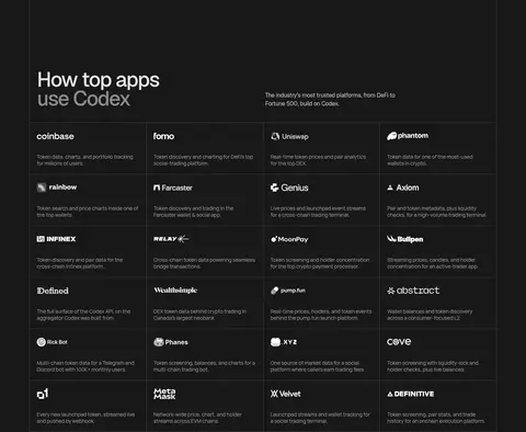
| 6 | logo-cloud | Section intro followed by a dense, multi-column grid of product and company marks. | Customer discovery, Social proof | Logo-and-copy cells, Thin grid lines |
| 7 | feature-split | Intro above a two-part interface: capability list beside a large code example. | Capability selection, API example | Vertical feature menu, Monospace code panel, Lime selection details |
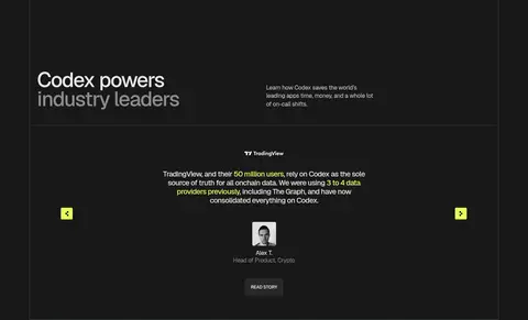
| 8 | testimonials | Centered testimonial within a framed band, with controls at the sides. | Carousel navigation, Read-story link | Centered quote, Customer attribution, Small lime controls |
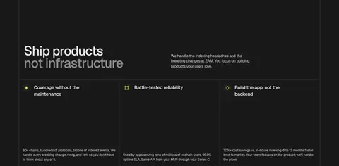
| 9 | feature-grid | Intro followed by three equal feature columns with compact copy. | Benefit scanning, Capability comparison | Three-column grid, Small icons, Bordered cells |
| 10 | pricing | Three pricing cards, a highlighted central plan, and a compact metrics row below. | Plan comparison, Primary plan selection | Featured light card, Dark side cards, Checklist rows |
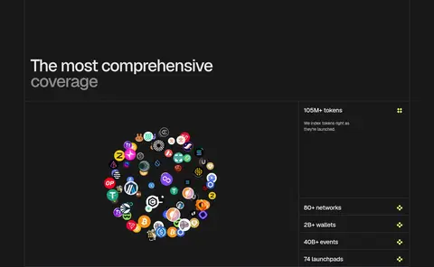
| 11 | stats | Large token illustration beside a vertically stacked set of coverage metrics. | Scale validation, Coverage browsing | Token-logo cluster, Metric list, Divided rows |
| 12 | integrations | Four-column endpoint cards beneath a section heading. | Endpoint discovery, Explore links | Bordered cards, Compact labels, Arrow accents |
| 13 | cta | Centered heading and short copy with paired calls to action. | Signup prompt, Documentation access | Centered composition, Lime primary action, Dark secondary action |
| 14 | footer | Brand description and several compact link columns above a fine bottom divider. | Grouped site navigation, Legal links | Small uppercase headings, Muted link lists, Thin separators |
## Source CSS custom properties (selected)
```css
--background: