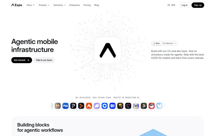
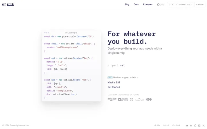
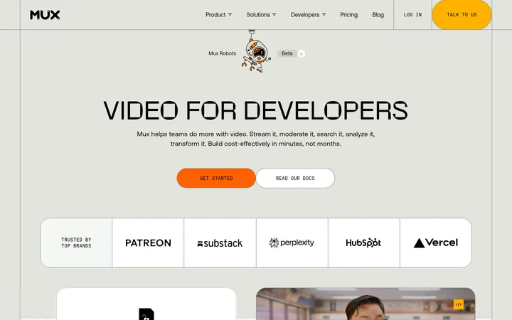
North star · Make technical content feel precise and approachable by pairing a quiet monochrome canvas with purposeful violet emphasis and real product interface visuals.
The page uses a white canvas as the default, punctuated by broad near-black feature bands that make technical diagrams and bright violet details stand out. Purple is used selectively in emphasized headline words, links, interface highlights, and primary actions; it is not a blanket background colour. Geist Sans supplies compact, direct product copy and tightly tracked display headings, while Geist Mono marks code, metadata, and small technical labels. The central layout is a restrained, centered content column with left-aligned copy and split product demonstrations; cards, logo rows, and testimonial grids provide variation without changing the overall rhythm. Product visuals are crisp terminal panels, manifests, and system diagrams rather than lifestyle photography. Soft violet glow appears behind selected hero and interface moments, while borders and shadows remain subtle. Comfortable whitespace separates sections, and rounded controls and panels soften the otherwise precise, engineering-led presentation.
Headings, body copy, navigation, buttons, and customer cards.
Aa 设计
GeistMono
网络字体 · 字重 400 / 600 / 500 · 占比 31%
免费替代:IBM Plex Mono
Code samples, metadata, compact captions, and technical links.
角色
示例
字号
字重
行高
字距
一级标题
Large, tightly tracked hero headline with selectively violet-emphasized words.
Flox
48px
600
1.04
-0.05em
二级标题
Section headlines introducing product capabilities and customer proof.
Flox
29px
400
1.42
-0.015em
三级标题
Feature titles, card headings, and smaller supporting section labels.
The quick brown fox 敏捷的狐狸
18px
400
1.55
0
正文
Compact explanatory copy, testimonials, and navigation text.
The quick brown fox 敏捷的狐狸
14px
400
1.45
-0.005em
辅助文字
Small monospaced metadata, labels, and technical annotations.
The quick brown fox 敏捷的狐狸
12px
400
1.5
0
链接
Monospaced inline links and understated technical calls to action.
The quick brown fox 敏捷的狐狸
13.5px
400
1.5
-0.01em
代码
Terminal commands and code-like product interface content.
const style = 1;
12px
400
1.5
0
间距与布局
基准单位 2px · 密度:适中
76px版块间距
12px元素间距
16px卡片内边距
1040px内容最大宽度
1px
2px
4px
5px
6px
7px
8px
9px
10px
11px
12px
14px
16px
18px
20px
22px
A centered page frame uses a measured maximum width of 1040px, with left-aligned copy and split text/product compositions. The hero balances headline and terminal mock-up; later sections alternate wide white and near-black bands. Feature areas use two- and four-column arrangements, while logos and testimonials form compact grids. Comfortable vertical separation gives each band a clear beginning, with tighter grouping inside cards and diagrams. Keep the overall density moderate and let product proof occupy deliberate, uncluttered space.
圆角与层次
按钮 · 12px
卡片 · 20px
图片 · 50%
徽标 · 7px
导航 · 6px
链接 · 12px
lg · card
lg · card
md · other
lg · card
The page is mostly flat, with section colour and thin borders defining structure. Cards and interface panels use restrained shadows for separation, while the dark terminal mock-up gains depth against white. Rounded corners soften cards and controls; avoid stacking multiple pronounced shadows or adding heavy outlines.
组件
下面的预览按实测的按钮、输入框、徽标、卡片样式重建(字体用替代字体)。
Site navigation
Compact centered header with logo, grouped text links, GitHub proof, and a light rounded Sign in control.
Hero terminal
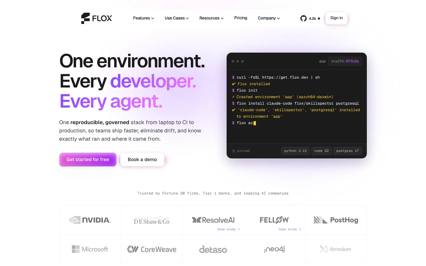
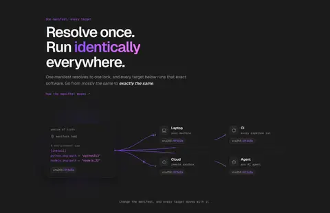
Two-column hero pairs oversized headline and copy with a dark terminal panel, syntax highlights, and environment badges.
Primary CTA
Violet-to-pink filled action with rounded corners and subtle inset/shadow treatment; secondary actions use a light surface.
Capability diagram
Dark-section diagrams connect a single manifest to multiple targets using fine lines and small monospaced labels.
Feature cards
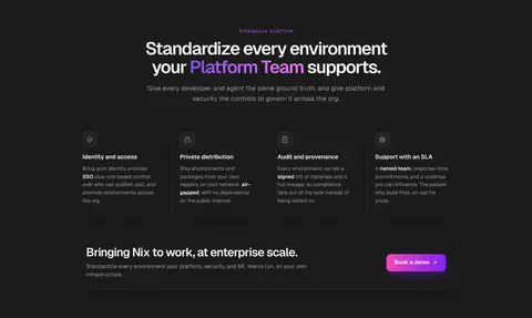
Light or dark cards use fine borders, rounded corners, concise headings, and compact supporting copy.
Customer proof
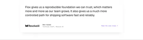
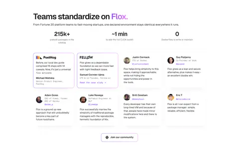
Logo grid and testimonial cards pair subdued brand marks with short quotes, names, roles, and small violet links.
Agent CTA panel
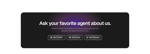
Large rounded near-black panel centers a heading, muted copy, and a row of compact outlined agent actions.
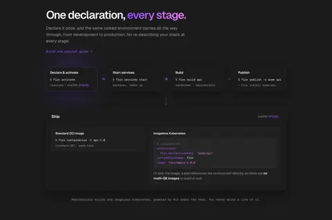
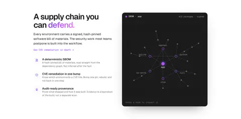
Imagery · Use product interface imagery rather than lifestyle photography: terminal windows, manifests, dependency maps, and workflow diagrams. Keep panels crisp and dark, with restrained code colours and violet highlights. The hero’s terminal mock-up sits opposite the headline; diagrams can spread across dark sections. Customer and company marks appear as compact evidence in grids. Violet radial glows are atmospheric accents, not substitutes for the underlying interface detail.
Use white as the default canvas and reserve near-black for defined feature bands.
Apply violet to meaningful emphasis, links, and primary actions.
Set code, labels, and compact technical links in Geist Mono.
Use real-looking terminal and environment diagrams as product proof.
Keep section copy left-aligned except for clearly centered enterprise or CTA blocks.
Separate content with generous whitespace and subtle borders.
✕ 不该做
Do not turn the whole page into a purple gradient.
Do not use lifestyle photography in place of product interface visuals.
Do not use bright yellow as a general brand accent; it belongs in terminal syntax.
Do not crowd technical diagrams with decorative labels.
Do not add heavy shadows or thick outlines to every card.
Do not set long explanatory copy in a monospaced font.
给 AI 的提示词
想快速出一个同风格的新页面,把这段话连同 DESIGN.md 一起发给 AI。
Build a new Flox-style page as a precise developer-tools experience. Use Canvas White (#ffffff) for the main canvas and Terminal Ink (#1b1b1b) for text and selected full-width feature bands. Reserve Signal Violet (#7b2bff), Bloom Violet (#af54ff), and Glow Pink (#f47bff) for headline emphasis, links, CTA treatment, and restrained interface glow. Use Geist Sans, or Inter as a free substitute, for headings and prose; use Geist Mono or IBM Plex Mono for code and metadata. Center content within the measured 1040px maximum width, alternating split product demonstrations with compact grids and clear section pauses. Show terminal panels, manifests, or dependency diagrams instead of lifestyle imagery. Keep cards softly rounded, borders fine, and elevation subtle. Ensure every decorative accent supports product clarity.