North star · Let generous white space and clear editorial hierarchy carry the story; use imagery and color only to distinguish meaningful content shifts.
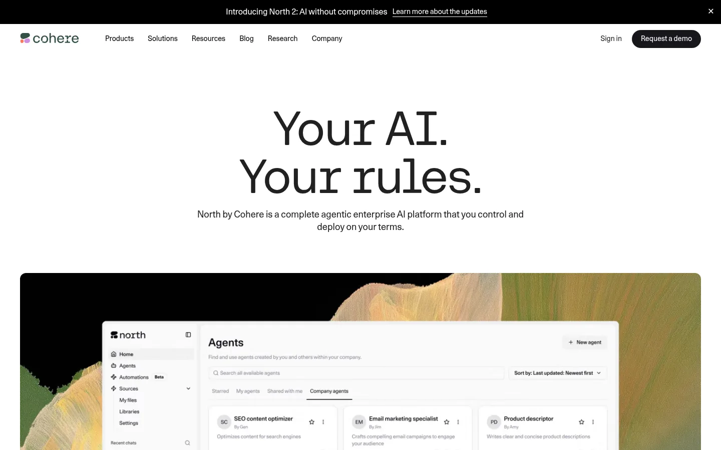
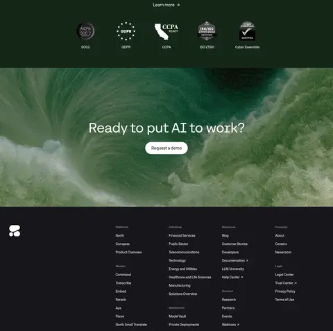
The page is anchored by Gallery White (#ffffff), with near-black text and a warm stone band (#f0eee9) that groups the purpose-built product stories. Deep green appears later as a focused security panel, while the footer switches to near-black. The measured coral-to-blue gradient accents are secondary details rather than the main page identity; the screenshots are led by neutral space, photography, and product interfaces. Unica77 Cohere Web carries navigation, body copy, and most headings in a restrained, regular-weight sans-serif voice. Large centered hero type creates a clear opening, while smaller editorial labels and fine dividers structure the lower content. Layout alternates broad open sections with paired feature panels, cards, and image-led industry examples. Photography, interface mockups, customer marks, and dark 3D product scenes add contrast without turning the page into a decorative collage. Pill-shaped actions and softly rounded media frames soften the otherwise crisp, flat composition.
Main navigation, body, links, captions, and most headings.
Aa 设计
CohereMono
网络字体 · 字重 400 · 占比 2%
免费替代:IBM Plex Mono
Code-like labels and technical metadata.
角色
示例
字号
字重
行高
字距
特大标题
Oversized hero headline, set as the page’s primary visual anchor.
Cohere
96px
400
1
-0.02em
一级标题
Hero-level headline or major page title.
Cohere
60px
400
1
-0.02em
二级标题
Section titles such as product, industry, and testimonial headings.
Cohere
48px
400
1.2
-0.01em
三级标题
Feature and customer-story card headings.
Cohere
32px
400
1.2
-0.01em
四级标题
Supporting subheads within product and editorial content.
The quick brown fox 敏捷的狐狸
24px
400
1.3
0
正文
Explanatory paragraphs, descriptions, and feature copy.
The quick brown fox 敏捷的狐狸
14px
400
1.4
0
辅助文字
Dates, category labels, and compact image or card details.
The quick brown fox 敏捷的狐狸
12px
400
1.4
0
导航
Primary navigation and footer link labels.
The quick brown fox 敏捷的狐狸
14px
400
1.4
0
链接
Text links and compact inline calls to action.
The quick brown fox 敏捷的狐狸
14px
400
1.4
0
代码
Technical labels and short uppercase metadata.
const style = 1;
14px
400
1.4
0.02em
间距与布局
基准单位 4px · 密度:紧凑
40px版块间距
4px元素间距
10px卡片内边距
1360px内容最大宽度
4px
6px
8px
10px
12px
16px
20px
24px
32px
36px
40px
80px
Use a centered content frame with a measured maximum width of 1360px and a compact underlying spacing scale. The opening hero is centered and spacious; subsequent sections alternate between full-width bands, paired image-and-copy layouts, and multi-column cards. The warm stone product area groups several stacked showcases, while white sections restore visual breathing room. Center section titles where they introduce a new topic; align feature copy and editorial cards to the start. Thin separators and restrained gaps establish rhythm without dense grids.
圆角与层次
按钮 · 9999px
卡片 · 22px
图片 · 8px
导航 · 9999px
链接 · 22px
没有测到阴影:页面是扁平的,层次靠底色和描边区分。
The page is mostly flat, with no measured shadow system. Separate sections through background bands, whitespace, hairlines, and changes in image tone rather than stacked elevation. Product and customer cards use rounded containers or image frames, while interfaces may contain their own dark panels. Keep boundaries clear and layering restrained.
组件
下面的预览按实测的按钮、输入框、徽标、卡片样式重建(字体用替代字体)。
Announcement strip
A black full-width top bar with centered update text and an inline learn-more link, set apart from the white navigation below.
Primary navigation
White horizontal header with Cohere mark, compact navigation links, sign-in text, and a dark pill-shaped demo action.
Hero
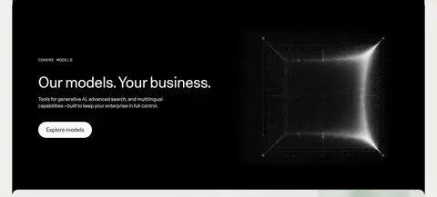
Centered two-line display headline and supporting sentence above a broad rounded product-media frame.
Pill action
Use fully rounded buttons; measured examples pair a white fill with dark text or a Cohere Ink fill with white text.
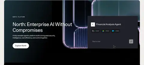
Product showcase
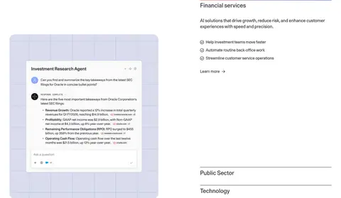
Stacked feature panels combine compact uppercase labels, prominent copy, a pill action, and large product imagery or interface mockups.
Customer story cards
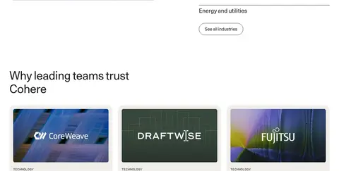
Three-column editorial cards pair imagery and customer marks with small category labels, concise headlines, and read-more links.
Security band
Centered light typography and a short link sit on Security Green, followed by a horizontal row of certification marks.
Footer
A dark inverse closing area with the brand mark and compact columns of product, industry, resource, and company links.
Imagery · Use cinematic enterprise product photography, interface mockups, customer logos, and selective dark 3D imagery. Frame large media in softly rounded containers and pair it with crisp, readable interface details. Industry and customer imagery should feel photographic and contextual, while security badges and logos stay small and orderly. Images bring color and atmosphere; avoid letting their incidental hues redefine the page palette.
Keep the opening canvas white and the hero headline centered.
Use Warm Stone to group related product showcases.
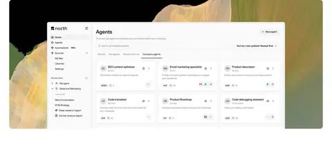
Let large product images or interface mockups support concise copy.
Use Security Green for the security-and-certification content block.
Keep buttons pill-shaped and text treatments calm.
Use hairlines and whitespace to divide editorial content.
Keep customer marks and certification logos visually secondary.
✕ 不该做
Do not make the accent gradient the dominant page treatment.
Do not apply the dark footer palette across the entire page.
Do not crowd the hero with multiple competing actions.
Do not add heavy shadows or stacked card elevation.
Do not use product-image colors as global brand colors.
Do not turn every content block into a boxed card.
Do not overuse uppercase technical labels.
给 AI 的提示词
想快速出一个同风格的新页面,把这段话连同 DESIGN.md 一起发给 AI。
Build a new enterprise AI page in Cohere’s restrained editorial style. Start with Gallery White (#ffffff), Cohere Ink (#17171c) typography, a compact horizontal navigation, and a centered, oversized hero with a single primary message. Organize related offerings in Warm Stone (#f0eee9) bands; alternate open white sections with image-and-copy features, customer proof, and editorial cards. Use rounded media frames and fully pill-shaped actions, with white or Cohere Ink fills. Reserve Security Green (#152717) for a focused trust or certification panel, and use near-black for the footer. Treat Coral Signal (#ff7759), Iris Signal (#7670c5), and Cobalt Signal (#4c6ee6) as minor accent-gradient colors only. Favor real product imagery, interfaces, and customer marks over decorative illustration. Keep layout flat, spacious, and clearly sectioned.