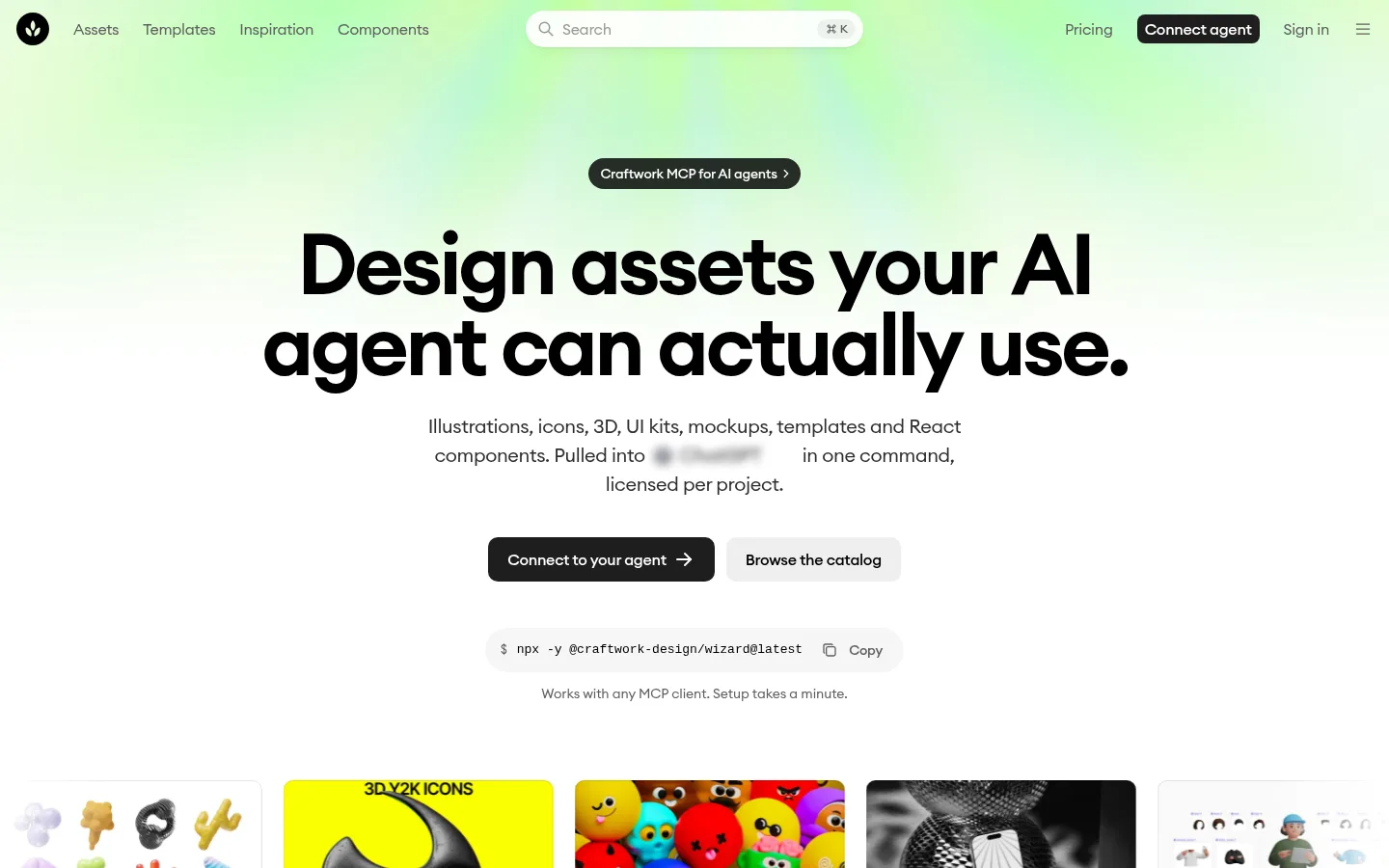
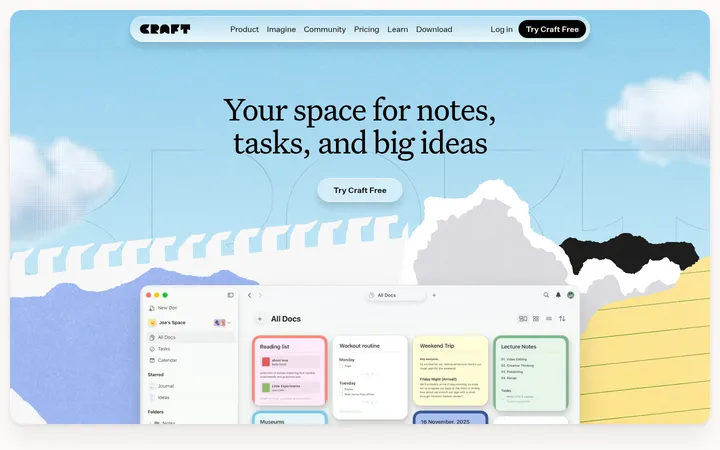
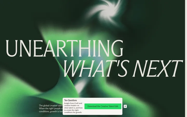
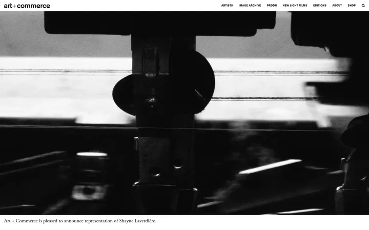
North star · Keep the interface nearly monochrome and spacious, letting one soft hero glow and vivid asset previews supply the colour.
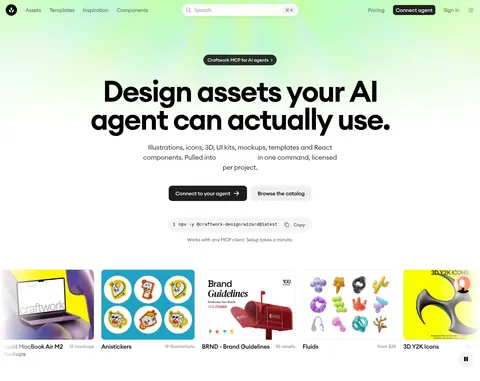
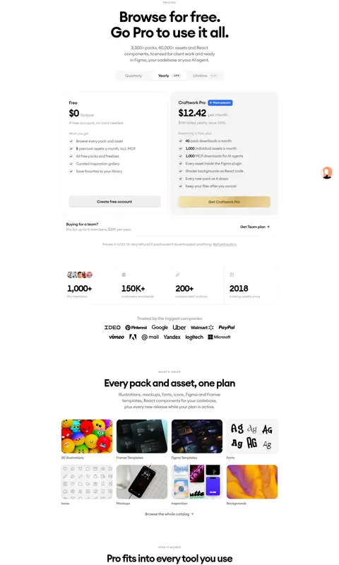
The page is built on a white canvas, with black typography and pale-gray surfaces carrying most of the interface. A soft lime-to-mint glow washes behind the opening navigation and hero, acting as a restrained signature rather than a general background treatment; the rest of the long page returns to white. Euclid Circular supplies rounded, compact forms across navigation, body copy, and oversized centered headings. The headline is heavy and tightly tracked, balanced by smaller muted explanatory text and dark, pill-like primary actions. Product previews bring the strongest colour and texture: colorful illustrations, mockups, templates, and interface screenshots sit inside pale neutral cards. Sections use generous vertical separation and a centered content column, with grids for assets and features, paired pricing cards, and a two-column FAQ. Thin gray borders and subtle shadows define controls and card edges without competing with the imagery.
Display, headings, navigation, body copy, labels, and controls throughout the interface.
Aa 设计
ui-monospace
系统字体 · 字重 400 · 占比 1%
免费替代:Roboto Mono
Install command and other compact code-like snippets.
角色
示例
字号
字重
行高
字距
特大标题
Oversized headline or high-impact hero display text.
Craftwork
88px
600
0.95
-0.045em
一级标题
Main hero headline and prominent page-level heading.
Craftwork
62px
600
1.06
-0.039em
二级标题
Major section headings, including marketplace and pricing sections.
Craftwork
42px
600
1.14
-0.05em
三级标题
Feature-card and smaller content-section headings.
Craftwork
32px
600
1.13
-0.03em
四级标题
Supporting feature titles and secondary headings.
The quick brown fox 敏捷的狐狸
20px
400
1.5
-0.018em
正文
Standard descriptions, explanatory copy, and card text.
The quick brown fox 敏捷的狐狸
16px
400
1.38
-0.02em
辅助文字
Small metadata, asset labels, and fine-print descriptions.
The quick brown fox 敏捷的狐狸
14px
400
1.43
0
按钮
Primary and secondary action labels.
The quick brown fox 敏捷的狐狸
14px
500
1.43
-0.02em
导航
Main header navigation links.
The quick brown fox 敏捷的狐狸
16px
500
1.38
-0.02em
链接
Inline and asset-card links.
The quick brown fox 敏捷的狐狸
16px
400
1.38
-0.02em
眉题
Uppercase small section labels above headings.
The quick brown fox 敏捷的狐狸
12px
500
1.83
0.06em
代码
Command-line installation snippet beneath the hero actions.
const style = 1;
13px
400
1.5
0
间距与布局
基准单位 2px · 密度:适中
60px版块间距
6px元素间距
—卡片内边距
1020px内容最大宽度
2px
4px
6px
7px
8px
10px
12px
14px
15px
16px
20px
24px
32px
Use a centered, comfortable-width content column capped at the measured 1020px, with broad white margins and a relaxed vertical rhythm. The opening hero is center-aligned beneath a compact horizontal header; later content alternates between asset grids, feature-card mosaics, and paired pricing or FAQ layouts. The measured section gap is 60px, while tighter internal groupings use the compact 6px element rhythm. Keep card grids aligned and evenly spaced, with considerable blank space between major page bands rather than filling every viewport.
圆角与层次
按钮 · 10px
卡片 · 20px
图片 · 10px
徽标 · 4px
导航 · 12px
链接 · 20px
inset · button, media, other
inset · card, link
hairline · media, badge
lg · card
The design is mostly flat, using white and pale-gray surfaces with thin, quiet borders. Cards gain separation through their background and rounded silhouette rather than heavy shadows. Reserve subtle inset edges and restrained button or card shadows for controls and floating media previews; avoid pronounced elevation across the page.
组件
下面的预览按实测的按钮、输入框、徽标、卡片样式重建(字体用替代字体)。
Header navigation
Compact horizontal header with logo, category links, centered search, pricing, dark Connect agent action, sign-in, and menu controls.
Hero actions
Centered headline and supporting copy above a dark rounded agent-connection CTA and a light Browse the catalog button.
Command snippet
Small pale rounded code strip under the hero actions, using monospace installation text and a copy affordance.
Asset preview cards
Catalog imagery sits in pale-gray cards with generous rounding; previews remain vivid and carry concise titles and metadata.
Feature mosaic
Uneven grid of broad and compact light-gray cards, pairing product screenshots with short feature descriptions.
Pricing cards
Two side-by-side plans with restrained borders, black pricing text, concise benefit lists, and distinct low-key CTA treatments.
FAQ accordion
Two-column FAQ area with a compact left introduction and right-side questions divided by fine horizontal rules.
Imagery · Imagery is primarily product-led rather than photographic: colorful illustration sets, 3D objects, mockups, template screenshots, and interface previews demonstrate the catalog. Place previews in tidy, rounded, pale-gray cards and preserve their native color and detail. The hero itself stays typographic, with a diffuse lime-and-mint glow behind the top area; avoid adding decorative imagery that competes with the assets.
Keep the main canvas white and the overall palette restrained.
Use the lime-to-mint glow only as a soft hero atmosphere.
Set major headings in rounded geometric sans with tight tracking.
Let asset previews retain their vivid original colours.
Use pale-gray cards and subtle hairlines to structure content.
Preserve generous whitespace between major sections.
✕ 不该做
Do not turn the whole page into a tinted or dark background.
Do not use the green glow behind every section.
Do not add bright interface accents that compete with asset previews.
Do not rely on heavy shadows for card separation.
Do not crowd the hero with illustrations or extra promotional blocks.
Do not make supporting text as large or bold as the headline.
给 AI 的提示词
想快速出一个同风格的新页面,把这段话连同 DESIGN.md 一起发给 AI。
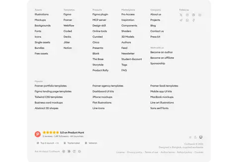
Build a new Craftwork-style design marketplace page with a white Gallery White (#ffffff) canvas, Ink (#000000) typography, and Porcelain Gray (#f4f4f4) cards. Use a restrained lime-and-mint hero wash with Lime Mist (#e4f99e) and Mint Haze (#def8f2), fading quickly back to white. Set headings in a rounded geometric sans such as DM Sans, with bold, tightly tracked display text and quieter gray supporting copy. Center the hero beneath a compact horizontal navigation; pair a dark primary CTA with a pale secondary action and a small monospace command strip. Organize content into spacious grids and feature mosaics, letting vivid product previews provide most visual variation. Use Quiet Line (#e5e5e5) hairlines, rounded cards, and subtle elevation only where needed. Keep later pricing, FAQ, newsletter, and footer areas clean and scannable.