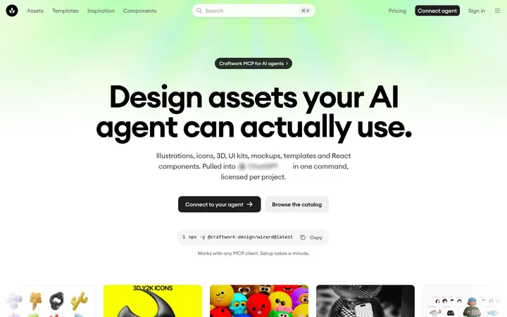
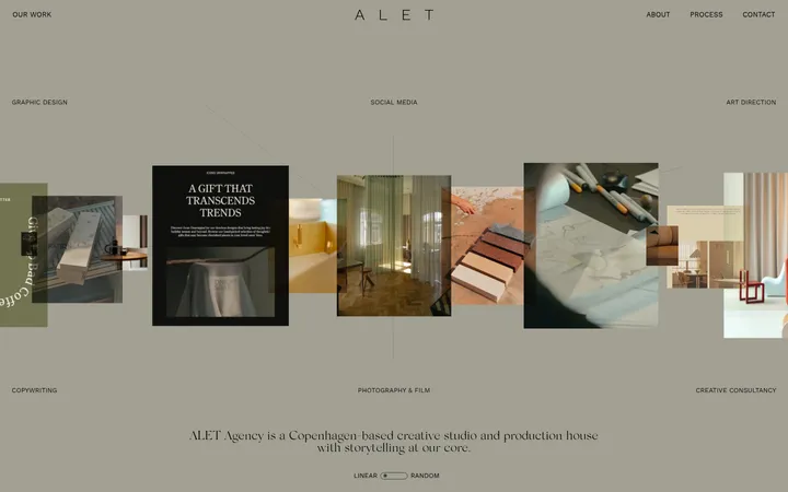
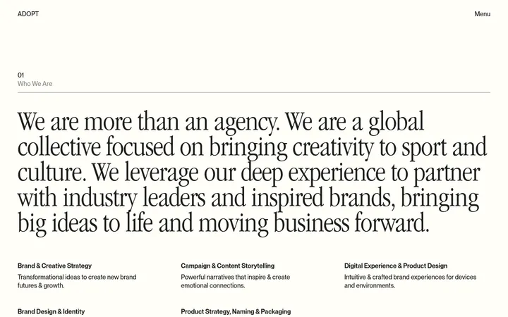
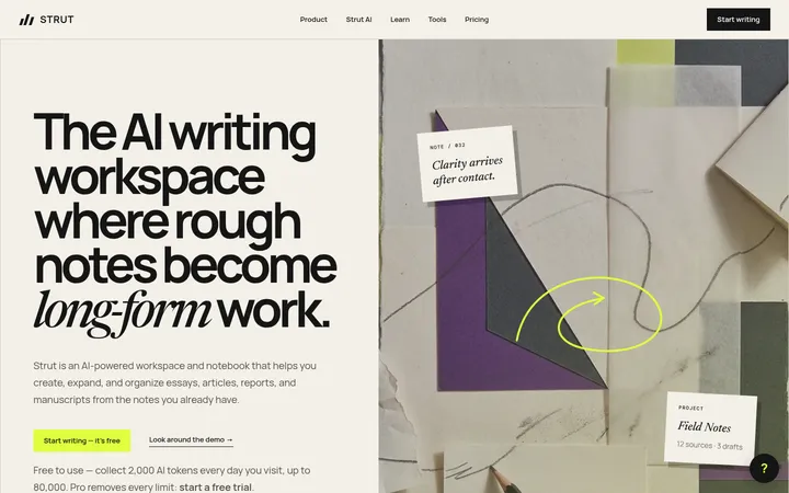
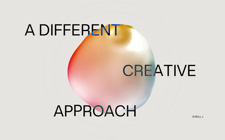
North star · Pair editorial-scale typography and organic imagery with a restrained paper-and-forest palette, keeping bright green for meaningful actions.
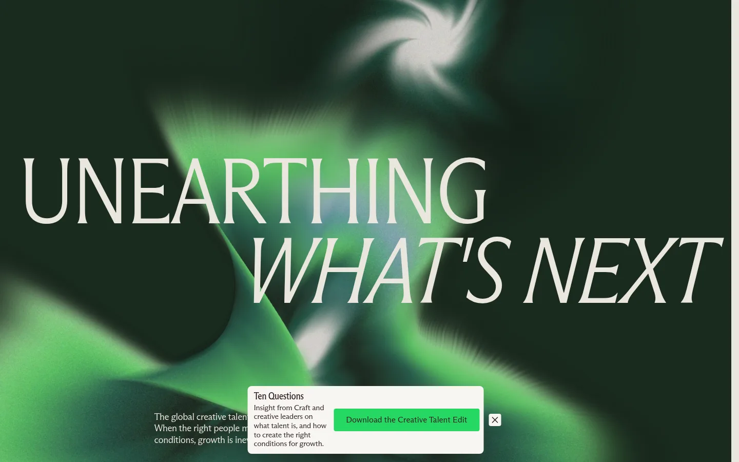
The page opens with a full-bleed deep green visual and oversized, pale editorial lettering, establishing a dramatic contrast with the warm off-white canvas that carries most of the page. Forest greens return in the guide feature and footer, while a vivid green is reserved for primary actions and occasional highlighted words. Typography is the main graphic device: a distinctive condensed display face handles large headlines, while the companion Arizona Flare face supports body copy and smaller labels. Generous breathing room separates content groups, but the main service area becomes a compact four-column image grid. Soft-focus botanical photography adds an organic counterpoint to the structured cards and editorial podcast portraits. Hairline borders and restrained card elevation preserve a mostly flat, print-like feel. The overall system balances confident scale, natural imagery, and a measured neutral palette rather than relying on decorative UI.
配色
点色块复制色值。用途说明来自对页面的实测位置(背景、文字、描边、按钮)与截图判读。
品牌色
强调色
表层色
中性色
功能色
页面底色 · Warm Paper表层 · Deep Forest表层 2 · Moss Shadow表层 3 · Linen Card主文字 · Burgundy Ink次要文字 · Muted Umber弱文字 · Ivory Mist描边 · Soft Stone强调 · Spring Signal
Body copy, captions, and supporting text across sections and cards.
Aa 设计
ABC Arizona Flare Condensed Variable
网络字体 · 字重 400 / 300 · 占比 27%
免费替代:Bodoni Moda
Display headlines, section headings, and selected large editorial statements.
角色
示例
字号
字重
行高
字距
特大标题
Oversized uppercase hero statement and brand-led editorial display.
Craft
182px
300
0.85
-0.02em
一级标题
Primary page or feature headlines, including major editorial statements.
Craft
104px
300
0.85
-0.03em
二级标题
Section headlines and prominent content titles.
Craft
48px
300
0.95
-0.025em
三级标题
Service and content-card headings.
Craft
32px
350
1.08
-0.03em
四级标题
Compact feature, guide, and supporting editorial titles.
The quick brown fox 敏捷的狐狸
26px
400
1.18
-0.02em
正文
Introductory paragraphs, service descriptions, and general copy.
The quick brown fox 敏捷的狐狸
18px
350
1.25
-0.02em
辅助文字
Small metadata, labels, episode details, and supporting notes.
The quick brown fox 敏捷的狐狸
15px
350
1.18
-0.02em
间距与布局
基准单位 8px · 密度:适中
56px版块间距
8px元素间距
24px卡片内边距
—内容最大宽度
6px
8px
12px
16px
24px
32px
56px
64px
The page alternates full-width visual moments with centered editorial content on a warm canvas. The service area uses a four-column image-led grid; other sections shift between broad text, a two-part guide feature, and a three-card podcast row. Alignment varies intentionally: centered introduction, left-aligned editorial blocks, and asymmetrical hero lettering. Sections have comfortable breathing room and clear separation, while cards keep their content compact. No measured maximum page width is specified, so preserve the screenshot’s broad canvas and content groupings rather than imposing an invented fixed width.
圆角与层次
按钮 · 8px
卡片 · 4px
xl · card
xl · card
The interface is largely flat: color blocks, imagery, and typography establish hierarchy rather than deep shadows. Cards use restrained light surfaces and modest rounded corners, with measured card shadows limited to editorial content surfaces. Thin warm-gray borders separate sections; keep layering focused on the hero overlay and image-card captions.
组件
下面的预览按实测的按钮、输入框、徽标、卡片样式重建(字体用替代字体)。
Primary CTA
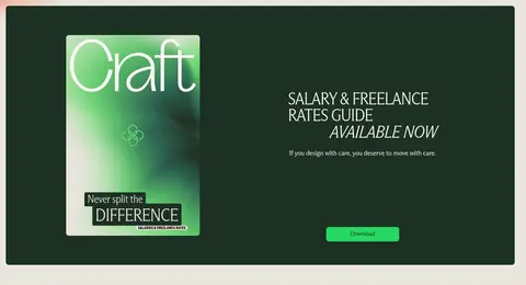
Bright green button with dark text, compact label, and a measured rounded treatment; reserve it for actions such as viewing jobs or downloading the guide.
Statistic cards
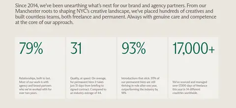
A row of four warm, lightly tinted cards pairing prominent green figures with small explanatory copy.
Service image grid
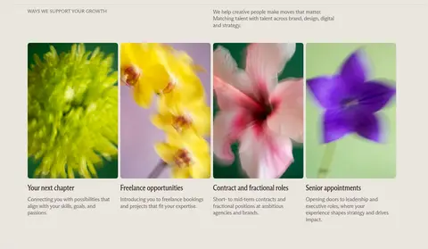
Four adjacent botanical-image cards with concise headings and supporting copy beneath each image.
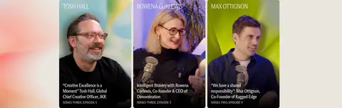
Podcast episode cards
Portrait-led cards arranged in a three-column row, with names and episode details legible over a dark image treatment.
Guide feature
A wide deep-green panel combining a guide cover image, light editorial heading and copy, and a bright download action.
Editorial text block
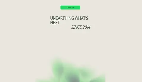
Large condensed headings paired with short, carefully spaced body copy on the warm canvas.
Imagery · Use soft-focus botanical photography as the recurring service-card motif, with vivid greens, yellow, pink, and violet appearing within the images rather than defining interface colors. The opening hero is an abstract, blurred green visual behind large type. Podcast content uses framed portrait imagery with dark lower overlays for readable captions, while the guide feature pairs a cover graphic with a dark green panel.
Use Warm Paper (#eae6df) as the primary page canvas.
Keep Deep Forest (#1d3023) for dramatic full-width sections and guide surfaces.
Reserve Spring Signal (#26d862) for clear actions and selective emphasis.
Use the condensed face for display headlines and editorial section titles.
Choose soft-focus, botanical imagery for service-oriented image cards.
Let large blank areas and section breaks create a calm editorial rhythm.
✕ 不该做
Do not turn the page into a generic white SaaS dashboard.
Do not use Spring Signal (#26d862) as a large, continuous page background.
Do not crowd the warm canvas with dense borders or controls.
Do not replace the narrow display typography with heavy geometric sans headings.
Do not treat image colors as additional brand palette colors.
Do not add deep shadows to every card or section.
给 AI 的提示词
想快速出一个同风格的新页面,把这段话连同 DESIGN.md 一起发给 AI。
Build a new editorial recruitment-consultancy page in Craft’s visual language. Use Warm Paper (#eae6df) as the principal canvas, with Deep Forest (#1d3023) for a dramatic hero or feature panel and Spring Signal (#26d862) only for primary actions or small emphasis. Use Burgundy Ink (#2a1a1d) for readable copy and pale text on dark green. Set display headings in a light, narrow editorial serif-like face and body text in a related expressive text face; keep tracking close and line lengths comfortable. Combine broad, quiet text sections with image-led grids, portrait cards, or a split guide feature. Favor soft-focus botanical photography, restrained card surfaces, hairline separators, and generous section breathing room. Keep hierarchy clear and decorative UI minimal; do not invent a fixed max width or extra palette colors.