Anything 以克制的白色画布、宽松的产品演示和醒目的深色功能区,介绍 AI 应用构建工具。圆角卡片、浅色描边与少量绿蓝点缀,让界面亲和而不喧宾夺主。
North star · Keep the page quiet and spacious, letting crisp product UI and alternating charcoal feature bands provide the visual emphasis.
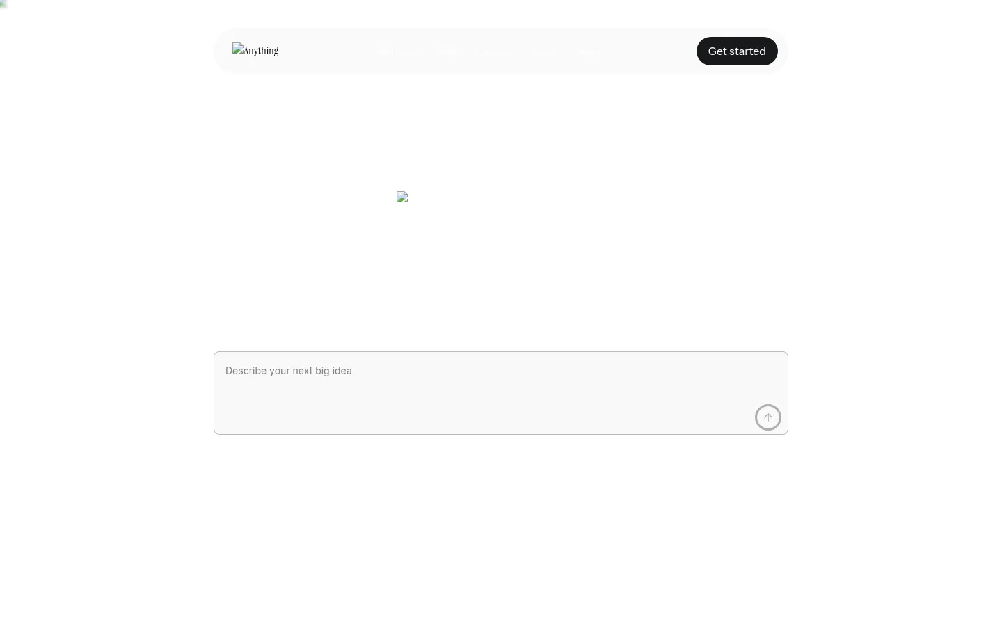
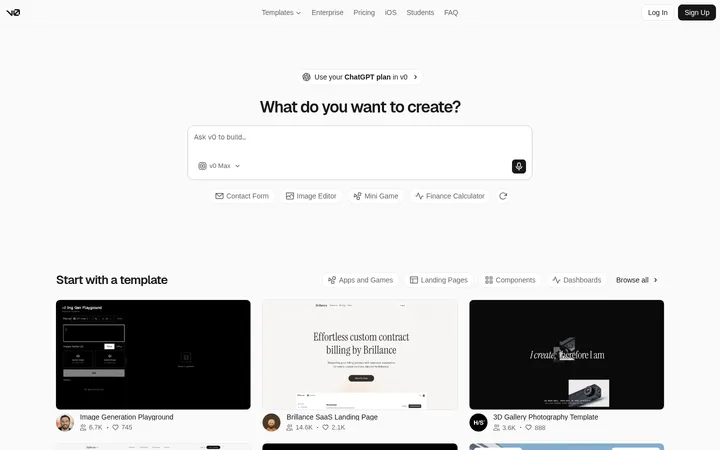
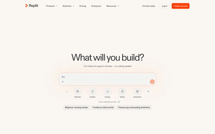
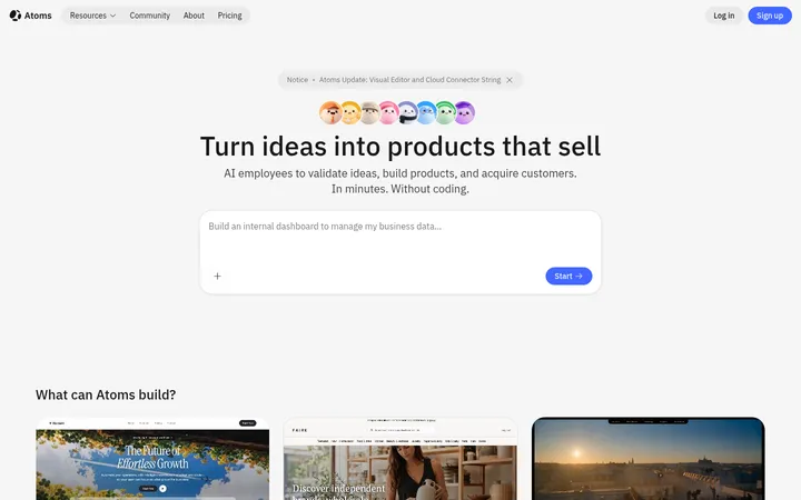
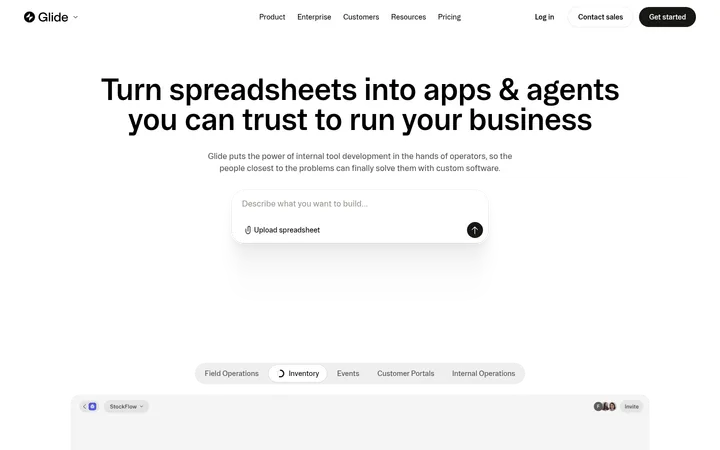
The page relies on a predominantly white canvas, with near-black sections used as deliberate pauses for feature storytelling. Charcoal text carries the main hierarchy; soft gray supports captions and secondary copy, while green and pale blue appear as restrained accents rather than broad brand-color fields. Typography combines Inter for much of the body copy with Instrument Sans for prominent headings and calls to action. The opening viewport is unusually spacious: a compact header, a large open hero area, and a wide prompt field create a calm invitation to start building. Further down, content alternates between centered introductions, product examples, and dark feature bands. Rounded cards, fine gray borders, and gentle shadows organize interface previews without making the page feel dense. Most imagery functions as product evidence—app screens and generated UI—rather than decorative photography.
配色
点色块复制色值。用途说明来自对页面的实测位置(背景、文字、描边、按钮)与截图判读。
品牌色
强调色
表层色
中性色
功能色
页面底色 · Gallery White表层 · Cloud Gray表层 2 · Night Charcoal表层 3 · Pure Black主文字 · Night Charcoal次要文字 · Soft Graphite弱文字 · Quiet Silver描边 · Fine Pewter强调 · Builder Green强调 2 · Sky Lavender强调 3 · Leaf Green
Body copy, captions, and much of the general interface text.
Aa 设计
Instrument Sans
网络字体 · 字重 400 / 600 · 占比 17%
免费替代:Inter
Prominent headings, links, and primary button labels.
Aa 设计
Instrument Serif
网络字体 · 字重 500 · 占比 1%
免费替代:Lora
A very minor serif detail in the measured page typography.
角色
示例
字号
字重
行高
字距
特大标题
Large display text where the page uses oversized promotional messaging.
Anything
64px
400
1.5
0
一级标题
Hero-level headline and primary page statement.
Anything
54px
400
1.4
0
二级标题
Section titles, including centered feature introductions.
Anything
42px
600
1.4
0
三级标题
Small or light-weight subheadings in feature content.
Anything
29px
300
0.55
0
四级标题
Compact feature titles and product-example headings.
The quick brown fox 敏捷的狐狸
24px
400
1.4
0
正文
Explanatory paragraphs and standard interface copy.
The quick brown fox 敏捷的狐狸
16px
400
1.5
0
辅助文字
Short supporting labels and secondary descriptions.
The quick brown fox 敏捷的狐狸
14px
400
1.5
0
按钮
Primary action labels such as Get started.
The quick brown fox 敏捷的狐狸
16px
400
1.2
0
链接
Navigation and inline text links.
The quick brown fox 敏捷的狐狸
16px
400
1.5
0
间距与布局
基准单位 2px · 密度:适中
50px版块间距
22px元素间距
—卡片内边距
855px内容最大宽度
2px
6px
8px
12px
15px
16px
18px
20px
22px
24px
25px
27px
30px
32px
40px
50px
The measured content max width is 855px, with a comfortable density and a spacious section rhythm. The opening composition centers a compact header and prompt field amid extensive white space. Subsequent sections mix centered headings with three-column examples, two-column dark feature content, and a card-heavy product showcase. Use a consistent centered content frame, generous separation between blocks, and restrained alignment changes to keep long product storytelling easy to scan.
圆角与层次
按钮 · 50%
卡片 · 20px
图片 · 20px
md · card
The visual system favors flat surfaces and fine outlines over strong depth effects. Product cards use subtle gray borders and rounded corners; a measured medium shadow exists on cards but is restrained. Use dark section bands as the main layer change, rather than stacking panels or adding dramatic shadows.
组件
下面的预览按实测的按钮、输入框、徽标、卡片样式重建(字体用替代字体)。
Header
Compact centered navigation bar on a white canvas, with a wordmark area and a dark pill-shaped Get started action.
Hero prompt field
Wide, lightly outlined prompt input with muted placeholder copy and a small circular submit control aligned at the lower right.
Builder example cards
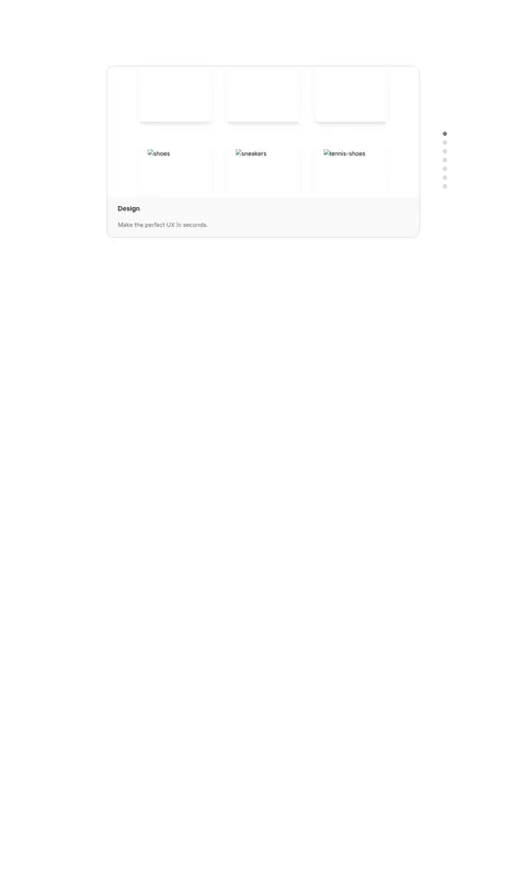
Light rounded cards with fine gray borders, short feature copy, and product-interface preview areas.
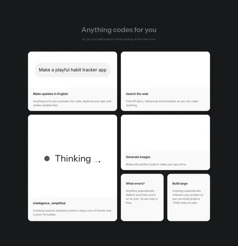
Dark feature band
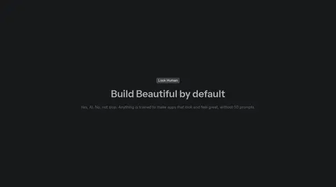
Full-width charcoal section with centered heading and light supporting copy, followed by contrasting white feature cards.
Product showcase
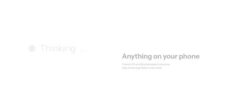
Large, restrained product UI panel on a white background, accompanied by concise feature labels and descriptions.
Section introduction
Centered heading and short muted subtitle with substantial open space around the content.
Imagery · The page uses product UI previews and generated app examples as its main imagery, not lifestyle photography. Present them as clean interface panels and cards with light surfaces and rounded corners. The screenshots show some unavailable image assets, so avoid making broken-image placeholders part of the intended style; prioritize believable, legible product mockups. Keep imagery secondary to the open canvas and copy.
Preserve the white canvas as the dominant surface.
Use charcoal sections as purposeful contrast, not as the default.
Center the opening prompt field within a generous hero.
Show product features inside rounded, lightly bordered cards.
Reserve green and pale blue for small accent moments.
Use muted gray for supporting text and captions.
✕ 不该做
Do not crowd the hero with extra navigation or decorative content.
Do not use large saturated color blocks as a background.
Do not add heavy shadows or thick card outlines.
Do not turn product mockups into lifestyle photography.
Do not make every section a card grid.
Do not use green or blue as dominant text or surface colors.
给 AI 的提示词
想快速出一个同风格的新页面,把这段话连同 DESIGN.md 一起发给 AI。
Build a new page in Anything’s restrained AI-builder style. Start with a Gallery White (#ffffff) canvas, compact centered header, and a spacious hero that focuses on one clear prompt input. Use Night Charcoal (#18191b) for primary text, dark feature bands, and the main pill CTA; use Soft Graphite (#6a6a6c) for supporting copy. Present product UI in Cloud Gray (#f9f9f9) cards with Fine Pewter (#c4c4c4) hairlines and rounded corners. Keep Builder Green (#6dc078) and Sky Lavender (#99b7fa) as small accents, not broad fills. Combine Instrument Sans headings with Inter body copy. Alternate calm white showcase sections with occasional charcoal feature blocks, and maintain generous whitespace, centered content, and readable short descriptions.