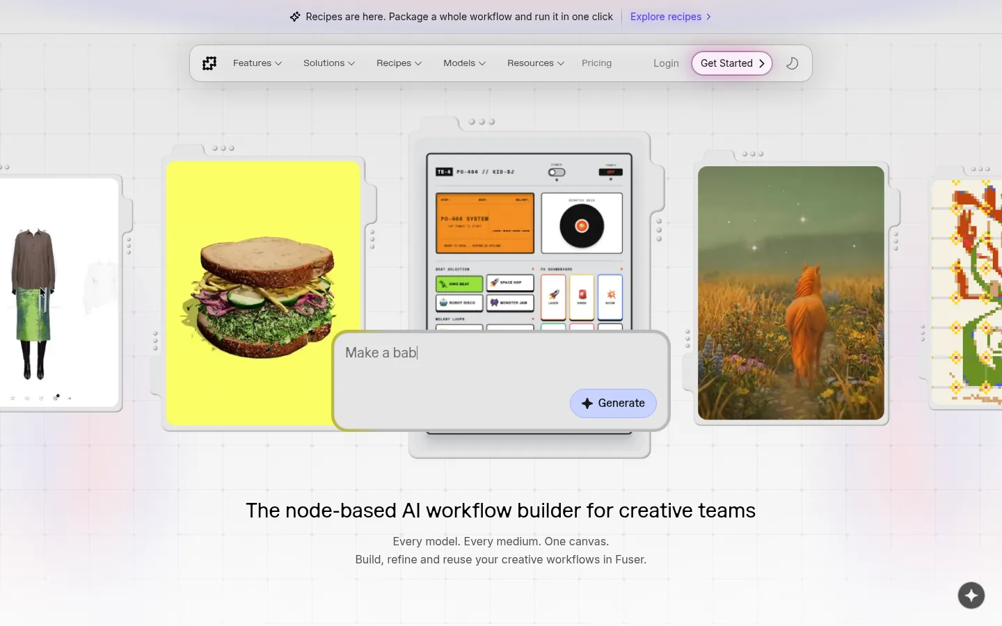
Fuser 以近白色界面呈现 AI 创意画布,并用鲜明的创作成果展示产品能力。克制的字体、圆润控件、细网格与柔和渐变,让长页面保持清爽且聚焦产品。
North star · Keep the interface quiet and near-white, and let layered creative-work examples—not decorative UI—provide the color and energy.
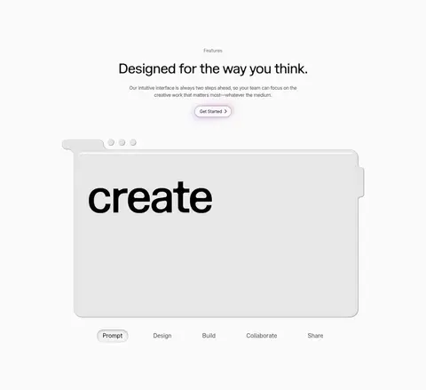
Fuser’s homepage is built around an almost-white canvas (#fafafa), allowing the node-based product demo and portfolio-like media to supply most of the visual drama. Near-black headings provide clear hierarchy, while muted gray copy and hairline borders keep navigation, cards, and supporting details quiet. Marund gives headings and prominent copy a distinctive, softly editorial character; Inter Variable handles compact interface labels, navigation, and controls. The first viewport layers a floating pill navigation above a fine grid backdrop and overlapping workflow cards, then centers the headline below. Across the page, generous whitespace separates application demos, recipe cards, feature storytelling, plans, integrations, FAQ, and mission content. Rounded pills and softly edged panels make the interface approachable and tactile. Violet, lavender, and pink appear sparingly in links, small controls, and ambient gradients; stronger yellows, greens, and terracottas belong to the creative examples, not the core brand palette.
Display and editorial text: large headings, body copy, and selected links.
Aa 设计
Inter Variable
网络字体 · 字重 400 / 500 · 占比 49%
免费替代:Inter
Navigation, buttons, captions, eyebrow labels, and selected card headings.
角色
示例
字号
字重
行高
字距
一级标题
Centered hero headline and other primary section statements.
Fuser
48px
450
1.1
-0.025em
二级标题
Section headlines for applications, features, plans, FAQ, and mission.
Fuser
30px
400
1.4
0
三级标题
Product or feature card headings and supporting subheads.
The quick brown fox 敏捷的狐狸
24px
500
1.33
0
四级标题
Smaller editorial headings and compact content labels.
The quick brown fox 敏捷的狐狸
22px
400
1
0
正文
Explanatory copy, mission statement, and supporting descriptions.
The quick brown fox 敏捷的狐狸
16px
300
1.5
0
辅助文字
Small interface captions and media or card metadata.
The quick brown fox 敏捷的狐狸
14px
400
1.43
0
按钮
Pill CTA labels and compact product-demo actions.
The quick brown fox 敏捷的狐狸
14px
400
1.43
0
导航
Primary navigation and menu items.
The quick brown fox 敏捷的狐狸
14px
400
1.43
0
链接
Inline text links and recipe exploration links.
The quick brown fox 敏捷的狐狸
16px
300
1.5
0
眉题
Uppercase section labels such as Applications and Features.
The quick brown fox 敏捷的狐狸
13px
500
1
0.14em
间距与布局
基准单位 8px · 密度:适中
32px版块间距
16px元素间距
16px卡片内边距
1376px内容最大宽度
1px
2px
4px
6px
7px
8px
10px
12px
16px
20px
24px
32px
64px
80px
160px
Use a centered, wide desktop composition constrained by the measured 1376px maximum width, with comfortable density and generous open space between content blocks. The hero and closing CTA are centered; FAQ, mission, and footer content shift to aligned columns. Product demonstrations can span multiple columns, while recipe cards form a compact grid. Maintain the measured 32px section-gap rhythm and 16px element spacing as a baseline, scaling whitespace qualitatively for larger section transitions. Keep navigation floating and centered rather than full-bleed.
圆角与层次
按钮 · 9999px
卡片 · 7px
图片 · 6px
徽标 · 9999px
导航 · 9999px
链接 · 9999px
md · card
inset · text, card
inset · other
md · button
The page is mostly flat, with thin gray outlines defining pill navigation and controls. Product cards and demos gain depth through overlapping panels, inset edges, and restrained soft shadows rather than heavy drop shadows. Preserve a tactile, layered canvas quality without making routine text blocks appear elevated.
组件
下面的预览按实测的按钮、输入框、徽标、卡片样式重建(字体用替代字体)。
Floating navigation
Centered rounded bar with a light gray surface, thin gray outline, muted Inter labels, and a pill-style Get Started action.
Hero canvas demo
Grid-backed stage with overlapping framed creative media, a central product panel, and a floating prompt input with Generate action.
Pill CTA
Compact rounded control with restrained dark text, a light surface, subtle outline, and soft glow where visible.
Recipe cards
Six creative examples arranged in a grid; image-led panels pair short labels and muted copy with rounded edges.
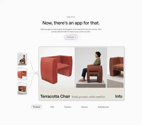
Application showcase
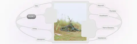
Wide product example framed as a canvas, with connected side thumbnails and a row of category selectors.
FAQ rows
Two-column FAQ area with a prominent heading and short questions separated by fine horizontal rules and plus controls.
Footer wordmark
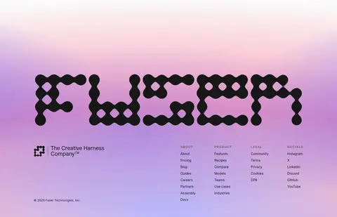
Large custom Fuser mark above company and link columns, set over the page’s strongest violet-pink gradient.
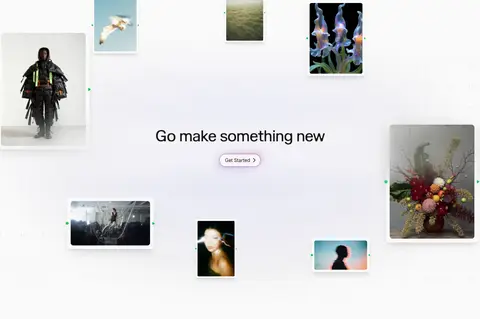
Imagery · Lead with layered product UI: framed creative outputs, a central node or canvas interface, and a floating prompt input. Throughout the page, mix product walkthroughs with photographic and rendered creative examples, including furniture, fashion, film, and generated scenes. Keep media in rounded or framed panels, with images carrying their own strong colors. Reserve soft violet-to-pink ambient gradients for broad atmospheric moments rather than applying them to every section.
Frame demos with fine gray outlines and rounded edges.
Keep violet and pink accents selective.
Give sections generous breathing room.
Let portfolio media supply vivid color.
✕ 不该做
Do not turn the whole page into a saturated gradient.
Do not use heavy shadows on every card.
Do not make the navigation full-bleed.
Do not use the media palette as core brand colors.
Do not crowd the page with dense copy.
Do not replace the canvas demos with generic stock imagery.
给 AI 的提示词
想快速出一个同风格的新页面,把这段话连同 DESIGN.md 一起发给 AI。
Build a new Fuser-style page as a quiet, product-led creative software experience. Use #fafafa Canvas White as the dominant background, #171717 Ink Black for key headings, and #525252 Soft Graphite for supporting copy. Reserve #4f39f6 Signal Violet, #bdbcfc Lavender Haze, and #fca3b9 Blush Glow for restrained links, control details, or atmospheric gradient moments. Set editorial headings in Marund or a close free substitute such as DM Sans; use Inter for navigation, buttons, and labels. Create a centered floating pill nav, a spacious canvas-like hero with layered product panels, and generous whitespace between sections. Use thin #b7b7b7 borders, rounded controls, and soft, limited shadows. Make vivid creative examples the main source of color, and keep product demonstrations tactile, framed, and clearly legible.