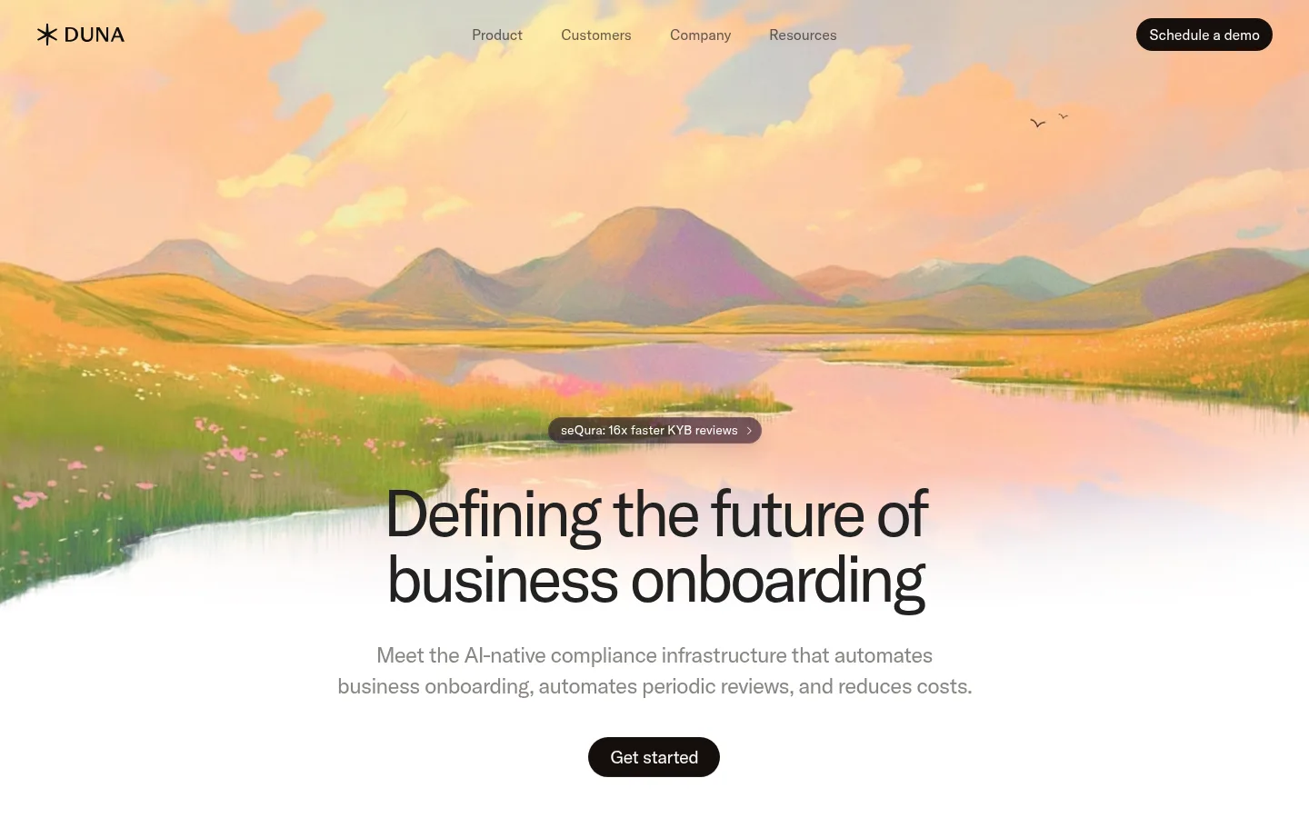
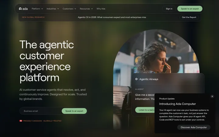
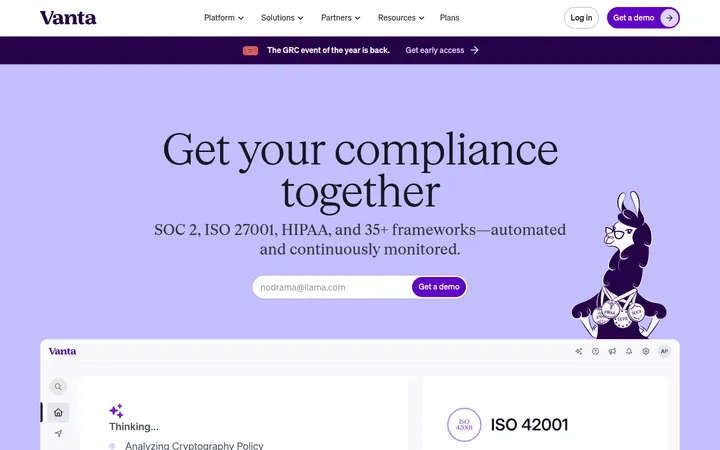
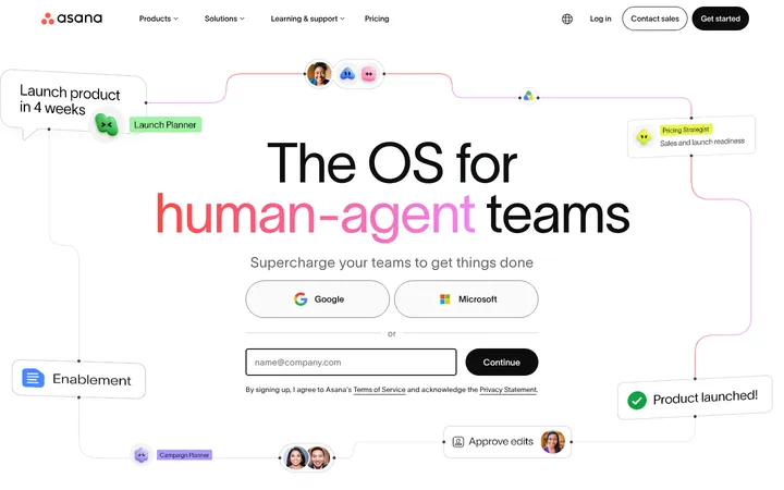
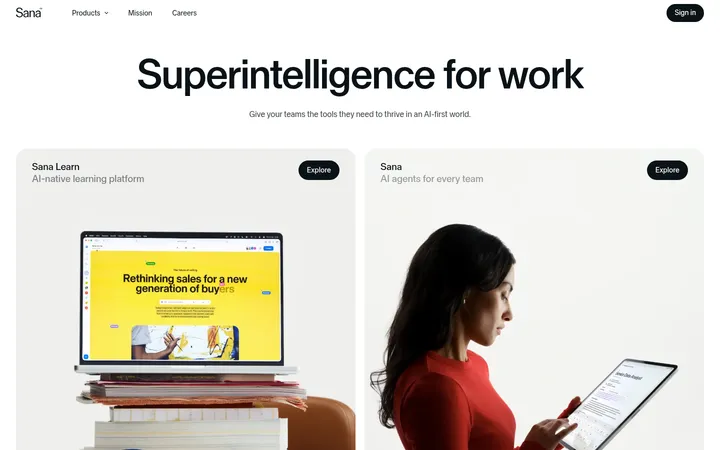
Duna 将克制的 SaaS 页面布局与沉浸式风景插画、柔和中性色结合起来。大字号紧凑标题搭配深色胶囊按钮,让合规产品叙事清晰而从容。
North star · Keep the interface quiet and legible, then use expansive painterly landscapes as the page’s emotional punctuation.
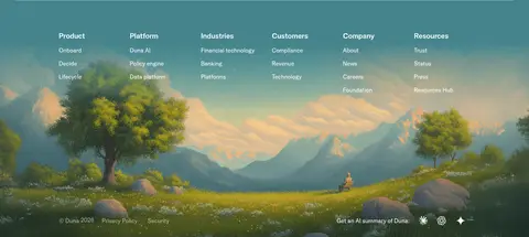
The page builds a quiet, editorial interface around a bright white canvas, using warm near-black text and muted gray supporting copy to keep product messaging legible. The opening is distinguished by a full-width, painterly landscape in peach, ochre, green, and lavender; these image colors are illustrative rather than the core interface palette. Across the rest of the long homepage, white space separates proof points, customer logos, testimonials, product capabilities, security, and customer stories. Pale warm-gray panels provide occasional contrast, while teal appears in a large AI feature band and the illustrated footer. GT America’s clean sans-serif forms support oversized, tightly tracked headings and compact body copy. Navigation and calls to action remain simple, with dark pill buttons and restrained labels. Product mockups sit within quiet, lightly tinted panels, preserving the overall sense of order and calm.
Primary headings, body copy, navigation, and links throughout the page.
Aa 设计
GT America Medium
网络字体 · 字重 400 · 占比 1%
免费替代:Inter
Sparse medium-weight emphasis within the main typographic system.
Aa 设计
GT America Trial Md
网络字体 · 字重 400 / 500 · 占比 1%
免费替代:Inter
Display-style headline treatment.
角色
示例
字号
字重
行高
字距
特大标题
Oversized display treatment for prominent headline moments.
Duna
80px
500
1
0
一级标题
Main hero headline about the future of business onboarding.
Duna
72px
400
1
-0.06em
二级标题
Major section headlines and feature-band statements.
Duna
44px
400
1.1
-0.05em
三级标题
Product capability, security, and customer-story section headings.
Duna
40px
400
1.2
-0.03em
四级标题
Smaller feature or card headings within content sections.
Duna
32px
400
1.2
-0.03em
正文
Supporting descriptions, testimonials, and explanatory product copy.
The quick brown fox 敏捷的狐狸
16px
400
1.5
-0.01em
辅助文字
Compact labels, customer attributions, and supporting metadata.
The quick brown fox 敏捷的狐狸
14px
400
1.71
0
链接
Navigation links and understated inline or section actions.
The quick brown fox 敏捷的狐狸
16px
400
1.5
-0.01em
间距与布局
基准单位 4px · 密度:紧凑
40px版块间距
10px元素间距
64px卡片内边距
1120px内容最大宽度
4px
6px
8px
10px
12px
16px
20px
24px
40px
48px
64px
128px
140px
The homepage uses a centered, constrained content frame with a measured maximum width of 1120px, alternating with full-bleed landscape and color-band sections. Navigation sits in a single horizontal row over the hero artwork. The main content is editorial and mostly left-aligned, with centered hero and brand-proof moments. Product features use spacious two-column splits, alternating text and mockup placement. Sections have generous separation and a compact information density within each block; the measured spacing system is based on a 4px unit.
圆角与层次
按钮 · 9999px
图片 · 24px
链接 · 9999px
lg · button
The interface is predominantly flat: white space and warm surface fills separate content rather than visible borders. Cards are mostly square-edged in the measured component data, while buttons and links use fully rounded pill shapes. A subtle layered shadow is measured on a small proof badge, not as a general card treatment. Avoid adding heavy outlines or broad elevation.
组件
下面的预览按实测的按钮、输入框、徽标、卡片样式重建(字体用替代字体)。
Primary pill CTA
Dark charcoal, fully rounded action button with concise white label; used for Schedule a demo and Get started.
Top navigation
Brand mark at left, centered text links, and a compact demo CTA at right; placed directly over the hero image.
Proof badge
Small rounded mauve-slate badge above the hero headline, carrying a customer outcome and a subtle shadow.
Customer logo row
Quiet, small customer marks aligned in a horizontal proof strip on white.
Testimonial panel
Large pale warm-gray quote card with generous inset space and a separate muted media panel.
Product feature split
Editorial heading and concise details paired with a softly tinted product mockup; alternate the media side across capabilities.
Full-bleed feature band
Centered AI message and compact CTA over a sky landscape, using the teal section treatment.
Imagery · Large, full-bleed painterly landscapes anchor the opening and footer; a sky-and-cloud image also fills a teal-toned AI feature band. Their warm, varied pigments are illustration colors, not a cue to recolor interface controls. Product sections use muted, softly tinted mockup panels with restrained interface details. Customer story cards introduce cropped imagery, while logos and certification marks stay small and secondary.
Use full-bleed landscapes as occasional section anchors.
Keep primary actions dark and fully pill-shaped.
Give feature sections ample breathing room.
✕ 不该做
Do not turn illustration colors into interface accents.
Do not add heavy borders to cards.
Do not use dense dashboard-like layouts.
Do not make every section a colored band.
Do not replace the restrained type with heavy bold display styles.
Do not use shadows as a default card treatment.
给 AI 的提示词
想快速出一个同风格的新页面,把这段话连同 DESIGN.md 一起发给 AI。
Build a new Duna-style SaaS page with a bright Gallery White #ffffff canvas, Warm Ink #292421 headings, and Quiet Gray #898683 supporting copy. Use GT America or a close sans-serif substitute such as Inter; keep display headings large, clean, and tightly tracked, with regular-weight body text. Structure content in a centered frame, opening with an immersive, full-bleed painterly landscape and a concise hero message. Use dark Button Charcoal #1a1816 pill CTAs, ample whitespace, and editorial feature splits with softly tinted mockup panels. Introduce Duna Teal #46838c only for a prominent feature band or illustrated footer, not as a pervasive control color. Keep cards mostly flat, use rounded pills for actions, and let customer proof and product details remain visually quiet.