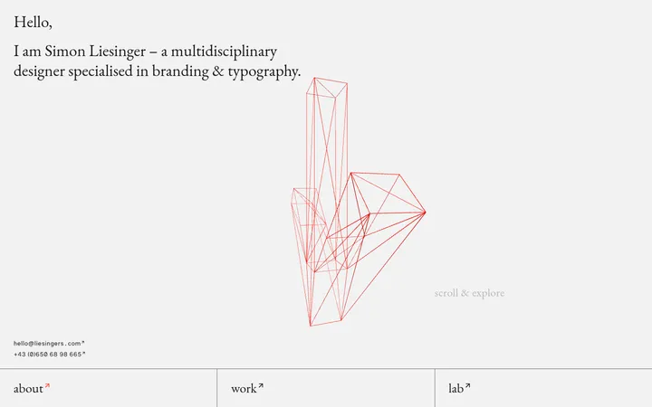
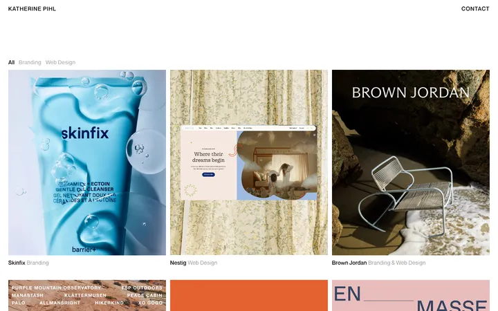
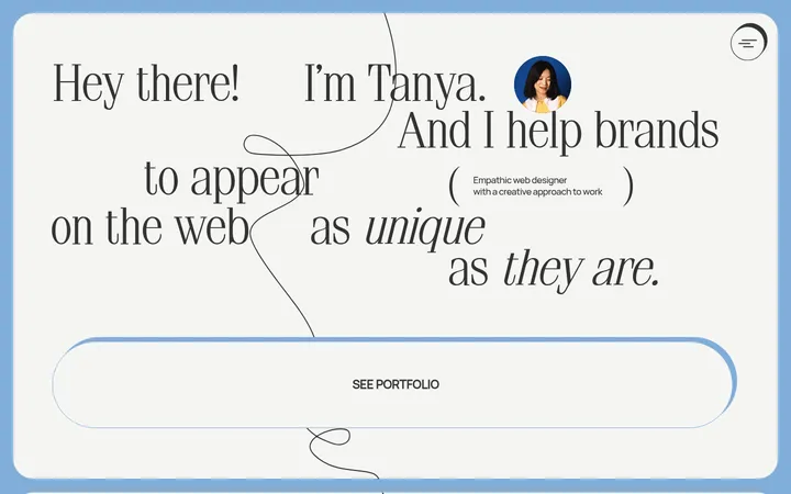
North star · Treat the page like a quietly paced editorial essay: warm neutral canvas, distinctive type, narrow reading measure, and imagery only where it supports the story.
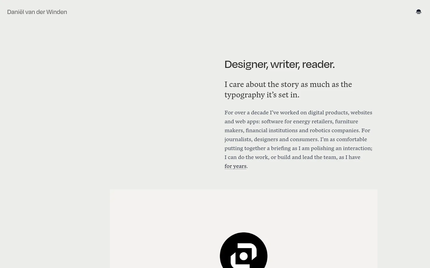
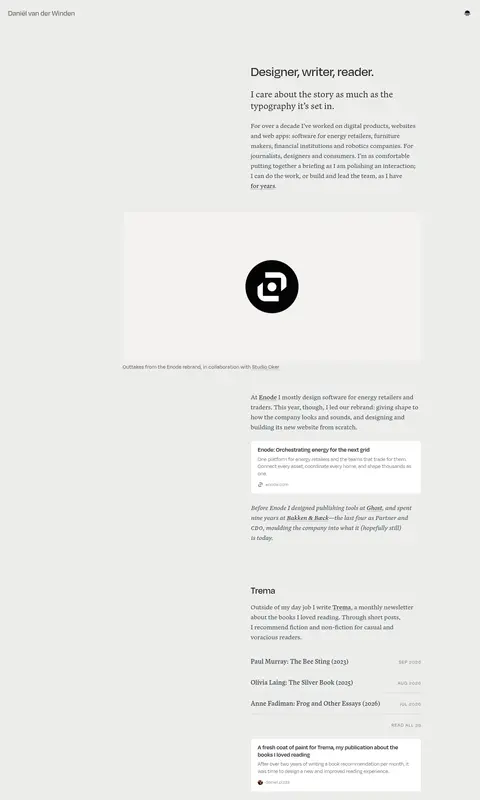
The page is built on a warm, light-gray canvas (#ededea), with nearly all content kept within that continuous field rather than separated into strong color bands. Dark gray text and muted secondary tones provide a soft but readable contrast. Blanco serif carries the long-form paragraphs and editorial project descriptions, while Degular sans-serif handles the identity, headings, captions, and compact labels. The opening places the main introduction in a narrow right-side column, leaving generous open space around it; subsequent work samples and sections follow a similarly focused reading column. Images appear as evidence of the work, not decoration: project artwork, book photography, and a speaking image are set into the page with minimal framing. Small white link previews and an occasional pale-blue card add quiet surface contrast. Fine gray rules separate content groups, while generous vertical pauses give the long portfolio an unhurried rhythm.
Editorial body copy, descriptive paragraphs, and text links.
Aa 设计
Degular
网络字体 · 字重 400 / 600 / 500 · 占比 32%
免费替代:DM Sans
Navigation, headings, captions, buttons, and uppercase eyebrow labels.
角色
示例
字号
字重
行高
字距
一级标题
Primary page identity or lead heading in the introduction.
Daniël van der Winden
40px
500
1.15
0
二级标题
Section headings such as work, résumé, and speaking.
Daniël van der Winden
32px
500
1.25
0
三级标题
Editorial subheadings and project titles within content.
Daniël van der Winden
28px
400
1.2
0
正文
Long-form introduction and project descriptions.
The quick brown fox 敏捷的狐狸
20px
400
1.5
0
辅助文字
Image credits, dates, and compact supporting labels.
The quick brown fox 敏捷的狐狸
16px
400
1.35
0
按钮
Compact utility controls and actions.
The quick brown fox 敏捷的狐狸
16px
400
1.5
0
链接
Inline text links and project references.
The quick brown fox 敏捷的狐狸
20px
400
1.3
0
眉题
Small uppercase labels introducing grouped content.
The quick brown fox 敏捷的狐狸
14px
400
1.5
0.1em
间距与布局
基准单位 8px · 密度:适中
62px版块间距
16px元素间距
—卡片内边距
—内容最大宽度
6px
8px
12px
16px
20px
24px
27px
32px
48px
60px
62px
64px
A single long page uses a narrow reading column against a much wider warm canvas. The first viewport offsets the introduction to the right of center, with broad empty space around the copy and a large project image below. Later content returns to a consistent text-led column, while selected images can extend wider than the copy. Section transitions rely on vertical breathing room and thin rules rather than colored bands. Keep alignment predominantly left and preserve an unhurried, comfortable reading density.
圆角与层次
按钮 · 50%
卡片 · 3px
图片 · 3px
链接 · 8px
没有测到阴影:页面是扁平的,层次靠底色和描边区分。
The interface is predominantly flat: no visible shadow system or stacked card effects. Thin gray rules distinguish content groups, and occasional white or pale-blue link previews provide modest surface contrast. Keep corners restrained where card treatments appear and avoid adding depth that competes with the editorial flow.
组件
下面的预览按实测的按钮、输入框、徽标、卡片样式重建(字体用替代字体)。
Top navigation
A minimal header places the personal name at the upper left and a compact utility icon at the opposite side, using small Degular sans-serif text.
Introduction
A right-offset text block pairs a Degular sans heading with Blanco serif lead copy and a longer biography, surrounded by generous open canvas.
Project media
Large project images and publication photographs appear inline, often followed by a small caption or photo credit.
Link preview
Compact white project previews use muted text and a fine #e5e7eb border; treat them as supporting references rather than prominent calls to action.
Section divider
A thin #d9d9d6 hairline separates major content groups without introducing a new background band.
Résumé and speaking lists
Compact date-and-description rows organize professional history and talks, with subtle secondary date labels and text-led links.
Imagery · Project imagery is a curated record of design work: brand artwork, publication spreads, book photography, and a speaking photograph. Images sit directly within the editorial flow, with restrained captions or credits, rather than being treated as decorative hero backgrounds. Preserve each asset’s own color and crop; the portfolio’s muted identity comes from the surrounding canvas and typography, not from forcing every image into a monochrome treatment.
Keep the warm-gray canvas continuous across the page.
Use Blanco for reading copy and Degular for headings and interface labels.
Let whitespace create the section rhythm.
Keep the main reading column narrow and left-aligned.
Use thin rules for quiet content separation.
Place project imagery in context with restrained captions.
✕ 不该做
Do not introduce bold, saturated color bands.
Do not center every heading or content block.
Do not turn project previews into large promotional cards.
Do not add conspicuous shadows or layered UI effects.
Do not replace editorial copy with dense dashboard-style layouts.
Do not recolor project imagery to match the neutral canvas.
给 AI 的提示词
想快速出一个同风格的新页面,把这段话连同 DESIGN.md 一起发给 AI。
Build a new page in Daniël van der Winden’s quiet editorial portfolio style. Use Warm Paper (#ededea) as the continuous canvas, Warm Ink (#2a2a28) and Slate Reading (#374151) for text, and Quiet Rule (#d9d9d6) for subtle dividers. Set long-form copy in a Blanco-like serif and navigation, headings, captions, and controls in a Degular-like sans. Keep content in a narrow, mostly left-aligned reading column; allow an opening introduction to sit off-center with ample surrounding space. Create rhythm with generous vertical pauses and hairlines, not colored section bands. Show project photography and artwork as evidence within the story, with concise captions. Use Gallery White (#ffffff) for small link previews and Mist Blue (#d9eaf2) only as a localized card surface. Keep the interface flat, restrained, and readable.