North star · Keep the warm neutral canvas and confident typography in control, using saturated color only to spotlight a meaningful product moment.
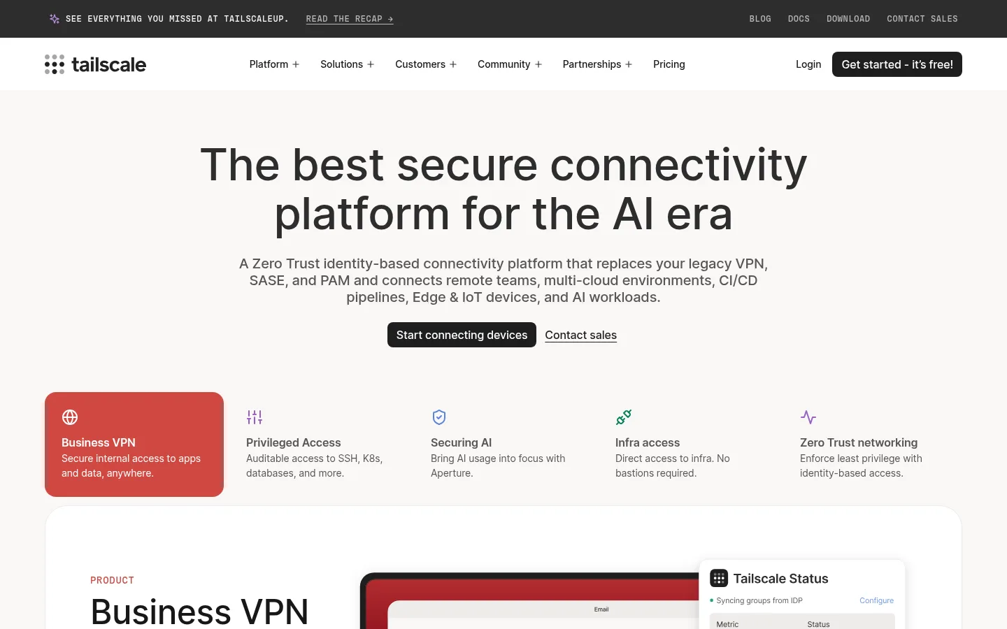
The page is built around a warm off-white canvas rather than stark white, with dark charcoal headlines and muted gray supporting copy. White product cards provide clean contrast, while thin pale borders define panels without making the page feel boxed in. Dark, compact calls to action anchor the otherwise quiet palette; the blue gradient is reserved for a prominent product-benefit showcase, and coral appears as a selected capability tile rather than a general brand color. Inter supplies the contemporary, readable sans-serif voice, with large centered hero typography and a consistent restrained weight. The MDIO monospace face is used sparingly for uppercase announcement and eyebrow text. Layout alternates centered messaging, broad product demonstrations, customer proof, and integration logos. Generous vertical breathing room separates sections, while dense product screens and logo arrays add technical detail. Rounded corners soften panels and buttons; subtle borders and very light shadows keep depth secondary to content.
Headlines, body copy, navigation, buttons, and card content.
Aa 设计
mdio
网络字体 · 字重 500 · 占比 3%
免费替代:IBM Plex Mono
Uppercase announcement-bar text and compact eyebrow labels.
角色
示例
字号
字重
行高
字距
特大标题
Large centered hero or feature-panel headline.
Tailscale
64px
500
1.1
-0.01em
一级标题
Primary page headline and major section heading.
Tailscale
48px
500
1.1
-0.01em
二级标题
Section titles and prominent supporting statements.
Tailscale
32px
500
1.1
-0.01em
三级标题
Capability, card, and subsection headings.
The quick brown fox 敏捷的狐狸
20px
500
1.2
-0.01em
正文
Explanatory copy, product details, and testimonial text.
The quick brown fox 敏捷的狐狸
16px
400
1.5
-0.01em
辅助文字
Compact labels and supporting card details.
The quick brown fox 敏捷的狐狸
14px
500
1.5
-0.01em
按钮
Primary and secondary action labels.
The quick brown fox 敏捷的狐狸
16px
500
1
-0.01em
导航
Main navigation and menu links.
The quick brown fox 敏捷的狐狸
16px
500
1.5
-0.01em
眉题
Uppercase monospace announcement and section labels.
The quick brown fox 敏捷的狐狸
12px
500
1
0.05em
间距与布局
基准单位 4px · 密度:适中
64px版块间距
12px元素间距
32px卡片内边距
1248px内容最大宽度
4px
8px
10px
12px
16px
20px
24px
32px
64px
Use a centered content frame with a measured maximum width of 1248px. The opening is vertically centered and text-led, followed by a horizontal capability row and a broad product split with interface media. Alternate full-width warm-neutral bands with white cards and one saturated feature panel. Center hero and proof messaging; align product detail and integration content to the left. Preserve the comfortable section rhythm and measured 64px section gap, while allowing dense interface previews and logo grids to contrast with spacious copy areas.
圆角与层次
按钮 · 8px
卡片 · 16px
图片 · 16px
导航 · 8px
sm · other, card, nav
md · nav
The page is mostly flat: pale hairline borders define white cards, and very light shadows lift select cards or navigation details. Product screenshots layer inside broad rounded panels, while the dark CTA is a solid band rather than a floating card. Keep depth subtle and avoid strong drop shadows.
组件
下面的预览按实测的按钮、输入框、徽标、卡片样式重建(字体用替代字体)。
Announcement and navigation
A narrow dark announcement strip with uppercase monospace copy sits above a white navigation row. Use dark text, compact links, and a dark rounded primary action.
Hero
Large centered charcoal headline, short muted supporting paragraph, and dark primary action paired with a plain text sales link on the warm canvas.
Capability selector
A horizontal row of concise use cases with small colored line icons; the selected Business VPN item becomes a rounded coral tile with white copy.
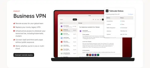
Product showcase
A white, rounded product panel combines a left-aligned eyebrow, headline, and checklist with a large software interface preview on the right.
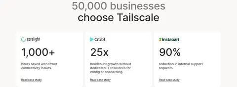
Customer proof cards
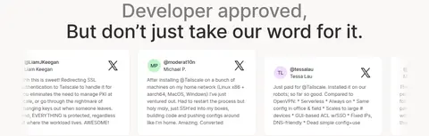
Customer metrics sit in white cards with fine pale borders, large figures, compact descriptions, and understated text links.
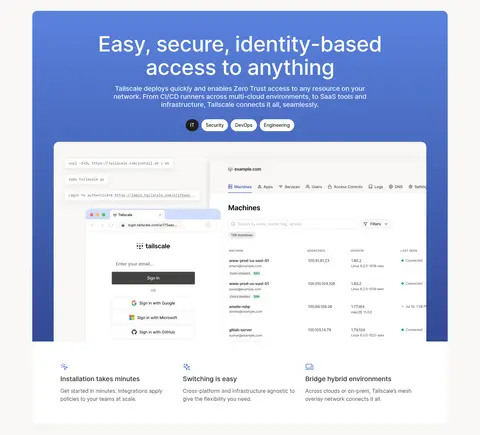
Gradient feature panel
A vivid blue gradient backs centered white feature messaging, small pill labels, and a large layered product-interface image.
Integration grid
A dense, evenly spaced array of partner and technology marks supports a short left-aligned heading and compact action.
Closing CTA and footer
A charcoal rounded CTA band precedes a white footer organized into logo and link columns, with subdued legal details.
Imagery · Product interfaces are the primary imagery: show realistic dashboards and device views inside large rounded white panels, with enough scale to read as software rather than decoration. Customer and integration logos form orderly, subdued grids. The feature showcase uses a blue gradient behind a large interface composite. Avoid generic lifestyle photography; reserve small colorful marks for product icons and the selected capability tile.
Reserve the blue gradient for a feature highlight.
Use thin borders to define white cards.
Give major sections generous breathing room.
✕ 不该做
Do not turn coral into a site-wide accent.
Do not use saturated backgrounds across every section.
Do not crowd the centered hero with extra elements.
Do not add heavy shadows to otherwise flat cards.
Do not let partner logos overpower nearby copy.
Do not use monospace for ordinary body text.
给 AI 的提示词
想快速出一个同风格的新页面,把这段话连同 DESIGN.md 一起发给 AI。
Build a new Tailscale-style SaaS page with a quiet, warm canvas in Warm Porcelain (#f9f7f6), charcoal headlines in Deep Charcoal (#2e2d2d), and muted supporting copy in Soft Graphite (#585757). Use Inter for headings, body, navigation, and controls; reserve expanded-tracking monospace for small uppercase labels. Create spacious centered messaging, broad white product panels, and realistic interface previews. Use Clean White (#ffffff) cards with Quiet Divider (#eeebea) hairlines and restrained corner rounding. Make actions Near Black (#1f1e1e). Apply Signal Blue (#5a82de) and Network Indigo (#324994) together only in a feature gradient; limit Capability Coral (#d04841) to selected-state emphasis. Alternate airy sections with dense interface or logo content, and finish with a charcoal CTA and orderly footer.