North star · Keep the discovery interface quiet and centered, using orange for action and saturated card colors to distinguish perspective content.
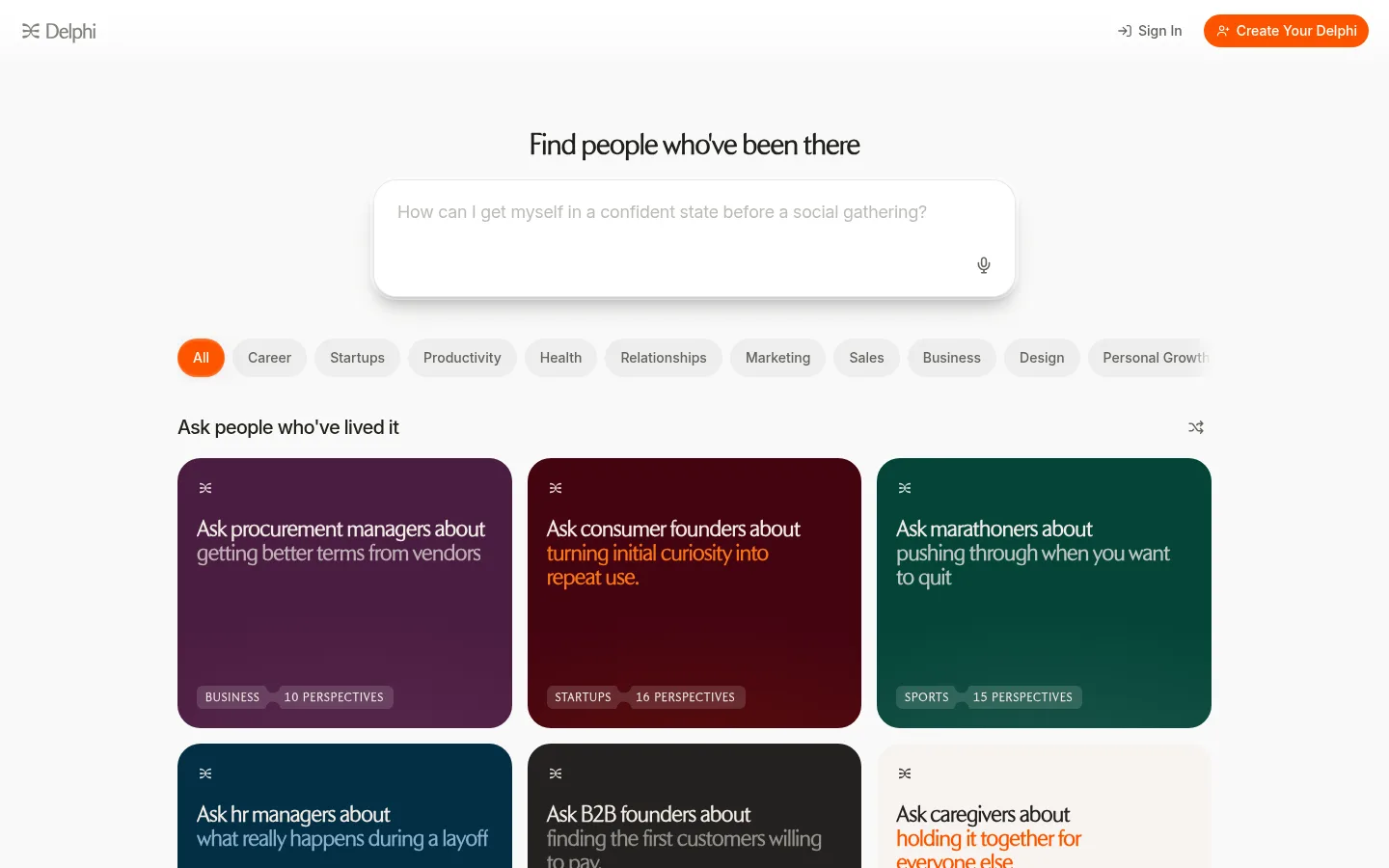
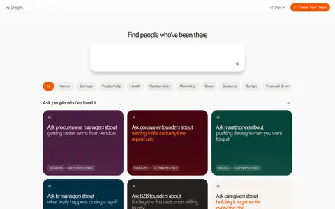
The page uses a warm near-white canvas and white navigation to keep the discovery experience open and unhurried. Dark ink carries headings and navigation, while the saturated orange accent marks the primary action and selected category. The strongest color appears in the perspective cards: burgundy, plum, and deep green create distinct content groups, with occasional orange emphasis in card copy. FontPythia gives headings and card prompts an editorial serif character; Inter handles controls and supporting text with compact clarity. A centered search prompt anchors the upper page, followed by a horizontal row of rounded category pills and a three-column card grid within a broad, centered content area. Generous gaps separate these functional layers. Cards use rounded corners, fine pale borders, and subtle inset or soft elevation rather than heavy outlines. The screenshot shows text-led cards, not prominent photography, so color and typography do the visual work.
Editorial headings, perspective-card prompts, and uppercase eyebrow labels.
Aa 设计
Inter
网络字体 · 字重 500 / 400 · 占比 41%
免费替代:Inter
Body copy, navigation, category controls, buttons, and input text.
角色
示例
字号
字重
行高
字距
一级标题
Centered page headline above the question input.
Delphi
28px
500
1.02
-0.025em
二级标题
Section headings and prominent content titles.
The quick brown fox 敏捷的狐狸
22px
600
1.15
-0.025em
正文
Question prompts and supporting descriptive copy.
The quick brown fox 敏捷的狐狸
18px
400
1.44
-0.01em
辅助文字
Category labels and compact card metadata.
The quick brown fox 敏捷的狐狸
14px
500
1.43
0
按钮
Navigation CTA and category filter controls.
The quick brown fox 敏捷的狐狸
14px
500
1.43
0
眉题
Small uppercase labels introducing supporting content.
The quick brown fox 敏捷的狐狸
11px
600
1
0.09em
间距与布局
基准单位 4px · 密度:适中
64px版块间距
12px元素间距
—卡片内边距
1072px内容最大宽度
2px
3px
4px
5px
6px
8px
9px
10px
12px
16px
20px
22px
40px
A centered content area uses a measured maximum width of 1072px, with a 12-column structure and comfortable density. The header spans the viewport; the discovery headline and input sit centered beneath it. Category pills form a single horizontal row, followed by a left-aligned section heading and three-column perspective cards. The measured section rhythm is 64px, with a 12px element gap. Preserve generous outer whitespace and keep the filter-to-grid transition compact.
圆角与层次
按钮 · 9999px
卡片 · 24px
inset · card
hairline · input
lg · button
Cards are defined by rounded corners and a fine pale border, with a subtle soft shadow or inset finish. The search field sits slightly above the canvas through restrained shadowing. Keep navigation and page background flat; avoid dramatic depth, thick outlines, or stacked floating panels.
组件
下面的预览按实测的按钮、输入框、徽标、卡片样式重建(字体用替代字体)。
Navigation
White full-width top bar with a compact Delphi mark at left, Sign In text link, and orange pill-shaped Create Your Delphi action at right.
Question input
Broad white rounded field centered beneath the headline; large Inter prompt text uses muted placeholder color, with a small microphone control near the lower right.
Category filters
One horizontal row of rounded pills. The selected All filter uses Signal Orange with white text; inactive categories use pale gray fills and Stone Gray labels.
Perspective card
Rounded, colored text card with a small brand mark, serif prompt, and compact category plus perspective-count labels near the bottom.
Card grid
Three equal-width columns of perspective cards with consistent narrow gutters and clear row spacing.
Section heading
Left-aligned Warm Ink heading introduces the card collection, with a small shuffle-style control aligned to the far right.
Imagery · The visible page is primarily typographic and interface-led rather than photography-led. Perspective cards use solid, saturated color fields with small brand marks, text prompts, and compact category/count labels. Avoid adding decorative imagery, gradients, or mockups that compete with the text. If card artwork is needed, keep it subordinate and preserve the strong color-block treatment.
Reserve Signal Orange for selected or primary actions.
Use Mulberry, Oxblood, and Forest Teal for perspective-card surfaces.
Set editorial headings in FontPythia and controls in Inter.
Keep card borders and shadows quiet.
Maintain a clear three-column content grid.
✕ 不该做
Do not turn the page into a dark interface.
Do not use orange as a large background field.
Do not add prominent photography to text-led cards.
Do not use heavy borders or dramatic shadows.
Do not scatter filters across multiple rows without need.
Do not make secondary labels compete with headings.
给 AI 的提示词
想快速出一个同风格的新页面,把这段话连同 DESIGN.md 一起发给 AI。
Build a new Delphi-style discovery page with a calm, warm-neutral canvas. Use Soft Canvas (#f9f9f8) behind a white (#ffffff) navigation bar and input; set primary text in Warm Ink (#21201c), muted labels in Stone Gray (#63635e), and fine borders in Quiet Line (#e3e3e1). Reserve Signal Orange (#fd5400) for the primary CTA, selected filter, and occasional highlighted text. Center the main discovery headline and question field, then place a compact horizontal pill-filter row above a broad three-column grid. Use FontPythia for editorial headlines and card prompts, Inter for controls and body copy. Give perspective cards rounded corners and distinct Mulberry (#4a1d40), Oxblood (#440411), or Forest Teal (#044438) surfaces. Keep elevation subtle, spacing comfortable, and imagery secondary to readable text.