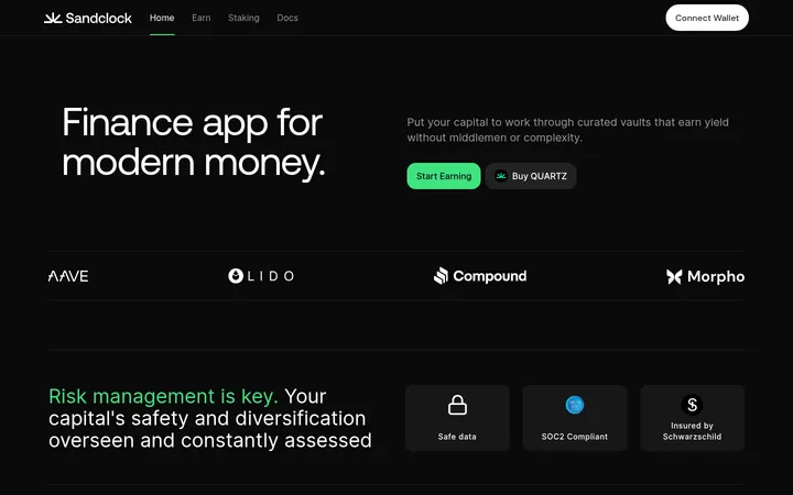
North star · Keep the page grounded in deep navy, then use restrained cyan-blue glow and crisp white type to make yield information immediately legible.
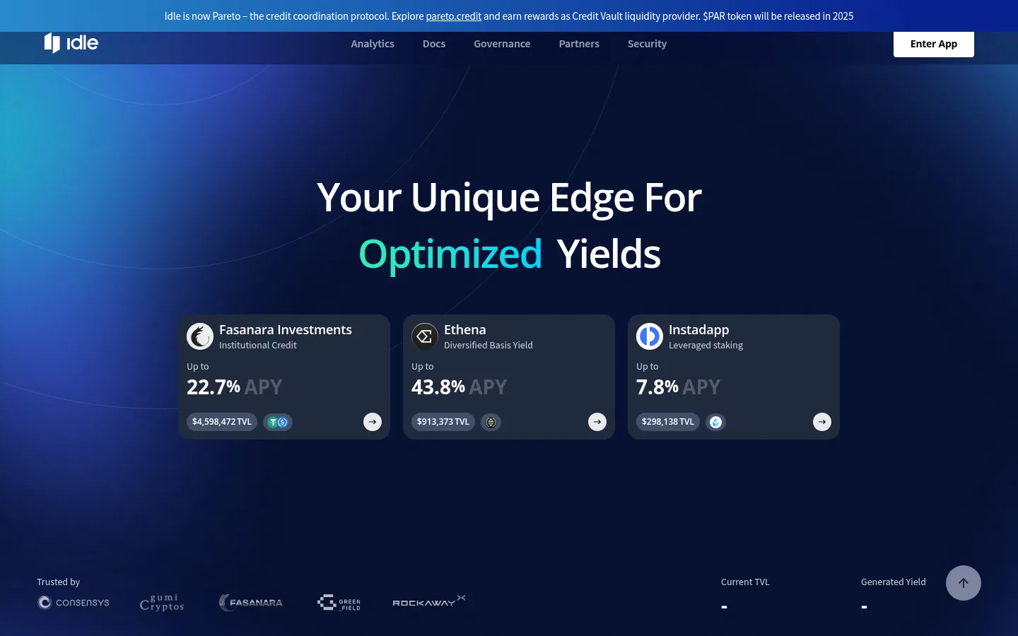
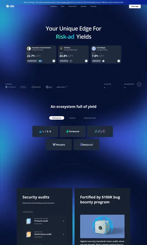
The visual system is anchored by a near-black navy canvas (#081336), which occupies most of the page and lets the luminous blue gradients read as ambient light rather than decorative blocks. White is reserved for high-priority headings, navigation, and bright CTA surfaces; muted gray supports explanatory copy and secondary metrics. Cyan highlights links and selected words, while green-to-cyan and blue gradients appear as localized glow fields. Source Sans Pro handles compact interface and body copy, with Open Sans used for prominent headings; both use mostly semibold or bold weights. The hero centers its headline above a row of dark yield cards, while partner marks, ecosystem tiles, security panels, and footer content form distinct horizontal groupings further down. Cards use a slightly lighter blue-gray surface and rounded corners to separate content without heavy elevation. Large areas of negative space preserve contrast and make the gradual background glow feel atmospheric. Illustration colors and token marks are supporting content, not the primary brand palette.
配色
点色块复制色值。用途说明来自对页面的实测位置(背景、文字、描边、按钮)与截图判读。
品牌色
强调色
表层色
中性色
功能色
页面底色 · Midnight Navy表层 · Slate Panel表层 2 · Signal White表层 3 · Blue Charcoal主文字 · Signal White次要文字 · Cool Mist弱文字 · True Black描边 · Graphite Rule强调 · Deep Cobalt强调 2 · Current Blue强调 3 · Glacier Cyan
Body copy, navigation, links, buttons, captions, and compact interface labels.
Aa 设计
Open Sans
网络字体 · 字重 600 / 700 · 占比 34%
免费替代:Open Sans
Headings and prominent explanatory or display copy.
Aa 设计
-apple-system
系统字体 · 字重 700 · 占比 3%
免费替代:Inter
Oversized display role in the measured type system; use sparingly for exceptional display numerals or emphasis.
角色
示例
字号
字重
行高
字距
特大标题
Oversized display emphasis or exceptional headline treatment.
Idle Finance
100px
700
1
0
一级标题
Main hero headline, centered above yield cards.
Idle Finance
56px
600
1.43
-0.036em
二级标题
Major section headings, including ecosystem and security sections.
Idle Finance
36px
700
1.33
-0.028em
三级标题
Card and feature headings.
Idle Finance
28px
700
1.57
0
四级标题
Smaller card titles and subsection labels.
The quick brown fox 敏捷的狐狸
20px
600
1.6
-0.05em
正文
Descriptions, explanatory copy, and supporting text.
The quick brown fox 敏捷的狐狸
16px
600
1.5
-0.062em
辅助文字
Compact card metadata, labels, and secondary notes.
The quick brown fox 敏捷的狐狸
15px
500
2.13
-0.067em
按钮
CTA and tab labels.
The quick brown fox 敏捷的狐狸
16px
600
1.5
-0.062em
导航
Header navigation labels.
The quick brown fox 敏捷的狐狸
16px
600
1.5
-0.062em
链接
Interactive links and linked partner or product names.
The quick brown fox 敏捷的狐狸
16px
600
1.5
-0.062em
间距与布局
基准单位 2px · 密度:适中
50px版块间距
8px元素间距
61px卡片内边距
1110px内容最大宽度
1px
2px
4px
5px
6px
8px
10px
12px
16px
20px
24px
28px
29px
30px
31px
50px
Use a centered content area capped at the measured 1110px maximum width, with a comfortable density and clear horizontal groupings. The opening hero centers its headline above three yield cards; lower content alternates between logo or protocol tiles and paired security panels. Preserve the measured 50-unit section rhythm and 8-unit element rhythm rather than crowding blocks together. Keep headings centered where they introduce a broad section, while card content remains left-aligned. Wide areas of dark canvas are intentional, balancing compact data and maintaining a calm, premium feel.
圆角与层次
按钮 · 50%
卡片 · 15px
链接 · 8px
没有测到阴影:页面是扁平的,层次靠底色和描边区分。
The interface is mostly flat: darker canvas, slightly lighter card surfaces, and restrained hairlines provide the hierarchy. Cards are visibly layered through surface contrast and measured rounded corners rather than strong shadows. Use gradients as background atmosphere, not as an elevation effect, and keep button treatment simple and sharply legible.
组件
下面的预览按实测的按钮、输入框、徽标、卡片样式重建(字体用替代字体)。
Announcement and navigation
A slim gradient announcement band sits above a dark navy navigation row; white nav labels and a white Enter App CTA are clearly separated.
Hero yield cards
Three compact #17202e cards sit beneath a centered headline, each presenting a protocol name, short descriptor, APY, TVL, token marks, and a circular arrow.
Protocol selector
A small set of pill-like tabs introduces the ecosystem area, followed by dark rectangular partner tiles with centered marks and names.
Security panels
Paired blue-gray rounded cards combine audit list content and a bug-bounty feature with an illustration, supporting copy, and a compact CTA.
Footer and newsletter
A dark footer groups the brand and email signup alongside several compact link columns; subtle blue glow remains behind the layout.
Primary CTA
Use a white button surface with dark readable label for actions such as Enter App; keep padding generous and treatment unembellished.
Imagery · The page relies more on luminous background treatment, protocol marks, and small product visuals than on photography. Use broad, soft blue radial glows fading into navy, with restrained cyan or mint highlights. Keep logos and token marks contained within cards or tiles; the small illustrated security object can be rendered as a contained 3D-style image. Avoid letting colorful mock-up details redefine the site palette.
Set major headings in Open Sans with strong weight.
Use Source Sans Pro for navigation and interface copy.
Separate cards with #17202e or #202a3e surfaces.
Reserve #6ae4ff for links and selective emphasis.
Leave ample dark negative space around content groups.
✕ 不该做
Do not replace the dark canvas with large white sections.
Do not apply gradients to every card or button.
Do not use mint or aqua as broad page backgrounds.
Do not crowd the centered hero or card groups.
Do not rely on heavy shadows for card hierarchy.
Do not treat illustration colors as the core brand palette.
Do not use low-contrast gray for primary actions or headings.
给 AI 的提示词
想快速出一个同风格的新页面,把这段话连同 DESIGN.md 一起发给 AI。
Build a new page in Idle Finance's visual style: use Midnight Navy (#081336) as the primary canvas and let spacious dark areas frame the content. Add restrained Deep Cobalt (#08218f) and Current Blue (#298acb) radial glow as atmospheric background light, with Glacier Cyan (#6ae4ff) reserved for links and selective emphasis. Use Signal White (#ffffff) for headings and key labels, Cool Mist (#cdd0d6) for secondary copy, and Slate Panel (#17202e) or Blue Charcoal (#202a3e) for cards. Set major headings in Open Sans and interface text in Source Sans Pro. Center broad section introductions, keep card content orderly and left-aligned, and preserve comfortable gaps between groups. Prefer surface contrast and subtle hairlines over shadows; keep CTAs simple, high-contrast, and easy to scan.