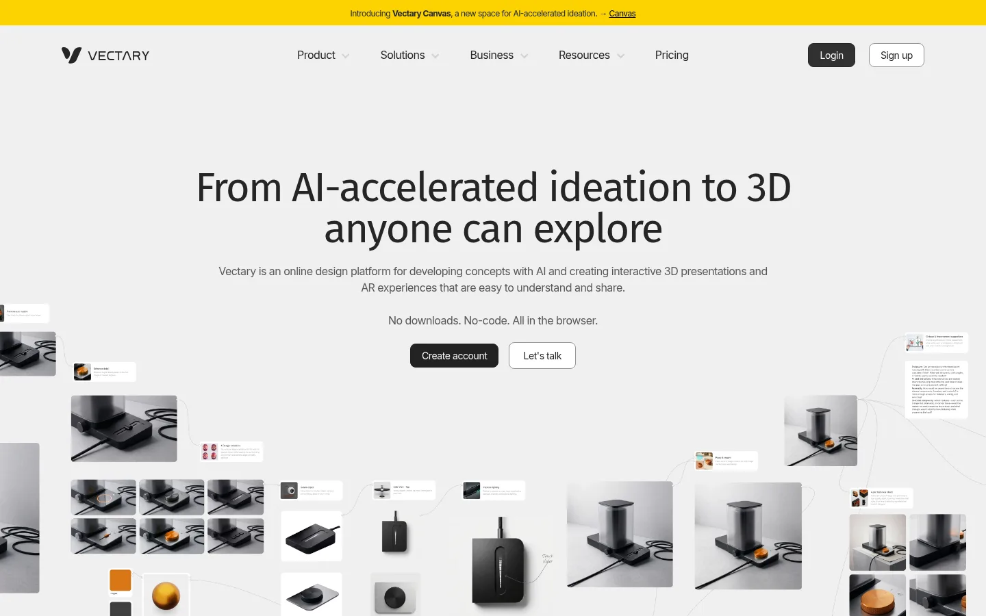
Vectary 首页以克制的灰色画布搭配大幅产品视觉,突出 AI 辅助设计与交互式 3D 展示。轻盈的字体、细边框和顶部黄色公告条让页面保持简洁,同时引导用户关注产品功能。
North star · Keep the interface quiet and spacious so the product’s 3D imagery, rather than UI decoration, carries the visual emphasis.
The page is built on a continuous #f0f0f0 canvas, giving the long homepage a unified, quiet backdrop rather than relying on alternating section colours. A slim yellow announcement strip is the strongest brand accent; elsewhere, product and interface imagery supply most of the visual variation. Headings use light Fira Sans with close tracking, while Inter handles navigation, body copy, links, and controls in compact, readable weights. The hero centers its message above a broad collage of product and concept imagery, then later sections alternate centered introductions, large media panels, and three-column feature text. Generous vertical gaps separate these groups, with a wider page frame keeping the content orderly. White surfaces create contrast for media panels and outlined buttons; dark charcoal is reserved for the login control and footer. Borders are subtle and shadows are absent, so imagery and spacing—not card elevation—establish hierarchy.
Navigation, body copy, captions, links, buttons, and most section headings.
Aa 设计
Fira Sans
网络字体 · 字重 300 · 占比 4%
免费替代:Roboto
Display headline and primary hero heading.
角色
示例
字号
字重
行高
字距
特大标题
Large, light hero display headline.
Vectary
60px
300
1
-0.033em
一级标题
Primary hero heading and major introductory title.
Vectary
36px
300
1.25
-0.027em
二级标题
Centered product-section headings.
The quick brown fox 敏捷的狐狸
22px
400
1.09
-0.025em
三级标题
Feature titles in three-column text groups.
The quick brown fox 敏捷的狐狸
20px
500
1.4
-0.035em
正文
Feature descriptions and explanatory copy.
The quick brown fox 敏捷的狐狸
16px
300
1.5
-0.034em
辅助文字
Small labels and secondary supporting text.
The quick brown fox 敏捷的狐狸
14px
400
1.5
-0.039em
按钮
Compact text inside outlined and filled controls.
The quick brown fox 敏捷的狐狸
14px
400
1.5
-0.03em
导航
Main header navigation links.
The quick brown fox 敏捷的狐狸
16px
400
1.69
-0.034em
链接
Inline product links and footer navigation.
The quick brown fox 敏捷的狐狸
14px
400
1.5
-0.039em
间距与布局
基准单位 2px · 密度:适中
60px版块间距
4px元素间距
—卡片内边距
1260px内容最大宽度
2px
4px
6px
8px
10px
12px
16px
20px
30px
60px
A centered, wide desktop composition uses a measured maximum content width of 1260px. The hero aligns headline and copy centrally, with a full-width collage occupying the lower viewport. Below it, centered section introductions lead into large media panels and three-column feature rows. Sections retain the same light canvas, separated by generous vertical rhythm; the footer switches to a six-column dark layout. Overall density is comfortable, with compact text blocks and broad image areas.
圆角与层次
按钮 · 8px
图片 · 16px
徽标 · 9999px
没有测到阴影:页面是扁平的,层次靠底色和描边区分。
The interface is mostly flat: measured shadows are absent, and section hierarchy comes from whitespace, image scale, and colour contrast. Fine gray borders define button edges and some controls. White media panels sit directly on the canvas with modest rounded corners; the footer creates a single dark, full-width layer.
组件
下面的预览按实测的按钮、输入框、徽标、卡片样式重建(字体用替代字体)。
Announcement strip
A narrow yellow band at the top contains centered introductory copy and a short linked callout.
Main navigation
Logo at left, compact Inter navigation across the center, and login plus sign-up controls on the right.
Hero
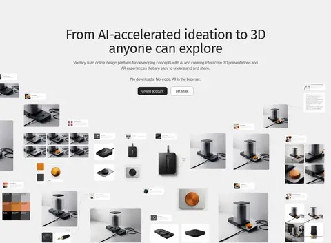
Centered light display heading, supporting copy, paired calls to action, and a broad product-image collage below.
Outlined button
White surface, dark text, a 1px #949494 border, 8px radius, and compact Inter label.
Feature rows
Three-column text groups use concise Inter headings and lightweight explanatory copy over the shared canvas.
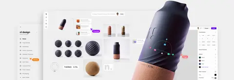
Media showcase
Large product or interface imagery sits in a white, softly rounded panel with no visible shadow.
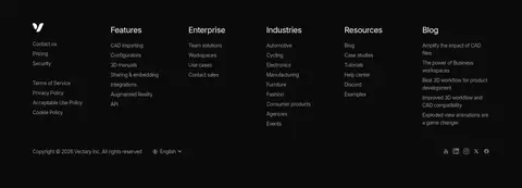
Footer
A #0b0b0b background organizes links into six columns, with small muted text and a bottom utility row.
Imagery · Large product collages combine interface captures, 3D object renders, and small contextual cards. The hero uses a loosely connected spread of product images across the lower canvas; later showcase panels present larger interface and rendered-object compositions. The visuals are mostly rectangular with gently rounded media corners, neutral backgrounds, and minimal decorative framing. The measured palette includes colours found inside product imagery, but the brand identity is primarily the gray canvas and restrained interface.
Reserve #fbd302 for a slim announcement or small beta marker.
Center major introductions above broad product imagery.
Use Fira Sans lightly for display headings and Inter for interface text.
Keep feature descriptions concise and arrange them in three columns where appropriate.
Use borders and whitespace instead of shadows to define surfaces.
✕ 不该做
Do not introduce alternating saturated section backgrounds.
Do not use yellow as a large panel or persistent CTA fill.
Do not crowd the hero with dense copy or extra controls.
Do not add pronounced shadows or layered card effects.
Do not let decorative UI compete with the 3D product imagery.
Do not make every section a boxed card.
给 AI 的提示词
想快速出一个同风格的新页面,把这段话连同 DESIGN.md 一起发给 AI。
Build a new Vectary-style SaaS page with a calm, spacious visual system. Use Canvas Mist (#f0f0f0) as the dominant background and Soft Graphite (#595959) for supporting copy. Set display headlines in light Fira Sans with close tracking; use Inter for navigation, body text, links, and controls. Keep a centered, wide content frame, generous vertical section spacing, and clear alternation between centered introductions, broad product showcases, and concise multi-column feature groups. Use Gallery White (#ffffff) for media surfaces and button fills, Quiet Silver (#949494) for fine borders, and Charcoal Ink (#252525) for navigation and button text. Reserve Signal Yellow (#fbd302) for small announcement or beta details. Keep shadows absent, corners restrained, and the footer a single Footer Black (#0b0b0b) band. Let product imagery provide the visual richness.