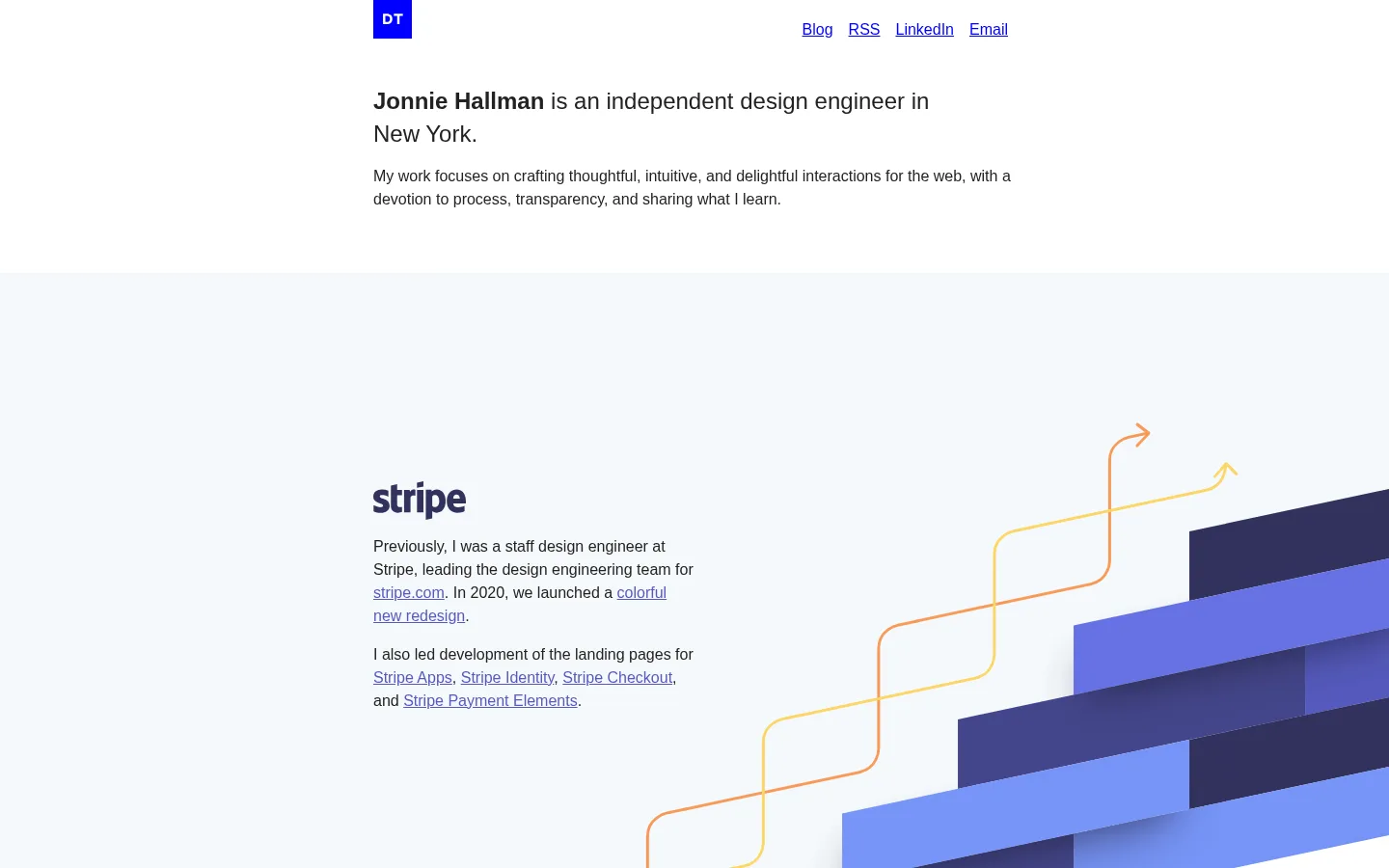
North star · Keep the editorial text narrow and quiet, and let each project’s imagery and full-width color field carry the visual impact.
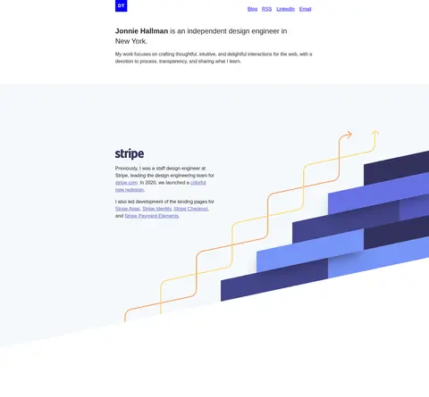
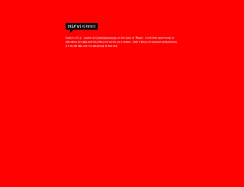
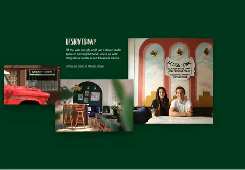
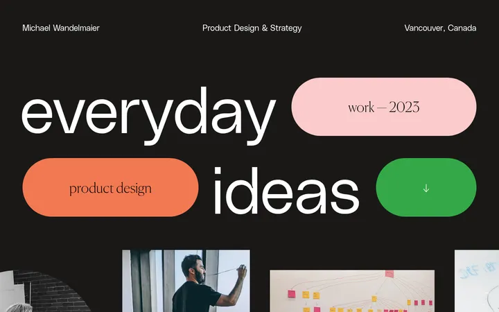
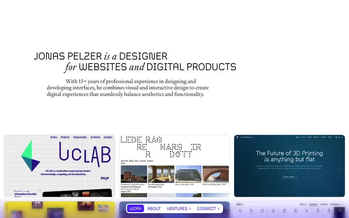
The visual strategy is built around contrast between a quiet, white introduction and a long sequence of expressive project canvases. The measured palette’s pure white and near-black text establish a plain editorial baseline; vivid blue identifies links and a small monogram, while charcoal, near-black, blue, red, and deep green distinguish selected project bands. A pale blue field also frames Stripe imagery, though its lighter blue tones belong largely to the artwork rather than the site’s core identity. System sans-serif typography stays unembellished: modest headings, readable body copy, and familiar underlined links. Content sits in a narrow, centered column, while project images can spread beyond the text and define each section’s visual scale. Generous vertical pauses give each case study room to register. The page favors flat fields and imagery over card chrome, using layered mockups and occasional media shadows for depth.
配色
点色块复制色值。用途说明来自对页面的实测位置(背景、文字、描边、按钮)与截图判读。
品牌色
强调色
表层色
中性色
功能色
页面底色 · Gallery White表层 · Warm Charcoal表层 2 · Night Ink表层 3 · Studio Green主文字 · Reading Ink次要文字 · Gallery White弱文字 · Soft Ash描边 · Section Hairline强调 · Electric Link Blue强调 2 · Muted Periwinkle强调 3 · Talk Red
Introductory statement introducing the designer and location.
The quick brown fox 敏捷的狐狸
24px
400
1.4
0
正文
Short portfolio descriptions, project context, and closing copy.
The quick brown fox 敏捷的狐狸
16px
400
1.5
0
导航
Compact top navigation links.
The quick brown fox 敏捷的狐狸
16px
400
normal
0
链接
Underlined inline links to projects, posts, and contact destinations.
The quick brown fox 敏捷的狐狸
16px
400
1.5
0
间距与布局
基准单位 8px · 密度:宽松
225px版块间距
64px元素间距
157px卡片内边距
666px内容最大宽度
8px
16px
32px
50px
64px
135px
Use a centered, narrow editorial text column; the measured page max width is 666px. Keep the introduction compact and align navigation and copy to the same central content area. Follow it with tall, full-width project bands, alternating mostly white space with distinct showcase backgrounds. Project copy remains concise while imagery may extend well beyond the text column. The measured spacing system is spacious, with large section gaps and generous pauses between cases; avoid dense grids except where a project’s image arrangement calls for one.
圆角与层次
lg · media
lg · media
xl · media
Most page structure is flat: full-width color fields and open white space replace cards and outlined containers. Let project mockups and media supply depth through their own layering and measured black shadows. Keep section separators subtle, and do not add generic drop shadows to text blocks or navigation.
组件
下面的预览按实测的按钮、输入框、徽标、卡片样式重建(字体用替代字体)。
Header and monogram
Small blue DT square at the left of the centered content area, with compact Blog, RSS, LinkedIn, and Email links aligned across the top.
Intro statement
Brief designer introduction and supporting sentence on white, set in regular system sans-serif with selected bold name emphasis.
Project text block
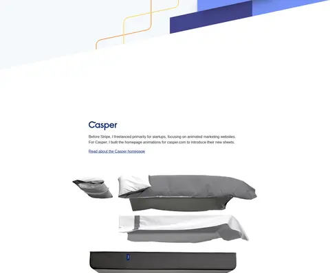
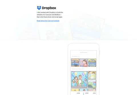
Short case-study description paired with a brand or project visual and a small underlined text link.
Full-width case-study band
Distinctive project canvas, including charcoal, near-black, Cushion blue, red, or deep green, with text and imagery composed for that project.
Inline text links
Blue or muted periwinkle underlined links embedded directly in body copy and lists, without button framing.
Writing list
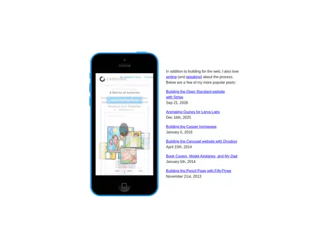
Editorial list of post titles and dates beside a device image, set on a white background.
Closing contact copy
Simple text-led end section with a short sign-off, blog link, and email invitation.
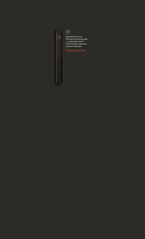
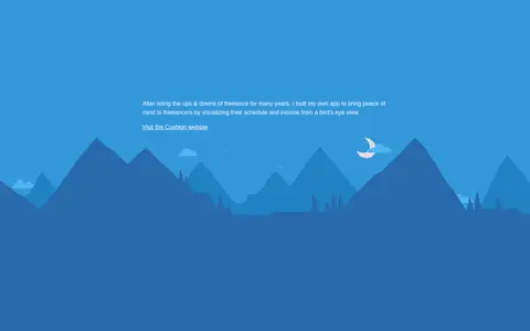
Imagery · Treat each project’s own artwork as the main visual event: layered Stripe graphics, product mockups, device screens, an illustrated mountain landscape, and documentary studio photographs. Preserve the original image aspect and avoid decorative overlays that compete with the artwork. Images can be large or compositionally offset from their accompanying text, while smaller editorial areas stay restrained.
Use #0000ff for primary links and the compact monogram.
Give each case study its own full-width visual field when appropriate.
Let project imagery extend beyond its text column.
Use system sans-serif typography with restrained emphasis.
Preserve generous whitespace between portfolio entries.
✕ 不该做
Do not turn the portfolio into a dense card grid.
Do not add unmeasured colors, radii, or spacing values.
Do not use oversized display typography for ordinary project copy.
Do not treat artwork-only colors as universal site accents.
Do not add button chrome to simple inline links.
Do not apply decorative shadows to every section.
给 AI 的提示词
想快速出一个同风格的新页面,把这段话连同 DESIGN.md 一起发给 AI。
Build a portfolio page in the style of Jonnie Hallman’s personal site. Use a white editorial canvas, a centered narrow text column, and a restrained system sans-serif stack; substitute Inter only if needed. Set ordinary copy in #222222 and make underlined links and the small monogram #0000ff. Begin with a concise introduction and compact navigation, then create spacious full-width project sections with short text and large, project-specific imagery. Use measured showcase surfaces deliberately: #2c2b28 for warm charcoal, #121311 for near-black, #3498db for the illustrated blue project, #ff0000 for a vivid talk section, and #00361c for a studio feature. Keep layouts flat and open; let layered media provide depth. Finish with a simple article list and contact copy. Do not invent decorative cards, border radii, or extra palette colors.