North star · Let lifestyle photography lead, then use precise Diabla red typography and abundant white space to make each content block feel like an editorial feature.
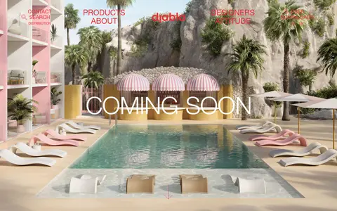
The visual identity is built around a strict two-colour foundation: white canvas and Diabla red (#ed2e38) for navigation, headings, copy, outlined controls, and fine rules. Red is assertive but not used as a filled page background; the imagery supplies most of the colour and atmosphere. Large uppercase Helvetica Neue displays create a light, fashion-editorial voice, balanced by compact uppercase navigation and small captions. The opening is a full-bleed poolside photograph with overlaid white title text and red navigation. Below it, white space separates an irregular editorial arrangement of landscape, furniture, and designer features rather than a uniform product catalogue. Thin red outlines define cards and pill-shaped links without shadows. The measured section rhythm is spacious, while the nine-column content structure supports varied image and text widths. The result feels casual and design-led, with photography carrying the lifestyle narrative and red providing consistent brand recognition.
免费替代:Helvetica Neue, with Arial as a free system fallback
Navigation, body copy, captions, links, buttons, and editorial headings.
角色
示例
字号
字重
行高
字距
特大标题
Oversized uppercase campaign words layered over the immersive hero imagery.
Diabla
110px
400
0.91
0
一级标题
Large uppercase headline for the main hero or lead editorial feature.
Diabla
80px
400
0.88
0
二级标题
Uppercase feature and section headings, including collection names.
Diabla
33px
400
1.09
0
三级标题
Uppercase product, designer, or story titles within the editorial grid.
The quick brown fox 敏捷的狐狸
22px
400
1.09
0
正文
Short descriptive copy for furniture, designers, and brand stories.
The quick brown fox 敏捷的狐狸
16px
400
1.13
0
辅助文字
Small uppercase labels beneath or beside editorial images.
The quick brown fox 敏捷的狐狸
14px
400
2
0
按钮
Uppercase text inside thin red outlined pill controls.
The quick brown fox 敏捷的狐狸
15px
400
1.8
0
导航
Uppercase primary navigation and footer column labels.
The quick brown fox 敏捷的狐狸
22px
400
1.09
0
链接
Small uppercase inline links and secondary actions.
The quick brown fox 敏捷的狐狸
10px
400
1.2
0
间距与布局
基准单位 2px · 密度:适中
80px版块间距
16px元素间距
17px卡片内边距
700px内容最大宽度
10px
15px
16px
17px
20px
25px
30px
32px
40px
80px
The page uses a nine-column editorial structure beneath a full-bleed hero. The hero spans the viewport, while lower content places images and text in varied widths and asymmetrical pairings rather than repeating identical cards. Content is center-aligned in many feature blocks, with broad white intervals between them. The measured section gap is 80px and element gap is 16px; the measured page max width is 700px, though the lead media breaks beyond it. The footer shifts to five columns and a denser information layout.
圆角与层次
按钮 · 9999px
没有测到阴影:页面是扁平的,层次靠底色和描边区分。
The interface is predominantly flat: white canvas, no measured shadows, and no gradients. Fine red borders outline feature cards and pill controls, providing separation without raised surfaces. Photography creates the strongest depth and layering, especially in the full-bleed hero, where title and navigation sit directly over the scene.
组件
下面的预览按实测的按钮、输入框、徽标、卡片样式重建(字体用替代字体)。
Full-bleed hero
Viewport-wide outdoor lifestyle image with centered, oversized uppercase campaign text and red navigation over the scene.
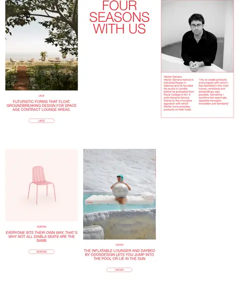
Editorial feature card
Image-led story or product block with uppercase red title, concise copy, and a thin red outline where a card boundary is used.
Pill action
Small uppercase red label in a thin outlined, fully rounded control; keep the fill transparent.
Primary navigation
Uppercase red links arranged across the top of the hero, with the Diabla mark centered among the navigation groups.
Designer profile
Portrait and editorial text grouped within a red hairline frame, using compact uppercase red typography.
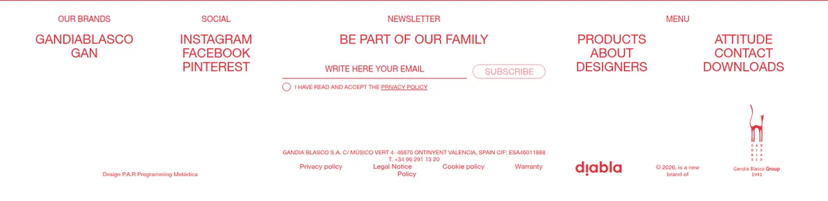
Multi-column footer
Compact white footer with red uppercase column labels, social links, newsletter fields, and a fine red top rule.
Imagery · Lifestyle and product photography dominate: the hero shows a resort-like pool and outdoor seating, while lower features mix landscape scenes, furniture, and a designer portrait. Images are presented as rectangular editorial frames with little visual ornament. Photography supplies the page’s greens, pinks, and natural material tones; these are image content, not additional interface palette colours.
Use #ed2e38 for brand text, outlines, and navigation.
Let high-quality outdoor photography carry the colour and mood.
Use uppercase display and navigation typography.
Vary editorial image and text widths instead of making every card identical.
Separate stories with generous white space.
Use thin outlines rather than shadows to define controls.
✕ 不该做
Do not introduce unmeasured interface colours.
Do not use large solid red panels as the default surface.
Do not add drop shadows or decorative gradients.
Do not force the editorial features into a uniform catalogue grid.
Do not crowd images with dense explanatory copy.
Do not use heavy or tightly tracked typography.
给 AI 的提示词
想快速出一个同风格的新页面,把这段话连同 DESIGN.md 一起发给 AI。
Build a new Diabla-style outdoor furniture page using Gallery White (#ffffff) as the primary canvas and Diabla Red (#ed2e38) for navigation, headings, copy, fine borders, and outlined controls. Start with a full-bleed lifestyle photograph and overlay a light, uppercase campaign heading plus restrained red navigation. Below, create an airy editorial sequence that alternates furniture, landscape, and designer imagery with concise text; vary the blocks rather than repeating a rigid product grid. Use the measured Helvetica Neue family or a close system fallback, regular weight, and uppercase styling for headings, navigation, buttons, and captions. Keep controls transparent with thin red outlines and pill-shaped ends. Avoid shadows, gradients, extra interface colours, and dense layouts. Finish with a compact multi-column footer for brand links, social channels, and newsletter signup.