North star · Use warm cream, forest-green structure, condensed display type, and playful hand-drawn product scenes to make every section feel bold but approachable.
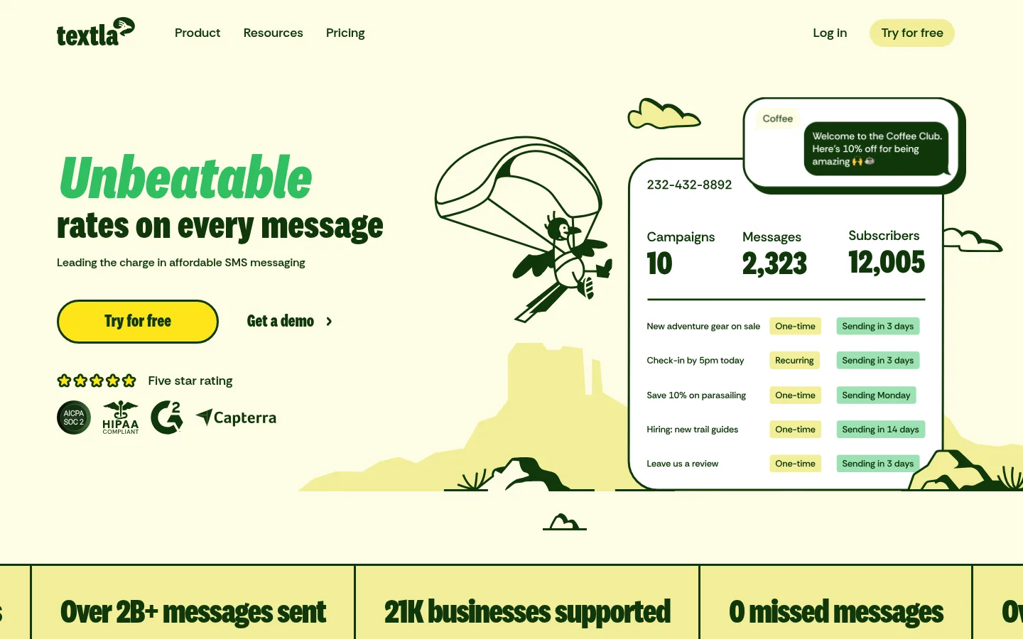
The page is anchored by a warm cream canvas (#fefde6), with deep forest green (#10380b) carrying nearly all text, outlines, and key interface structure. Broad pale yellow-green bands (#f2ee98) group product education, while saturated yellow (#fce519) marks editorial content and testimonial moments; muted sage (#dbe8ac) softens the footer and support pledge. Headlines use National 2 Condensed in heavy, tightly stacked forms, with bright green emphasis visible in the hero and section titles. RethinkSans handles navigation and explanatory copy. A broad, comfortable layout pairs left-aligned text with large illustrated product scenes, then shifts into split feature panels and three-column article cards. Hand-drawn desert motifs give the software interface a distinctive personality. Rounded pill actions, large-radius cards, dark outlines, and occasional offset media shadows keep the page tactile without relying on gradients or diffuse shadows.
Navigation, body copy, labels, and explanatory text.
Aa 设计
National 2 Condensed
网络字体 · 字重 700 / 800 / 600 · 占比 38%
免费替代:Barlow Condensed
Display headlines, section headings, and prominent CTA labels.
角色
示例
字号
字重
行高
字距
特大标题
Oversized hero and campaign headline emphasis.
Textla
180px
600
0.8
0
一级标题
Primary hero message and major conversion heading.
Textla
156px
600
0.8
0
二级标题
Large feature-section and editorial headings.
Textla
104px
700
1.13
0
三级标题
Feature titles and card or testimonial headings.
Textla
86.5px
700
0.8
0
四级标题
Secondary feature and content-block headings.
Textla
64px
700
1.13
0
正文
Supporting product explanations and customer-facing copy.
The quick brown fox 敏捷的狐狸
20px
600
1.5
0
辅助文字
Small labels, article details, and illustration annotations.
The quick brown fox 敏捷的狐狸
16px
600
1.5
0
导航
Header links and primary site navigation.
The quick brown fox 敏捷的狐狸
18px
600
1.6
0
链接
Inline actions, article links, and CTA text.
The quick brown fox 敏捷的狐狸
20px
600
1.5
0
间距与布局
基准单位 8px · 密度:适中
40px版块间距
16px元素间距
24px卡片内边距
1280px内容最大宽度
8px
16px
24px
40px
64px
80px
The page uses a comfortable, wide layout with a measured maximum content width of 1280px. The hero is a two-part composition: left-aligned copy and actions beside a large illustrated product scene. Later sections alternate between broad full-width color bands and contained split layouts; feature education uses two-column arrangements, while news cards form a three-column row. Content is mostly left aligned, with centered emphasis in the dark closing CTA. Spacing follows a generous 8px-based scale, with measured 40px section gaps and 16px element gaps; the page remains spacious even where content density rises.
圆角与层次
按钮 · 50%
输入框 · 9999px
卡片 · 40px
图片 · 40px
导航 · 16px
链接 · 40px
hairline · media
The design is mostly flat, relying on color bands, strong green outlines, and large rounded corners to separate content. Cards use generous measured radii, while pill-shaped buttons and inputs stand out through shape and border. A measured offset green shadow appears on media, not as a general-purpose elevation treatment. Avoid soft gradients and diffuse shadows.
组件
下面的预览按实测的按钮、输入框、徽标、卡片样式重建(字体用替代字体)。
Primary CTA
Forest-green filled pill with warm-cream label and a measured 3px green border; the hero also uses a saturated yellow outlined pill CTA.
Navigation
Light-canvas horizontal header with forest-green links, compact logo, and a pill-style trial action.
Feature panel
Wide pale yellow-green band with condensed heading, explanatory text, and product illustration or interface mockup in a split layout.
Testimonial card
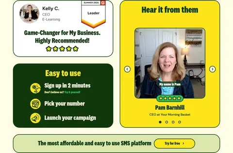
Yellow, green-outlined rounded panel with customer video, name, role, and carousel navigation.
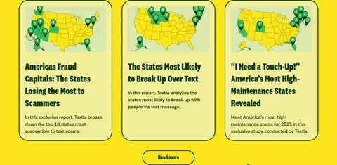
News card
Three-column article card with map thumbnail, green headline, concise summary, and rounded green outline.
Newsletter form
Sage footer section with email input and sign-up action; use warm-cream field fill, green outline, and pill rounding.
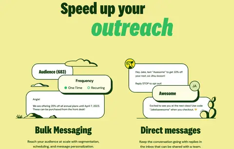
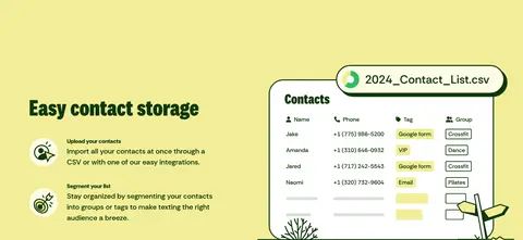
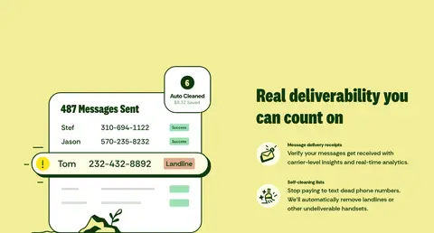
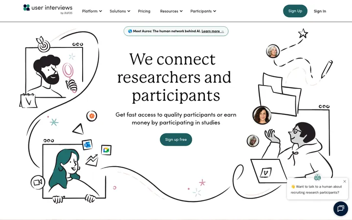
Imagery · Custom, hand-drawn desert and messaging illustrations frame product mockups, with linework and details in forest green and pale landscape fills. Interface scenes appear as clean dashboard cards, message bubbles, lists, and contact tables rather than glossy 3D renders. Customer proof includes video portraits in a yellow panel; news cards use map imagery. Keep illustrations integrated with the layout and let their colors echo the surrounding section band.
Use #10380b for text, outlines, and interface structure.
Alternate broad color bands with contained feature layouts.
Give product illustrations room to breathe beside copy.
Keep CTAs and inputs strongly rounded and clearly outlined.
✕ 不该做
Do not replace the warm cream canvas with pure white.
Do not use gradients as a primary visual treatment.
Do not make body copy compete with oversized display headlines.
Do not apply soft shadows to every card.
Do not use generic glossy 3D product renders.
Do not introduce unmeasured brand colors into the core palette.
给 AI 的提示词
想快速出一个同风格的新页面,把这段话连同 DESIGN.md 一起发给 AI。
Build a new Textla-style SaaS page with a warm, playful visual system. Use Warm Canvas (#fefde6) as the main background and Desert Pine (#10380b) for text, outlines, and structure. Bring in Agave Cream (#f2ee98) for feature bands, Signal Sun (#fce519) for high-attention moments, and Sage Mist (#dbe8ac) for softer supporting surfaces. Use a heavy condensed display face for large, stacked headings and a clear sans serif for navigation and body copy. Pair concise left-aligned copy with bespoke hand-drawn messaging or desert illustrations and crisp software mockups. Organize content in spacious split sections and rounded cards, with a three-column editorial row where useful. Favor pill actions, strong outlines, generous whitespace, and minimal shadow; avoid gradients and generic glossy imagery.